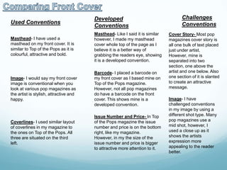
Conventions
Question 1- In what ways does your media product use,
develop or challenge forms and conventions of real media
products
Masthead

Cover Story

Coverlines

Cover Image

Price

Issue Number
Barcode
Publishers
Masthead

Cover Image

Coverlines
Cover Story

Artist Features

Barcode

Issue Number & Date
Used Conventions

Developed
Conventions

Masthead- I have used a
masthead on my front cover. It is
similar to Top of the Pops as it is
colourful, attractive and bold.

Masthead- Like I said it is similar
however, I made my masthead
cover whole top of the page as I
believe it is a better way of
grabbing the readers eye, showing
it is a developed convention.

Image- I would say my front cover
image is conventional when you
look at various pop magazines as
the artist is stylish, attractive and
happy.

Barcode- I placed a barcode on
my front cover as I based mine on
Top of the Pops magazine.
However, not all pop magazines
do have a barcode on the front
cover. This shows mine is a
developed convention.

Coverlines- I used similar layout
of coverlines in my magazine to
the ones on Top of the Pops. All
three are situated on the third
left.

Issue Number and Price- In Top
of the Pops magazine the issue
number and price is on the bottom
right, like my magazine.
However, in my the size of the
issue number and price is bigger
to attractive more attention to it.

Challenges
Conventions
Cover Story- Most pop
magazines cover story is
all one bulk of text placed
just under artist.
However, mine is
separated into two
section, one above the
artist and one below. Also
one section of it is slanted
to create an attractive
message.
Image- I have
challenged conventions
in my image by using a
different shot type. Many
pop magazines use a
mid shot, however, I
used a close up as it
shows the artists
expression more
appealing to the reader
better.
Headline

Page Reference
Features

Magazine Image

Image

Features

Cover Story
Headline
Image

Page Reference

Features

Features
Image

Page Number
Used Conventions
Headline- The headline of the
contents page is very similar to Top
of the Pops magazines. They both
have same sort of font style, colour
scheme and layout.

Image- Both magazines has an
image of the front cover to highlight
where key elements of the magazine
are. By placing page numbers next to
this, the audience can see where the
information in the magazine is.
Subtitles- Both magazine use
subtitles to place the magazines
content in a set order so its easier for
the readers to find the information
they are looking for. As the target
audience are teenagers there
attention are small so they need to
find the information quickly to keep
them fixed.

Developed
Conventions
Page Numbers- I used page
numbers to highlight where
information is in the magazine.
However, I decided to make mine
all different sizes, colours and
fonts as I thought it would be
better way of attracting the
audience.

Subtitles- I used subtitles like
Top of the Pops however, I used
sans-serif font to make them look
formal rather than informal as it is
information which needs to be
addressed quickly and seriously.
Whereas Top of the Pops uses
serif font for the subtitles.

Challenges
Conventions
Artist Image- I decided to
place an image of an
artist in the corner like in
Top of the Pops
magazine. However, I
decided to get the
audience to face the other
way to make him look
more mysterious.

Subtitles- Top of the
Pops uses subtitles,
however, they are
basically all the same
on the contents page.
However, my magazine
uses a different font
and colour for one
section as it is exciting
and uses words relating
to the colour, e.g.- Red
and Love.
Headline
Pull Quote
Kicker
Standfirst

Image

Byline

Feature
Pull Quote
Image

Page Number

Image

Page Number
Standfirst

Image

Pull Quote

Image
Feature

Page
Number
Used Conventions
Page Numbers- Both
magazines have page
numbers at the bottom of
the pages, they are also in
a coloured fill shape to
attracted audiences
attention.
Standfirst- The articles
both have a standfirst
highlighting what's in the
article. Also they are both
above the article to give the
reader a small insist into
the article.
Pull Quote- Similar to all
pop magazines, my
magazine has two pull
quotes from the article.
This allows the reader to
quickly glance at them so
they can see what the
article is most probably
going to say.

Developed
Conventions
Image- Both magazines
have an image of an artist
sitting down and both taking
up majority of one page.
However, in my magazine
the image is only taking up
one full page, whereas the
professional magazine is
more in the middle of both
pages.
Pull Quote- The Top of the
Pops magazine uses two
pull quotes in the article, so I
decided to use two as well.
However, I decided to move
them away from the featured
article in the corners and
made them the same
colours so it keeps to a
consistent house style and
colour scheme.

Challenges
Conventions
Headline- In majority of pop
magazines there double page
spread headline is a pull quote
from the article. I have decided
not to do that and have created a
normal headline on its own as it
creates a bigger attraction
element to the reader.
Article/Feature- The majority of
pop magazines use interviews as
ways of promoting and
highlighting the artist. However, I
decided to use a biography
describing the artists life and
journey from his childhood to
breaking into the industry. I
believed this would be more
interesting than a interview.
Image- The professional
magazine decided to do one
reasonable sized long shot of the
artist on the double page spread.
Whereas I decided to do two
small mid shot images of the
artist as I believed it gives more
publicity to the artist from the
readers.

Question 1- Conventions

  • 1.
    Conventions Question 1- Inwhat ways does your media product use, develop or challenge forms and conventions of real media products
  • 2.
  • 3.
  • 4.
    Used Conventions Developed Conventions Masthead- Ihave used a masthead on my front cover. It is similar to Top of the Pops as it is colourful, attractive and bold. Masthead- Like I said it is similar however, I made my masthead cover whole top of the page as I believe it is a better way of grabbing the readers eye, showing it is a developed convention. Image- I would say my front cover image is conventional when you look at various pop magazines as the artist is stylish, attractive and happy. Barcode- I placed a barcode on my front cover as I based mine on Top of the Pops magazine. However, not all pop magazines do have a barcode on the front cover. This shows mine is a developed convention. Coverlines- I used similar layout of coverlines in my magazine to the ones on Top of the Pops. All three are situated on the third left. Issue Number and Price- In Top of the Pops magazine the issue number and price is on the bottom right, like my magazine. However, in my the size of the issue number and price is bigger to attractive more attention to it. Challenges Conventions Cover Story- Most pop magazines cover story is all one bulk of text placed just under artist. However, mine is separated into two section, one above the artist and one below. Also one section of it is slanted to create an attractive message. Image- I have challenged conventions in my image by using a different shot type. Many pop magazines use a mid shot, however, I used a close up as it shows the artists expression more appealing to the reader better.
  • 5.
  • 6.
  • 7.
    Used Conventions Headline- Theheadline of the contents page is very similar to Top of the Pops magazines. They both have same sort of font style, colour scheme and layout. Image- Both magazines has an image of the front cover to highlight where key elements of the magazine are. By placing page numbers next to this, the audience can see where the information in the magazine is. Subtitles- Both magazine use subtitles to place the magazines content in a set order so its easier for the readers to find the information they are looking for. As the target audience are teenagers there attention are small so they need to find the information quickly to keep them fixed. Developed Conventions Page Numbers- I used page numbers to highlight where information is in the magazine. However, I decided to make mine all different sizes, colours and fonts as I thought it would be better way of attracting the audience. Subtitles- I used subtitles like Top of the Pops however, I used sans-serif font to make them look formal rather than informal as it is information which needs to be addressed quickly and seriously. Whereas Top of the Pops uses serif font for the subtitles. Challenges Conventions Artist Image- I decided to place an image of an artist in the corner like in Top of the Pops magazine. However, I decided to get the audience to face the other way to make him look more mysterious. Subtitles- Top of the Pops uses subtitles, however, they are basically all the same on the contents page. However, my magazine uses a different font and colour for one section as it is exciting and uses words relating to the colour, e.g.- Red and Love.
  • 8.
  • 9.
  • 10.
    Used Conventions Page Numbers-Both magazines have page numbers at the bottom of the pages, they are also in a coloured fill shape to attracted audiences attention. Standfirst- The articles both have a standfirst highlighting what's in the article. Also they are both above the article to give the reader a small insist into the article. Pull Quote- Similar to all pop magazines, my magazine has two pull quotes from the article. This allows the reader to quickly glance at them so they can see what the article is most probably going to say. Developed Conventions Image- Both magazines have an image of an artist sitting down and both taking up majority of one page. However, in my magazine the image is only taking up one full page, whereas the professional magazine is more in the middle of both pages. Pull Quote- The Top of the Pops magazine uses two pull quotes in the article, so I decided to use two as well. However, I decided to move them away from the featured article in the corners and made them the same colours so it keeps to a consistent house style and colour scheme. Challenges Conventions Headline- In majority of pop magazines there double page spread headline is a pull quote from the article. I have decided not to do that and have created a normal headline on its own as it creates a bigger attraction element to the reader. Article/Feature- The majority of pop magazines use interviews as ways of promoting and highlighting the artist. However, I decided to use a biography describing the artists life and journey from his childhood to breaking into the industry. I believed this would be more interesting than a interview. Image- The professional magazine decided to do one reasonable sized long shot of the artist on the double page spread. Whereas I decided to do two small mid shot images of the artist as I believed it gives more publicity to the artist from the readers.