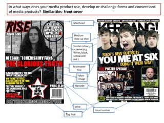
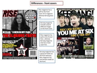
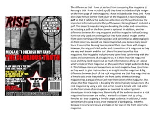
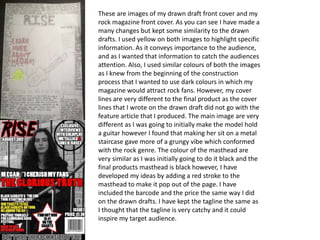
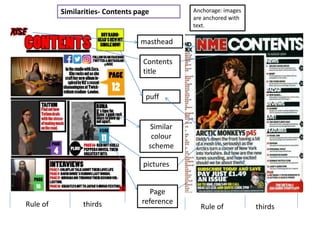
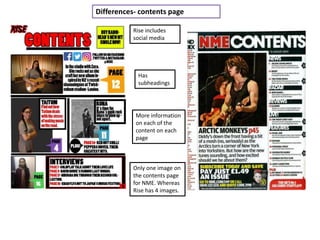
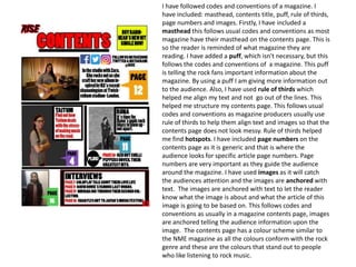
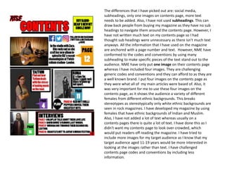
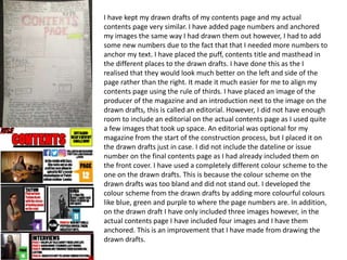
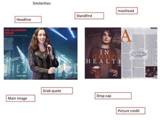
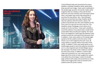
The document discusses the ways in which the author's rock magazine product uses and develops conventions of real media products. It provides comparisons between the author's magazine and other magazines like Kerrang and Rise. The author explains design elements like the front cover, contents page, and double page spread and how they follow conventions through features like the masthead, headlines, and images while also challenging some conventions, like using a solo female artist. The author discusses keeping elements similar between initial drafts and the final product while also developing some aspects, like changing the color scheme and layout.