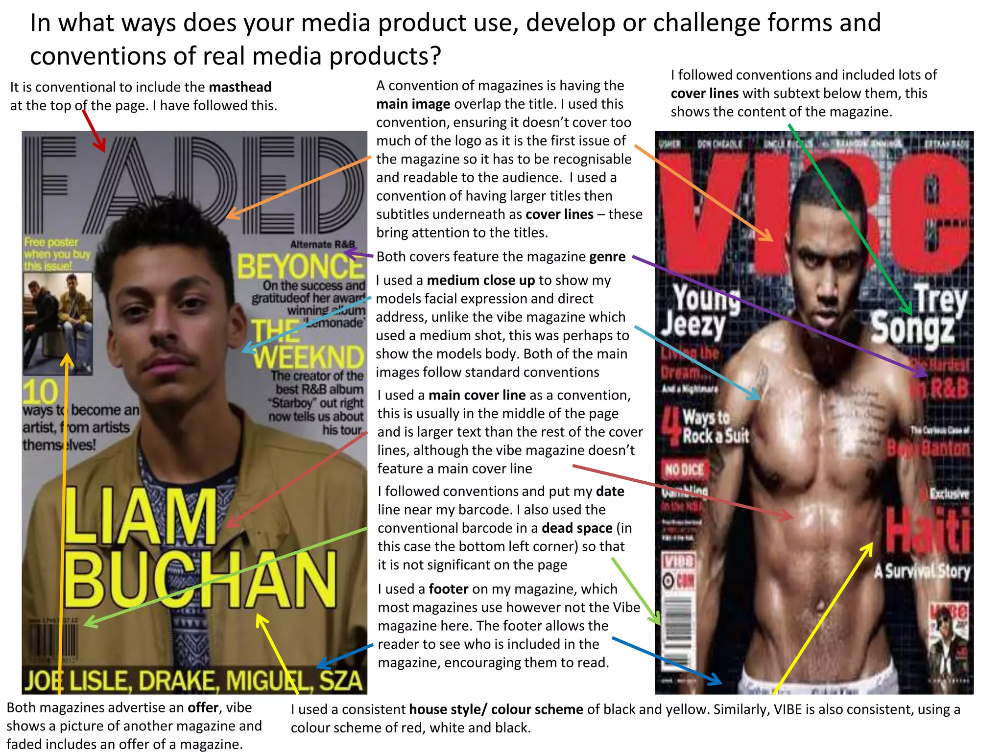
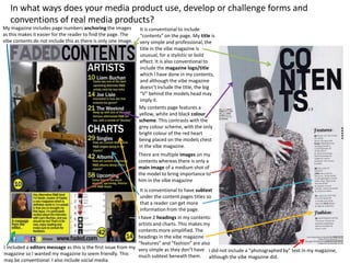
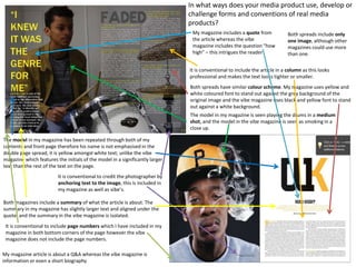
In what ways does your media product use, develop or challenge forms and
conventions of real media products?
A convention of magazines is having the
main image overlap the title. I used this
convention, ensuring it doesn’t cover too
much of the logo as it is the first issue of
the magazine so it has to be recognisable
and readable to the audience. I used a
convention of having larger titles then
subtitles underneath as cover lines – these
bring attention to the titles.
I used a medium close up to show my
models facial expression and direct
address, unlike the vibe magazine which
used a medium shot, this was perhaps to
show the models body. Both of the main
images follow standard conventions
I used a main cover line as a convention,
this is usually in the middle of the page
and is larger text than the rest of the cover
lines, although the vibe magazine doesn’t
feature a main cover line
Both magazines advertise an offer, vibe
shows a picture of another magazine and
faded includes an offer of a magazine.
Both covers feature the magazine genre
I followed conventions and put my date
line near my barcode. I also used the
conventional barcode in a dead space (in
this case the bottom left corner) so that
it is not significant on the page
It is conventional to include the masthead
at the top of the page. I have followed this.
I used a footer on my magazine, which
most magazines use however not the Vibe
magazine here. The footer allows the
reader to see who is included in the
magazine, encouraging them to read.
I used a consistent house style/ colour scheme of black and yellow. Similarly, VIBE is also consistent, using a
colour scheme of red, white and black.
I followed conventions and included lots of
cover lines with subtext below them, this
shows the content of the magazine.
In what ways does your media product use, develop or challenge forms and
conventions of real media products?
My contents page features a
yellow, white and black colour
scheme. This contrasts with the
grey colour scheme, with the only
bright colour of the red heart
being placed on the models chest
in the vibe magazine.
There are multiple images on my
contents whereas there is only a
main image of a medium shot of
the model to bring importance to
him in the vibe magazine
It is conventional to include
“contents” on the page. My title is
very simple and professional, the
title in the vibe magazine is
unusual, for a stylistic or bold
effect. It is also conventional to
include the magazine logo/title
which I have done in my contents,
and although the vibe magazine
doesn’t include the title, the big
“V” behind the models head may
imply it.
I did not include a “photographed by” text in my magazine,
although the vibe magazine did.
It is conventional to have subtext
under the content pages titles so
that a reader can get more
information from the page.
I have 2 headings in my contents:
artists and charts. This makes my
contents more simplified. The
headings in the vibe magazine
“features” and “fashion” are also
very simple as they don’t have
much subtext beneath them.
My magazine includes page numbers anchoring the images
as this makes it easier for the reader to find the page. The
vibe contents do not include this as there is only one image.
I included a editors message as this is the first issue from my
magazine so I wanted my magazine to seem friendly. This
may be conventional. I also include social media
The model in my magazine has been repeated through both of my
contents and front page therefore his name is not emphasised in the
double page spread, it is yellow amongst white text; unlike the vibe
magazine which features the initials of the model in a significantly larger
text than the rest of the text on the page.
The model in my magazine is seen playing the drums in a medium
shot, and the model in the vibe magazine is seen as smoking in a
close up.
Both spreads have similar colour scheme. My magazine uses yellow and
white coloured font to stand out against the grey background of the
original image and the vibe magazine uses black and yellow font to stand
out against a white background.
It is conventional to credit the photographer by
anchoring text to the image, this is included in
my magazine as well as vibe’s.
It is conventional to include the article in a column as this looks
professional and makes the text looks tighter or smaller.
Both magazines include a summary of what the article is about. The
summary in my magazine has slightly larger text and aligned under the
quote, and the summary in the vibe magazine is isolated.
My magazine includes a quote from
the article whereas the vibe
magazine includes the question “how
high” – this intrigues the reader
It is conventional to include page numbers which I have included in my
magazine in both bottom corners of the page however the vibe
magazine does not include the page numbers.
Both spreads include only
one image, although other
magazines could use more
than one.
In what ways does your media product use, develop or
challenge forms and conventions of real media
products?
My magazine article is about a Q&A whereas the vibe magazine is
information or even a short biography

Presentation1

  • 1.
    In what waysdoes your media product use, develop or challenge forms and conventions of real media products? A convention of magazines is having the main image overlap the title. I used this convention, ensuring it doesn’t cover too much of the logo as it is the first issue of the magazine so it has to be recognisable and readable to the audience. I used a convention of having larger titles then subtitles underneath as cover lines – these bring attention to the titles. I used a medium close up to show my models facial expression and direct address, unlike the vibe magazine which used a medium shot, this was perhaps to show the models body. Both of the main images follow standard conventions I used a main cover line as a convention, this is usually in the middle of the page and is larger text than the rest of the cover lines, although the vibe magazine doesn’t feature a main cover line Both magazines advertise an offer, vibe shows a picture of another magazine and faded includes an offer of a magazine. Both covers feature the magazine genre I followed conventions and put my date line near my barcode. I also used the conventional barcode in a dead space (in this case the bottom left corner) so that it is not significant on the page It is conventional to include the masthead at the top of the page. I have followed this. I used a footer on my magazine, which most magazines use however not the Vibe magazine here. The footer allows the reader to see who is included in the magazine, encouraging them to read. I used a consistent house style/ colour scheme of black and yellow. Similarly, VIBE is also consistent, using a colour scheme of red, white and black. I followed conventions and included lots of cover lines with subtext below them, this shows the content of the magazine.
  • 2.
    In what waysdoes your media product use, develop or challenge forms and conventions of real media products? My contents page features a yellow, white and black colour scheme. This contrasts with the grey colour scheme, with the only bright colour of the red heart being placed on the models chest in the vibe magazine. There are multiple images on my contents whereas there is only a main image of a medium shot of the model to bring importance to him in the vibe magazine It is conventional to include “contents” on the page. My title is very simple and professional, the title in the vibe magazine is unusual, for a stylistic or bold effect. It is also conventional to include the magazine logo/title which I have done in my contents, and although the vibe magazine doesn’t include the title, the big “V” behind the models head may imply it. I did not include a “photographed by” text in my magazine, although the vibe magazine did. It is conventional to have subtext under the content pages titles so that a reader can get more information from the page. I have 2 headings in my contents: artists and charts. This makes my contents more simplified. The headings in the vibe magazine “features” and “fashion” are also very simple as they don’t have much subtext beneath them. My magazine includes page numbers anchoring the images as this makes it easier for the reader to find the page. The vibe contents do not include this as there is only one image. I included a editors message as this is the first issue from my magazine so I wanted my magazine to seem friendly. This may be conventional. I also include social media
  • 3.
    The model inmy magazine has been repeated through both of my contents and front page therefore his name is not emphasised in the double page spread, it is yellow amongst white text; unlike the vibe magazine which features the initials of the model in a significantly larger text than the rest of the text on the page. The model in my magazine is seen playing the drums in a medium shot, and the model in the vibe magazine is seen as smoking in a close up. Both spreads have similar colour scheme. My magazine uses yellow and white coloured font to stand out against the grey background of the original image and the vibe magazine uses black and yellow font to stand out against a white background. It is conventional to credit the photographer by anchoring text to the image, this is included in my magazine as well as vibe’s. It is conventional to include the article in a column as this looks professional and makes the text looks tighter or smaller. Both magazines include a summary of what the article is about. The summary in my magazine has slightly larger text and aligned under the quote, and the summary in the vibe magazine is isolated. My magazine includes a quote from the article whereas the vibe magazine includes the question “how high” – this intrigues the reader It is conventional to include page numbers which I have included in my magazine in both bottom corners of the page however the vibe magazine does not include the page numbers. Both spreads include only one image, although other magazines could use more than one. In what ways does your media product use, develop or challenge forms and conventions of real media products? My magazine article is about a Q&A whereas the vibe magazine is information or even a short biography