This document summarizes how the student's media product of a magazine uses and develops conventions of real music magazines, while also challenging some conventions. Specifically:
- The front cover uses common elements like a mid-shot image and left-hand placement of information, but challenges conventions with a QR code and advertisement of a boxing match.
- The contents page is influenced by another magazine's layout but challenges it with an adjusted color scheme and additional images.
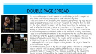
- The double-page spread keeps a common layout of image on one side and text on the other, but challenges conventions by adding more images and changing the color scheme to match the magazine's house style.