This document discusses the forms and conventions used in the media product of a music magazine. It begins by explaining that all magazines have codes and conventions that are generally followed to meet audience expectations. However, some magazines like Clash break conventions to better convey their genre.
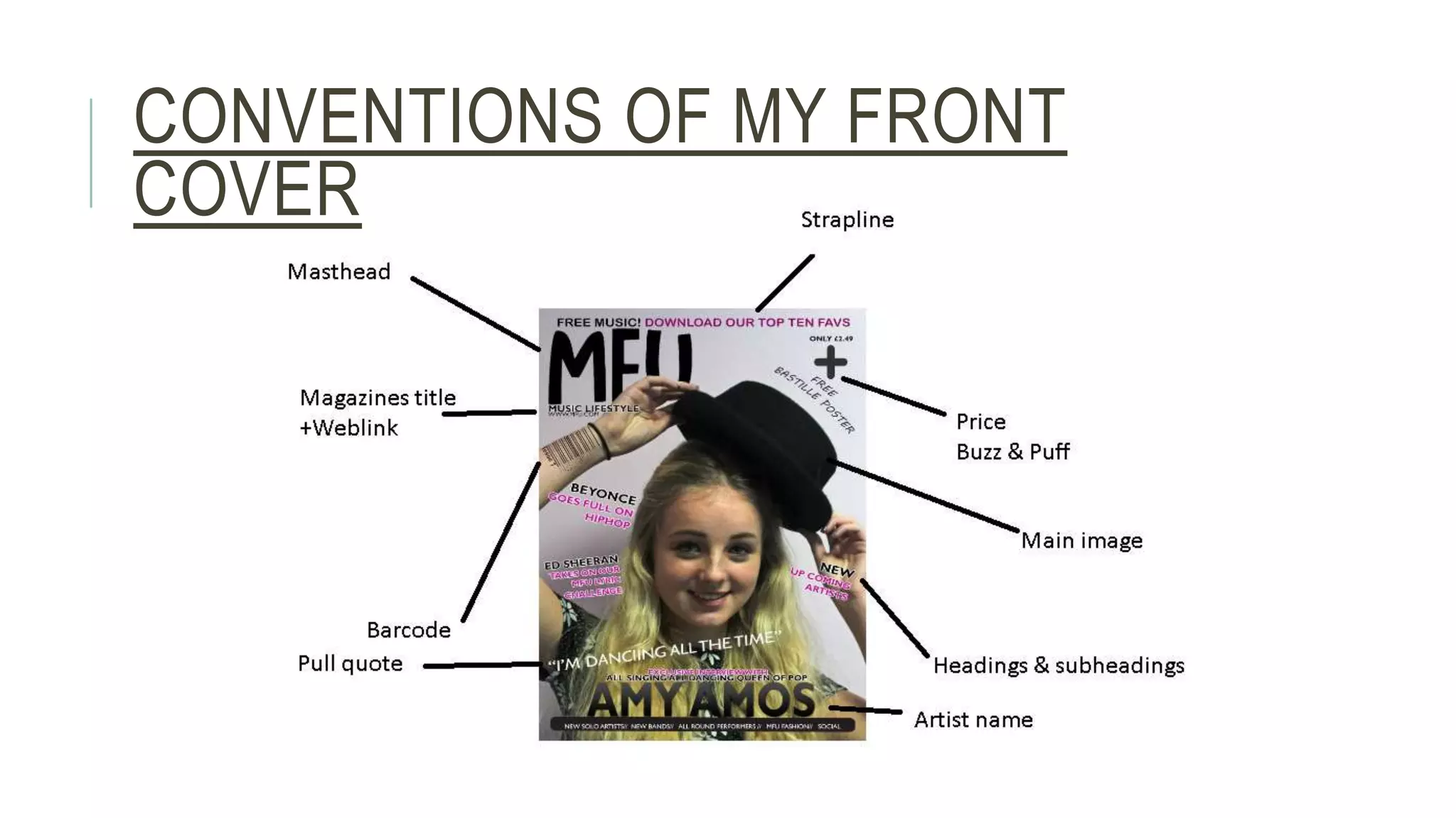
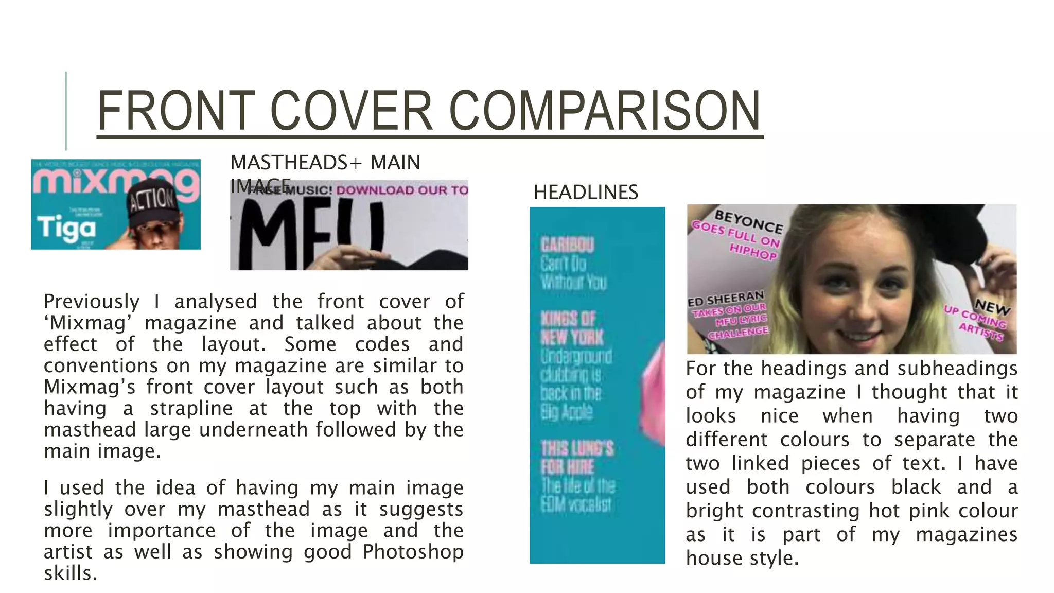
The author analyzed existing music magazines Clash and Mixmag to understand conventions. Their magazine follows some conventions, like the masthead and main image on the front cover, but challenges others to seem more fun and edgy for their target audience of pop music fans.
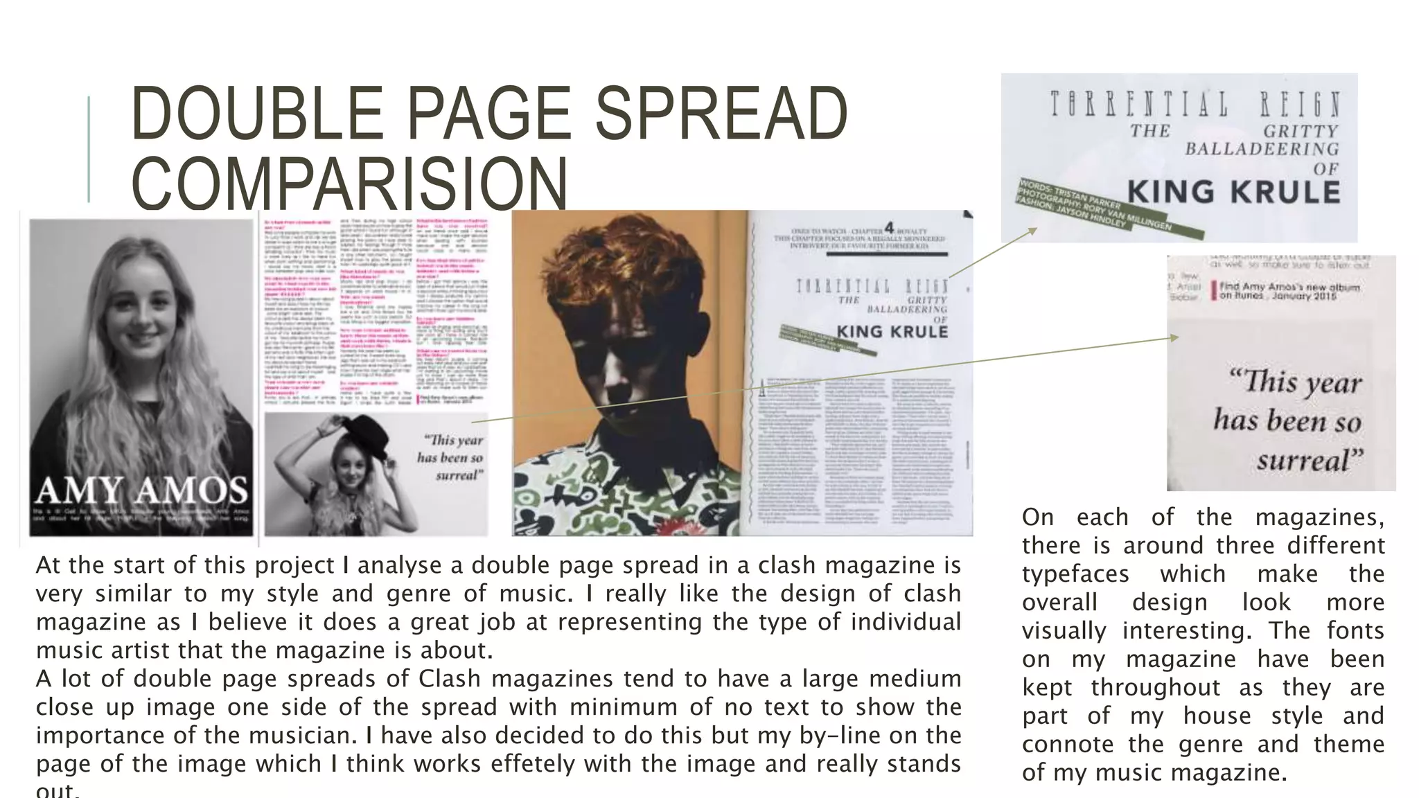
Double page spreads in Clash magazine inspired the author's style, with a large central image and minimal text. Typography and layout are also discussed in relation to conventions used and challenged in the