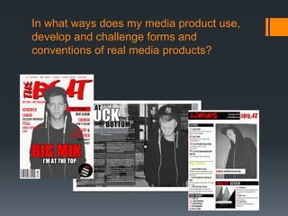
This document discusses how the media product follows conventions of real magazines. On the front cover, it uses large masthead and image in the center, as well as cover lines and strap line, following magazine conventions. The contents page also follows conventions with features column and page numbers in a different color. The main article has a large main image, title, date, and page numbers, positioning the focus on the featured artist. Throughout the product, conventions are followed for layout and design elements, with only one convention not used - the reduced front cover on the contents page.
Skeleton Key Property Management team provides services from asset management to property management for owner developers and investors.We were finding that more and more of our investors were after a specialist agent whose service would manage properties throughout New York.
Skeleton Key Property Management team provides services from asset management to property management for owner developers and investors.We were finding that more and more of our investors were after a specialist agent whose service would manage properties throughout New York.
Synthetic Fiber Construction in lab .pptxPavel ( NSTU)
Synthetic fiber production is a fascinating and complex field that blends chemistry, engineering, and environmental science. By understanding these aspects, students can gain a comprehensive view of synthetic fiber production, its impact on society and the environment, and the potential for future innovations. Synthetic fibers play a crucial role in modern society, impacting various aspects of daily life, industry, and the environment. ynthetic fibers are integral to modern life, offering a range of benefits from cost-effectiveness and versatility to innovative applications and performance characteristics. While they pose environmental challenges, ongoing research and development aim to create more sustainable and eco-friendly alternatives. Understanding the importance of synthetic fibers helps in appreciating their role in the economy, industry, and daily life, while also emphasizing the need for sustainable practices and innovation.
Read| The latest issue of The Challenger is here! We are thrilled to announce that our school paper has qualified for the NATIONAL SCHOOLS PRESS CONFERENCE (NSPC) 2024. Thank you for your unwavering support and trust. Dive into the stories that made us stand out!
Ethnobotany and Ethnopharmacology:
Ethnobotany in herbal drug evaluation,
Impact of Ethnobotany in traditional medicine,
New development in herbals,
Bio-prospecting tools for drug discovery,
Role of Ethnopharmacology in drug evaluation,
Reverse Pharmacology.
Palestine last event orientationfvgnh .pptxRaedMohamed3
An EFL lesson about the current events in Palestine. It is intended to be for intermediate students who wish to increase their listening skills through a short lesson in power point.
Operation “Blue Star” is the only event in the history of Independent India where the state went into war with its own people. Even after about 40 years it is not clear if it was culmination of states anger over people of the region, a political game of power or start of dictatorial chapter in the democratic setup.
The people of Punjab felt alienated from main stream due to denial of their just demands during a long democratic struggle since independence. As it happen all over the word, it led to militant struggle with great loss of lives of military, police and civilian personnel. Killing of Indira Gandhi and massacre of innocent Sikhs in Delhi and other India cities was also associated with this movement.
How to Make a Field invisible in Odoo 17Celine George
It is possible to hide or invisible some fields in odoo. Commonly using “invisible” attribute in the field definition to invisible the fields. This slide will show how to make a field invisible in odoo 17.
2024.06.01 Introducing a competency framework for languag learning materials ...Sandy Millin
http://sandymillin.wordpress.com/iateflwebinar2024
Published classroom materials form the basis of syllabuses, drive teacher professional development, and have a potentially huge influence on learners, teachers and education systems. All teachers also create their own materials, whether a few sentences on a blackboard, a highly-structured fully-realised online course, or anything in between. Despite this, the knowledge and skills needed to create effective language learning materials are rarely part of teacher training, and are mostly learnt by trial and error.
Knowledge and skills frameworks, generally called competency frameworks, for ELT teachers, trainers and managers have existed for a few years now. However, until I created one for my MA dissertation, there wasn’t one drawing together what we need to know and do to be able to effectively produce language learning materials.
This webinar will introduce you to my framework, highlighting the key competencies I identified from my research. It will also show how anybody involved in language teaching (any language, not just English!), teacher training, managing schools or developing language learning materials can benefit from using the framework.
Model Attribute Check Company Auto PropertyCeline George
In Odoo, the multi-company feature allows you to manage multiple companies within a single Odoo database instance. Each company can have its own configurations while still sharing common resources such as products, customers, and suppliers.
Unit 8 - Information and Communication Technology (Paper I).pdfThiyagu K
This slides describes the basic concepts of ICT, basics of Email, Emerging Technology and Digital Initiatives in Education. This presentations aligns with the UGC Paper I syllabus.
The Art Pastor's Guide to Sabbath | Steve ThomasonSteve Thomason
What is the purpose of the Sabbath Law in the Torah. It is interesting to compare how the context of the law shifts from Exodus to Deuteronomy. Who gets to rest, and why?
3. My masthead is one of the largest
features on my front cover and
therefore stands out. It follows
conventions because all magazines
have a masthead and use it in the
same way.
I placed the strap line on the very top
of my page, the strap line contains
names of rappers. I made it black and
red to link it to the rest of the cover
which uses those colours. It follows
conventions because many
magazines use this to tell the
audience what they can expect.
4. The main image is in the centre and is the biggest
thing on the page as it is the most important thing on
the front cover, therefore, it follows conventions of all
music magazine which always have the image
taking up the majority of the page and it is in always
in the centre.
The background of the front cover is all in one colour which makes the
artist stand out.
I located the selling line just underneath the
masthead. If a magazine follows this
convention and uses a selling line then it is
also placed near the masthead
5. I think that cover lines are an important convention because
they tell the reader what the main stories are in the
magazine. Although not all music magazines follow this
convention, I think it is important and decided to use it. I
placed the cover lines on the sides of my front cover.
The headline and subheading, just like the image and the
masthead, take up a large part of the magazine because it
is an important part which tells the audience who the main
artist is. It also links to the main image because that is the
name of the artist which is presented.
Eye contact is an important convention
because it engages the reader.
7. This is the features
column from the ‘Q’
magazine contents
page which I base my
contents page on.
Although the Q
magazine is not the
same theme as mine, I
thought that it worked
well. The column is
very clear and make
the page numbers
stand out through the
use of a different
colour (red)
This is my version
of the features
column taken from
my contents page.
It is very similar to
the example from
the Q magazine as
I have also use a
different colour for
the page numbers.
I have used the same font (futura) as
on the front cover, this keeps the
theme going throughout the magazine
and links everything together.
8. COLUMNS
On my contents page I decided to use two columns. This allowed me to
combine the images and the text together well.
The text on the left hand side is made up of the feature, and a rapper
special. The right hand column on the other hand is mainly taken up by two
images. The large image is at the top and it is a photograph of the main
artist and the bottom, small image is a photograph taken in London.
9. Page title- Contents
I made it clear that it is a contents page by putting ‘contents’ at the
top of the page. I used the same font for this as I did for my
masthead, this maintains the house style throughout the
magazine.
In the top right hand corner of the page I also placed the name of
my magazine which also maintains a house style.
11. Main image
The main image portrays the main rapper
which is ‘Big Mik’. It is a very large image and
takes up the whole right side of the double
sided article. I think that it is important for the
main image to be so big because the focus
needs to be on the music artist and making it
so large certainly does that. I decided to only
use one image because that way the reader
can only focus on that specific photograph.
I wanted the image to present ‘Big Mik’
because he is the main talking point of the
magazine and this article and therefore links
with the whole product.
12. Main parts of the article
Date of issue tell the reader which issue they are
reading
Web address which allows the reader to find out
more or subscribe
The title of the article which is a quote from
the music artist. This straight away gives an
idea of what the article could be about.
The page numbers help the reader to find his/hers way
around the magazine but also help to remember where the
article is located.
For the background I used a photo taken in London. I think that this works
better than a plain background which would be in one colour. I also made
the photograph black and white which fits in with the theme of the article
which talks about difficult moments of the rappers life. The black and white
also fits in with the style of my magazine.
13. article
The introduction informs the
reader roughly what the article
is going to be about and will
help to decide whether they
want to read on or not.
The article is split into two
columns in order to fit the text
in on one page an make it
more comfortable to read. The
questions are in a different
colour to the answers so that
the reader can easily
distinguish whether it is a
question being asked or
whether the artist is answering.
15. Front cover
I developed the ideas of
my magazine from looking
at a front of cover the vibe
magazine. In this
magazine I liked the use of
colours (black and yellow)
This is the first front
cover that I created
using the same
colours as the vibe
magazine. I also used
a very similar layout of
the masthead, strap
line and cover lines.
After taking my
photographs I decided
that a black image
would work better but it
didn’t suit the main
colours on the cover.
Therefore, I changed
the main colours in to
red and white.
16. Challenging conventions
Throughout my magazine I do not challenge conventions. The only convention
that I have gone against is a reduced version of the cover on the contents
page. After carrying out research on contents pages I found out that rap
magazines do not follow this convention. Also the content page which I used as
inspiration for my contents page did not use a reduced version of the front
cover.
Editor's Notes
nvention on most music magazines. I have decided to follow the convention because it informs the reader about some of the key contents of the magazine.