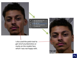
Q6. What have you
learnt about
technologies from the
process of construction
this product?
I will begin with the construction of my front cover using Photoshop.
The first thing I did
was insert my original
image in Photoshop
with my masthead
from dafont.com
behind the model
using a layer mask (I
coloured the models
hair over the title). I
increased the
brightness of the
picture and decided
to keep the original
grey background
because of the
interesting shadow
and plain grey
background.
I used the eraser in
the size 55 to erase
the masthead
behind the models
head
I also used the patch tool to
get rid of any blemishes or
marks on the models face
which I was not happy with.
I brought the
model closer and
made him more
centre so that he is
significant. I used
the text tool to add
the main cover line
of “Liam Buchan”
which is in the font
Franklin Gothic
Medium size 270. I
also used a tagline
of “alternative
r&b” to denote the
genre. I got the
“R&B is life” quote
off dafont.com
There is also the
necessary barcode
at the bottom of
the page.
By using the
magic wand
tool, I deleted
the white
background of
the barcode and
I added the
issue, date and
price.
I decided to use a yellow colour on the
main coverline and add a stroke. I added a
rectangle shape at the bottom with a lower
opacity as I want to put text over it. I also
inserted a “free poster” offer.
I clicked on
“fx” to add a
stroke
I then added all my
coverlines with yellow
and black text. This is
supposed to appeal to
the audience as it Is
very bright. I used lots
of artists names in the
font Franklin Gothic
Medium in size 120
To make the
rectangle footer
at the bottom, I
reduced the
opacity
This is my final
front page.
Now I will show my
double page spread
construction using
InDesign
First, you open an InDesign
document and insert 4
pages for each page of the
magazine made. I then
imported this image of the
model into InDesign as I
thought it was a clear,
medium shot of the model
and the drums. I also added
page numbers in the corner.
I pasted the article/
interview and decided
to keep it on the right
side of the spread.
I used the
option of colour
to change the
colour of my
text to white
and yellow
I aligned the text
over the background
I then picked out a
significant quote from
the article and decided to
use it as a quote on the
left side of the spread,
followed by a short
summary of what the
interview is about. The
text has all been
intentionally aligned to
the left so that the
models face can still be
seen.
I used the text tool from the
toolbar on the left
I then decided to insert
my masthead into the
article. I had to wrap
the article around the
text by highlighting the
shape of the masthead
and moving the text
around it.
This is my final
double page
spread I am very
proud of it.
Finally, I used blogger which is a blog type platform which allowed me to
record all my coursework since I started the preliminary task.

T6

  • 1.
    Q6. What haveyou learnt about technologies from the process of construction this product?
  • 2.
    I will beginwith the construction of my front cover using Photoshop.
  • 3.
    The first thingI did was insert my original image in Photoshop with my masthead from dafont.com behind the model using a layer mask (I coloured the models hair over the title). I increased the brightness of the picture and decided to keep the original grey background because of the interesting shadow and plain grey background. I used the eraser in the size 55 to erase the masthead behind the models head
  • 4.
    I also usedthe patch tool to get rid of any blemishes or marks on the models face which I was not happy with.
  • 5.
    I brought the modelcloser and made him more centre so that he is significant. I used the text tool to add the main cover line of “Liam Buchan” which is in the font Franklin Gothic Medium size 270. I also used a tagline of “alternative r&b” to denote the genre. I got the “R&B is life” quote off dafont.com There is also the necessary barcode at the bottom of the page.
  • 6.
    By using the magicwand tool, I deleted the white background of the barcode and I added the issue, date and price.
  • 7.
    I decided touse a yellow colour on the main coverline and add a stroke. I added a rectangle shape at the bottom with a lower opacity as I want to put text over it. I also inserted a “free poster” offer. I clicked on “fx” to add a stroke
  • 8.
    I then addedall my coverlines with yellow and black text. This is supposed to appeal to the audience as it Is very bright. I used lots of artists names in the font Franklin Gothic Medium in size 120 To make the rectangle footer at the bottom, I reduced the opacity
  • 9.
    This is myfinal front page.
  • 10.
    Now I willshow my double page spread construction using InDesign
  • 11.
    First, you openan InDesign document and insert 4 pages for each page of the magazine made. I then imported this image of the model into InDesign as I thought it was a clear, medium shot of the model and the drums. I also added page numbers in the corner.
  • 12.
    I pasted thearticle/ interview and decided to keep it on the right side of the spread. I used the option of colour to change the colour of my text to white and yellow I aligned the text over the background
  • 13.
    I then pickedout a significant quote from the article and decided to use it as a quote on the left side of the spread, followed by a short summary of what the interview is about. The text has all been intentionally aligned to the left so that the models face can still be seen. I used the text tool from the toolbar on the left
  • 14.
    I then decidedto insert my masthead into the article. I had to wrap the article around the text by highlighting the shape of the masthead and moving the text around it.
  • 15.
    This is myfinal double page spread I am very proud of it.
  • 16.
    Finally, I usedblogger which is a blog type platform which allowed me to record all my coursework since I started the preliminary task.