Masthead Analysis
What did I create and why? 
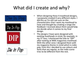
• When designing these 4 masthead designs, 
I purposely created 4 very different styles. I 
did this as I’m still not sure on the 
characteristics that I want my masthead to 
have and thought by creating a range the 
feedback I received about them would help 
me decide when it comes to my final 
design. 
• The designs I have were designed with 
existing mastheads in mind, for example, in 
my 3rd one, I shortened the title to “DIP” 
after looking at NME magazines masthead. 
With the other ones I designed them with 
my magazine theme in mind which is indie 
pop, from this I decided to use colours and 
fonts that are regular, as the indie scene 
tries to be different from the rest.
Feedback 
• As a group we came up with 4 different 
questions to review each others masthead 
designs, they were: 
– 1. Genre of Magazine? 
– 2. Favourite masthead? 
– 3. Least favourite masthead? 
– 4. How to make masthead fit the genre?
Analysing Feedback 
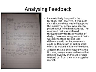
• I was relatively happy with the 
feedback that I received. It was quite 
clear that my these was indie pop and 
the majority of people were able to 
pick that our from my mastheads. The 
masthead that was preferred 
throughout my feedback was the 3rd 
design, there was an agreement that is 
was able to stand out and look 
differently well, but improvements 
could be things such as adding small 
effects to make it a little more unique. 
• A design that no one enjoyed was the 
first one, everyone seemed to say that 
it lacked diversity and would struggle 
to stand out from the music magazine 
market.

Masthead analysis

  • 1.
  • 2.
    What did Icreate and why? • When designing these 4 masthead designs, I purposely created 4 very different styles. I did this as I’m still not sure on the characteristics that I want my masthead to have and thought by creating a range the feedback I received about them would help me decide when it comes to my final design. • The designs I have were designed with existing mastheads in mind, for example, in my 3rd one, I shortened the title to “DIP” after looking at NME magazines masthead. With the other ones I designed them with my magazine theme in mind which is indie pop, from this I decided to use colours and fonts that are regular, as the indie scene tries to be different from the rest.
  • 3.
    Feedback • Asa group we came up with 4 different questions to review each others masthead designs, they were: – 1. Genre of Magazine? – 2. Favourite masthead? – 3. Least favourite masthead? – 4. How to make masthead fit the genre?
  • 4.
    Analysing Feedback •I was relatively happy with the feedback that I received. It was quite clear that my these was indie pop and the majority of people were able to pick that our from my mastheads. The masthead that was preferred throughout my feedback was the 3rd design, there was an agreement that is was able to stand out and look differently well, but improvements could be things such as adding small effects to make it a little more unique. • A design that no one enjoyed was the first one, everyone seemed to say that it lacked diversity and would struggle to stand out from the music magazine market.