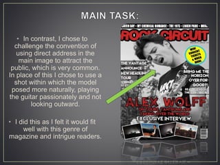
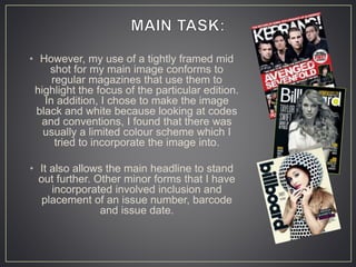
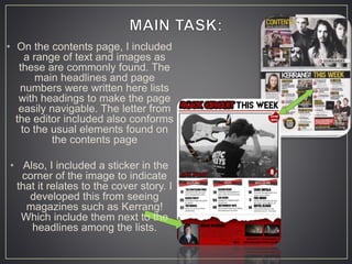
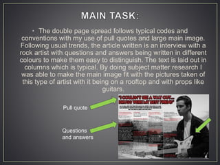
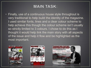
• From analysing the front cover of similar
magazines like ‘COLLEGE’ we got an idea of
the sorts of forms and conventions of school
magazines. We found that mid to medium long
shots were typical and that the model usually
looked kind and inviting.
• There was always a clear colour scheme and
focus around the school colours and interesting
information about it in headlines.
• In this way, we incorporated the
school uniform into the house style
for this edition. Though we used a
mid shot, we challenged convention
by using two models. This was to
create a more natural feel to the
cover and make it seem more
relatable to other students.
• Again through looking at the contents
pages of similar texts we found that
typically, contents pages had a mix of
images and texts, we used this
convention to make it look
professional and interesting.
• Through research into similar media texts I found that a common convention of
music magazines was the placement of the masthead at the top of the page. In
addition, I found that these were usually very bold and in the largest size font.
The colour also tended to contrast the background to allow it to stand out.
• For this reason, I decided to use red as this was common in rock magazines
such as ‘Kerrang!’ and ‘NME’ and also stood out from my background and is
eye catching to passing consumers.
• Similarly, I found that the more established magazines could afford to cover
their masthead somewhat with the main image. In this way, I edited my models
head over part of the magazine name in order to convey the message of
prestige and quality to buyers.
vs
• In contrast, I chose to
challenge the convention of
using direct address in the
main image to attract the
public, which is very common.
In place of this I chose to use a
shot within which the model
posed more naturally, playing
the guitar passionately and not
looking outward.
• I did this as I felt it would fit
well with this genre of
magazine and intrigue readers.
• However, my use of a tightly framed mid
shot for my main image conforms to
regular magazines that use them to
highlight the focus of the particular edition.
In addition, I chose to make the image
black and white because looking at codes
and conventions, I found that there was
usually a limited colour scheme which I
tried to incorporate the image into.
• It also allows the main headline to stand
out further. Other minor forms that I have
incorporated involved inclusion and
placement of an issue number, barcode
and issue date.
• On the contents page, I included
a range of text and images as
these are commonly found. The
main headlines and page
numbers were written here lists
with headings to make the page
easily navigable. The letter from
the editor included also conforms
to the usual elements found on
the contents page
• Also, I included a sticker in the
corner of the image to indicate
that it relates to the cover story. I
developed this from seeing
magazines such as Kerrang!
Which include them next to the
headlines among the lists.
• The double page spread follows typical codes and
conventions with my use of pull quotes and large main image.
Following usual trends, the article written is an interview with a
rock artist with questions and answers being written in different
colours to make them easy to distinguish. The text is laid out in
columns which is typical. By doing subject matter research I
was able to make the main image fit with the pictures taken of
this type of artist with it being on a rooftop and with props like
guitars.
Pull quote
Questions
and answers
• Finally, use of a continuous house style throughout is
very traditional to help build the identity of the magazine.
I used similar fonts, lines and a clear colour scheme to
help achieve this though the colour scheme isn’t usually
so strictly limited to 3 colours. I chose to do this as I
thought it would help link the main story with all aspects
of the issue and help it flow and be highlighted as the
most important.

QUESTION 1

  • 2.
    • From analysingthe front cover of similar magazines like ‘COLLEGE’ we got an idea of the sorts of forms and conventions of school magazines. We found that mid to medium long shots were typical and that the model usually looked kind and inviting. • There was always a clear colour scheme and focus around the school colours and interesting information about it in headlines.
  • 3.
    • In thisway, we incorporated the school uniform into the house style for this edition. Though we used a mid shot, we challenged convention by using two models. This was to create a more natural feel to the cover and make it seem more relatable to other students. • Again through looking at the contents pages of similar texts we found that typically, contents pages had a mix of images and texts, we used this convention to make it look professional and interesting.
  • 4.
    • Through researchinto similar media texts I found that a common convention of music magazines was the placement of the masthead at the top of the page. In addition, I found that these were usually very bold and in the largest size font. The colour also tended to contrast the background to allow it to stand out. • For this reason, I decided to use red as this was common in rock magazines such as ‘Kerrang!’ and ‘NME’ and also stood out from my background and is eye catching to passing consumers. • Similarly, I found that the more established magazines could afford to cover their masthead somewhat with the main image. In this way, I edited my models head over part of the magazine name in order to convey the message of prestige and quality to buyers. vs
  • 5.
    • In contrast,I chose to challenge the convention of using direct address in the main image to attract the public, which is very common. In place of this I chose to use a shot within which the model posed more naturally, playing the guitar passionately and not looking outward. • I did this as I felt it would fit well with this genre of magazine and intrigue readers.
  • 6.
    • However, myuse of a tightly framed mid shot for my main image conforms to regular magazines that use them to highlight the focus of the particular edition. In addition, I chose to make the image black and white because looking at codes and conventions, I found that there was usually a limited colour scheme which I tried to incorporate the image into. • It also allows the main headline to stand out further. Other minor forms that I have incorporated involved inclusion and placement of an issue number, barcode and issue date.
  • 7.
    • On thecontents page, I included a range of text and images as these are commonly found. The main headlines and page numbers were written here lists with headings to make the page easily navigable. The letter from the editor included also conforms to the usual elements found on the contents page • Also, I included a sticker in the corner of the image to indicate that it relates to the cover story. I developed this from seeing magazines such as Kerrang! Which include them next to the headlines among the lists.
  • 8.
    • The doublepage spread follows typical codes and conventions with my use of pull quotes and large main image. Following usual trends, the article written is an interview with a rock artist with questions and answers being written in different colours to make them easy to distinguish. The text is laid out in columns which is typical. By doing subject matter research I was able to make the main image fit with the pictures taken of this type of artist with it being on a rooftop and with props like guitars. Pull quote Questions and answers
  • 9.
    • Finally, useof a continuous house style throughout is very traditional to help build the identity of the magazine. I used similar fonts, lines and a clear colour scheme to help achieve this though the colour scheme isn’t usually so strictly limited to 3 colours. I chose to do this as I thought it would help link the main story with all aspects of the issue and help it flow and be highlighted as the most important.