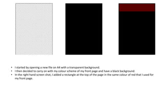
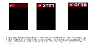
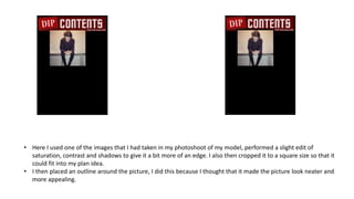
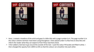
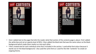
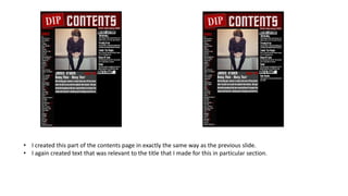
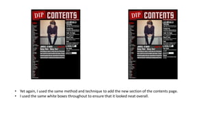
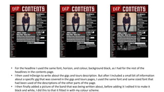
2. • I started by opening a new file on A4 with a transparent background.
• I then decided to carry on with my colour scheme of my front page and have a black background.
• In the right hand screen shot, I added a rectangle at the top of the page in the same colour of red that I used for
my front page.
3. • I then added the same masthead that I used for my front cover in the top left hand corner of my contents page.
• After, I used InDesign to create a text that read “contents” I used the Horizon font. With a slight opacity of 75%.
• Then, I created a line that told the reader the date of the release of the magazine and I placed it under the
contents.
4. • Here I used one of the images that I had taken in my photoshoot of my model, performed a slight edit of
saturation, contrast and shadows to give it a bit more of an edge. I also then cropped it to a square size so that it
could fit into my plan idea.
• I then placed an outline around the picture, I did this because I thought that it made the picture look neater and
more appealing.
5. • Here, I created a headline of the artist and gave it a little title with a page number to it. The page number is in
the colour scheme red that I have been using throughout. I then placed under it a few lines to describe and
inform the reader what they can expect to find if they read that article.
• I then added a text box to go around the outside of the text. I used the colour fill bucket and filled it white. I
then changed the opacity from 100% to 25% so that the colours ran smoother into each other.
6. • In this screen shot it shows the placed band index that I created on InDesign. This lets the reader know what
bands are on what pages.
• I then added a dark grey rectangle box to go around the band index, I did this because I feel that it makes it
easier to determine the different parts of the contents page once everything is on it.
7. • Here I added text to the page that tells the reader what that section of the contents page is about. First I added
the white box and set an opacity level of 85%. I then added the black text that was the same colour as the black
background which made them neatly run into each other.
• I then created text for each individual artist that I included in the section. I used white font colour because it
stands out on the black background. I also used the same font as I used for the title “contents” to create an
ongoing theme.
8. • I created this part of the contents page in exactly the same way as the previous slide.
• I again created text that was relevant to the title that I made for this in particular section.
9. • Yet again, I used the same method and technique to add the new section of the contents page.
• I used the same white boxes throughout to ensure that it looked neat overall.
10. • For the headline I used the same font, horizon, and colour, background black, as I had for the rest of the
headlines in the contents page.
• I then used InDesign to write about the gigs and tours description. But after I included a small bit of information
about a specific gig that was covered in the gigs and tours pages, I used the same font and same sized font that
had been used of the descriptions of the other parts of the page.
• I then finally added a picture of the band that was being written about, before adding it I edited it to make it
black and white, I did this to that it fitted in with my colour scheme.
11. • Again, I used the already produced aspects for the editors note, with the white box, text size, font and colour.
• In the second screenshot I added the letter that I wrote that is to all the readers, here I tell them about the
information on the magazine, that artists that had been included in the issue and what they could do with it.
• Finally, I added the masthead into the text in the bottom right hand side. I believe that this make the magazine
look more professional, and that more care and effort has gone in to the production of the magazine.
12. • Here I added a white box that would be to hold the advertisement of subscribing to the magazine.
• I then added the information to go into the box, I used the same red that I had used throughout the magazine
and the same font that I had used on this page.
• I finally added an image of the magazine so that it is easy to recognise what the advert is advertising without
having to read all of the information. This is my final contents page.