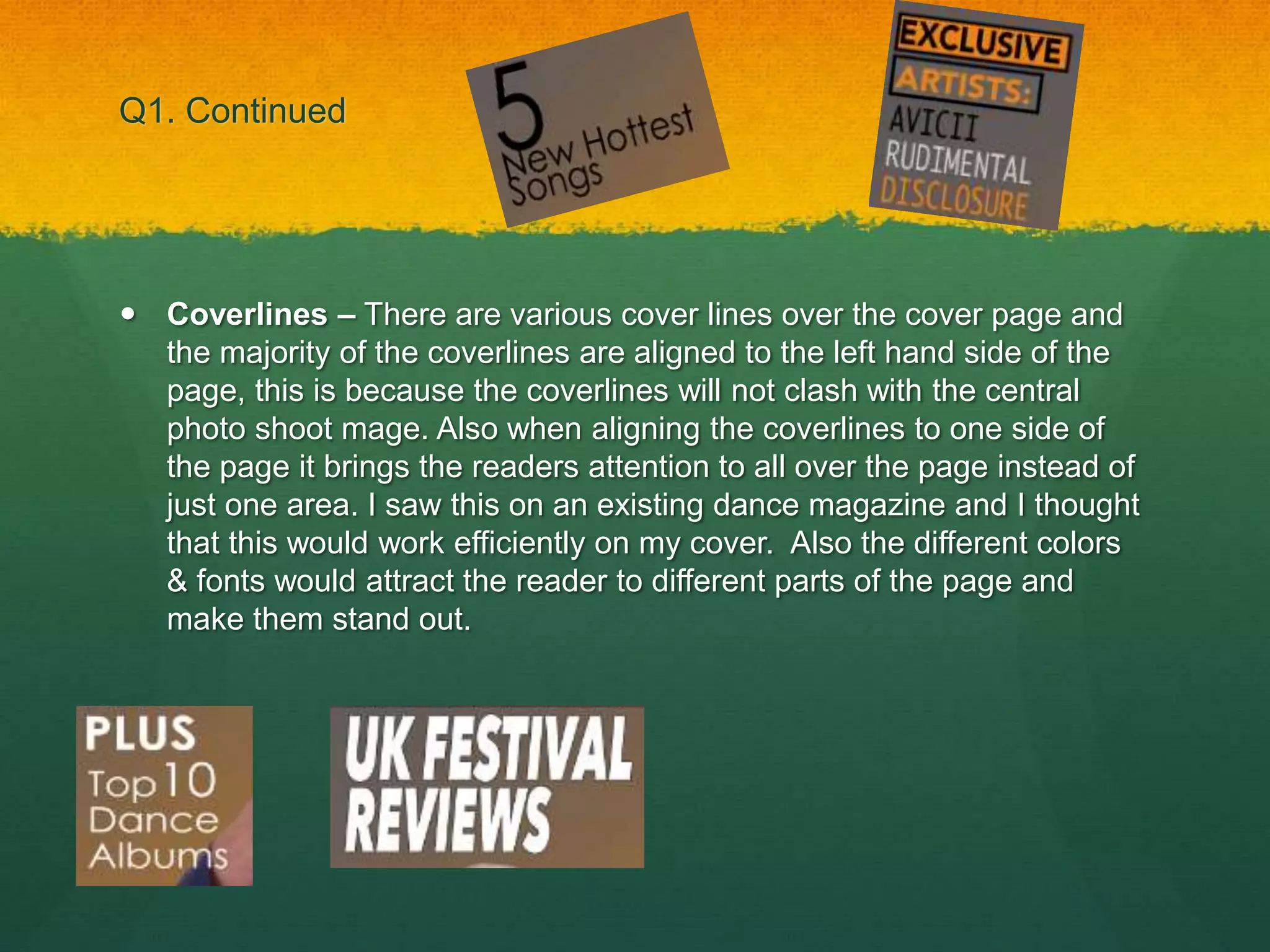
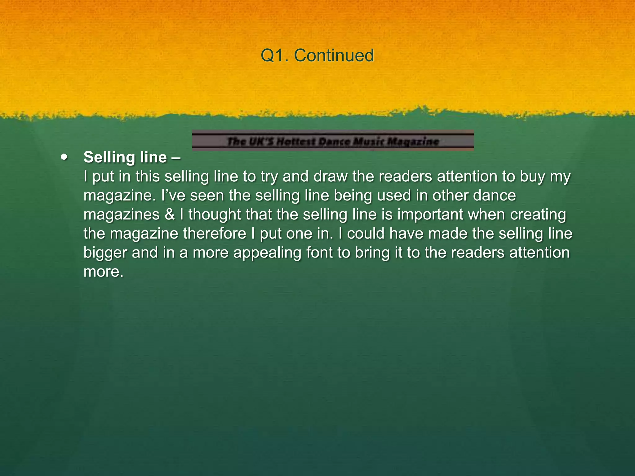
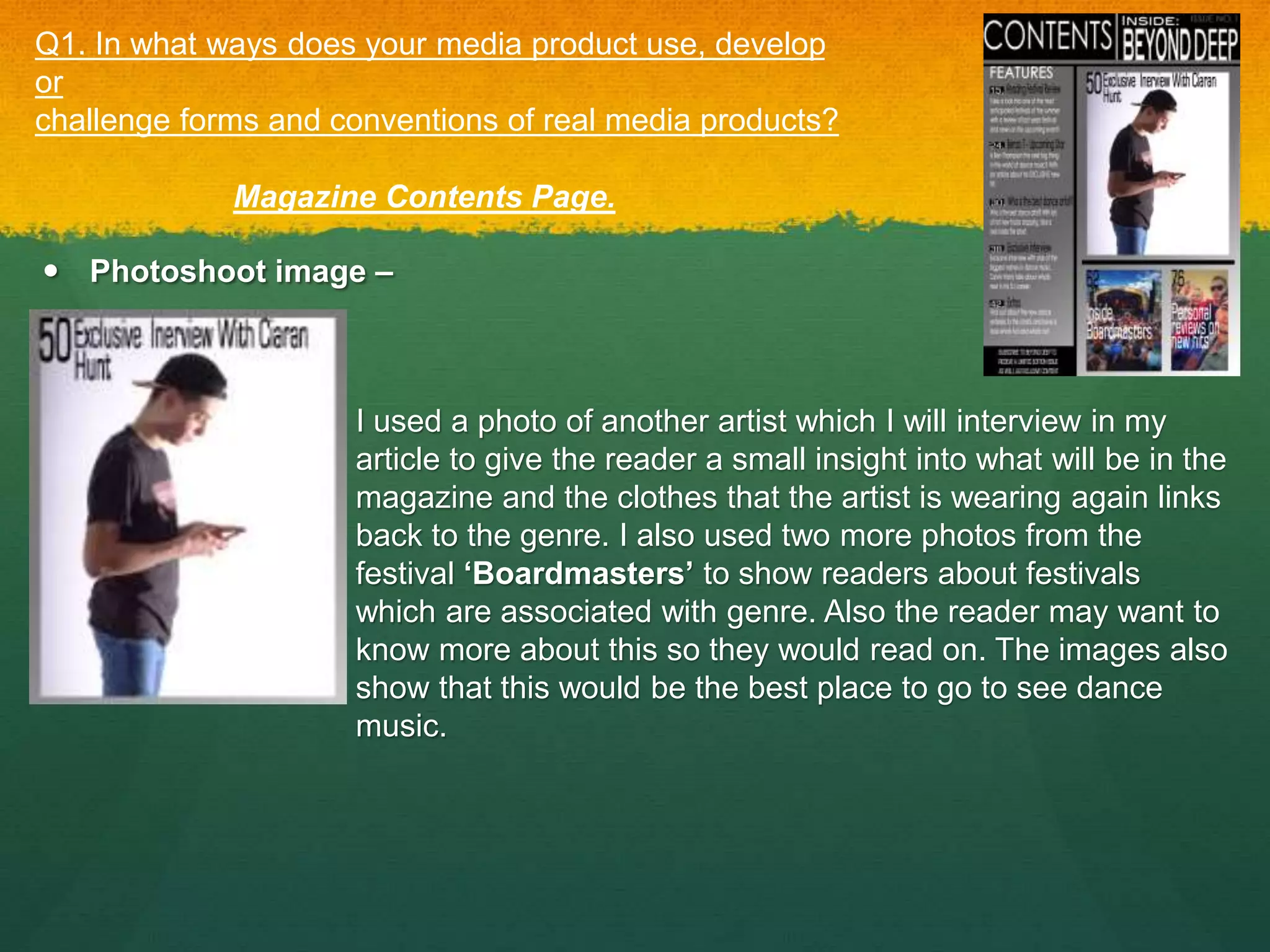
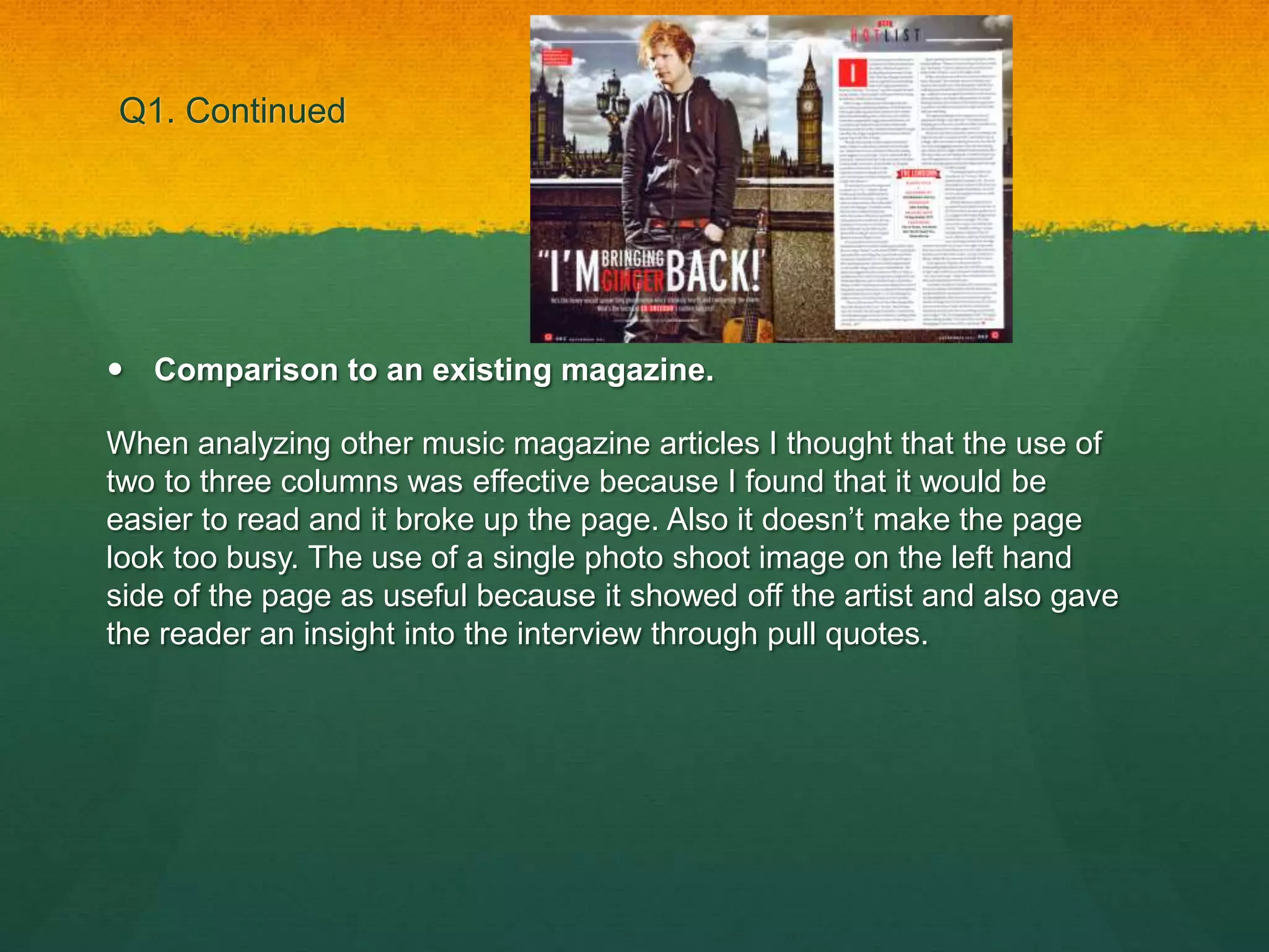
 Cover Image – The cover image used shows the genre of
magazine because of the clothes that the artist is wearing, also the
pose that the model is striking relate to the genre and it informs the
audience that is a dance genre. I got the idea from a previous
magazine to have the model dressed as a DJ. The use of the
headphones around the neck of the model is the main aspect which
shows off the genre. I also have no text covering the artists face so
that he is the main focus of the page. Also the cover photo links to the
headline as it is a photo of the artist and the readers get an insight into
the artist without having to read the magazine.
Q1. In what ways does your media product use, develop or
challenge forms and conventions of real media products?
Magazine Cover Page.
Q1. Continued
 Cover Image – Also the way the model is making eye contact with
the reader makes it more personal to the reader and it creates a
better connection between the magazine and the reader.
Masthead – The masthead I used shows the name of my magazine
and also the font used for the masthead reflects the modern genre
and it gives the reader an insight into what the magazine is about.
Q1. Continued
 Coverlines – There are various cover lines over the cover page and
the majority of the coverlines are aligned to the left hand side of the
page, this is because the coverlines will not clash with the central
photo shoot mage. Also when aligning the coverlines to one side of
the page it brings the readers attention to all over the page instead of
just one area. I saw this on an existing dance magazine and I thought
that this would work efficiently on my cover. Also the different colors
& fonts would attract the reader to different parts of the page and
make them stand out.
Q1. Continued
 Graphics – I used a small graphic on my magazine cover, I used the
box around the text to bring the readers attention to two coverlines. I
also used this box to try and make the text pop out of the page. When
the reader sees the ‘exclusive’ it makes them think that there is
something new in the magazine which makes them want to read on.
Also the ‘Artists’ text gives the reader an insight into who will be in
the magazine
Q1. Continued
 Selling line –
I put in this selling line to try and draw the readers attention to buy my
magazine. I’ve seen the selling line being used in other dance
magazines & I thought that the selling line is important when creating
the magazine therefore I put one in. I could have made the selling line
bigger and in a more appealing font to bring it to the readers attention
more.
Q1. Continued
I could have added more Forms & Conventions such as a date line and a
Subheading. By adding these I would have filled the cover more and
these features would have also been present in a professional magazine.
I could have incorporated a logo into the masthead/title to make it look
like my magazine has a ‘brand’ and it can be easily identified if readers
purchase another copy. Also the logo can be associated with the
magazine to make it easily identifiable.
Q1. Continued
 Comparison to an existing magazine.
I felt that some of the forms and conventions used in this magazine
worked effectively and I thought that if I used them in magazine it would
help to portray the genre effectively. The use of the right aligned
coverlines keeps the attention focused on the cover image and also
informs the reader about what's inside the magazine. Also the different
colors of the coverlines helps the text to fit in with the house style.
 Photoshoot image –
Q1. In what ways does your media product use, develop
or
challenge forms and conventions of real media products?
Magazine Contents Page.
I used a photo of another artist which I will interview in my
article to give the reader a small insight into what will be in the
magazine and the clothes that the artist is wearing again links
back to the genre. I also used two more photos from the
festival ‘Boardmasters’ to show readers about festivals
which are associated with genre. Also the reader may want to
know more about this so they would read on. The images also
show that this would be the best place to go to see dance
music.
Q1. Continued
 Title – I used the white color of the title against the black background
to make the title stand out more, also this would be the first thing that
the reader is drawn to. I chose a different font for the ‘Contents’ text
so that the reader is informed straight away that this Is the contents
page. The name of the magazine is in a different font so it does not
look all the same and the name does not have to stand out as the
reader already knows the name of the magazine. I also included an
issue number in the top right hand corner so that the reader knows
how many issues have been released, I didn't’t make it stand out too
much so the readers attention is not drawn away from the title.
Q1. Continued
 Columns & Features -
I used 2 columns in the page to create a break in the page and
to make the page look structured and if I added anymore
columns the page would have been too crowded which would
give off the wrong impression. The features column shows
what will be inside my magazine and I used a similar font which
I have used throughout my magazine to have cohesion through
my different pages. I made the page numbers bigger than the
font so they were easy to read and the reader could navigate to
pages with ease. Also the title of each feature is easy to read
and stands out from the background.
Q1. Continued
 Artist name & Page numbers – I had a interview with another artist
as one of the features and this feature was the main aspect of the
contents page and this took up the majority of the page with a photo
shoot image to draw the readers attention. I also included 2 more
images with page numbers and text, to show what the features were
about. Also the text stands out against the back of the image and the
page numbers are easy to read so that reader can find the page
easily.
Q1. Continued
 Comparison to an existing magazine.
When looking at the forms and conventions used in existing magazine
contents pages, I found that the ones used in the ‘Q’ magazine worked
effectively. I liked the look of using two columns, in the first column would
be the artist names and page numbers with information about that page.
Also in the second column I would have two images, one big image on
the right with a smaller image underneath it.
 Photoshoot image -
Magazine Article Page.
Q1. In what ways does your media product use, develop
or
challenge forms and conventions of real media products?
This photoshoot image once again reflects the house style of
the magazine and it does this by the clothes that the artist is
wearing. Also the shadow of the photo image creates the idea
that all of the spotlight is on the artist.
Also the use of how the artist has a phone in his hand shows
that the magazine is modern and this modernity relates to the
genre of music as it has not been out for a long period of time.
Q1. Continued
 Pull Quote – I have used 2 pull quotes across my article page and I
have used these because they give the reader an insight into what is
inside the interview. Also I used them in different across my article
page because I felt like it would draw the readers attention to
separate parts of the page.
 Drop Cap – I used a drop cap in my article page to make it easily
visible where the article starts. It also draws the readers attention to
start reading the interview.
Q1. Continued
 Headline – The headline that I used introduces the artist and the use
of a rhetorical question makes the reader more intrigued to read on
and see if his performance will take over the genre. Also I chose to
put it in a much larger and different font so that it would be the first
thing to catch the readers attention.
 Lead in – I used a lead in to inform the reader about the artist and tell
them some personal information about the artist. By doing this it
makes it personal to the reader. Also I used this to make the link
between the headline and the actual interview cohesive.
Q1. Continued
 Comparison to an existing magazine.
When analyzing other music magazine articles I thought that the use of
two to three columns was effective because I found that it would be
easier to read and it broke up the page. Also it doesn’t make the page
look too busy. The use of a single photo shoot image on the left hand
side of the page as useful because it showed off the artist and also gave
the reader an insight into the interview through pull quotes.

Evaluation question 1

  • 2.
     Cover Image– The cover image used shows the genre of magazine because of the clothes that the artist is wearing, also the pose that the model is striking relate to the genre and it informs the audience that is a dance genre. I got the idea from a previous magazine to have the model dressed as a DJ. The use of the headphones around the neck of the model is the main aspect which shows off the genre. I also have no text covering the artists face so that he is the main focus of the page. Also the cover photo links to the headline as it is a photo of the artist and the readers get an insight into the artist without having to read the magazine. Q1. In what ways does your media product use, develop or challenge forms and conventions of real media products? Magazine Cover Page.
  • 3.
    Q1. Continued  CoverImage – Also the way the model is making eye contact with the reader makes it more personal to the reader and it creates a better connection between the magazine and the reader. Masthead – The masthead I used shows the name of my magazine and also the font used for the masthead reflects the modern genre and it gives the reader an insight into what the magazine is about.
  • 4.
    Q1. Continued  Coverlines– There are various cover lines over the cover page and the majority of the coverlines are aligned to the left hand side of the page, this is because the coverlines will not clash with the central photo shoot mage. Also when aligning the coverlines to one side of the page it brings the readers attention to all over the page instead of just one area. I saw this on an existing dance magazine and I thought that this would work efficiently on my cover. Also the different colors & fonts would attract the reader to different parts of the page and make them stand out.
  • 5.
    Q1. Continued  Graphics– I used a small graphic on my magazine cover, I used the box around the text to bring the readers attention to two coverlines. I also used this box to try and make the text pop out of the page. When the reader sees the ‘exclusive’ it makes them think that there is something new in the magazine which makes them want to read on. Also the ‘Artists’ text gives the reader an insight into who will be in the magazine
  • 6.
    Q1. Continued  Sellingline – I put in this selling line to try and draw the readers attention to buy my magazine. I’ve seen the selling line being used in other dance magazines & I thought that the selling line is important when creating the magazine therefore I put one in. I could have made the selling line bigger and in a more appealing font to bring it to the readers attention more.
  • 7.
    Q1. Continued I couldhave added more Forms & Conventions such as a date line and a Subheading. By adding these I would have filled the cover more and these features would have also been present in a professional magazine. I could have incorporated a logo into the masthead/title to make it look like my magazine has a ‘brand’ and it can be easily identified if readers purchase another copy. Also the logo can be associated with the magazine to make it easily identifiable.
  • 8.
    Q1. Continued  Comparisonto an existing magazine. I felt that some of the forms and conventions used in this magazine worked effectively and I thought that if I used them in magazine it would help to portray the genre effectively. The use of the right aligned coverlines keeps the attention focused on the cover image and also informs the reader about what's inside the magazine. Also the different colors of the coverlines helps the text to fit in with the house style.
  • 9.
     Photoshoot image– Q1. In what ways does your media product use, develop or challenge forms and conventions of real media products? Magazine Contents Page. I used a photo of another artist which I will interview in my article to give the reader a small insight into what will be in the magazine and the clothes that the artist is wearing again links back to the genre. I also used two more photos from the festival ‘Boardmasters’ to show readers about festivals which are associated with genre. Also the reader may want to know more about this so they would read on. The images also show that this would be the best place to go to see dance music.
  • 10.
    Q1. Continued  Title– I used the white color of the title against the black background to make the title stand out more, also this would be the first thing that the reader is drawn to. I chose a different font for the ‘Contents’ text so that the reader is informed straight away that this Is the contents page. The name of the magazine is in a different font so it does not look all the same and the name does not have to stand out as the reader already knows the name of the magazine. I also included an issue number in the top right hand corner so that the reader knows how many issues have been released, I didn't’t make it stand out too much so the readers attention is not drawn away from the title.
  • 11.
    Q1. Continued  Columns& Features - I used 2 columns in the page to create a break in the page and to make the page look structured and if I added anymore columns the page would have been too crowded which would give off the wrong impression. The features column shows what will be inside my magazine and I used a similar font which I have used throughout my magazine to have cohesion through my different pages. I made the page numbers bigger than the font so they were easy to read and the reader could navigate to pages with ease. Also the title of each feature is easy to read and stands out from the background.
  • 12.
    Q1. Continued  Artistname & Page numbers – I had a interview with another artist as one of the features and this feature was the main aspect of the contents page and this took up the majority of the page with a photo shoot image to draw the readers attention. I also included 2 more images with page numbers and text, to show what the features were about. Also the text stands out against the back of the image and the page numbers are easy to read so that reader can find the page easily.
  • 13.
    Q1. Continued  Comparisonto an existing magazine. When looking at the forms and conventions used in existing magazine contents pages, I found that the ones used in the ‘Q’ magazine worked effectively. I liked the look of using two columns, in the first column would be the artist names and page numbers with information about that page. Also in the second column I would have two images, one big image on the right with a smaller image underneath it.
  • 14.
     Photoshoot image- Magazine Article Page. Q1. In what ways does your media product use, develop or challenge forms and conventions of real media products? This photoshoot image once again reflects the house style of the magazine and it does this by the clothes that the artist is wearing. Also the shadow of the photo image creates the idea that all of the spotlight is on the artist. Also the use of how the artist has a phone in his hand shows that the magazine is modern and this modernity relates to the genre of music as it has not been out for a long period of time.
  • 15.
    Q1. Continued  PullQuote – I have used 2 pull quotes across my article page and I have used these because they give the reader an insight into what is inside the interview. Also I used them in different across my article page because I felt like it would draw the readers attention to separate parts of the page.  Drop Cap – I used a drop cap in my article page to make it easily visible where the article starts. It also draws the readers attention to start reading the interview.
  • 16.
    Q1. Continued  Headline– The headline that I used introduces the artist and the use of a rhetorical question makes the reader more intrigued to read on and see if his performance will take over the genre. Also I chose to put it in a much larger and different font so that it would be the first thing to catch the readers attention.  Lead in – I used a lead in to inform the reader about the artist and tell them some personal information about the artist. By doing this it makes it personal to the reader. Also I used this to make the link between the headline and the actual interview cohesive.
  • 17.
    Q1. Continued  Comparisonto an existing magazine. When analyzing other music magazine articles I thought that the use of two to three columns was effective because I found that it would be easier to read and it broke up the page. Also it doesn’t make the page look too busy. The use of a single photo shoot image on the left hand side of the page as useful because it showed off the artist and also gave the reader an insight into the interview through pull quotes.