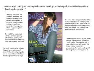
The document discusses how the magazine cover page challenges conventions of real magazines. It uses balanced layout with heavy and light elements distributed evenly. The model makes eye contact to grab attention. Bold text emphasizes headlines. The contents page does not follow the typical left-to-right eye movement pattern. White space is used positively to make images stand out. Layers and columns add depth. Iconography represents celebrities' lives.