The document summarizes how the author's media product uses, develops, and challenges conventions of real media products.
Some key points:
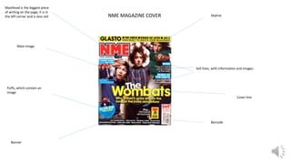
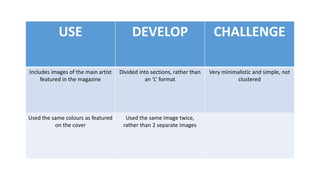
- The magazine cover features a masthead in the center rather than the corner, and uses color to match the cover image. A skyline promotes artists rather than offers. There are no sell lines to keep it minimal.
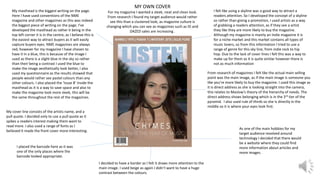
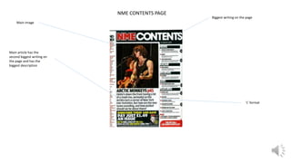
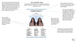
- The contents page separates sections rather than using an 'L' format. It features the cover artist's image twice and uses the same colors as the cover.
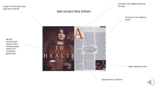
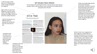
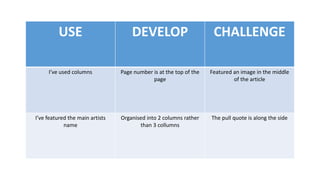
- The double-page article saves space by featuring the pull quote along the side. It uses two columns rather than three and positions the page number, artist name, and image to draw