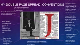
Ella Ash analyzed the forms and conventions used in real music magazines like NME and Q magazine to design her own music magazine focused on ska and rocksteady genres. Her magazine both incorporates common conventions such as mastheads, pull quotes, and column text layout, as well as challenges conventions by using a unique color scheme, enlarged artist initials, and spreading content across double pages. This allows her magazine to be recognized while also having its own distinct style that captures the uniqueness of its niche genre focus.
Corporate Lawyers- With an experienced team of corporate lawyers we provide legal services relating to strategic relationship, owner and investor interest, acquisitions and mergers, intellectual property right, insolvency and many other services that are required in the corporate world.
This is an overview about Java Mission Control and Java Flight Recorder which is part of the Oracle JDK since JDK 7u40. The purpose of JFR is to have a continuous recording about the behavior of the JVM and the Java application at the same time. You can walk back in time and find out whats going on, to discover a specific problem situation in history
As a business owner in Delaware, staying on top of your tax obligations is paramount, especially with the annual deadline for Delaware Franchise Tax looming on March 1. One such obligation is the annual Delaware Franchise Tax, which serves as a crucial requirement for maintaining your company’s legal standing within the state. While the prospect of handling tax matters may seem daunting, rest assured that the process can be straightforward with the right guidance. In this comprehensive guide, we’ll walk you through the steps of filing your Delaware Franchise Tax and provide insights to help you navigate the process effectively.
RMD24 | Debunking the non-endemic revenue myth Marvin Vacquier Droop | First ...BBPMedia1
Marvin neemt je in deze presentatie mee in de voordelen van non-endemic advertising op retail media netwerken. Hij brengt ook de uitdagingen in beeld die de markt op dit moment heeft op het gebied van retail media voor niet-leveranciers.
Retail media wordt gezien als het nieuwe advertising-medium en ook mediabureaus richten massaal retail media-afdelingen op. Merken die niet in de betreffende winkel liggen staan ook nog niet in de rij om op de retail media netwerken te adverteren. Marvin belicht de uitdagingen die er zijn om echt aansluiting te vinden op die markt van non-endemic advertising.
Remote sensing and monitoring are changing the mining industry for the better. These are providing innovative solutions to long-standing challenges. Those related to exploration, extraction, and overall environmental management by mining technology companies Odisha. These technologies make use of satellite imaging, aerial photography and sensors to collect data that might be inaccessible or from hazardous locations. With the use of this technology, mining operations are becoming increasingly efficient. Let us gain more insight into the key aspects associated with remote sensing and monitoring when it comes to mining.
Cracking the Workplace Discipline Code Main.pptxWorkforce Group
Cultivating and maintaining discipline within teams is a critical differentiator for successful organisations.
Forward-thinking leaders and business managers understand the impact that discipline has on organisational success. A disciplined workforce operates with clarity, focus, and a shared understanding of expectations, ultimately driving better results, optimising productivity, and facilitating seamless collaboration.
Although discipline is not a one-size-fits-all approach, it can help create a work environment that encourages personal growth and accountability rather than solely relying on punitive measures.
In this deck, you will learn the significance of workplace discipline for organisational success. You’ll also learn
• Four (4) workplace discipline methods you should consider
• The best and most practical approach to implementing workplace discipline.
• Three (3) key tips to maintain a disciplined workplace.
Memorandum Of Association Constitution of Company.pptseri bangash
www.seribangash.com
A Memorandum of Association (MOA) is a legal document that outlines the fundamental principles and objectives upon which a company operates. It serves as the company's charter or constitution and defines the scope of its activities. Here's a detailed note on the MOA:
Contents of Memorandum of Association:
Name Clause: This clause states the name of the company, which should end with words like "Limited" or "Ltd." for a public limited company and "Private Limited" or "Pvt. Ltd." for a private limited company.
https://seribangash.com/article-of-association-is-legal-doc-of-company/
Registered Office Clause: It specifies the location where the company's registered office is situated. This office is where all official communications and notices are sent.
Objective Clause: This clause delineates the main objectives for which the company is formed. It's important to define these objectives clearly, as the company cannot undertake activities beyond those mentioned in this clause.
www.seribangash.com
Liability Clause: It outlines the extent of liability of the company's members. In the case of companies limited by shares, the liability of members is limited to the amount unpaid on their shares. For companies limited by guarantee, members' liability is limited to the amount they undertake to contribute if the company is wound up.
https://seribangash.com/promotors-is-person-conceived-formation-company/
Capital Clause: This clause specifies the authorized capital of the company, i.e., the maximum amount of share capital the company is authorized to issue. It also mentions the division of this capital into shares and their respective nominal value.
Association Clause: It simply states that the subscribers wish to form a company and agree to become members of it, in accordance with the terms of the MOA.
Importance of Memorandum of Association:
Legal Requirement: The MOA is a legal requirement for the formation of a company. It must be filed with the Registrar of Companies during the incorporation process.
Constitutional Document: It serves as the company's constitutional document, defining its scope, powers, and limitations.
Protection of Members: It protects the interests of the company's members by clearly defining the objectives and limiting their liability.
External Communication: It provides clarity to external parties, such as investors, creditors, and regulatory authorities, regarding the company's objectives and powers.
https://seribangash.com/difference-public-and-private-company-law/
Binding Authority: The company and its members are bound by the provisions of the MOA. Any action taken beyond its scope may be considered ultra vires (beyond the powers) of the company and therefore void.
Amendment of MOA:
While the MOA lays down the company's fundamental principles, it is not entirely immutable. It can be amended, but only under specific circumstances and in compliance with legal procedures. Amendments typically require shareholder
Buy Verified PayPal Account | Buy Google 5 Star Reviewsusawebmarket
Buy Verified PayPal Account
Looking to buy verified PayPal accounts? Discover 7 expert tips for safely purchasing a verified PayPal account in 2024. Ensure security and reliability for your transactions.
PayPal Services Features-
🟢 Email Access
🟢 Bank Added
🟢 Card Verified
🟢 Full SSN Provided
🟢 Phone Number Access
🟢 Driving License Copy
🟢 Fasted Delivery
Client Satisfaction is Our First priority. Our services is very appropriate to buy. We assume that the first-rate way to purchase our offerings is to order on the website. If you have any worry in our cooperation usually You can order us on Skype or Telegram.
24/7 Hours Reply/Please Contact
usawebmarketEmail: support@usawebmarket.com
Skype: usawebmarket
Telegram: @usawebmarket
WhatsApp: +1(218) 203-5951
USA WEB MARKET is the Best Verified PayPal, Payoneer, Cash App, Skrill, Neteller, Stripe Account and SEO, SMM Service provider.100%Satisfection granted.100% replacement Granted.
Discover the innovative and creative projects that highlight my journey throu...dylandmeas
Discover the innovative and creative projects that highlight my journey through Full Sail University. Below, you’ll find a collection of my work showcasing my skills and expertise in digital marketing, event planning, and media production.
Premium MEAN Stack Development Solutions for Modern BusinessesSynapseIndia
Stay ahead of the curve with our premium MEAN Stack Development Solutions. Our expert developers utilize MongoDB, Express.js, AngularJS, and Node.js to create modern and responsive web applications. Trust us for cutting-edge solutions that drive your business growth and success.
Know more: https://www.synapseindia.com/technology/mean-stack-development-company.html
Unveiling the Secrets How Does Generative AI Work.pdfSam H
At its core, generative artificial intelligence relies on the concept of generative models, which serve as engines that churn out entirely new data resembling their training data. It is like a sculptor who has studied so many forms found in nature and then uses this knowledge to create sculptures from his imagination that have never been seen before anywhere else. If taken to cyberspace, gans work almost the same way.
Explore our most comprehensive guide on lookback analysis at SafePaaS, covering access governance and how it can transform modern ERP audits. Browse now!
Affordable Stationery Printing Services in Jaipur | Navpack n PrintNavpack & Print
Looking for professional printing services in Jaipur? Navpack n Print offers high-quality and affordable stationery printing for all your business needs. Stand out with custom stationery designs and fast turnaround times. Contact us today for a quote!
Attending a job Interview for B1 and B2 Englsih learnersErika906060
It is a sample of an interview for a business english class for pre-intermediate and intermediate english students with emphasis on the speking ability.
1. IN WHAT WAYS DOES YOUR
PRODUCT USE, DEVELOP OR
CHALLENGE FORMS AND
CONVENTIONS OF REAL MEDIA
PRODUCTS?
EVALUATION- QUESTION 1
ELLA ASH
2. RESEARCH & PLANNING
When I began planning my magazine design and creating my basic flat plans for my music magazine, I had
to bear in mind the forms and conventions of real music magazines and magazines in general. To begin I
did my research of music magazines and chose the conventions I’d like to incorporate into my magazine
e.g. pull quotes (text wrapped around), strapline/ tagline etc. As my magazine is based around a genre
where there is a significant gap in the market (Ska & Rocksteady primarily), I couldn’t find any music
magazine of that genre to relate to and help me choose what conventions to use. Therefore, I based my
magazine similarly on NME and Q magazine in particular, however this slideshow is only going to show
examples of NMEs cover, contents, and double page spread.
As well as incorporating the forms and conventions of real music magazines, I also challenged these at
some points, which will be explained in the following slides.
3. FRONT COVER OF NMECONVENTIONS
Iconic masthead
Black, red and white
colour scheme is
suggested.
Puff & plug
Side banner- includes extra
images and cover lines
Slanted cover lines
Main image
Pull quote
Artist banner
Main cover line- large
and bold
Barcode,
price, date
and tagline
4. MY FRONT COVERCONVENTIONS
Tagline/ strapline
Top banner showing
the reader what else is
‘exclusively’ included in
the magazine
Iconic mastheadbold and the largest
text on the cover
Pull quote
Side banner containing other
smaller images with smaller
cover lines. I have still kept three
images likewise NME, but I have
changed the positioning so it is
slanted as like that look. Also
the colour links in with my
chosen ‘primary colour’ scheme.
Primary colour scheme and
black and white (especially
images)
Artist banner
Main cover line- second
largest text on the cover
Puff & plugdrop capital ‘50’
as the number
grabs the
readers
attention and
indicates
they’re going to
get something
extra, that they
wouldn’t find
elsewhere.
Barcode, issue number,
date and price
5. COMPARISONS BETWEEN CONVENTIONSFRONT COVER
•
On my front cover, that was based around the NME cover I analysed for conventions, I have included numerous conventions of real
magazines. Firstly I created a masthead using ‘dafont.com’ and the font ‘Independant’ as it suited the genre of Rocksteady and looked
a little 60s. I also made it the largest and boldest text on the page so that can easily be recognised. I also incorporated a puff & plug
which the readers are immediately drawn to. Puffs and plugs usually show something exclusive or extra included in the magazine and
mine does. However, I added a number to it which is also a common convention of magazine front covers, to catch the readers
attention immediately and get them to want to read on and to make them feel as if their getting something extra that you can’t get
elsewhere. Likewise NME, I added an side panel with extra images and smaller cover lines so that it would appeal to everyone. I
thought that if there was just one story/ cover line on the cover, that some people not interested in the artist would just not pick it
up, so this way it can appeal to everyone. However, as mentioned I decided to make my slanted to make it a bit different and added
the bright yellow which I didn’t originally plan to use. I feel this makes the magazine gender neutral too. For the magazine to be
aimed at both genders I don’t feel as if it needs images of both males and females and content to specifically suit each gender
individually, so by using a neutral colour scheme and non gender biased content, it suits both genders as well as my intended age
group (16- 50 or even older). I have also added an artist banner as I feel this is another effective way of addressing the content and
the wide range of music to suit the audience. I also made this at a slant to make the cover cohesive and interesting to look at.
•
Although the NME cover I analysed didn’t have a top banner, I decided to incorporate one as other magazines have them, and I feel
again, it is another way of grabbing the readers attention and showing what additional content you get with the magazine. This can
also make it appeal to more readers. I have also included a tagline similar to NME and most magazines, however unlike NME, I
haven’t put it alongside the barcode, and instead under my masthead so it can be easily recognised and associated with the
masthead. Also, I have used a close up portrait style shot for my main image. This is a typical convention of magazines to make the
reader connect and feel like the artist is looking directly at them. This kind of shot is often seen on music magazine often as it’s more
personal etc.
6. CONTENTS PAGE NME- CONVENTIONS
Masthead- can be easily
recognised away from
the magazine
Main image- On this contents page
there is one main image which
immediately grabs the readers
attention. This is accompanied with a
short but snappy cover line and bold
page number so the reader can easily
find it.
Band index- Acts as a simple
navigation method for
readers.
Date
of the
issue
Contents=
The contents is split up into
various categories to make
it easier and quicker for the
readers to find where to go.
However, I feel too much
text has been squeezed
onto one page.
These small arrows
highlight the most
important features.
This is an advertisement
banner which boosts
magazine sales. This is a
very common
convention on contents
pages especially in
music magazines.
7. MY CONTENTS PAGE- CONVENTIONS
‘This week’s artists’ side
panel- Likewise NME with
their ‘band index’,
however I haven’t
included page numbers as
I feel it will make it more
intriguing for readers.
Having this also shows
straight away all of the
musicians included which
could also make a wider
audience buy it.
The numbers of the pages the images relate to are
in large, bold text in bright yellow so they
immediately stand out. If a reader just looked at the
image and liked the artist they could just flick
straight to those pages without having to read
anything else. This is an easy navigation system.
Advert- similar to NMEs
one but positioned at
the side without an
image.
Masthead- can be
recognised easily
I have included three images in a grid like
fashion, which a lot of magazines do. I
think this makes the contents page more
visually appealing and offers a variety of
significant features included in the
magazine, whereas the NME only
highlighted one. These are accompanied
by short, catch captions containing buzz
words such as ‘exclusive’ and ‘favourite’,
which make the reader want to read on
and also feel like they’re getting
something extra from the magazine.
I have kept the text to a minimum and the
overall contents on the page to a minimum, as
it looks more simplistic and I feel this is more
effective at grabbing the readers attention
rather than a cluttered page. I have also used
two different fonts to make it more cohesive
and interesting to look at/ read.
8. COMPARISONS BETWEEN CONVENTIONSCONTENTS PAGE
I have used numerous conventions of contents page on my contents page, however I feel my contents page does also challenge
the conventions slightly. Firstly, I have included my magazines masthead on the contents page, so it becomes memorable for the
reader and so that if they were to just see the contents page they would recognise what magazine it came from. I have also
included large, colourful page numbers to aid simple navigation, as most magazines do. I have also created a small advert which
advertises a subscription service for my magazine, likewise NME does. I have selected parts of the text to be in yellow rather
than white so it catches the readers eye and they will be shocked by the price, which they will see first, and as a consequence be
more likely to subscribe. I have kept to my primary and black and white colour scheme and also putting some of the text and
lines at slight angles to make it more visually pleasing and to give it an edge, similar to the genre it is representing.
However, in general I feel my contents page doesn’t conform to the typical conventions of contents pages. This is because I have
more than one main image, all showing different stories within the magazine, with no order of importance, however in most
magazines there’s one main, important feature. Another way that my product challenged conventions of magazines is the side
bar named ‘This week’s artists’ that I created. Although NME has something similar, I haven’t included page numbers as I feel it
will make it more intriguing for readers. Having this also shows straight away all of the musicians included which could also make
a wider audience buy it. I’ve never seen it in any other music magazines and it gives my contents page a uniqueness and also
makes it visually interesting for readers. I have tried to kept the text to a minimum and the overall contents on the page to a
minimum, as it looks more simplistic and I feel this is more effective at grabbing the readers attention rather than a cluttered
page.
9. DOUBLE PAGE SPREAD NMECONVENTIONS
Pull quote/ titleconsumes a page and
a half. It’s bold and
visually interesting so
it will be the first thing
the reader reads.
Main imagemedium
close up
Introduction to
make people
decide whether
they want to
continue
reading
Drop capital
Date, page number
and masthead
Small text box
containing a
caption to
accompany
the image
Main body of text neatly organised into four
columns on the left page.
Page
number
and web
address
10. MY DOUBLE PAGE SPREAD- CONVENTIONS
Lines to separate the text from
the introduction and basic info.
i.e. page numbers
Main body of text is organised
into neat columns- convention
of almost all magazines.
Enlarged letter ‘J’ to
represent the artists
name- this is unusual
and adds to the
uniqueness of my
magazine and the
genre/ artist being
interviewedchallenging the
conventions.
Main imageSticking to my
theme of
black and
white images
and still using
red.
Page number
and artists
name- same as
other side.
Short introduction to
let the readers decide
whether they want to
read on or not. I have
included a drop capital
in this as it is a
common convention.
Pull quote with
text wrapped
around it
Caption containing artist, place and date
the photo was taken. This is common in a
lot of magazines.
Page number, artists
name and website/
masthead.
11. COMPARISONS BETWEEN CONVENTIONSDOUBLE PAGE SPREAD
My double page spread is probably the most deviant of conventions of magazines compared to my front cover and contents
page. Firstly, I have included a main image which fills up the whole left hand page and I haven’t included a title at all or a pull
quote on this page, which is unusual, however, I feel it looks effective and gives my magazine the uniqueness I was trying to
create. Another way my double page spread challenges conventions is by putting the enlarged letter ‘J’ (representing the artists
name) behind the main body of text. I got this idea from Q magazine so it isn’t completely original, but I feel it is a simple way of
grabbing the readers attention and again giving the magazine a sense of individuality and so it can be told apart from other
music magazines.
However, I have made use of many conventions too including the introductory paragraph but instead have put it above the line
that separate it from the text, including a drop capital too. I have also structured the text as most magazines usually do in 3
columns running down the right hand side page. NME challenges this however, and has four smaller columns that spread across
both pages, as well as the pull quote spreading across both pages. I have also added a pull quote with the text wrapped around it
which is a typical convention, but I feel it looks good and grabs the readers attention. I chose an interesting part of the text that
leaves unanswered questions which will hopefully make the reader want to read the entire article. I have similarly used a smaller
version of my masthead below the main article, and have incorporated it into the web address for the magazine.
Overall I think my magazine both makes use of the forms and conventions of real media products, but also challenges them. I
think this mixture is good because as well as it being recognised as a legitimate and realistic magazine design, it also as
individuality and the uniqueness I set out to create.
BY ELLA ASH