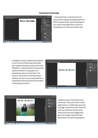
Construction of front page
I startedoff witha verybasicfontand
colourwitha slightdropshadow behindit.
Withmy drawndraft I usedredand green
but itdidn’tlookrightwhenItriedit on
PhotoshopsoI triedseveral otherideas.
I changedmy planscompletelyandopted
to use a font onPhotoshopcalledwide
Latin regularhavingpreviouslyusedafont
off Dafont.I reallywantedtoconveytothe
audience thatthisisa pop genre soI
changedthe colourof eachletter.The
coloursI chose were all vibrantandeye-
catching.You can see my mastheadfroma
longdistance awayand thiswill be helpful
inattracting consumers.
I addeda picture I had takentomy
frontcover.The picture wasn’tquite
righthowever.Itdidn’tgetacross the
message Iwanteditto and itdidn’tfit
withmymasthead.The day of the
photoshootwas quite foggyandit
givesthe image amysteriousfeel
whichdoesn’tfitwithmypopgenre.
I was muchmore pleasedwiththispicture.Iaskedmy
model tohold an acousticguitar whichiscommonly
usedinpop music.Ialso hada microphone whichhas
quite old-fashioned,thatcontrastswithmynew
upcomingartistSpencer. Iput a popfilterinfrontof this
microphone tomake itlookmore professional.Iplaced
a barcode bottom rightbecause thisisone of the
essential featuresof amagazine asitmust be scanned
at checkout.
I addeda dark blue bannertoput furtheremphasisonthe masthead. I
alsoaddeda size 18 stroke to make itbolderandslightlymore
aggressive.Ialsoalteredthe dropshadow until Iwasfullyhappywithit.
I was nowpleasedwithmymasthead andfeltitmade itveryclearthat I
have produceda popmagazine thatappeals to bothgenders.
I addedanotherblue banneratthe bottomand the textI addedmade the
genre clearand appealedtobothgenders.Gigsinterestpeople particularlyof
teenage yearsandI wantedtomake it clearthat thismagazine wouldbe full of
interestingcontent. The white textlooksreallygoodwiththe blackstroke
whichI setat size 27. I triedusingthe same fontas my mastheadbutitdidn’t
lookas goodas it didwiththe impactregularfont.
I addedseveral coverlines toentice peopleintobuyingmymagazine.Ihave
usedlanguage like "fave"toappeal tomy teenage targetaudience whooften
like wordslike this.Mymaincoverline isabout"Spencer"whowill be my
double page spreadartist.Itisclear that thisismy maincoverline because of
howmuch largerit isand it'salso veryclearthat the image isof Spencer
because of where Ihave placedthe coverline.The othercoverlinesare also
large and clear. I placeda small stroke onthe coverlinesbutforthe maincover
line Iincreasedthe size from 9 to 14. I alsoplaceda dropshadow on all of the
coverlines.
A puff isa code and conventionof manymagazines.Iusedablack
star withyellowwritingbecause itlooksappealingandit'simportant
that an offerstandsoutbecause thatcouldbe the decisive factor
that convincessomeonetobuymymagazine.A free CD isworth
quite a bitof moneyanda lotof teenagersenjoylisteningtoCD's or
addingthemto theirmusicplayer.Itdoesn’treveal muchabout
whichartistsCD it isbecause thenpeople maypickupmymagazine
to findout.Aswell asthisI addedsome red textbelow one of my
coverlines,advertisingcurrentpopularartiststhatare featured
inside. Irealise thatbecause thisisthe firstissue of mymagazine I
wouldneedtoinclude some famousartiststopersuade peopleto
buyit.
Thisis mycompletedfrontcover.Iaddedthe final touches
that are some of the most vital componentsof afront
cover.Thisincludesthe price,issue date andissue number.
I wantedtomake the price clearbecause Iusedmy
researchto findoutwhat price wouldbe reasonable and
wouldencourage people topurchase it.Iknew fromthen
that the consumerswouldappreciate me stickingtomy
promise of a reasonable price.Iunderstandthatteenagers
don’thave loadsof moneyto spendsohave to spendit
wiselyandI believethiswouldbe apurchase thatwould
give themtheirvalue formoney.Ialsowantedtomake it
clearthat thiswas the firstissue andpeople shouldpickup
the firstof manyissues. Iam veryhappywithmyfront
coverand I hope itis verysuccessful.

Construction

  • 1.
    Construction of frontpage I startedoff witha verybasicfontand colourwitha slightdropshadow behindit. Withmy drawndraft I usedredand green but itdidn’tlookrightwhenItriedit on PhotoshopsoI triedseveral otherideas. I changedmy planscompletelyandopted to use a font onPhotoshopcalledwide Latin regularhavingpreviouslyusedafont off Dafont.I reallywantedtoconveytothe audience thatthisisa pop genre soI changedthe colourof eachletter.The coloursI chose were all vibrantandeye- catching.You can see my mastheadfroma longdistance awayand thiswill be helpful inattracting consumers. I addeda picture I had takentomy frontcover.The picture wasn’tquite righthowever.Itdidn’tgetacross the message Iwanteditto and itdidn’tfit withmymasthead.The day of the photoshootwas quite foggyandit givesthe image amysteriousfeel whichdoesn’tfitwithmypopgenre.
  • 2.
    I was muchmorepleasedwiththispicture.Iaskedmy model tohold an acousticguitar whichiscommonly usedinpop music.Ialso hada microphone whichhas quite old-fashioned,thatcontrastswithmynew upcomingartistSpencer. Iput a popfilterinfrontof this microphone tomake itlookmore professional.Iplaced a barcode bottom rightbecause thisisone of the essential featuresof amagazine asitmust be scanned at checkout. I addeda dark blue bannertoput furtheremphasisonthe masthead. I alsoaddeda size 18 stroke to make itbolderandslightlymore aggressive.Ialsoalteredthe dropshadow until Iwasfullyhappywithit. I was nowpleasedwithmymasthead andfeltitmade itveryclearthat I have produceda popmagazine thatappeals to bothgenders. I addedanotherblue banneratthe bottomand the textI addedmade the genre clearand appealedtobothgenders.Gigsinterestpeople particularlyof teenage yearsandI wantedtomake it clearthat thismagazine wouldbe full of interestingcontent. The white textlooksreallygoodwiththe blackstroke whichI setat size 27. I triedusingthe same fontas my mastheadbutitdidn’t lookas goodas it didwiththe impactregularfont.
  • 3.
    I addedseveral coverlinestoentice peopleintobuyingmymagazine.Ihave usedlanguage like "fave"toappeal tomy teenage targetaudience whooften like wordslike this.Mymaincoverline isabout"Spencer"whowill be my double page spreadartist.Itisclear that thisismy maincoverline because of howmuch largerit isand it'salso veryclearthat the image isof Spencer because of where Ihave placedthe coverline.The othercoverlinesare also large and clear. I placeda small stroke onthe coverlinesbutforthe maincover line Iincreasedthe size from 9 to 14. I alsoplaceda dropshadow on all of the coverlines. A puff isa code and conventionof manymagazines.Iusedablack star withyellowwritingbecause itlooksappealingandit'simportant that an offerstandsoutbecause thatcouldbe the decisive factor that convincessomeonetobuymymagazine.A free CD isworth quite a bitof moneyanda lotof teenagersenjoylisteningtoCD's or addingthemto theirmusicplayer.Itdoesn’treveal muchabout whichartistsCD it isbecause thenpeople maypickupmymagazine to findout.Aswell asthisI addedsome red textbelow one of my coverlines,advertisingcurrentpopularartiststhatare featured inside. Irealise thatbecause thisisthe firstissue of mymagazine I wouldneedtoinclude some famousartiststopersuade peopleto buyit.
  • 4.
    Thisis mycompletedfrontcover.Iaddedthe finaltouches that are some of the most vital componentsof afront cover.Thisincludesthe price,issue date andissue number. I wantedtomake the price clearbecause Iusedmy researchto findoutwhat price wouldbe reasonable and wouldencourage people topurchase it.Iknew fromthen that the consumerswouldappreciate me stickingtomy promise of a reasonable price.Iunderstandthatteenagers don’thave loadsof moneyto spendsohave to spendit wiselyandI believethiswouldbe apurchase thatwould give themtheirvalue formoney.Ialsowantedtomake it clearthat thiswas the firstissue andpeople shouldpickup the firstof manyissues. Iam veryhappywithmyfront coverand I hope itis verysuccessful.