The document summarizes how the creator's album cover, poster, and music video for a band both use and develop upon conventions from real album covers, posters, and music videos, while also challenging some conventions.
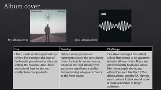
For the album cover, elements like prominent logos and bold fonts are used similarly to real covers, while featuring the artist more prominently. Color is used to make it more accessible than typical indie covers.
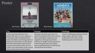
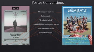
The poster uses conventions like listing the band, album, release date and tracks, but develops on it with reviews and purchase information.
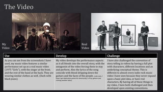
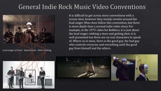
The music video shows the band performing similarly to real videos, but develops a story with characters, locations and a conceptual theme, challenging the lack of plot in