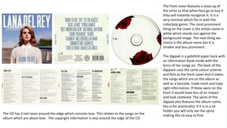
Digipak analysis
The front cover features a close up of
the artist so that when fans go to buy it
they will instantly recognise it. It is a
very minimal which fits in with the
indie/pop genre. The most prominent
thing on the cover is the artists name in
white which stands out against the
background image. The next thing we
notice is the album name but it is
smaller and less prominent.
The digipak is a gatefold paper back with
an information book inside with the
lyrics of her songs on. The back of the
digipack uses the same colour scheme
and font as the front cover and it states
the songs which are on the album as
well as a barcode, trade mark and copy
right information. If these were on the
front it would have less of an impact
and look cluttered. The spine of the
digipak also features the album name,
this is for practicality. If it is in a cd
holder you will only see the spine
making the cd easy to find.The CD has 3 red roses around the edge which connote love. This relates to the songs on the
album which are about love. The copyright information is also around the edge of the CD.
This digipak has a very chaotic cover, the artist Chris Brown is
instantly recognisable there is a close up of him in the centre
of the cover. His name is only featured in the bottom left
corner and it is not very prominent. The album name “fame” is
at the bottom of the cover and shows that the name of the
album is important.
The other people featured on the front cover are in casual
clothing often linked with the genre of hip hop and rap. The
two men shown either side of Brown are wearing snapbacks
which is typical of the hip hop genre. The colours used and
type face remind me of graffiti which is also linked with hip
hop and rap.
The back cover of the digipak features a man in a suit which
connotes power. The pink background contradicts this
masculinity, the artist could be showing that he doesn’t want
to stick to typical conventions which links with the music
genre. The back cover also features the song names on the
album as well as the copy right information, logos and the
barcode.
The Spine of the digipak has the name of the artist and the
album name, again for practicality when trying to find it. The
CD contrasts with the front and back cover, it has a plain white
background but features the same man from the back and
using the same fonts from the cover creating synergy within
the digipak. Copy right information is also around the edge of
the CD

Digipak analysis

  • 1.
  • 2.
    The front coverfeatures a close up of the artist so that when fans go to buy it they will instantly recognise it. It is a very minimal which fits in with the indie/pop genre. The most prominent thing on the cover is the artists name in white which stands out against the background image. The next thing we notice is the album name but it is smaller and less prominent. The digipak is a gatefold paper back with an information book inside with the lyrics of her songs on. The back of the digipack uses the same colour scheme and font as the front cover and it states the songs which are on the album as well as a barcode, trade mark and copy right information. If these were on the front it would have less of an impact and look cluttered. The spine of the digipak also features the album name, this is for practicality. If it is in a cd holder you will only see the spine making the cd easy to find.The CD has 3 red roses around the edge which connote love. This relates to the songs on the album which are about love. The copyright information is also around the edge of the CD.
  • 3.
    This digipak hasa very chaotic cover, the artist Chris Brown is instantly recognisable there is a close up of him in the centre of the cover. His name is only featured in the bottom left corner and it is not very prominent. The album name “fame” is at the bottom of the cover and shows that the name of the album is important. The other people featured on the front cover are in casual clothing often linked with the genre of hip hop and rap. The two men shown either side of Brown are wearing snapbacks which is typical of the hip hop genre. The colours used and type face remind me of graffiti which is also linked with hip hop and rap. The back cover of the digipak features a man in a suit which connotes power. The pink background contradicts this masculinity, the artist could be showing that he doesn’t want to stick to typical conventions which links with the music genre. The back cover also features the song names on the album as well as the copy right information, logos and the barcode. The Spine of the digipak has the name of the artist and the album name, again for practicality when trying to find it. The CD contrasts with the front and back cover, it has a plain white background but features the same man from the back and using the same fonts from the cover creating synergy within the digipak. Copy right information is also around the edge of the CD