Depicting death at war #SOCREL13
•Download as PPT, PDF•
1 like•676 views

This document summarizes a presentation on depicting death in World War 2 posters. It discusses how propaganda posters aimed to create a shared national identity and portray citizens as active members of the war effort. The boundaries between civilians and soldiers were blurred, with attempts to depict everyone as heroic. Posters addressed many issues including recruiting, health and safety, and the enemy. Overall posters served as a government messaging tool but responses could be mixed, with "harsher" images more accepted for military audiences.

Recommended
More Related Content
What's hot
What's hot (20)
Viewers also liked
Viewers also liked (9)
Similar to Depicting death at war #SOCREL13
Similar to Depicting death at war #SOCREL13 (19)
More from Bex Lewis
More from Bex Lewis (20)
Recently uploaded
Recently uploaded (20)
Depicting death at war #SOCREL13
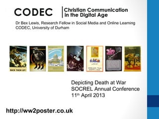
- 1. Dr Bex Lewis, Research Fellow in Social Media and Online Learning CODEC, University of Durham Depicting Death at War SOCREL Annual Conference 11th April 2013 http://ww2poster.co.uk @drbexl
- 2. Total War • During the war, a ‘shared sense of national identity had to be mobilised amongst the people of Britain’. Achieved partly through propaganda posters, more and more people ‘were encouraged to identify themselves as active citizens, as active members of the nation’, a citizenship ‘to be earned by communal and individual service of one’s nation in wartime’. Lewis, R., Unpublished PhD thesis (2004), quoting Noakes, L., War and the British: Gender and National Identity, 1939-91, 1998, p.48.
- 3. The nature of warfare… … increasingly technologised … increasingly depersonalised
- 4. World War I: The Heroic Individual
- 5. World War I: Sport
- 6. The Spanish Civil War (1936)
- 7. • A public notice aims to inform or command. A poster aims to seduce, to exhort, to sell, to educate, to convince, to appeal. Whereas a public notice distributes information to interested or alert citizens, a poster reaches out to grab those who might otherwise pass it by. • Susan Sontag Read more: http://j.mp/ww2posterch2
- 8. In Situ: March 1943
- 9. Benedict Anderson: ‘Imagined Communities’ what ‘makes people love and die for nations, as well as hate and kill in their name’ http://tinyurl.com/ imaginedcommuniti es
- 10. Citizen Warriors • The boundaries between the civilian and the combatant soldier were blurred during the war, with ‘propagandist attempts to personify the entire population as heroic’. • Lewis, R., Unpublished PhD thesis, quoting Paris, M., Warrior Nation: Images of War in British Popular Culture, 1850-2000, 2000, p.201
- 12. Ministry of Information • Central governmental publicity machine • Formed September 1939 • Tell the citizen ‘clearly and swiftly what he is to do, where he is to do it, how he is to do it and what he should not do’.
- 16. RURAL LIFE V URBAN DECAY
- 19. Fougasse, 1940
- 20. The Human Cost?
- 22. Abram Games (1914-1996), War Office • 1940: Infantry • ‘an understanding of what the ranker thinks, does and, perhaps more important, does not do’, as the army mentality was different from that of the ‘outside world’. • 1941: Recruiting Posters for RAC • 1942: “Official War Office Poster Designer”
- 24. Careless Talk in the Army
- 27. Bloody Hitler…
- 28. Enemy Ally
- 29. HEALTH & SAFETY
- 30. DANGER in the Factory (1)
- 31. DANGER in the Factory (2)
- 32. VD: A Scourge of War?
- 35. HEADING TO THE FUTURE • The day will come when the joybells will ring again throughout Europe, and when victorious nations, masters not only of their foes but of themselves, will plan and build in justice, in tradition, and in freedom..' • The Rt. Hon. Winston S. Chuchill, C.H., M.P. Jan.
- 36. Post-War • “I am grateful to your correspondents who have pointed out that the ubiquitous poster is intended to represent a widow, as I have been labouring under the misapprehension that it depicted an actual victim.” • Mass-Observation
- 37. Conclusions • Death conspicuous by its ever-present absence. • Variety of campaigns • Mixed responses • ‘Harsher’ images more accepted in the armed forces despite the notion that the civilian was part of the ‘fighting front’.
Editor's Notes
- ABSTRACT: In the Second World War, the second ‘ total war ’ of the Twentieth Century, death was a daily reality for both those on the fighting fronts and those on the Home Front in Britain. The Ministry of Information (MOI), officially formed at the outbreak of the Second World War, was the central governmental publicity machine, working with other official bodies, including the War Office. Its role was to tell the citizen ‘ clearly and swiftly what he is to do, where he is to do it, how he is to do it and what he should not do ’ . Posters produced by the MOI needed to deal with the ever-present reality of death: How did governmental bodies deal with the representation of death, ensuring that the seriousness of their message was conveyed, whilst avoiding too “ starkly realistic posters ” for those who “ already knew so much of reality ” . What are the moral, religious and other discourses drawn upon and depicted within the posters? Are there clear differences between the images aimed at soldiers, industrial worker and civilians? Was humour ever seen as an appropriate tool in relation to the possibility of death? What were some of the more subtle symbols of death which recurred within wartime posters, particularly within health and “ Careless Talk ” campaigns? Immediately see here a range of images – one of the findings of thesis is that in a democracy = necessary to allow artists a bit of licence, so most of the agreements about what to represent were culturally encoded rather than legislated…
- Although warfare has been pretty much a constant in every generation (now an age of “the war on terror”) - 20 th Century - commonly known as the century of ‘Total War’ … needed all involved as ‘citizen soldiers’. Of all the war-related deaths in the last 500 years, ¾ occurred in the 20 th century, with around 26 million in World War 1, and around double that (53 million) in World War II.
- If we think about how the nature of that warfare has changed, weapons have become increasingly lethal, and the identification of acceptable target populations has widened. Well before the 20 th century, warfare had become increasingly technologised, and social organisations of society had ensured that mass killings as an outcome of war , were normalised. Warfare became increasingly defined by the technological nature of war , and the increasingly efficient production through industrialised methods , not only in the production of weaponry, but in the increasing depersonalisation of the war, where every soldier was appearing to become part of an impersonal mass, interchangeable and therefore effectively ‘disposable’. http://www.rgbstock.com/download/costiq/meT7Re8.jpg
- In the First World War, this wasn ’t so obvious. The ‘ heroic individual ’ was clearly evident in propaganda posters… and there was clear evidence of heroic hand-to-hand combat between soldiers. Here we can see a couple of examples, the first commissioned from Frank Brangwyn for London Transport Museum (frustrated by a lack of ‘decent’ posters being produced by the Government), intended to encourage men to ‘do their duty’, Although Bevis Hillier, said for many . “Realism, of the kind Brangwyn could have offered … was out. Death was to be sold like Bovril, with nice, healthy, cheerful placards.”
- As with modern day Army recruitment, the dangers of death are effectively invisible in recruitment posters. Efficient censorship = kept huge casualty figures involved, and realities of life in the trenches out of the Press. Posters avoided the ‘seamy’ side of warfare, introduced it as though it was a football match, and used romantically idealised figures, such as St George polishing off dragons.
- The dangers of illustrating romanticised figures was clearly demonstrated in the Spanish Civil War in 1936, when ‘simple men accepted poster ideal as fact and took the illustration of men astride horse with arms upflung as proper military procedure = many = killed before realised that proper practice of taking cover was more effective. ( This poster not necessarily the one he’s referring to) Again quoting Hillier: “Nothing could better illustrate the power of the poster than this macabre anecdote of men flinging themselves to death at its suggestion. By the Second World War, radio had become the principal instrument of propaganda, but still no country could ignore the primitive graphic appeal of the propaganda poster.” http://pinterest.com/pin/36028865741112595/
- The power of the poster is also indicated in this definition from Susan Sontag…. (and note that by WW2 – the radio had overtaken posters as primary means of communication – largely working as a support service … although shortage of batteries, etc. meant came back into its own..) By 1942 posters were expected to be displayed ‘ wherever free posting can be obtained and for economy reasons should only be fixed at points where there is a considerable amount of pedestrian traffic or large bodies gathered together ’ . This would include railway stations, cinema and theatre entrances, shopping thoroughfares, schools, church notice boards, town halls, women ’ s institutes, lecture centres of Civil Defence Units and all places where bodies of people are gathered together for special purposes….
- Posters need to be visually striking, and catch those who are NOT already entirely on board, and need convincing… However, in the 1930s Aldous Huxley recognised that propaganda ‘canalises an already existing stream’; it is only effective on those already in tune with the ideas expressed. Propaganda encourages its audience further along the direction that they are already moving, and reinforces partly formed ideas… The symbolism used in posters was largely borrowed from established cultural notions and institutions, rather than being formed from the propaganda itself… SO…. http://www.ltmcollection.org/photos/photo/photo.html?_IXSR_=ql6cDQA9DJ5&_IXMAXHITS_=1&IXinv=1998/76854&IXsummary=results/results&IXsearch=poster&_IXFIRST_=421
- What DOES make ‘people love and dies for nations, as well as hate and kill in their name’. Benedict Anderson offered the notion of ‘imagined communities’- citizens are likely to work together in ‘imagined communities’, “ imagined because the members of even the smallest nation will never know most of their fellow-members, meet them, of even hear of them, yet in the minds of each lives the image of their communion.” Anderson examines how tradition is constructed, invented and appropriated, often through symbolism based on false tradition. Dying for one ’s country, assumes a moral grandeur which dying for any other organisation (e.g. a political party) cannot rival, for these are all bodies one can join or leave at easy will – dying for your nation is seen as something that is fundamentally pure (and heroic). We will note in the upcoming images, that some of that symbolism, e.g. the use of skulls, shadows, a movement to light, are used within posters, and these were not produced in a cultural vacuum, but were drawing on longer term discourses - as with all types of language, the visual draws on the norms and assumptions of an established culture, and this is clearly demonstrated as the posters draw on established traditions, both in style and content.
- In an atmosphere of total war, civilians were effectively on the front-line as much as soldiers were, if not more so on occasions… Priestley, in his ‘Postscripts’ hailed ‘citizen warriors’ fighting a ‘citizen’s war’, a ‘nation constituted through shared and anonymous suffering and heroism …’ For many, the notion of war is clearly identified with death. In Britain there were around 360,000 war-related deaths (low compared with other conflict nations), nearly all attributable to German bombing campaigns… and the population actually increased by 3% over the war, as the birth rate rose and the death rate decreased around 1942. For those serving in the armed forces, the average death rate was around 5.7%, with the most in the Army, then the RAF, then the Navy, with the Merchant Navy having a very high rate of death.
- These posters demonstrate the need for each person to play a full part in the war , whether that was on the front, at home, or simply by ensuring that they kept themselves/others well… we see the need to stress a shared bond with the soldiers, and to emphasise that the ‘industrial front’ was as important as any other front in the war. See these posters – heroic battle scenes in which death again is present in its absence. The Bomber was a key tool in the Second World War, attacking from thousands of feet in the air, and largely indiscriminate in its target… The factory worker in as much danger as the serviceman, with more civilians killed than servicemen until 1941.” Target Bombing of enemy territory was deemed acceptable in the Second World War as it was sold as ‘precision bombing’, although this was very far from the actual truth, and the experience of the British (largely Londoners) in the Blitz led to some calls for the British to abandon mass air raids…
- All material for the Home Front was produced by the Ministry of Information, in planning from 1935, but not formed until war officially declared. Had been formed in 1918, but disbanded as war ended, but increasing interwar professionalization of the industry.,.. it ’s remit was to Tell the citizen ‘clearly and swiftly what he is to do, where he is to do it, how he is to do it and what he should not do’. As this poster indicates, it didn ’t have as much power as anticipated, with other departments continuing to produce their own material…. And MO report June 1940 complained that if government couldn’t control it’s own publicity – how was it going to manage people’s morale?
- Certainly something that was thrown at the first posters produced by the government … which you can read more about on this link…
- … and I have been watching with fascination how the story of KCCO has emerged as a story of the 21 st century years of austerity, rather than the original production, when many more of this poster produced than the other 2, but largely ignored until “discovered” by Barter Books …
- Of interest, as we’re talking about materiality – I’ve always said that I’m just as happy with a picture/postcard as the original poster (unlike someone else who did his PhD on the printing) … but I do remember the sensation of excitement at picking up a letter by Winston Churchill … but posters were mass produced – designed to serve a purpose & then be discarded … so interesting that they WERE saved by archives … read more about the posters in a project I wrote the majority of the content for in 2005.
- The recurrent binary opposition in interwar British culture had been the belief that rural indicated life, and urban indicated death . Initially the Industrial Revolution appeared to reinvigorate towns and cities, offering ‘handsome public buildings and parks, gracious suburbs and vibrant shopping streets’. However, by the twentieth century the terms more associated with urban areas were crowded, cramped, polluted, poverty, dirty and disease-ridden. Just briefly, we can see in these two images, produced for soldiers in 1942, two visions of the Britain that they were fighting for . One the rural ‘idyll’, the other Finsbury Health Centre, with death (indicated by the gravestone), disease and rickets evident in the background –in the past, to be solved by modern healthcare regimes. McLaine, writing about the Ministry of Information, indicated their fears that the large numbers trekking out from the city to the country each night was often taken as a sign of low morale. However, the desire for escape from the possibility of sudden death and the constant noise of bombing was a sign of a wish for survival rather than low morale. Interestingly, in other urban areas (which tended to have more ‘trekkers’) outside London the bombing was often of equal or greater intensity but shorter duration, with some morbid inter-urban rivalry arising concerning degrees of suffering and recognition…
- ‘ The Proud City’ was a series of six in traditional painted style in 1944 - focused on historic or significant buildings in the capital, surrounded by, or the victim of, bombing campaigns, but demonstrating resilience or new life coming through … in all this death and destruction, it is the survival and regrowth that is focused on by Walter Spradbery, the artist. Established institutions, indicated by buildings (palaces and churches ) are the focus of the image, the damaged materials offer a ‘naturalised’ vision of death and decay , and the focus on the sky was often deeply symbolic. The Early Romantics took great attraction in studying the clouds, seen as tangible manifestations of the infinite/sublime = seemingly chaotic/amorphous/ever-changing phenomena. Light, expansion, warmth and dryness were associated with heaven and perfection, whilst darkness, contraction, cold and moistness were associated with the earth and imperfection… and therefore mortal death.
- Conversations about death were frequent in wartime – and when not all the facts can be published, it is natural that people will try and guess. During the first few months of war, particularly the first-few days, rumours were rife. Rumours included exaggerated numbers who died in bombings, the lack of wood resultant from the number of coffins made in preparation, and on bombings that were believed to have been hushed-up. Urging others not to spread rumours became a popular occupation as ‘[n]ewspapers harangued their readers, clergy their congregations, headmasters their pupils’. In the early days of the war, the Government was told the only real way to bring home to the public the real danger of careless talk was by ‘pictures which hurt’, but the scheme was turned down as ‘too tough and too realistic for the British public’. Norman Wilkinson’s realistic design (1940) & the second (from 1943) with a symbolic depiction of death, in some ways play upon the familiarity with marine landscapes, subverting the tradition, depicting destruction, rather than the magnificence of shipping. It was often difficult to be too realistic, as graphic images of death would not necessarily have been well received. More common & popular were (& the press picked up on the differences)...
- These humourous designs by Fougasse, established Punch cartoonist (who offered his services free to the government) suggested that humour was an ‘ideal vehicle’ for propaganda, offering a ‘unifying quality, where the common understanding of a joke creates a bond, and persuades without causing resentment. He believed that humour can spotlight the ridiculousness or foolishness of actions and irresponsible behaviour without offence. Think how much we react to being ‘told’, but humour can make us see inside , depicting an everyday situation with which everyone could identify. Shapes, colours and the main slogan could be seen from a distance, but in order to enjoy the joke, the viewer was forced to come near enough to read the small caption and then make his/her own conclusions about the situation. This personal involvement was the key to remembering and ‘actioning’ the message although defining change as a result of the propaganda = hard to tell! Bartlett was wary about the use of humour, which he labelled a ‘dangerous tool’, only really effective within the artist’s own population - the sense of humour needed to be known ‘intimately’ and ‘sympathetically’. Fougasse, a British artist appealing to a British audience, fitted this criteria, and his cartoons marked ‘a fundamental change from the earlier sober government posters against careless talk’.
- Even in the serious posters - the victim is rarely visible in posters, or if he is, it is the risk of death that is posed, rather than the reality. Where the reality is shown, the human cost is rarely visible, rather a ship is seen sinking, or a plane is crashed….
- Exceptions to the rule, with depictions of individual death, were to be found were army posters: ‘ A Maiden Loved’ shows the ‘grave’ consequences, and Abram Games’ modern designs (which we’ll look at in a minute). In 1945, however, a campaign aimed at soldiers returning from the fighting fronts was deliberately designed to be humorous, with the figure depicted in the bed deliberately drawn in a non-realistic manner, symbolic of the men who ‘shoot their mouth off’. It ‘was not policy to produce starkly realistic posters for men who already knew so much of reality’.
- In 1940 Games joined the Infantry, but was recalled to the War Office in June 1941 to design a recruiting poster for the Royal Armoured Corps (RAC), and proposed the idea that designers should be ‘enlisted’ as instructional designers – more usefully employed than with a gun on the front! In 1942, he was given the opportunity to experiment, successfully, and was offered the newly created poster of Official War Office Poster Designer. Games described that his experience in the Infantry had given him ‘an understanding of what the ranker thinks, does and, perhaps more important, does not do’, as the army mentality was different from that of the ‘outside world’.
- We can see the evidence of this in these poster designs. Games was unafraid to subvert the realism of the image, and use abstract graphic techniques to provide visual links between ‘careless talk’/careless weapon handling.. and the victim. Drawing on psychological discourses, this was aimed directly at the soldiers, who were presumed to live with death on a far closer basis than civilians, and images could therefore be much harsher and more direct. You ’ ll note this is different from what we ’ ve just said – positive – democracy – allowed for such differences, negative – may have added to sense of confusion…
- This first image in particular uses a powerful graphic device, emphasised by his use of colour, became itself an enactment of the message. This depiction of the death of three comrades, unusually frank, was an emotive and effective way of driving home to the troops the potentially serious consequences of careless talk, and the second image is similar… using an interesting interpretation on photographic realism.
- So, we wanted to prevent death to our own people, but death to the enemy… well, that was another matter!
- As we indicated earlier, posters of air bombing dehumanised death… and posters fell into two categories: The strength of one's own air power, the boasts of air superiority , the results of raids. Chivalric heroism/romance of flight - scenes of air-to-air contact, bombing of industrial targets. Or the danger posed by enemy bombing. Relied less on rhetoric and concentrated more on providing information and instruction. Morbid, surreal, allusions to death dealing with bombing of civilian targets. The external threat tended to ensure that internal divisions, and fears of loss, hardship and death were played down… as all ‘pulled together’ (in this case with the Soviet Union) to fight the Nazis – whose skull head here rather reminds me of Goebbels...
- The skull makes a recurrent image in attempts to demonise the enemy (who interestingly are largely represented by their leaders, rather than the rank & file, offering a differentiation between ‘The Nazis’ and ‘The Ordinary German’), as we see that the Nazi movement is built upon uncivilised blood, death and destruction.
- When the Soviet Union entered on the side of the allies the UK designed posters drawing on the Russian style… vicious depictions of death (as the previous ones also were) elements of a common cultural heritage, and a shared enemy were emphasised, rather than any kind of political affiliation (notice we never refer to them as the Soviet Union!)
- So, onto issues of health and safety… very much tying in with the idea that in order to be an effective citizen in time of war, one needed to keep oneself clean & healthy , in whatever capacity one was serving on… Again, we can see here, the first couple of images are aimed at the armed services, and are quite harsh images (although the first offers a focus on LIFE, rather than the DEATH so evident in the VD poster, and the ROSPA poster designed for factory workers has a stronger use of humour…)
- However, not all images used in the factories were chirpy and cheery! This is a very simple design, potentially designed by a factory worker themselves, illustrating the dangers of an accident, whilst this design offers a much harsher image – whereas cogs are used in images elsewhere to illustrate the place of the worker in the factory system, here they are tools of danger, indicated by the dark colours…. and the wolf baying for blood (both a general symbol of death and danger, and could also be associated with German Shepherd dogs…).
- Many images relating to safety re: machines, particularly those targeted at women, focused upon the dangers of scalping (often tying in with ideas of fashion) or other forms of disability, but this image returns to the use of the skull and the dangers of DEATH from uncareful use of machines…
- In 1941, rates of VD started to rise dramatically … and VD was characterised as a ‘ problem ’ within both scientific and religious (often equated with moral) discourse. Medical, legal, political and religious institutions influenced, and gained the power to deal with, the ‘ problem ’ within discourses of citizenship…. We said earlier that much of the focus was on the damage done to homes, and we can see this in this first VD poster (not 1 st chronologically)… but we see more of a focus on the individual in most of these posters, where again we see motives of death, decay and danger, illustrated through these grasping shadowy hands…
- … .this design, which reminded me immediately of the Gravestyle style letters on AIDS posters that I remembered seeing in the 1980s, has more of a focus on ‘the nation’. In reactions to all the VD posters, it was evident that men were more concerned with death & disability, with women more concerned with it being passed on to children who might be born with a deformity, mental deficiency, or blindness.
- The most interesting design from quite a collection of VD posters, however, is this one. Designed by Reginald Mount, it has since become a very famous design. It, however, was simply the first of three posters, designed to indicate that VD was not just caught from prostitutes, reflecting worries about ‘amateurs’ who harboured the disease. Distribution of the poster was restricted to some 500 copies, and certain port areas, with an obvious male audience intended. The flower on the hat has a certain fleshy ‘unhealthiness’, viewed as a ‘symbol of enticement’. The skull gives an indication of the ‘kiss of death’, smiling as it beckons (emphasised by the text) the man towards the faceless ‘easy’ woman. The veil adds a furtive atmosphere to all this, suggesting that the true nature of the woman cannot be seen, that she is behaving in a ‘shady’ manner, as a prostitute would. The message is consistent with Victorian moral discourses of sexuality: a man has natural sexual urges, whilst a woman should remain a virgin until marriage, otherwise be stigmatised ‘easy’. The diseases are specified, and the medical damage spelt out, although not the emotional damage. The government appeared to be less in favour of religious or particularly emotional messages. Medicine allowed the problem to be dealt with in the present, in a pragmatic way. Religion, however, deals with the hereafter and while redemption is possible, some viewed the hereafter as pre-ordained.
- As the war (and myself) draw towards a conclusion, it ’s interesting to see this poster, using a slogan from 1940, but clearly later, which indicates a move away from death (not signified by bodies, but by the cross/grave marker), decay and destruction, towards light, colour and the future… a life of redemption (ignoring the fact that many families would be incomplete through war induced death).
- Unlike WW1, the MOI was seen to have a post-war function (and continued as Central Office of Information til 2012) … the Ministry of Information, unlike after the First World War, was seen to have a continued role post-war (and indeed still exists as the Central Office of Information – closed 2012), and continued to produce designs to continue to involve citizens in their contribution to the nation. The government had also been running campaigns to reduce the death rate on the roads, but none attracted the response that this poster did. It became known as “the black widow”, most describing it as ‘appalling’, ‘terrifying’, ‘awful’, ‘terrible’, ‘grim’ - but unmissable! The poster was withdrawn after continued complaints – as it was recognised that widowhood was a sensitive subject so soon after the Second World War! Although on display for only 13 weeks, the poster achieved long-term recognition and notoriety.
- Death was not a key focus on my research, as it was largely conspicuous by it ’s ever-present absence…. But it was something I was keen to return to, so I’m pleased at the opportunity that giving this paper has given me to revisit the material and think about how death is ever-present, although rarely acknowledged… When I was working for the University of Manchester, here ’ s a draft of a poster we created for a conference ‘War and our World’ – indicating the inextricable link between war & death – although this bottom/middle image we decided not to use – images of drama, but look too much like ‘real’ death, and that’s something that in the modern world we try and avoid coming face to face with… over time it has moved from being a natural part of life, to something that we frequently deny and try to ignore…