Downloaded 92 times


![IMPORTING DATASET
dataset = pd.read_csv(file_path)
X= dataset.iloc[:,1:2].values
y= dataset.iloc[:,2:3].values](https://image.slidesharecdn.com/5-decisiontreeregression-171230051804/85/decision-tree-regression-10-320.jpg)


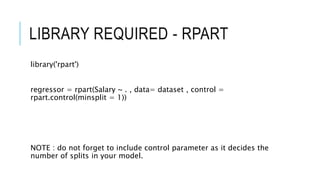
![READ DATASET
library(readr)
dataset <- read_csv("D:/machine learning AZ/Machine Learning A-Z
Template Folder/Part 2 - Regression/Section 7 - Support Vector
Regression (SVR)/SVR/Position_Salaries.csv")
dataset= dataset[2:3]](https://image.slidesharecdn.com/5-decisiontreeregression-171230051804/85/decision-tree-regression-16-320.jpg)
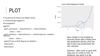
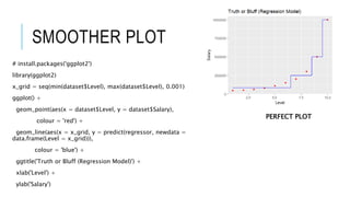

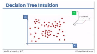
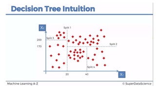
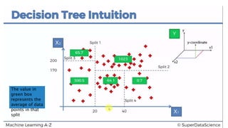
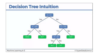
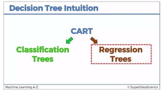
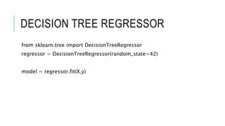
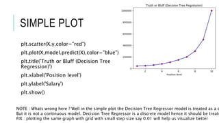
This document discusses decision tree regression for predicting salary based on position level. It shows how to import data, build a decision tree regression model using scikit-learn in Python and rpart in R, make predictions, and plot the results. It notes that decision trees are discrete models, so the plots need to treat the x-axis as discrete rather than continuous to properly visualize the model's piecewise constant predictions.


![[DSC Europe 25] Raul Cruz Bonilla - Harnessing GEN AI in Fashion, Luxury and ...](https://cdn.slidesharecdn.com/ss_thumbnails/me7nvup5thwqzwzblbvw-raul-cruz-harnessing-ai-en-luxury-260123083019-32ac5a43-thumbnail.jpg?width=640&height=640&fit=bounds)


![[DSC Europe 25] Milos Belcevic - Product Professional's Journey to Full-Stack...](https://cdn.slidesharecdn.com/ss_thumbnails/1zovd6fgsycdg4wvgvls-milos-belcevic-product-professionals-journey-to-full-stack-product-developer-260123083019-d993120d-thumbnail.jpg?width=640&height=640&fit=bounds)


