Downloaded 306 times
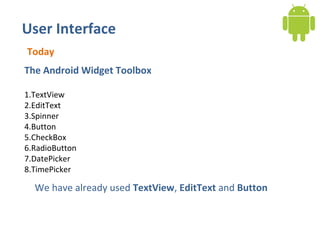
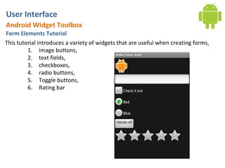
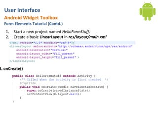
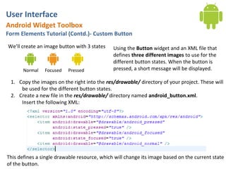
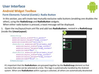
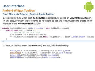
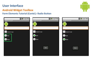
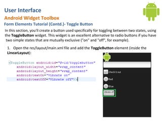
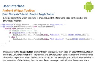
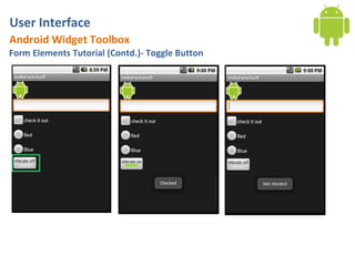
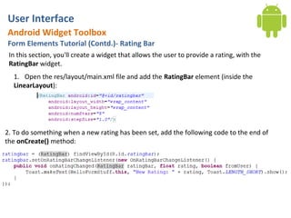
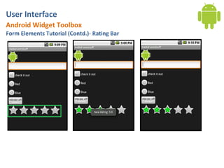
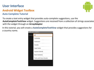
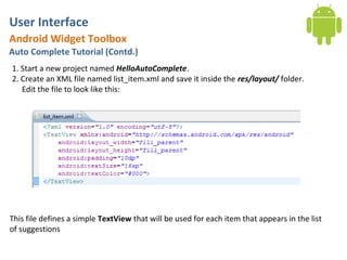
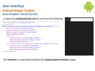
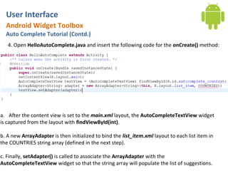
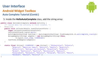
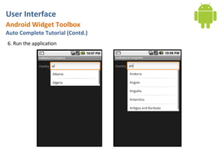
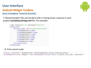

The document discusses various widgets in Android for building user interfaces, including TextView, EditText, Button, CheckBox, RadioButton, DatePicker, TimePicker, image buttons, text fields, toggle buttons, and a rating bar. It provides tutorials on how to create and handle events for these different form elements and widgets. The last part discusses how to create an autocomplete text view that provides country name suggestions from a string array.