Download as PDF, PPTX

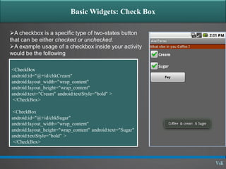
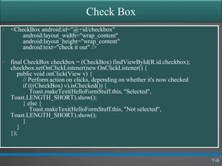
![Basic Widgets: Spinner [listbox]
A view that displays one child at a time
and lets the user pick among them.
The items in the Spinner come from the
Adapter associated with this view.
<Spinner
android:layout_height="wrap_content"
android:layout_width="wrap_content"
android:id="@+id/State"/>](https://image.slidesharecdn.com/01-09-graphicaluserinterface-basicwidgets-140324121123-phpapp01/85/01-09-graphical-user-interface-basic-widgets-13-320.jpg)

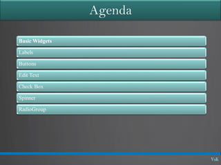
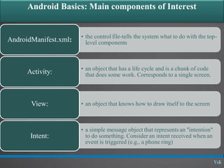
This document discusses basic widgets in Android user interfaces. It describes labels, buttons, edit texts, check boxes, spinners, radio groups, radio buttons, images views and image buttons. Labels are used to display text and are not editable. Buttons allow clicking actions. Edit texts are editable like text boxes. Check boxes represent two-state selections. Spinners display a single child like a drop-down list. Radio groups contain radio buttons where only one can be selected at a time. Images can be displayed using image views and buttons. All widgets extend from views and can set properties for visibility, background, focus and enabled status.


![Day 5: Android User Interface [View Widgets]](https://cdn.slidesharecdn.com/ss_thumbnails/android1-7-130407053041-phpapp02-thumbnail.jpg?width=640&height=640&fit=bounds)


![[Android] Basic Widgets and Containers](https://cdn.slidesharecdn.com/ss_thumbnails/trainingandroidlesson2-130304082650-phpapp02-thumbnail.jpg?width=640&height=640&fit=bounds)