SlideShare a Scribd company logo
Chapter 8
Interface Elements and Controls
By
Dr. Ramkumar Lakshminarayanan
Introduction
TextView
One of the most basic user interface elements, or controls, in the Android SDK is
the TextView control. You use it, quite simply, to draw text on the screen. You primarily
use it to display fixed text strings or labels.
First, though, let’s see how to put some quick text up on the screen. <TextView> is
the XML layout file tag used to display text on the screen. You can set the android:text
property of the TextView to be either a raw text string in the layout file or a reference to a
string resource.
Here are examples of both methods you can use to set the android:text attribute of a
TextView. The first method sets the text attribute to a raw string; the second method uses
a string resource called sample_text, which must be defined in the strings.xml resource file.
To display this TextView on the screen, all your Activity needs to do is
call the setContentView() method with the layout resource identifier in which you
defined the preceding XML shown. You can change the text displayed programmatically
by calling the setText() method on the TextView object. Retrieving the text is done with
the getText() method.
<TextView android:id=”@+id/TextView01” android:layout_width=”wrap_content”
android:layout_height=”wrap_content” android:text=”Some sample text here” />
<TextView android:id=”@+id/TextView02” android:layout_width=”wrap_content”
android:layout_height=”wrap_content” android:text=”@string/sample_text” />
Retrieving Text Input Using EditText Controls
The Android SDK provides a convenient control called EditText to handle text
input from a user. The EditText class is derived from TextView. In fact, most of its
functionality is contained within TextView but enabled when created as an EditText. The
EditText object has a number of useful features enabled by default First, though, let’s see
how to define an EditText control in an XML layout file:
This layout code shows a basic EditText element. There are a couple of interesting
things to note. First, the hint attribute puts some text in the edit box that goes away when
the user starts entering text. Essentially, this gives a hint to the user as to what should go
there. Next is the lines attribute, which defines how many lines tall the input box is. If this
is not set, the entry field grows as the user enters text. However, setting a size allows the
user to scroll within a fixed sized to edit the text. This also applies to the width of the
entry. By default, the user can perform a long press to bring up a context menu. This
provides to the user some basic copy, cut, and paste operations as well as the ability to
change the input method and add a word to the user’s dictionary of frequently used words.
<EditText android:id=”@+id/EditText01”
android:layout_height=”wrap_content” android:hint=”type
here”android:lines=”4” android:layout_width=”fill_parent” />
Figure 8.1 Various styles of EditText controls and Spinner and Button controls
Giving Users Input Choices Using Spinner Controls
Sometimes you want to limit the choices available for users to type. For instance, if users
are going to enter the name of a state, you might as well limit them to only the valid states
because this is a known set. Although you could do this by letting them type something and then
blocking invalid entries, you can also provide similar functionality with a Spinner control. As
with the auto-complete method, the possible choices for a spinner can come from an Adapter.
You can also set the available choices in the layout definition by using the entries attribute with
an array resource (specifically a string-array that is referenced as something such as
@array/state- list).The Spinner control isn’t actually an EditText, although it is frequently used
in a similar fashion. Here is an example of the XML layout definition for a Spinner control for
choosing a color:
<Spinner android:id=”@+id/Spinner01” android:layout_width=”wrap_content”
android:layout_height=”wrap_content” android:entries=”@array/colors”
android:prompt=”@string/spin_prompt” />
Resource :
<array
name=”colors”><item>red</item><item>green</item><item>blue</item></array>
Figure 8.2 Filtering choices with a spinner control
When the user selects it, a pop-up shows the prompt text followed by a list of the possible
choices. This list allows only a single item to be selected at a time, and when one is selected, the
pop-up goes away.
Using Basic Buttons
The android.widget.Button class provides a basic button implementation in the
Android SDK. Within the XML layout resources, buttons are specified using the Button
element. The primary attribute for a basic button is the text field. This is the label that
appears on the middle of the button’s face. You often use basic Button controls for
buttons with text such as “Ok,”“Cancel,” or “Submit.” The following XML layout
resource file shows a typical Button control definition:
A button won’t do anything, other than animate, without some code to handle the click
event. Here is an example of some code that handles a click for a basic button and displays a
Toast message on the screen:
<Button android:id=”@+id/basic_button” android:layout_width=”wrap_content”
android:layout_height=”wrap_content” android:text=”Basic Button” />
setContentView(R.layout.buttons);
final Button basic_button = (Button) findViewById(R.id.basic_button);
basic_button.setOnClickListener(new View.OnClickListener() {
public void onClick(View v) {
EditText t2=(EditText)findViewById(R.id.EditText02);
EditText t1=(EditText)findViewById(R.id.EditText01);
t2.setText(t1.getText());
}
});
To handle the click event for when a button is pressed, we first get a reference to the
Button by its resource identifier. Next, the setOnClickListener() method is called. It requires
a valid instance of the class View.OnClickListener. A simple way to provide this is to define the
instance right in the method call. This requires implementing the onClick() method. Within the
onClick() method, you are free to carry out whatever actions you need. Here, we simply display
a message to the users telling them that the button was, in fact, clicked.
A button with its primary label as an image is an ImageButton. An ImageButton is, for
most purposes, almost exactly like a basic button. Click actions are handled in the same way.
The primary difference is that you can set its src attribute to be an image. Here is an example of
an ImageButton definition in an XML layout resource file:
In this case, a small drawable resource is referenced.
Using Check Boxes
The check box button is often used in lists of items where the user can select multiple
items. The Android check box contains a text attribute that appears to the side of the check box.
This is used in a similar way to the label of a basic button. In fact, it’s basically a TextView next
to the button. Here’s an XML layout resource definition for a CheckBox control:
The following example shows how to check for the state of the button programmatically
and change the text label to reflect the change:
<ImageButton android:layout_width=”wrap_content”
android:layout_height=”wrap_content”
android:id=”@+id/image_button” android:src=”@drawable/droid” />
<CheckBox android:id=”@+id/checkbox” android:layout_width=”wrap_content”
android:layout_height=”wrap_content” android:text=”Check me?” />
final CheckBox check_button = (CheckBox) findViewById(R.id.checkbox);
check_button.setOnClickListener(new View.OnClickListener() {
public void onClick (View v) {
TextView tv = (TextView)findViewById(R.id.checkbox);
tv.setText(check_button.isChecked() ? “This option is checked” :
“This option is not checked”);
}
});
This is similar to the basic button. A check box automatically shows the check as enabled
or disabled. This enables us to deal with behavior in our application rather than worrying about
how the button should behave. The layout shows that the text starts out one way but, after the
user presses the button, the text changes to one of two different things depending on the checked
state. As the code shows, the CheckBox is also a TextView.
Figure 8.3 Various types of buttons
Using RadioGroups and RadioButtons
You often use radio buttons when a user should be allowed to only select one item from a
small group of items. For instance, a question asking for gender can give three options: male,
female, and unspecified. Only one of these options should be checked at a time. The
RadioButton objects are similar to CheckBox objects. They have a text label next to them, set via
the text attribute, and they have a state (checked or unchecked). However, you can group
RadioButton objects inside a RadioGroup that handles enforcing their combined states so that
only one RadioButton can be checked at a time. If the user selects a RadioButton that is already
checked, it does not become unchecked. However, you can provide the user with an action to
clear the state of the entire RadioGroup so that none of the buttons are checked.
Here we have an XML layout resource with a RadioGroup containing four RadioButton
objects. The RadioButton objects have text labels,“Option 1,” and so on. The XML layout
resource definition is shown here:
You handle actions on these RadioButton objects through the RadioGroup object. The
following example shows registering for clicks on the RadioButton objects within the
RadioGroup:
<RadioGroup android:id=”@+id/RadioGroup01”
android:layout_width=”wrap_content”
android:layout_height=”wrap_content”>
<RadioButton android:id=”@+id/RadioButton01”
android:layout_width=”wrap_content”
android:layout_height=”wrap_content” android:text=”Option 1”></RadioButton>
<RadioButton android:id=”@+id/RadioButton02”
android:layout_width=”wrap_content”
android:layout_height=”wrap_content” android:text=”Option 2”></RadioButton>
<RadioButton android:id=”@+id/RadioButton03”
android:layout_width=”wrap_content”
android:layout_height=”wrap_content” android:text=”Option 3”></RadioButton>
<RadioButton android:id=”@+id/RadioButton04”
android:layout_width=”wrap_content”
android:layout_height=”wrap_content” android:text=”Option 4”></RadioButton>
</RadioGroup>
final RadioGroup group = (RadioGroup)findViewById(R.id.RadioGroup01);
final TextView tv = (TextView) findViewById(R.id.TextView01);
group.setOnCheckedChangeListener(new
RadioGroup.OnCheckedChangeListener()
{
public void onCheckedChanged( RadioGroup group, int checkedId)
{
if (checkedId != -1) {
RadioButton rb = (RadioButton) findViewById(checkedId);
if (rb != null) {
tv.setText(“You chose: “ + rb.getText());
}
} else {
tv.setText(“Choose 1”);
}
}
});
As this layout example demonstrates, there is nothing special that you need to do to make
the RadioGroup and internal RadioButton objects work properly. The preceding code illustrates
how to register to receive a notification whenever the RadioButton selection changes. The code
demonstrates that the notification contains the resource identifier for the specific RadioButton
that the user chose, as assigned in the layout file. To do something interesting with this, you need
to provide a mapping between this resource identifier (or the text label) to the corresponding
functionality in your code. In the example, we query for the button that was selected, get its text,
and assign its text to another TextView control that we have on the screen.
Getting Dates and Times from Users
The Android SDK provides a couple controls for getting date and time input from the
user. The first is the DatePicker control. It can be used to get a month, day, and year from the
user. The basic XML layout resource definition for a DatePicker follows:
As you can see from this example, there aren’t any attributes specific to the DatePicker
control. As with many of the other controls, your code can register to receive a method call when
the date changes. You do this by implementing the onDateChanged() method. However, this
isn’t done the usual way.
The preceding code sets the DatePicker.OnDateChangedListener by a call to the
DatePicker.init() method. A DatePicker control is initialized with the current date. A TextView is
set with the date value that the user entered into the DatePicker control. The value of 1900 is
subtracted from the year parameter to make it compatible with the java.util.Date class.
<DatePicker android:id=”@+id/DatePicker01” android:layout_width=”wrap_content”
android:layout_height=”wrap_content” />
final DatePicker date = (DatePicker)findViewById(R.id.DatePicker01);
date.init(date.getYear(), date.getMonth(), date.getDayOfMonth(),
new DatePicker.OnDateChangedListener() {
public void onDateChanged(DatePicker view, int year, int monthOfYear,
int dayOfMonth) {
Date dt = new Date(year-1900, monthOfYear, dayOfMonth, time.getCurrentHour(),
time.getCurrentMinute());
text.setText(dt.toString());
}
});
A TimePicker control is similar to the DatePicker control. It also doesn’t have any unique
attributes. However, to register for a method call when the values change, you call the more
traditional method of TimePicker.setOnTimeChangedListener().
time.setOnTimeChangedListener(new TimePicker.OnTimeChangedListener() {
public void onTimeChanged(TimePicker view, int hourOfDay, int minute) {
Date dt = new Date(date.getYear()-1900, date.getMonth(), date.getDayOfMonth(), hourOfDay,
minute); text.setText(dt.toString());
}
});
As in the previous example, this code also sets a TextView to a string displaying the time
value that the user entered. When you use the DatePicker control and the TimePicker control
together, the user can set a full date and time.
Figure 8.4 Date and Time Control
Using Indicators to Display Data to Users
The Android SDK provides a number of controls that can be used to visually show some
form of information to the user. These indicator controls include progress bars, clocks, and other
similar controls.
Indicating Progress with ProgressBar
Applications commonly perform actions that can take a while. A good practice during
this time is to show the user some sort of progress indicator that informs the user that the
application is off “doing something.”Applications can also show how far a user is through some
operation, such as a playing a song or watching a video. The Android SDK provides several
types of progress bars.
The standard progress bar is a circular indicator that only animates. It does not show how
complete an action is. It can, however, show that something is taking place. This is useful when
an action is indeterminate in length. There are three sizes of this type of progress indicator.
Figure 8.5 Various types of progress and rating Indicators
The second type is a horizontal progress bar that shows the completeness of an action.
(For example, you can see how much of a file is downloading.) This horizontal progress bar can
also have a secondary progress indicator on it. This can be used, for instance, to show the
completion of a downloading media file while that file plays. This is an XML layout resource
definition for a basic indeterminate progress bar:
The default style is for a medium-size circular progress indicator; not a “bar” at all. The
other two styles for indeterminate progress bar are progressBarStyleLarge and
progressBarStyleSmall. This style animates automatically. The next sample shows the layout
definition for a horizontal progress indicator:
<ProgressBar android:id=”@+id/progress_bar”
android:layout_width=”wrap_content”
android:layout_height=”wrap_content” />
We have also set the attribute for max in this sample to 100.This can help mimic a
percentage progress bar. That is, setting the progress to 75 shows the indicator at 75 percent
complete. We can set the indicator progress status programmatically as follows:
You can also put these progress bars in your application’s title bar (as shown in Figure).
This can save screen real estate. This can also make it easy to turn on and off an indeterminate
progress indicator without changing the look of the screen. Indeterminate progress indicators are
commonly used to display progress on pages where items need to be loaded before the page can
finish drawing. This is often employed on web browser screens. The following code
demonstrates how to place this type of indeterminate progress indicator on your Activity screen:
To use the indeterminate indicator on your Activity objects title bar, you need to request
the feature Window.FEATURE_INDETERMINATE_PROGRESS, as previously shown.
This shows a small circular indicator in the right side of the title bar. For a horizontal progress
bar style that shows behind the title, you need to enable the Window.FEATURE_PROGRESS.
These features must be enabled before your application calls the setContentView() method, as
shown in the preceding example.
You need to know about a couple of important default behaviors. First, the indicators are
visible by default. Calling the visibility methods shown in the preceding example can set their
visibility on or off. Second, the horizontal progress bar defaults to a maximum progress value of
10,000. In the preceding example, we set it to 5,000, which is equivalent to 50 percent. When the
<ProgressBar android:id=”@+id/progress_bar”
style=”?android:attr/progressBarStyleHorizontal”
android:layout_width=”fill_parent”
android:layout_height=”wrap_content” android:max=”100” />
mProgress = (ProgressBar) findViewById(R.id.progress_bar);
mProgress.setProgress(75);
requestWindowFeature(Window.FEATURE_INDETERMINATE_PROGRESS);
requestWindowFeature(Window.FEATURE_PROGRESS);
setContentView(R.layout.indicators);
setProgressBarIndeterminateVisibility(true);
setProgressBarVisibility(true);
setProgress(5000);
value reaches the maximum value, the indicators fade away so that they aren’t visible. This
happens for both indicators.
Adjusting Progress with SeekBar
You have seen how to display progress to the user. What if, however, you want to give
the user some ability to move the indicator, for example, to set the current cursor position in a
playing media file or to tweak a volume setting? You accomplish this by using the SeekBar
control provided by the Android SDK. It’s like the regular horizontal progress bar, but includes a
thumb, or selector, that can be dragged by the user. A default thumb selector is provided, but you
can use any drawable item as a thumb.
Here we have an example of an XML layout resource definition for a simple SeekBar:
With this sample SeekBar, the user can drag the thumb to any value between 0 and 500.
Although this is shown visually, it might be useful to show the user what exact value the user is
selecting.To do this, you can provide an implementation of the onProgressChanged() method, as
shown here:
<SeekBar android:id=”@+id/seekbar1”
android:layout_height=”wrap_content”
android:layout_width=”240px” android:max=”500” />
SeekBar seek = (SeekBar) findViewById(R.id.seekbar1);
seek.setOnSeekBarChangeListener(
new SeekBar.OnSeekBarChangeListener() {
public void onProgressChanged(
SeekBar seekBar, int progress,boolean fromTouch) {
((TextView)findViewById(R.id.seek_text))
.setText(“Value: “+progress); seekBar.setSecondaryProgress(
(progress+seekBar.getMax())/2);
}
});
There are two interesting things to notice in this example. The first is that the fromTouch.
parameter tells the code if the change came from the user input or if, instead, it came from a
programmatic change as demonstrated with the regular ProgressBar controls. The second
interesting thing is that the SeekBar still enables you to set a secondary progress value. In this
example, we set the secondary indicator to be halfway between the user’s selected value and the
maximum value of the progress bar. You might use this feature to show the progress of a video
and the buffer stream.
Displaying Rating Data with RatingBar
Although the SeekBar is useful for allowing a user to set a value, such as the volume, the
RatingBar has a more specific purpose: showing ratings or getting a rating from a user. By
default, this progress bar uses the star paradigm with five stars by default. A user can drag across
this horizontal to set a rating. A program can set the value, as well. However, the secondary
indicator cannot be used because it is used internally by this particular control. Here’s an
example of an XML layout resource definition for a RatingBar with four stars:
This layout definition for a RatingBar demonstrates setting both the number of stars and
the increment between each rating value. Here, users can choose any rating value between 0 and
4.0, but only in increments of 0.25, the stepSize value. For instance, users can set a value of
2.25.This is visualized to the users, by default, with the stars partially filled. Figure (center)
illustrates how the RatingBar behaves. Although the value is indicated to the user visually, you
might still want to show a numeric representation of this value to the user. You can do this by
implementing the onRatingChanged() method of the RatingBar.OnRatingBarChangeListener
class.
<RatingBar android:id=”@+id/ratebar1”
android:layout_width=”wrap_content”
android:layout_height=”wrap_content”
android:numStars=”4”
android:stepSize=”0.25” />
RatingBar rate = (RatingBar) findViewById(R.id.ratebar1);
rate.setOnRatingBarChangeListener(new RatingBar.OnRatingBarChangeListener() {
public void onRatingChanged(RatingBar ratingBar, float rating, boolean fromTouch)
{ ((TextView)findViewById(R.id.rating_text))
.setText(“Rating: “+ rating);
}
});
The preceding example shows how to register the listener. When the user selects a
rating using the control, a TextView is set to the numeric rating the user entered. One
interesting thing to note is that, unlike the SeekBar, the implementation of the
onRatingChange() method is called after the change is complete, usually when the user
lifts a finger. That is, while the user is dragging across the stars to make a rating, this
method isn’t called. It is called when the user stops pressing the control.
Showing Time Passage with the Chronometer
Sometimes you want to show time passing instead of incremental progress. In this
case, you can use the Chronometer control as a timer .This might be useful if it’s the user
who is taking time doing some task or in a game where some action needs to be timed.The
Chronometer control can be formatted with text, as shown in this XML layout resource
definition:
You can use the Chronometer object’s format attribute to put text around the time
that displays. A Chronometer won’t show the passage of time until its start() method is
called. To stop it, simply call its stop() method. Finally, you can change the time from
which the timer is counting. That is, you can set it to count from a particular time in the
past instead of from the time it’s started.You call the setBase() method to do this.
In this next example code, the timer is retrieved from the View by its resource
identifier. We then check its base value and set it to 0. Finally, we start the timer counting
up from there.
<Chronometer android:id=”@+id/Chronometer01”
android:layout_width=”wrap_content”
android:layout_height=”wrap_content” android:format=”Timer: %s” />
final Chronometer timer =
(Chronometer)findViewById(R.id.Chronometer01);
long base = timer.getBase();
Log.d(ViewsMenu.debugTag, “base = “+ base); timer.setBase(0);
timer.start();
Displaying the Time
Displaying the time in an application is often not necessary because Android devices
have a status bar to display the current time. However, there are two clock controls available to
display this information: the DigitalClock and AnalogClock controls.
Using the DigitalClock
The DigitalClock control . is a compact text display of the current time in standard
numeric format based on the users’ settings. It is a TextView, so anything you can do with a
TextView you can do with this control, except change its text. You can change the color and
style of the text, for example. By default, the DigitalClock control shows the seconds and
automatically updates as each second ticks by. Here is an example of an XML layout resource
definition for a DigitalClock control:
Using the AnalogClock
The AnalogClock control is a dial-based clock with a basic clock face with two hands,
one for the minute and one for the hour. It updates automatically as each minute passes. The
image of the clock scales appropriately with the size of its View. Here is an example of an XML
layout resource definition for an AnalogClock control:
The AnalogClock control’s clock face is simple. However you can set its minute and
hour hands. You can also set the clock face to specific drawable resources, if you want to jazz it
up. Neither of these clock controls accepts a different time or a static time to display. They can
show only the current time in the current time zone of the device, so they are not particularly
useful.
Providing Users with Options Menu
<DigitalClock android:id=”@+id/DigitalClock01”
android:layout_width=”wrap_content”
android:layout_height=”wrap_content” />
<AnalogClock android:id=”@+id/AnalogClock01”
android:layout_width=”wrap_content”
android:layout_height=”wrap_content” />
You need to be aware of two special application menus for use within your Android
applications: the options menu and the context menu.
Enabling the Options Menu
The Android SDK provides a method for users to bring up a menu by pressing the menu
key from within the application. You can use options menus within your application to bring up
help, to navigate, to provide additional controls, or to configure options. The OptionsMenu
control can contain icons, submenus, and keyboard shortcuts.
Figure 8.6 Option Menu
For an options menu to show when a user presses the Menu button on their device, you
need to override the implementation of onCreateOptionsMenu() in your Activity. Here is a
sample implementation that gives the user three menu items to choose from:
For each of the items that are added, we also set a built-in icon resource and assign an
Intent to each item. We give the item title with a regular text string, for clarity. You can use a
resource identifier, as well. For this example, there is no other handling or code needed. When
one of these menu items is selected, the Activity described by the Intent starts.
public boolean onCreateOptionsMenu( android.view.Menu menu) {
super.onCreateOptionsMenu(menu);
menu.add(“Forms”)
.setIcon(android.R.drawable.ic_menu_edit)
.setIntent(new Intent(this, FormsActivity.class));
menu.add(“Indicators”)
.setIntent(new Intent(this, IndicatorsActivity.class))
.setIcon(android.R.drawable.ic_menu_info_details);
menu.add(“Containers”)
.setIcon(android.R.drawable.ic_menu_view)
.setIntent(new Intent(this, ContainersActivity.class));
return true;
}
This type of options menu can be useful for navigating to important parts of an
application, such as the help page, from anywhere within your application. Another great use for
an options menu is to allow configuration options for a given screen. The user can configure
these options in the form of checkable menu items.
Working with Dialogs
An Activity can use dialogs to organize information and react to user-driven
events. For example, an activity might display a dialog informing the user of a problem or ask
the user to confirm an action such as deleting a data record. Using dialogs for simple tasks helps
keep the number of application activities manageable.
Exploring the Different Types of Dialogs
There are a number of different dialog types available within the Android SDK. Each has
a special function that most users should be somewhat familiar with. The dialog types available
include
• Dialog: The basic class for all Dialog types. A basic Dialog is shown in the top left of
Figure
• AlertDialog: A Dialog with one, two, or three Button controls. An AlertDialog is shown
in the top center of Figure
• CharacterPickerDialog: A Dialog for choosing an accented character associated with a
base character. A CharacterPickerDialog is shown in the top right of Figure
• DatePickerDialog: A Dialog with a DatePicker control. A DatePickerDialog is shown in
the bottom left of Figure
• ProgressDialog: A Dialog with a determinate or indeterminate ProgressBar control.An
indeterminate ProgressDialog is shown in the bottom center of Figure
• TimePickerDialog: A Dialog with a TimePicker control. A TimePickerDialog is shown
in the bottom right of Figure
Figure 8.7 The different dialog types available in Android
If none of the existing Dialog types is adequate, you can also create custom Dialog
windows, with your specific layout requirements.
Tracing the Lifecycle of a Dialog
Each Dialog must be defined within the Activity in which it is used. A Dialog may be
launched once, or used repeatedly. Understanding how an Activity manages the Dialog
lifecycle is important to implementing a Dialog correctly. Let’s look at the key methods that an
Activity must use to manage a Dialog:
• The showDialog() method is used to display a Dialog.
• The dismissDialog() method is used to stop showing a Dialog. The Dialog is kept
around in the Activity’s Dialog pool. If the Dialog is shown again using showDialog(), the
cached version is displayed once more.
• The removeDialog() method is used to remove a Dialog from the Activity objects
Dialog pool. The Dialog is no longer kept around for future use. If you call showDialog() again,
the Dialog must be re-created.
Adding the Dialog to an Activity involves several steps:
1. Define a unique identifier for the Dialog within the Activity.
2. Implement the onCreateDialog() method of the Activity to return a Dialog of
the appropriate type, when supplied the unique identifier.
3. Implement the onPrepareDialog() method of the Activity to initialize the Dialog as
appropriate.
4. Launch the Dialog using the showDialog() method with the unique identifier.
Summary
In this chapter we have seen the various element of Android SDK, we will see more about their
usage in User Interface Design.

More Related Content

What's hot

Programming the web
Programming the webProgramming the web
Programming the web
chirag patil
 
Html Xhtml And Xml 3e Tutorial 6
Html Xhtml And Xml 3e Tutorial 6Html Xhtml And Xml 3e Tutorial 6
Html Xhtml And Xml 3e Tutorial 6larsonsb
 
Murach : How to work with session state and cookies
Murach : How to work with session state and cookiesMurach : How to work with session state and cookies
Murach : How to work with session state and cookies
MahmoudOHassouna
 
Web designing
Web designingWeb designing
Web designing
Prof. Dr. K. Adisesha
 
Creating accessible modals and autocompletes
Creating accessible modals and autocompletesCreating accessible modals and autocompletes
Creating accessible modals and autocompletes
Russ Weakley
 
Session 05 – mel and expression
Session 05 – mel and expressionSession 05 – mel and expression
Session 05 – mel and expression
Trí Bằng
 
Web Design & Development - Session 4
Web Design & Development - Session 4Web Design & Development - Session 4
Web Design & Development - Session 4
Shahrzad Peyman
 
How to build accessible UI components
How to build accessible UI componentsHow to build accessible UI components
How to build accessible UI components
Russ Weakley
 
Vb 6.0 controls
Vb 6.0 controlsVb 6.0 controls
Vb 6.0 controls
'Bharat Kumar
 
Web Design & Development - Session 3
Web Design & Development - Session 3Web Design & Development - Session 3
Web Design & Development - Session 3
Shahrzad Peyman
 
Html
HtmlHtml
Web Design & Development - Session 2
Web Design & Development - Session 2Web Design & Development - Session 2
Web Design & Development - Session 2
Shahrzad Peyman
 
Computer homework
Computer homeworkComputer homework
Computer homeworkadarsh-kaul
 
ASPNET_MVC_Tutorial_06_CS
ASPNET_MVC_Tutorial_06_CSASPNET_MVC_Tutorial_06_CS
ASPNET_MVC_Tutorial_06_CStutorialsruby
 
HTML Foundations, pt 3: Forms
HTML Foundations, pt 3: FormsHTML Foundations, pt 3: Forms
HTML Foundations, pt 3: FormsShawn Calvert
 
Accessible states in Design Systems
Accessible states in Design SystemsAccessible states in Design Systems
Accessible states in Design Systems
Russ Weakley
 

What's hot (20)

Programming the web
Programming the webProgramming the web
Programming the web
 
Html Xhtml And Xml 3e Tutorial 6
Html Xhtml And Xml 3e Tutorial 6Html Xhtml And Xml 3e Tutorial 6
Html Xhtml And Xml 3e Tutorial 6
 
Murach : How to work with session state and cookies
Murach : How to work with session state and cookiesMurach : How to work with session state and cookies
Murach : How to work with session state and cookies
 
Web designing
Web designingWeb designing
Web designing
 
Chapter09
Chapter09Chapter09
Chapter09
 
Creating accessible modals and autocompletes
Creating accessible modals and autocompletesCreating accessible modals and autocompletes
Creating accessible modals and autocompletes
 
Session 05 – mel and expression
Session 05 – mel and expressionSession 05 – mel and expression
Session 05 – mel and expression
 
Web Design & Development - Session 4
Web Design & Development - Session 4Web Design & Development - Session 4
Web Design & Development - Session 4
 
How to build accessible UI components
How to build accessible UI componentsHow to build accessible UI components
How to build accessible UI components
 
Vb 6.0 controls
Vb 6.0 controlsVb 6.0 controls
Vb 6.0 controls
 
Unit 2
Unit 2 Unit 2
Unit 2
 
Web Design & Development - Session 3
Web Design & Development - Session 3Web Design & Development - Session 3
Web Design & Development - Session 3
 
Html
HtmlHtml
Html
 
Web Design & Development - Session 2
Web Design & Development - Session 2Web Design & Development - Session 2
Web Design & Development - Session 2
 
Computer homework
Computer homeworkComputer homework
Computer homework
 
ASPNET_MVC_Tutorial_06_CS
ASPNET_MVC_Tutorial_06_CSASPNET_MVC_Tutorial_06_CS
ASPNET_MVC_Tutorial_06_CS
 
HTML Email
HTML EmailHTML Email
HTML Email
 
HTML Foundations, pt 3: Forms
HTML Foundations, pt 3: FormsHTML Foundations, pt 3: Forms
HTML Foundations, pt 3: Forms
 
Accessible states in Design Systems
Accessible states in Design SystemsAccessible states in Design Systems
Accessible states in Design Systems
 
Unit 2
Unit 2 Unit 2
Unit 2
 

Viewers also liked

Android-data storage in android-chapter21
Android-data storage in android-chapter21Android-data storage in android-chapter21
Android-data storage in android-chapter21
Dr. Ramkumar Lakshminarayanan
 
IT Security Awareness Posters
IT Security Awareness PostersIT Security Awareness Posters
IT Security Awareness Posters
Dr. Ramkumar Lakshminarayanan
 
Android view animation in android-chapter18
Android view animation in android-chapter18Android view animation in android-chapter18
Android view animation in android-chapter18
Dr. Ramkumar Lakshminarayanan
 
Android
AndroidAndroid
Android sq lite-chapter 22
Android sq lite-chapter 22Android sq lite-chapter 22
Android sq lite-chapter 22
Dr. Ramkumar Lakshminarayanan
 
Creating List in Android App (in tamil)
Creating List in Android App (in tamil)Creating List in Android App (in tamil)
Creating List in Android App (in tamil)
Dr. Ramkumar Lakshminarayanan
 
Android animation in android-chapter17
Android animation in android-chapter17Android animation in android-chapter17
Android animation in android-chapter17
Dr. Ramkumar Lakshminarayanan
 
Notification in Android App (in tamil)
Notification in Android App (in tamil)Notification in Android App (in tamil)
Notification in Android App (in tamil)
Dr. Ramkumar Lakshminarayanan
 

Viewers also liked (14)

Android-data storage in android-chapter21
Android-data storage in android-chapter21Android-data storage in android-chapter21
Android-data storage in android-chapter21
 
IT Security Awareness Posters
IT Security Awareness PostersIT Security Awareness Posters
IT Security Awareness Posters
 
Android view animation in android-chapter18
Android view animation in android-chapter18Android view animation in android-chapter18
Android view animation in android-chapter18
 
Android
AndroidAndroid
Android
 
Cloud monitoring overview
Cloud monitoring overviewCloud monitoring overview
Cloud monitoring overview
 
Android sq lite-chapter 22
Android sq lite-chapter 22Android sq lite-chapter 22
Android sq lite-chapter 22
 
Creating List in Android App (in tamil)
Creating List in Android App (in tamil)Creating List in Android App (in tamil)
Creating List in Android App (in tamil)
 
Android animation in android-chapter17
Android animation in android-chapter17Android animation in android-chapter17
Android animation in android-chapter17
 
Notification in Android App (in tamil)
Notification in Android App (in tamil)Notification in Android App (in tamil)
Notification in Android App (in tamil)
 
Cloud monitoring overview
Cloud monitoring overviewCloud monitoring overview
Cloud monitoring overview
 
Normalisation revision
Normalisation revisionNormalisation revision
Normalisation revision
 
Cloud reference model session1
Cloud reference model session1Cloud reference model session1
Cloud reference model session1
 
Cloud reference model session3
Cloud reference model session3Cloud reference model session3
Cloud reference model session3
 
Cloud Reference Model
Cloud Reference ModelCloud Reference Model
Cloud Reference Model
 

Similar to Android interface elements and controls-chapter8

ASP.NET 03 - Working With Web Server Controls
ASP.NET 03 - Working With Web Server ControlsASP.NET 03 - Working With Web Server Controls
ASP.NET 03 - Working With Web Server Controls
Randy Connolly
 
Visual basic programming
Visual basic programmingVisual basic programming
Visual basic programming
SoundaryaB2
 
Visual basic programming
Visual basic programmingVisual basic programming
Visual basic programming
sowndaryadharmaraj
 
Android Application Development - Level 2
Android Application Development - Level 2Android Application Development - Level 2
Android Application Development - Level 2
Isham Rashik
 
Building a simple user interface lesson2
Building a simple user interface lesson2Building a simple user interface lesson2
Building a simple user interface lesson2
Kalluri Vinay Reddy
 
Android Bootcamp Tanzania:understanding ui in_android
Android Bootcamp Tanzania:understanding ui in_androidAndroid Bootcamp Tanzania:understanding ui in_android
Android Bootcamp Tanzania:understanding ui in_android
Denis Minja
 
Html form
Html formHtml form
Html form
Jaya Kumari
 
Detail view in distributed technologies
Detail view in distributed technologiesDetail view in distributed technologies
Detail view in distributed technologies
jamessakila
 
HTML Forms
HTML FormsHTML Forms
HTML Forms
Nisa Soomro
 
AdRotator and AdRepeater Control in Asp.Net for Msc CS
AdRotator and AdRepeater Control in Asp.Net for Msc CSAdRotator and AdRepeater Control in Asp.Net for Msc CS
AdRotator and AdRepeater Control in Asp.Net for Msc CSThanveen
 
Web forms and html lecture Number 4
Web forms and html lecture Number 4Web forms and html lecture Number 4
Web forms and html lecture Number 4
Mudasir Syed
 
Mobile Application Development-Designing User Interface With View
Mobile Application Development-Designing User Interface With ViewMobile Application Development-Designing User Interface With View
Mobile Application Development-Designing User Interface With View
Chandrakant Divate
 
Winforms
WinformsWinforms
Android User Interface Tutorial: DatePicker, TimePicker & Spinner
Android User Interface Tutorial: DatePicker, TimePicker & SpinnerAndroid User Interface Tutorial: DatePicker, TimePicker & Spinner
Android User Interface Tutorial: DatePicker, TimePicker & Spinner
Ahsanul Karim
 
ChircuVictor StefircaMadalin rad_aspmvc3_wcf_vs2010
ChircuVictor StefircaMadalin rad_aspmvc3_wcf_vs2010ChircuVictor StefircaMadalin rad_aspmvc3_wcf_vs2010
ChircuVictor StefircaMadalin rad_aspmvc3_wcf_vs2010
vchircu
 

Similar to Android interface elements and controls-chapter8 (20)

Chapter 6
Chapter 6Chapter 6
Chapter 6
 
ASP.NET 03 - Working With Web Server Controls
ASP.NET 03 - Working With Web Server ControlsASP.NET 03 - Working With Web Server Controls
ASP.NET 03 - Working With Web Server Controls
 
Visual basic programming
Visual basic programmingVisual basic programming
Visual basic programming
 
Visual basic programming
Visual basic programmingVisual basic programming
Visual basic programming
 
Android Application Development - Level 2
Android Application Development - Level 2Android Application Development - Level 2
Android Application Development - Level 2
 
Building a simple user interface lesson2
Building a simple user interface lesson2Building a simple user interface lesson2
Building a simple user interface lesson2
 
Mca 504 dotnet_unit5
Mca 504 dotnet_unit5Mca 504 dotnet_unit5
Mca 504 dotnet_unit5
 
Android Bootcamp Tanzania:understanding ui in_android
Android Bootcamp Tanzania:understanding ui in_androidAndroid Bootcamp Tanzania:understanding ui in_android
Android Bootcamp Tanzania:understanding ui in_android
 
Html form
Html formHtml form
Html form
 
Web(chap2)
Web(chap2)Web(chap2)
Web(chap2)
 
Detail view in distributed technologies
Detail view in distributed technologiesDetail view in distributed technologies
Detail view in distributed technologies
 
HTML Forms
HTML FormsHTML Forms
HTML Forms
 
AdRotator and AdRepeater Control in Asp.Net for Msc CS
AdRotator and AdRepeater Control in Asp.Net for Msc CSAdRotator and AdRepeater Control in Asp.Net for Msc CS
AdRotator and AdRepeater Control in Asp.Net for Msc CS
 
Web forms and html lecture Number 4
Web forms and html lecture Number 4Web forms and html lecture Number 4
Web forms and html lecture Number 4
 
WPF Controls
WPF ControlsWPF Controls
WPF Controls
 
Mobile Application Development-Designing User Interface With View
Mobile Application Development-Designing User Interface With ViewMobile Application Development-Designing User Interface With View
Mobile Application Development-Designing User Interface With View
 
01 10 - graphical user interface - others
01  10 - graphical user interface - others01  10 - graphical user interface - others
01 10 - graphical user interface - others
 
Winforms
WinformsWinforms
Winforms
 
Android User Interface Tutorial: DatePicker, TimePicker & Spinner
Android User Interface Tutorial: DatePicker, TimePicker & SpinnerAndroid User Interface Tutorial: DatePicker, TimePicker & Spinner
Android User Interface Tutorial: DatePicker, TimePicker & Spinner
 
ChircuVictor StefircaMadalin rad_aspmvc3_wcf_vs2010
ChircuVictor StefircaMadalin rad_aspmvc3_wcf_vs2010ChircuVictor StefircaMadalin rad_aspmvc3_wcf_vs2010
ChircuVictor StefircaMadalin rad_aspmvc3_wcf_vs2010
 

More from Dr. Ramkumar Lakshminarayanan

IT security awareness
IT security awarenessIT security awareness
IT security awareness
Dr. Ramkumar Lakshminarayanan
 
Windows mobile programming
Windows mobile programmingWindows mobile programming
Windows mobile programming
Dr. Ramkumar Lakshminarayanan
 
Concurrency control
Concurrency controlConcurrency control
Concurrency control
Dr. Ramkumar Lakshminarayanan
 
Web technology today
Web technology todayWeb technology today
Web technology today
Dr. Ramkumar Lakshminarayanan
 
Php Tutorial
Php TutorialPhp Tutorial
Phonegap for Android
Phonegap for AndroidPhonegap for Android
Phonegap for Android
Dr. Ramkumar Lakshminarayanan
 
Create and Sell Android App (in tamil)
Create and Sell Android App (in tamil)Create and Sell Android App (in tamil)
Create and Sell Android App (in tamil)
Dr. Ramkumar Lakshminarayanan
 
Android app - Creating Live Wallpaper (tamil)
Android app - Creating Live Wallpaper (tamil)Android app - Creating Live Wallpaper (tamil)
Android app - Creating Live Wallpaper (tamil)
Dr. Ramkumar Lakshminarayanan
 
Android Tips (Tamil)
Android Tips (Tamil)Android Tips (Tamil)
Android Tips (Tamil)
Dr. Ramkumar Lakshminarayanan
 
Android Animation (in tamil)
Android Animation (in tamil)Android Animation (in tamil)
Android Animation (in tamil)
Dr. Ramkumar Lakshminarayanan
 
Single Touch event view in Android (in tamil)
Single Touch event view in Android (in tamil)Single Touch event view in Android (in tamil)
Single Touch event view in Android (in tamil)
Dr. Ramkumar Lakshminarayanan
 
Android Application using seekbar (in tamil)
Android Application using seekbar (in tamil)Android Application using seekbar (in tamil)
Android Application using seekbar (in tamil)
Dr. Ramkumar Lakshminarayanan
 
Rating Bar in Android Example
Rating Bar in Android ExampleRating Bar in Android Example
Rating Bar in Android Example
Dr. Ramkumar Lakshminarayanan
 
Creating Image Gallery - Android app (in tamil)
Creating Image Gallery - Android app (in tamil)Creating Image Gallery - Android app (in tamil)
Creating Image Gallery - Android app (in tamil)
Dr. Ramkumar Lakshminarayanan
 
Create Android App using web view (in tamil)
Create Android App using web view (in tamil)Create Android App using web view (in tamil)
Create Android App using web view (in tamil)
Dr. Ramkumar Lakshminarayanan
 
Hardware Interface in Android (in tamil)
Hardware Interface in Android (in tamil)Hardware Interface in Android (in tamil)
Hardware Interface in Android (in tamil)
Dr. Ramkumar Lakshminarayanan
 
GPS in Android (in tamil)
GPS in Android (in tamil)GPS in Android (in tamil)
GPS in Android (in tamil)
Dr. Ramkumar Lakshminarayanan
 
Using many languages in single Android App (in tamil)
Using many languages in single Android App (in tamil)Using many languages in single Android App (in tamil)
Using many languages in single Android App (in tamil)
Dr. Ramkumar Lakshminarayanan
 
SQLite in Android App (in tamil)
SQLite in Android App (in tamil)SQLite in Android App (in tamil)
SQLite in Android App (in tamil)
Dr. Ramkumar Lakshminarayanan
 

More from Dr. Ramkumar Lakshminarayanan (20)

IT security awareness
IT security awarenessIT security awareness
IT security awareness
 
Basics of IT security
Basics of IT securityBasics of IT security
Basics of IT security
 
Windows mobile programming
Windows mobile programmingWindows mobile programming
Windows mobile programming
 
Concurrency control
Concurrency controlConcurrency control
Concurrency control
 
Web technology today
Web technology todayWeb technology today
Web technology today
 
Php Tutorial
Php TutorialPhp Tutorial
Php Tutorial
 
Phonegap for Android
Phonegap for AndroidPhonegap for Android
Phonegap for Android
 
Create and Sell Android App (in tamil)
Create and Sell Android App (in tamil)Create and Sell Android App (in tamil)
Create and Sell Android App (in tamil)
 
Android app - Creating Live Wallpaper (tamil)
Android app - Creating Live Wallpaper (tamil)Android app - Creating Live Wallpaper (tamil)
Android app - Creating Live Wallpaper (tamil)
 
Android Tips (Tamil)
Android Tips (Tamil)Android Tips (Tamil)
Android Tips (Tamil)
 
Android Animation (in tamil)
Android Animation (in tamil)Android Animation (in tamil)
Android Animation (in tamil)
 
Single Touch event view in Android (in tamil)
Single Touch event view in Android (in tamil)Single Touch event view in Android (in tamil)
Single Touch event view in Android (in tamil)
 
Android Application using seekbar (in tamil)
Android Application using seekbar (in tamil)Android Application using seekbar (in tamil)
Android Application using seekbar (in tamil)
 
Rating Bar in Android Example
Rating Bar in Android ExampleRating Bar in Android Example
Rating Bar in Android Example
 
Creating Image Gallery - Android app (in tamil)
Creating Image Gallery - Android app (in tamil)Creating Image Gallery - Android app (in tamil)
Creating Image Gallery - Android app (in tamil)
 
Create Android App using web view (in tamil)
Create Android App using web view (in tamil)Create Android App using web view (in tamil)
Create Android App using web view (in tamil)
 
Hardware Interface in Android (in tamil)
Hardware Interface in Android (in tamil)Hardware Interface in Android (in tamil)
Hardware Interface in Android (in tamil)
 
GPS in Android (in tamil)
GPS in Android (in tamil)GPS in Android (in tamil)
GPS in Android (in tamil)
 
Using many languages in single Android App (in tamil)
Using many languages in single Android App (in tamil)Using many languages in single Android App (in tamil)
Using many languages in single Android App (in tamil)
 
SQLite in Android App (in tamil)
SQLite in Android App (in tamil)SQLite in Android App (in tamil)
SQLite in Android App (in tamil)
 

Android interface elements and controls-chapter8

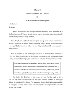
  • 1. Chapter 8 Interface Elements and Controls By Dr. Ramkumar Lakshminarayanan Introduction TextView One of the most basic user interface elements, or controls, in the Android SDK is the TextView control. You use it, quite simply, to draw text on the screen. You primarily use it to display fixed text strings or labels. First, though, let’s see how to put some quick text up on the screen. <TextView> is the XML layout file tag used to display text on the screen. You can set the android:text property of the TextView to be either a raw text string in the layout file or a reference to a string resource. Here are examples of both methods you can use to set the android:text attribute of a TextView. The first method sets the text attribute to a raw string; the second method uses a string resource called sample_text, which must be defined in the strings.xml resource file. To display this TextView on the screen, all your Activity needs to do is call the setContentView() method with the layout resource identifier in which you defined the preceding XML shown. You can change the text displayed programmatically by calling the setText() method on the TextView object. Retrieving the text is done with the getText() method. <TextView android:id=”@+id/TextView01” android:layout_width=”wrap_content” android:layout_height=”wrap_content” android:text=”Some sample text here” /> <TextView android:id=”@+id/TextView02” android:layout_width=”wrap_content” android:layout_height=”wrap_content” android:text=”@string/sample_text” />
  • 2. Retrieving Text Input Using EditText Controls The Android SDK provides a convenient control called EditText to handle text input from a user. The EditText class is derived from TextView. In fact, most of its functionality is contained within TextView but enabled when created as an EditText. The EditText object has a number of useful features enabled by default First, though, let’s see how to define an EditText control in an XML layout file: This layout code shows a basic EditText element. There are a couple of interesting things to note. First, the hint attribute puts some text in the edit box that goes away when the user starts entering text. Essentially, this gives a hint to the user as to what should go there. Next is the lines attribute, which defines how many lines tall the input box is. If this is not set, the entry field grows as the user enters text. However, setting a size allows the user to scroll within a fixed sized to edit the text. This also applies to the width of the entry. By default, the user can perform a long press to bring up a context menu. This provides to the user some basic copy, cut, and paste operations as well as the ability to change the input method and add a word to the user’s dictionary of frequently used words. <EditText android:id=”@+id/EditText01” android:layout_height=”wrap_content” android:hint=”type here”android:lines=”4” android:layout_width=”fill_parent” />
  • 3. Figure 8.1 Various styles of EditText controls and Spinner and Button controls Giving Users Input Choices Using Spinner Controls Sometimes you want to limit the choices available for users to type. For instance, if users are going to enter the name of a state, you might as well limit them to only the valid states because this is a known set. Although you could do this by letting them type something and then blocking invalid entries, you can also provide similar functionality with a Spinner control. As with the auto-complete method, the possible choices for a spinner can come from an Adapter. You can also set the available choices in the layout definition by using the entries attribute with an array resource (specifically a string-array that is referenced as something such as @array/state- list).The Spinner control isn’t actually an EditText, although it is frequently used in a similar fashion. Here is an example of the XML layout definition for a Spinner control for choosing a color: <Spinner android:id=”@+id/Spinner01” android:layout_width=”wrap_content” android:layout_height=”wrap_content” android:entries=”@array/colors” android:prompt=”@string/spin_prompt” /> Resource : <array name=”colors”><item>red</item><item>green</item><item>blue</item></array>
  • 4. Figure 8.2 Filtering choices with a spinner control When the user selects it, a pop-up shows the prompt text followed by a list of the possible choices. This list allows only a single item to be selected at a time, and when one is selected, the pop-up goes away. Using Basic Buttons The android.widget.Button class provides a basic button implementation in the Android SDK. Within the XML layout resources, buttons are specified using the Button element. The primary attribute for a basic button is the text field. This is the label that appears on the middle of the button’s face. You often use basic Button controls for buttons with text such as “Ok,”“Cancel,” or “Submit.” The following XML layout resource file shows a typical Button control definition: A button won’t do anything, other than animate, without some code to handle the click event. Here is an example of some code that handles a click for a basic button and displays a Toast message on the screen: <Button android:id=”@+id/basic_button” android:layout_width=”wrap_content” android:layout_height=”wrap_content” android:text=”Basic Button” /> setContentView(R.layout.buttons); final Button basic_button = (Button) findViewById(R.id.basic_button); basic_button.setOnClickListener(new View.OnClickListener() { public void onClick(View v) { EditText t2=(EditText)findViewById(R.id.EditText02); EditText t1=(EditText)findViewById(R.id.EditText01); t2.setText(t1.getText()); } });
  • 5. To handle the click event for when a button is pressed, we first get a reference to the Button by its resource identifier. Next, the setOnClickListener() method is called. It requires a valid instance of the class View.OnClickListener. A simple way to provide this is to define the instance right in the method call. This requires implementing the onClick() method. Within the onClick() method, you are free to carry out whatever actions you need. Here, we simply display a message to the users telling them that the button was, in fact, clicked. A button with its primary label as an image is an ImageButton. An ImageButton is, for most purposes, almost exactly like a basic button. Click actions are handled in the same way. The primary difference is that you can set its src attribute to be an image. Here is an example of an ImageButton definition in an XML layout resource file: In this case, a small drawable resource is referenced. Using Check Boxes The check box button is often used in lists of items where the user can select multiple items. The Android check box contains a text attribute that appears to the side of the check box. This is used in a similar way to the label of a basic button. In fact, it’s basically a TextView next to the button. Here’s an XML layout resource definition for a CheckBox control: The following example shows how to check for the state of the button programmatically and change the text label to reflect the change: <ImageButton android:layout_width=”wrap_content” android:layout_height=”wrap_content” android:id=”@+id/image_button” android:src=”@drawable/droid” /> <CheckBox android:id=”@+id/checkbox” android:layout_width=”wrap_content” android:layout_height=”wrap_content” android:text=”Check me?” /> final CheckBox check_button = (CheckBox) findViewById(R.id.checkbox); check_button.setOnClickListener(new View.OnClickListener() { public void onClick (View v) { TextView tv = (TextView)findViewById(R.id.checkbox); tv.setText(check_button.isChecked() ? “This option is checked” : “This option is not checked”); } });
  • 6. This is similar to the basic button. A check box automatically shows the check as enabled or disabled. This enables us to deal with behavior in our application rather than worrying about how the button should behave. The layout shows that the text starts out one way but, after the user presses the button, the text changes to one of two different things depending on the checked state. As the code shows, the CheckBox is also a TextView. Figure 8.3 Various types of buttons Using RadioGroups and RadioButtons You often use radio buttons when a user should be allowed to only select one item from a small group of items. For instance, a question asking for gender can give three options: male, female, and unspecified. Only one of these options should be checked at a time. The RadioButton objects are similar to CheckBox objects. They have a text label next to them, set via the text attribute, and they have a state (checked or unchecked). However, you can group RadioButton objects inside a RadioGroup that handles enforcing their combined states so that only one RadioButton can be checked at a time. If the user selects a RadioButton that is already checked, it does not become unchecked. However, you can provide the user with an action to clear the state of the entire RadioGroup so that none of the buttons are checked. Here we have an XML layout resource with a RadioGroup containing four RadioButton objects. The RadioButton objects have text labels,“Option 1,” and so on. The XML layout resource definition is shown here:
  • 7. You handle actions on these RadioButton objects through the RadioGroup object. The following example shows registering for clicks on the RadioButton objects within the RadioGroup: <RadioGroup android:id=”@+id/RadioGroup01” android:layout_width=”wrap_content” android:layout_height=”wrap_content”> <RadioButton android:id=”@+id/RadioButton01” android:layout_width=”wrap_content” android:layout_height=”wrap_content” android:text=”Option 1”></RadioButton> <RadioButton android:id=”@+id/RadioButton02” android:layout_width=”wrap_content” android:layout_height=”wrap_content” android:text=”Option 2”></RadioButton> <RadioButton android:id=”@+id/RadioButton03” android:layout_width=”wrap_content” android:layout_height=”wrap_content” android:text=”Option 3”></RadioButton> <RadioButton android:id=”@+id/RadioButton04” android:layout_width=”wrap_content” android:layout_height=”wrap_content” android:text=”Option 4”></RadioButton> </RadioGroup> final RadioGroup group = (RadioGroup)findViewById(R.id.RadioGroup01); final TextView tv = (TextView) findViewById(R.id.TextView01); group.setOnCheckedChangeListener(new RadioGroup.OnCheckedChangeListener() { public void onCheckedChanged( RadioGroup group, int checkedId) { if (checkedId != -1) { RadioButton rb = (RadioButton) findViewById(checkedId); if (rb != null) { tv.setText(“You chose: “ + rb.getText()); } } else { tv.setText(“Choose 1”); } } });
  • 8. As this layout example demonstrates, there is nothing special that you need to do to make the RadioGroup and internal RadioButton objects work properly. The preceding code illustrates how to register to receive a notification whenever the RadioButton selection changes. The code demonstrates that the notification contains the resource identifier for the specific RadioButton that the user chose, as assigned in the layout file. To do something interesting with this, you need to provide a mapping between this resource identifier (or the text label) to the corresponding functionality in your code. In the example, we query for the button that was selected, get its text, and assign its text to another TextView control that we have on the screen. Getting Dates and Times from Users The Android SDK provides a couple controls for getting date and time input from the user. The first is the DatePicker control. It can be used to get a month, day, and year from the user. The basic XML layout resource definition for a DatePicker follows: As you can see from this example, there aren’t any attributes specific to the DatePicker control. As with many of the other controls, your code can register to receive a method call when the date changes. You do this by implementing the onDateChanged() method. However, this isn’t done the usual way. The preceding code sets the DatePicker.OnDateChangedListener by a call to the DatePicker.init() method. A DatePicker control is initialized with the current date. A TextView is set with the date value that the user entered into the DatePicker control. The value of 1900 is subtracted from the year parameter to make it compatible with the java.util.Date class. <DatePicker android:id=”@+id/DatePicker01” android:layout_width=”wrap_content” android:layout_height=”wrap_content” /> final DatePicker date = (DatePicker)findViewById(R.id.DatePicker01); date.init(date.getYear(), date.getMonth(), date.getDayOfMonth(), new DatePicker.OnDateChangedListener() { public void onDateChanged(DatePicker view, int year, int monthOfYear, int dayOfMonth) { Date dt = new Date(year-1900, monthOfYear, dayOfMonth, time.getCurrentHour(), time.getCurrentMinute()); text.setText(dt.toString()); } });
  • 9. A TimePicker control is similar to the DatePicker control. It also doesn’t have any unique attributes. However, to register for a method call when the values change, you call the more traditional method of TimePicker.setOnTimeChangedListener(). time.setOnTimeChangedListener(new TimePicker.OnTimeChangedListener() { public void onTimeChanged(TimePicker view, int hourOfDay, int minute) { Date dt = new Date(date.getYear()-1900, date.getMonth(), date.getDayOfMonth(), hourOfDay, minute); text.setText(dt.toString()); } }); As in the previous example, this code also sets a TextView to a string displaying the time value that the user entered. When you use the DatePicker control and the TimePicker control together, the user can set a full date and time. Figure 8.4 Date and Time Control Using Indicators to Display Data to Users The Android SDK provides a number of controls that can be used to visually show some form of information to the user. These indicator controls include progress bars, clocks, and other similar controls. Indicating Progress with ProgressBar Applications commonly perform actions that can take a while. A good practice during this time is to show the user some sort of progress indicator that informs the user that the application is off “doing something.”Applications can also show how far a user is through some operation, such as a playing a song or watching a video. The Android SDK provides several types of progress bars.
  • 10. The standard progress bar is a circular indicator that only animates. It does not show how complete an action is. It can, however, show that something is taking place. This is useful when an action is indeterminate in length. There are three sizes of this type of progress indicator. Figure 8.5 Various types of progress and rating Indicators The second type is a horizontal progress bar that shows the completeness of an action. (For example, you can see how much of a file is downloading.) This horizontal progress bar can also have a secondary progress indicator on it. This can be used, for instance, to show the completion of a downloading media file while that file plays. This is an XML layout resource definition for a basic indeterminate progress bar: The default style is for a medium-size circular progress indicator; not a “bar” at all. The other two styles for indeterminate progress bar are progressBarStyleLarge and progressBarStyleSmall. This style animates automatically. The next sample shows the layout definition for a horizontal progress indicator: <ProgressBar android:id=”@+id/progress_bar” android:layout_width=”wrap_content” android:layout_height=”wrap_content” />
  • 11. We have also set the attribute for max in this sample to 100.This can help mimic a percentage progress bar. That is, setting the progress to 75 shows the indicator at 75 percent complete. We can set the indicator progress status programmatically as follows: You can also put these progress bars in your application’s title bar (as shown in Figure). This can save screen real estate. This can also make it easy to turn on and off an indeterminate progress indicator without changing the look of the screen. Indeterminate progress indicators are commonly used to display progress on pages where items need to be loaded before the page can finish drawing. This is often employed on web browser screens. The following code demonstrates how to place this type of indeterminate progress indicator on your Activity screen: To use the indeterminate indicator on your Activity objects title bar, you need to request the feature Window.FEATURE_INDETERMINATE_PROGRESS, as previously shown. This shows a small circular indicator in the right side of the title bar. For a horizontal progress bar style that shows behind the title, you need to enable the Window.FEATURE_PROGRESS. These features must be enabled before your application calls the setContentView() method, as shown in the preceding example. You need to know about a couple of important default behaviors. First, the indicators are visible by default. Calling the visibility methods shown in the preceding example can set their visibility on or off. Second, the horizontal progress bar defaults to a maximum progress value of 10,000. In the preceding example, we set it to 5,000, which is equivalent to 50 percent. When the <ProgressBar android:id=”@+id/progress_bar” style=”?android:attr/progressBarStyleHorizontal” android:layout_width=”fill_parent” android:layout_height=”wrap_content” android:max=”100” /> mProgress = (ProgressBar) findViewById(R.id.progress_bar); mProgress.setProgress(75); requestWindowFeature(Window.FEATURE_INDETERMINATE_PROGRESS); requestWindowFeature(Window.FEATURE_PROGRESS); setContentView(R.layout.indicators); setProgressBarIndeterminateVisibility(true); setProgressBarVisibility(true); setProgress(5000);
  • 12. value reaches the maximum value, the indicators fade away so that they aren’t visible. This happens for both indicators. Adjusting Progress with SeekBar You have seen how to display progress to the user. What if, however, you want to give the user some ability to move the indicator, for example, to set the current cursor position in a playing media file or to tweak a volume setting? You accomplish this by using the SeekBar control provided by the Android SDK. It’s like the regular horizontal progress bar, but includes a thumb, or selector, that can be dragged by the user. A default thumb selector is provided, but you can use any drawable item as a thumb. Here we have an example of an XML layout resource definition for a simple SeekBar: With this sample SeekBar, the user can drag the thumb to any value between 0 and 500. Although this is shown visually, it might be useful to show the user what exact value the user is selecting.To do this, you can provide an implementation of the onProgressChanged() method, as shown here: <SeekBar android:id=”@+id/seekbar1” android:layout_height=”wrap_content” android:layout_width=”240px” android:max=”500” /> SeekBar seek = (SeekBar) findViewById(R.id.seekbar1); seek.setOnSeekBarChangeListener( new SeekBar.OnSeekBarChangeListener() { public void onProgressChanged( SeekBar seekBar, int progress,boolean fromTouch) { ((TextView)findViewById(R.id.seek_text)) .setText(“Value: “+progress); seekBar.setSecondaryProgress( (progress+seekBar.getMax())/2); } });
  • 13. There are two interesting things to notice in this example. The first is that the fromTouch. parameter tells the code if the change came from the user input or if, instead, it came from a programmatic change as demonstrated with the regular ProgressBar controls. The second interesting thing is that the SeekBar still enables you to set a secondary progress value. In this example, we set the secondary indicator to be halfway between the user’s selected value and the maximum value of the progress bar. You might use this feature to show the progress of a video and the buffer stream. Displaying Rating Data with RatingBar Although the SeekBar is useful for allowing a user to set a value, such as the volume, the RatingBar has a more specific purpose: showing ratings or getting a rating from a user. By default, this progress bar uses the star paradigm with five stars by default. A user can drag across this horizontal to set a rating. A program can set the value, as well. However, the secondary indicator cannot be used because it is used internally by this particular control. Here’s an example of an XML layout resource definition for a RatingBar with four stars: This layout definition for a RatingBar demonstrates setting both the number of stars and the increment between each rating value. Here, users can choose any rating value between 0 and 4.0, but only in increments of 0.25, the stepSize value. For instance, users can set a value of 2.25.This is visualized to the users, by default, with the stars partially filled. Figure (center) illustrates how the RatingBar behaves. Although the value is indicated to the user visually, you might still want to show a numeric representation of this value to the user. You can do this by implementing the onRatingChanged() method of the RatingBar.OnRatingBarChangeListener class. <RatingBar android:id=”@+id/ratebar1” android:layout_width=”wrap_content” android:layout_height=”wrap_content” android:numStars=”4” android:stepSize=”0.25” /> RatingBar rate = (RatingBar) findViewById(R.id.ratebar1); rate.setOnRatingBarChangeListener(new RatingBar.OnRatingBarChangeListener() { public void onRatingChanged(RatingBar ratingBar, float rating, boolean fromTouch) { ((TextView)findViewById(R.id.rating_text)) .setText(“Rating: “+ rating); } });
  • 14. The preceding example shows how to register the listener. When the user selects a rating using the control, a TextView is set to the numeric rating the user entered. One interesting thing to note is that, unlike the SeekBar, the implementation of the onRatingChange() method is called after the change is complete, usually when the user lifts a finger. That is, while the user is dragging across the stars to make a rating, this method isn’t called. It is called when the user stops pressing the control. Showing Time Passage with the Chronometer Sometimes you want to show time passing instead of incremental progress. In this case, you can use the Chronometer control as a timer .This might be useful if it’s the user who is taking time doing some task or in a game where some action needs to be timed.The Chronometer control can be formatted with text, as shown in this XML layout resource definition: You can use the Chronometer object’s format attribute to put text around the time that displays. A Chronometer won’t show the passage of time until its start() method is called. To stop it, simply call its stop() method. Finally, you can change the time from which the timer is counting. That is, you can set it to count from a particular time in the past instead of from the time it’s started.You call the setBase() method to do this. In this next example code, the timer is retrieved from the View by its resource identifier. We then check its base value and set it to 0. Finally, we start the timer counting up from there. <Chronometer android:id=”@+id/Chronometer01” android:layout_width=”wrap_content” android:layout_height=”wrap_content” android:format=”Timer: %s” /> final Chronometer timer = (Chronometer)findViewById(R.id.Chronometer01); long base = timer.getBase(); Log.d(ViewsMenu.debugTag, “base = “+ base); timer.setBase(0); timer.start();
  • 15. Displaying the Time Displaying the time in an application is often not necessary because Android devices have a status bar to display the current time. However, there are two clock controls available to display this information: the DigitalClock and AnalogClock controls. Using the DigitalClock The DigitalClock control . is a compact text display of the current time in standard numeric format based on the users’ settings. It is a TextView, so anything you can do with a TextView you can do with this control, except change its text. You can change the color and style of the text, for example. By default, the DigitalClock control shows the seconds and automatically updates as each second ticks by. Here is an example of an XML layout resource definition for a DigitalClock control: Using the AnalogClock The AnalogClock control is a dial-based clock with a basic clock face with two hands, one for the minute and one for the hour. It updates automatically as each minute passes. The image of the clock scales appropriately with the size of its View. Here is an example of an XML layout resource definition for an AnalogClock control: The AnalogClock control’s clock face is simple. However you can set its minute and hour hands. You can also set the clock face to specific drawable resources, if you want to jazz it up. Neither of these clock controls accepts a different time or a static time to display. They can show only the current time in the current time zone of the device, so they are not particularly useful. Providing Users with Options Menu <DigitalClock android:id=”@+id/DigitalClock01” android:layout_width=”wrap_content” android:layout_height=”wrap_content” /> <AnalogClock android:id=”@+id/AnalogClock01” android:layout_width=”wrap_content” android:layout_height=”wrap_content” />
  • 16. You need to be aware of two special application menus for use within your Android applications: the options menu and the context menu. Enabling the Options Menu The Android SDK provides a method for users to bring up a menu by pressing the menu key from within the application. You can use options menus within your application to bring up help, to navigate, to provide additional controls, or to configure options. The OptionsMenu control can contain icons, submenus, and keyboard shortcuts. Figure 8.6 Option Menu For an options menu to show when a user presses the Menu button on their device, you need to override the implementation of onCreateOptionsMenu() in your Activity. Here is a sample implementation that gives the user three menu items to choose from: For each of the items that are added, we also set a built-in icon resource and assign an Intent to each item. We give the item title with a regular text string, for clarity. You can use a resource identifier, as well. For this example, there is no other handling or code needed. When one of these menu items is selected, the Activity described by the Intent starts. public boolean onCreateOptionsMenu( android.view.Menu menu) { super.onCreateOptionsMenu(menu); menu.add(“Forms”) .setIcon(android.R.drawable.ic_menu_edit) .setIntent(new Intent(this, FormsActivity.class)); menu.add(“Indicators”) .setIntent(new Intent(this, IndicatorsActivity.class)) .setIcon(android.R.drawable.ic_menu_info_details); menu.add(“Containers”) .setIcon(android.R.drawable.ic_menu_view) .setIntent(new Intent(this, ContainersActivity.class)); return true; }
  • 17. This type of options menu can be useful for navigating to important parts of an application, such as the help page, from anywhere within your application. Another great use for an options menu is to allow configuration options for a given screen. The user can configure these options in the form of checkable menu items. Working with Dialogs An Activity can use dialogs to organize information and react to user-driven events. For example, an activity might display a dialog informing the user of a problem or ask the user to confirm an action such as deleting a data record. Using dialogs for simple tasks helps keep the number of application activities manageable. Exploring the Different Types of Dialogs There are a number of different dialog types available within the Android SDK. Each has a special function that most users should be somewhat familiar with. The dialog types available include • Dialog: The basic class for all Dialog types. A basic Dialog is shown in the top left of Figure • AlertDialog: A Dialog with one, two, or three Button controls. An AlertDialog is shown in the top center of Figure • CharacterPickerDialog: A Dialog for choosing an accented character associated with a base character. A CharacterPickerDialog is shown in the top right of Figure • DatePickerDialog: A Dialog with a DatePicker control. A DatePickerDialog is shown in the bottom left of Figure • ProgressDialog: A Dialog with a determinate or indeterminate ProgressBar control.An indeterminate ProgressDialog is shown in the bottom center of Figure • TimePickerDialog: A Dialog with a TimePicker control. A TimePickerDialog is shown in the bottom right of Figure
  • 18. Figure 8.7 The different dialog types available in Android If none of the existing Dialog types is adequate, you can also create custom Dialog windows, with your specific layout requirements. Tracing the Lifecycle of a Dialog Each Dialog must be defined within the Activity in which it is used. A Dialog may be launched once, or used repeatedly. Understanding how an Activity manages the Dialog lifecycle is important to implementing a Dialog correctly. Let’s look at the key methods that an Activity must use to manage a Dialog: • The showDialog() method is used to display a Dialog. • The dismissDialog() method is used to stop showing a Dialog. The Dialog is kept around in the Activity’s Dialog pool. If the Dialog is shown again using showDialog(), the cached version is displayed once more. • The removeDialog() method is used to remove a Dialog from the Activity objects Dialog pool. The Dialog is no longer kept around for future use. If you call showDialog() again, the Dialog must be re-created. Adding the Dialog to an Activity involves several steps: 1. Define a unique identifier for the Dialog within the Activity. 2. Implement the onCreateDialog() method of the Activity to return a Dialog of the appropriate type, when supplied the unique identifier. 3. Implement the onPrepareDialog() method of the Activity to initialize the Dialog as appropriate. 4. Launch the Dialog using the showDialog() method with the unique identifier. Summary In this chapter we have seen the various element of Android SDK, we will see more about their usage in User Interface Design.