Downloaded 1,016 times
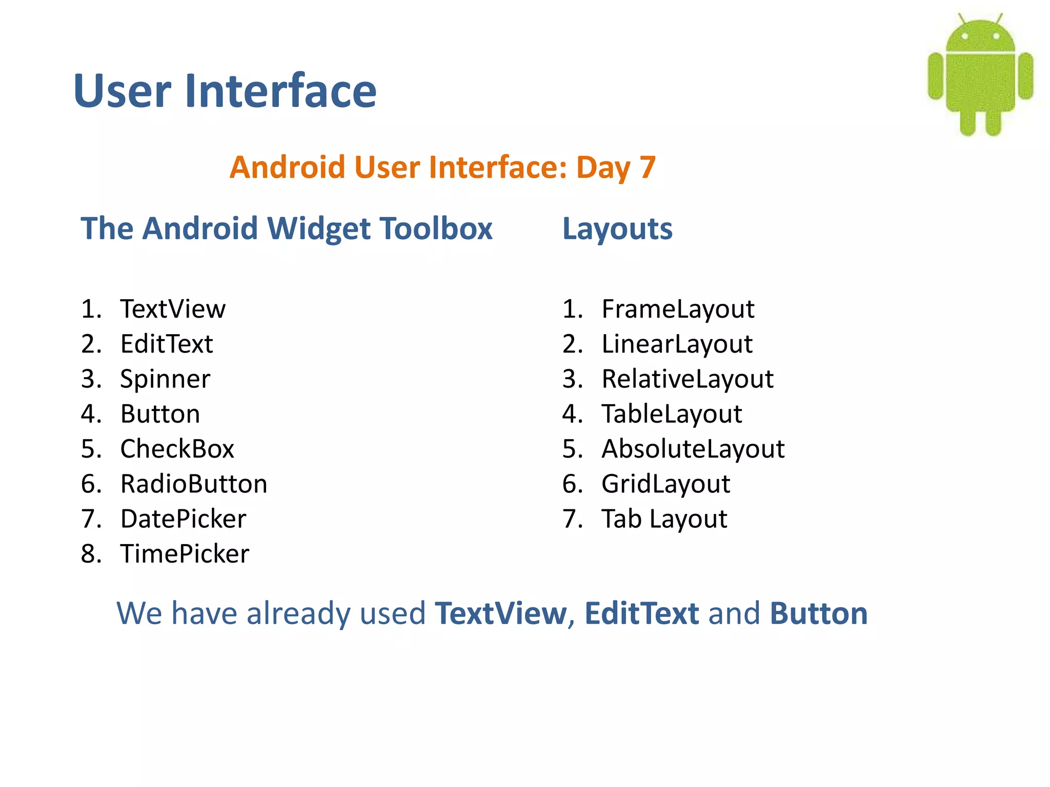
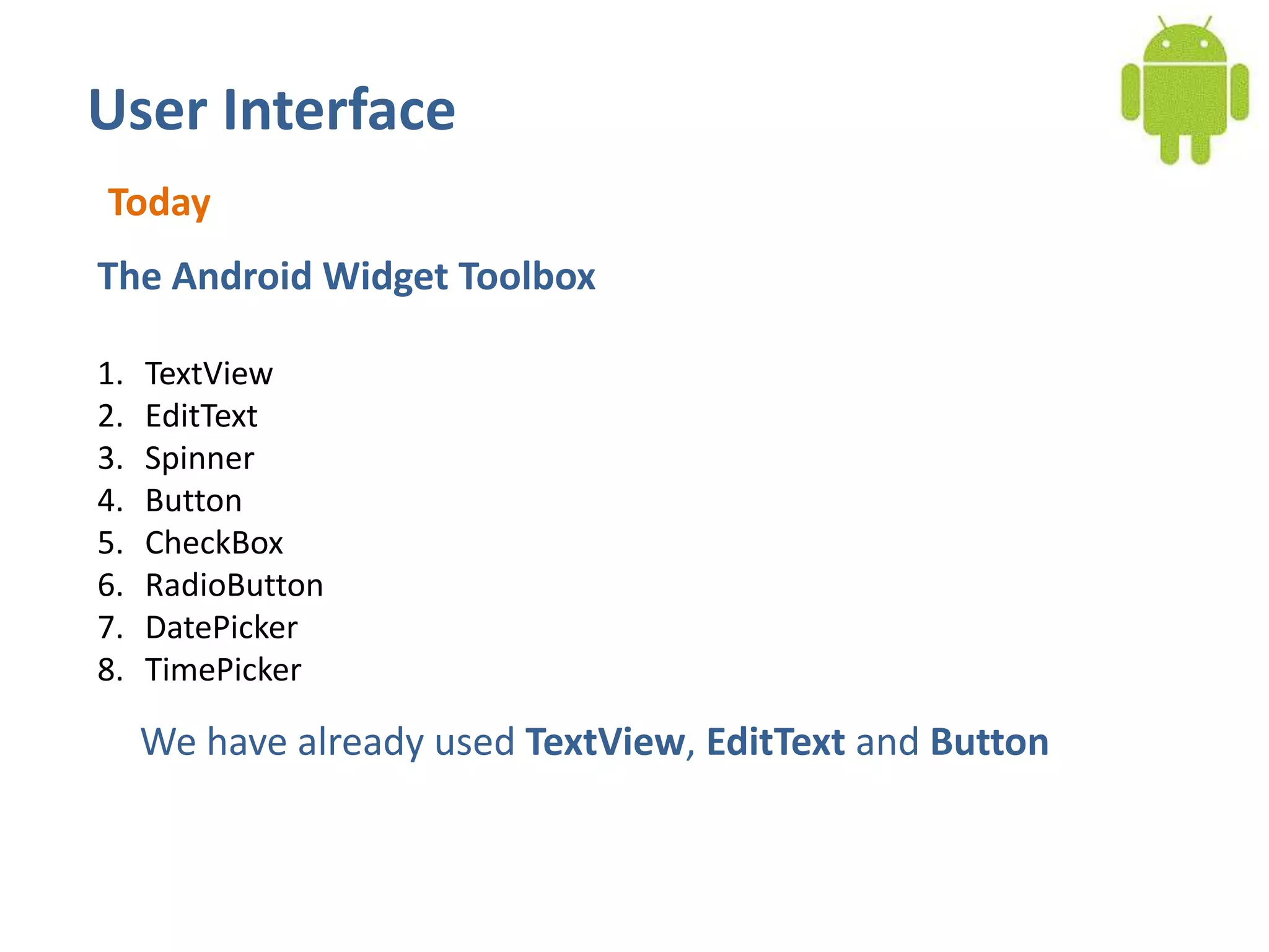
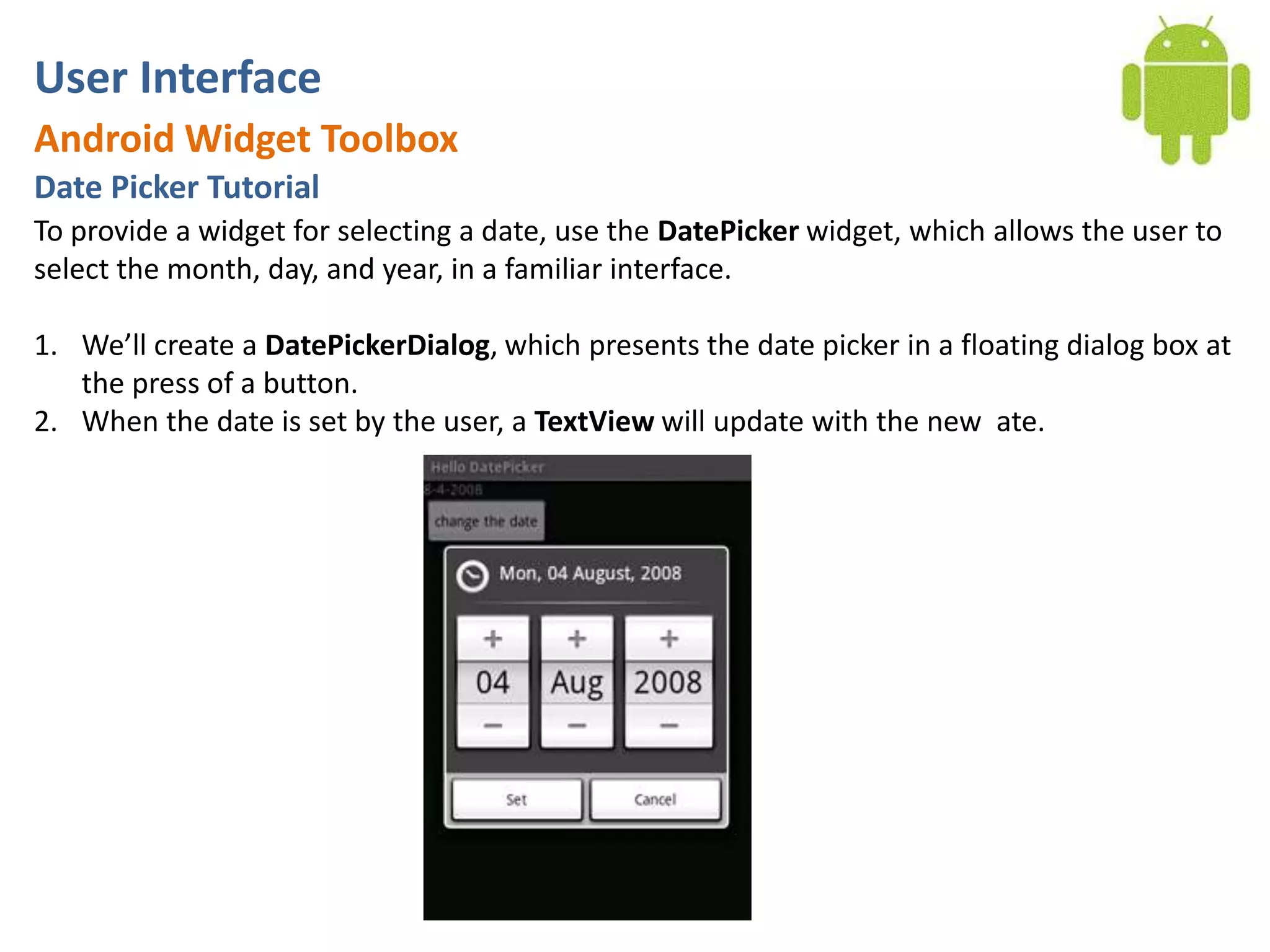
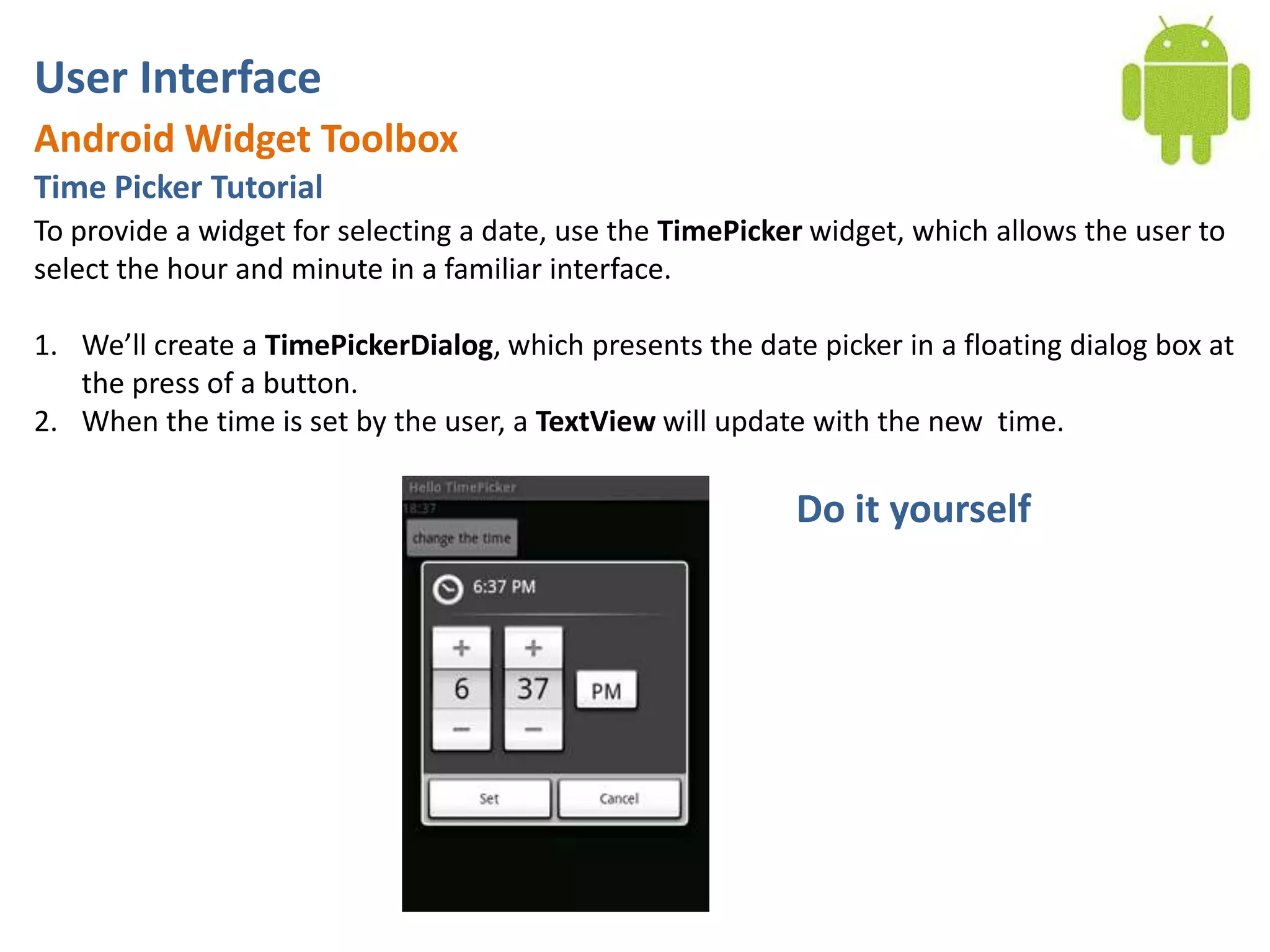
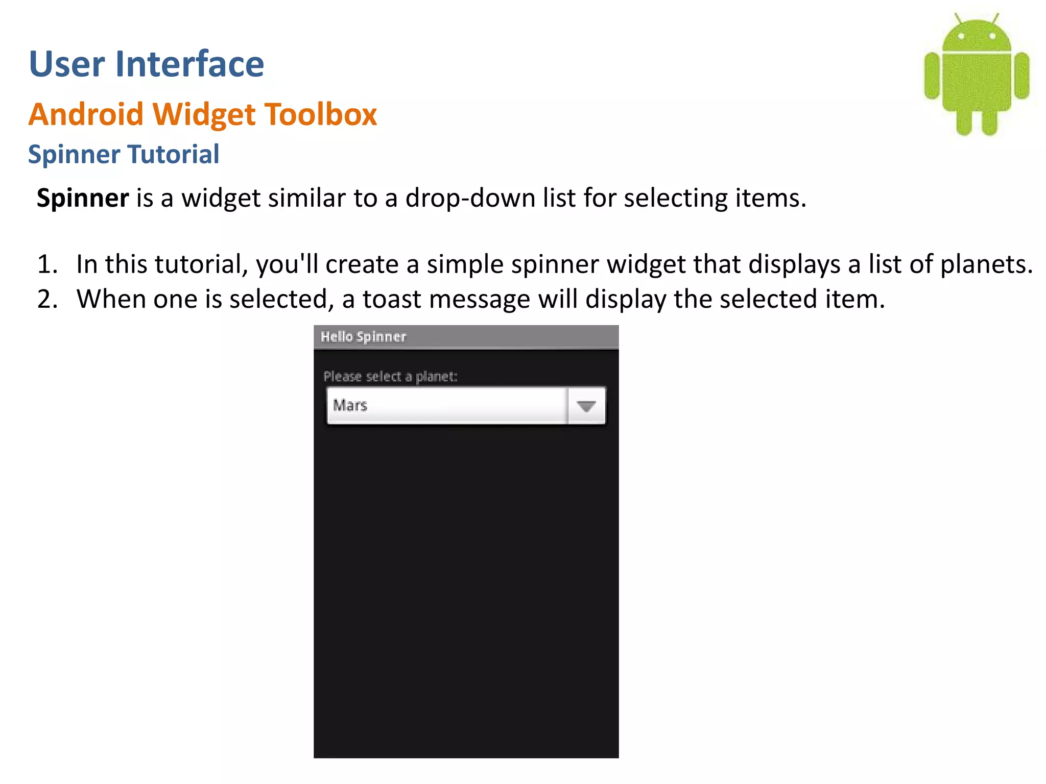

The document covers the basics of Android application development with a focus on user interface components and widgets such as TextView, EditText, Spinner, DatePicker, TimePicker, CheckBox, RadioButton, and more. It includes detailed tutorials on creating various UI elements, their functionalities, and associated code examples. Key elements discussed include the implementation of listeners and callbacks to handle user interactions with these widgets.


![Day 5: Android User Interface [View Widgets]](https://cdn.slidesharecdn.com/ss_thumbnails/android1-7-130407053041-phpapp02-thumbnail.jpg?width=640&height=640&fit=bounds)


![[Android] Using Selection Widgets](https://cdn.slidesharecdn.com/ss_thumbnails/trainingandroidlesson3-130304082858-phpapp01-thumbnail.jpg?width=640&height=640&fit=bounds)