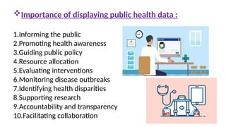
Importance of displayingpublic health data :
1.Informing the public
2.Promoting health awareness
3.Guiding public policy
4.Resource allocation
5.Evaluating interventions
6.Monitoring disease outbreaks
7.Identifying health disparities
8.Supporting research
9.Accountability and transparency
10.Facilitating collaboration
3.
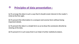
Principles ofdata presentation :
(a) To arrange the data in such a way that it should create interest in the reader’s
mind at the first sight.
(b) To present the information in a compact and concise form without losing
important details.
(c) To present the data in a simple form so as to draw the conclusion directly by
viewing at the data.
(d) To present it in such away that it can help in further statistical analysis.
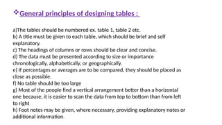
General principles ofdesigning tables :
a)The tables should be numbered ex. table 1, table 2 etc.
b) A title must be given to each table, which should be brief and self
explanatory.
c) The headings of columns or rows should be clear and concise.
d) The data must be presented according to size or importance
chronologically, alphabetically, or geographically.
e) If percentages or averages are to be compared, they should be placed as
close as possible.
f) No table should be too large
g) Most of the people find a vertical arrangement better than a horizontal
one because, it is easier to scan the data from top to bottom than from left
to right
h) Foot notes may be given, where necessary, providing explanatory notes or
additional information.
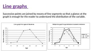
Successive points arejoined by means of line segments so that a glance at the
graph is enough for the reader to understand the distribution of the variable.
Line graphs
9.
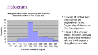
• It isa set of vertical bars
whose areas are
proportional to the
frequencies of the classes
that they represent.
• It consist of a series of
blocks. The class intervals
are given along horizontal
axis and the frequency
along the vertical axis
Histogram
10.
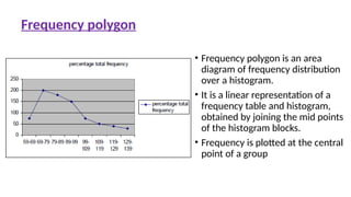
• Frequency polygonis an area
diagram of frequency distribution
over a histogram.
• It is a linear representation of a
frequency table and histogram,
obtained by joining the mid points
of the histogram blocks.
• Frequency is plotted at the central
point of a group
Frequency polygon
11.
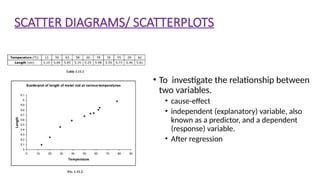
SCATTER DIAGRAMS/ SCATTERPLOTS
•To investigate the relationship between
two variables.
• cause-effect
• independent (explanatory) variable, also
known as a predictor, and a dependent
(response) variable.
• After regression
12.
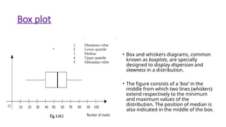
Box plot
• Boxand whiskers diagrams, common
known as boxplots, are specially
designed to display dispersion and
skewness in a distribution.
• The figure consists of a ‘box’ in the
middle from which two lines (whiskers)
extend respectively to the minimum
and maximum values of the
distribution. The position of median is
also indicated in the middle of the box.
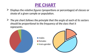
Displays therelative figures (proportions or percentages) of classes or
strata of a given sample or population.
The pie chart follows the principle that the angle of each of its sectors
should be proportional to the frequency of the class that it
represents.
PIE CHART
15.
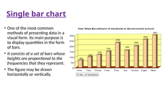
Single bar chart
•One of the most common
methods of presenting data in a
visual form. Its main purpose is
to display quantities in the form
of bars.
• It consists of a set of bars whose
heights are proportional to the
frequencies that they represent.
• The figure may be drawn
horizontally or vertically.
16.
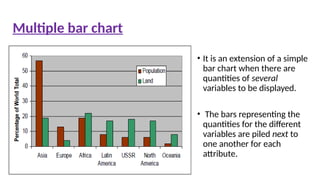
• It isan extension of a simple
bar chart when there are
quantities of several
variables to be displayed.
• The bars representing the
quantities for the different
variables are piled next to
one another for each
attribute.
Multiple bar chart
17.
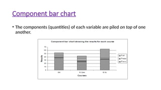
Component bar chart
•The components (quantities) of each variable are piled on top of one
another.
18.
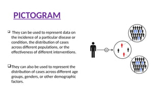
PICTOGRAM
They canbe used to represent data on
the incidence of a particular disease or
condition, the distribution of cases
across different populations, or the
effectiveness of different interventions.
They can also be used to represent the
distribution of cases across different age
groups, genders, or other demographic
factors.
19.
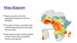
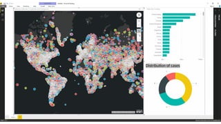
Maps are usedto show the
geographic location of events or
attributes.
Two types of maps commonly used
in field epidemiology are spot maps
and area maps.
Spot maps use dots or other symbols
to show where each case-patient
lived or was exposed
Map diagram
20.
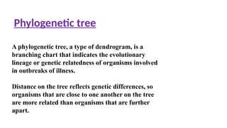
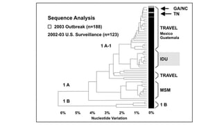
Phylogenetic tree
A phylogenetictree, a type of dendrogram, is a
branching chart that indicates the evolutionary
lineage or genetic relatedness of organisms involved
in outbreaks of illness.
Distance on the tree reflects genetic differences, so
organisms that are close to one another on the tree
are more related than organisms that are further
apart.
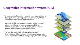
A geographicinformation system is a computer system for
the input, editing, storage, retrieval, analysis, synthesis,
and output of location-based information.
In public health, GIS may use geographic distribution of
cases or risk factors, health service availability or
utilization, presence of insect vectors, environmental
factors, and other location-based variables.
GIS can be particularly effective when layers of
information or different types of information about place
are combined to identify or clarify geographic relationships
Geographic information system (GIS)
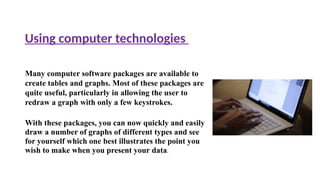
Many computer softwarepackages are available to
create tables and graphs. Most of these packages are
quite useful, particularly in allowing the user to
redraw a graph with only a few keystrokes.
With these packages, you can now quickly and easily
draw a number of graphs of different types and see
for yourself which one best illustrates the point you
wish to make when you present your data.
Using computer technologies
27.
Part-I Overview ReportHealth MDDS.pdf (
mohfw.gov.in)
Public Health Data Policy and Standards | CDC
standards-for-public-health-inform
ation-services.pdf (who.int)
Principles of Epidemiology in Public Health Practice ,3rd
Edition
published on may2012 center for disease control
References :