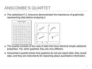
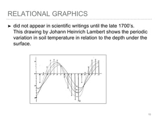
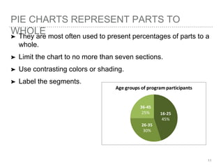
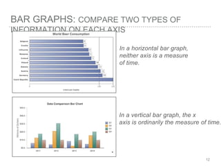
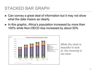
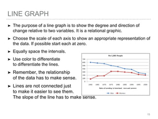
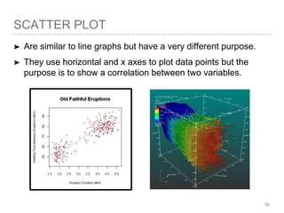
HOW TO GRAPHICALLY
Represent Data
1
A BRIEF HISTORY OF VISUALIZING
QUANTITATIVE DATA➤ Visually representing numbers is a new invention.
➤ It was not until 1750-1800 that statistical graphics were
invented.
2
THE WORK OF THREE PEOPLE FOUNDATIONAL
TO MODERN GRAPHICS:
➤ William Playfair (1759-1823) a Scottish engineer and political
scientist invented three types of graphics: the line chart, bar
chart, and pie chart.
➤ Charles Joseph Minard (1781-1870) a French civil engineer
created cartographic representations of data — combining
data with maps to display the flow of people and goods.
➤ Florence Nightengale (1820-1910) a nurse, statistician, and
medical reformer innovatively visualized data in her persuasive
reports to the British Parliament in easy-to-understand
informational graphics.
WILLIAM PLAYFAIR’S GRAPHIC
REPRESENTATIONS
And I did not use Excel.
4
MINARD’S GRAPHIC OF NAPOLEON’S ARMY
INVADING RUSSIA IN 1912:
➤ Six variables are plotted and the take away here is to realize
that graphics can convey a high level of complexity if
handled right.
5
NIGHTENGALE’S REPORTS TO
PARLIAMENT:➤ Include graphics she created to her support arguments about
the need for medical reform. She graphically represented data
using standard bar charts, but she also visualized data in an
innovative way.
NIGHTENGALE’S COXCOMB OR POLAR
CHART:➤ displayed causes of deaths of soldiers during the Crimean
war. It conveyed, at-a-glance, how more soldiers died from
infection than from wounds.
ANSCOMBE’S QUARTET
➤ The statistician F.J. Anscome demonstrated the importance of graphically
representing data before analyzing it.
➤ The quartet consists of four sets of data that have identical simple statistical
properties. Yet, when graphed, they are very different.
➤ Anscombe’s quartet shows how graphics do not just report data, they reveal
data, and they are instruments for reasoning about quantitative information.
8
DATA MAP: SCATTER PLOT
9
RELATIONAL GRAPHICS
➤ did not appear in scientific writings until the late 1700’s.
This drawing by Johann Heinrich Lambert shows the periodic
variation in soil temperature in relation to the depth under the
surface.
10
PIE CHARTS REPRESENT PARTS TO
WHOLE➤ They are most often used to present percentages of parts to a
whole.
➤ Limit the chart to no more than seven sections.
➤ Use contrasting colors or shading.
➤ Label the segments.
11
BAR GRAPHS: COMPARE TWO TYPES OF
INFORMATION ON EACH AXIS
In a horizontal bar graph,
neither axis is a measure
of time.
In a vertical bar graph, the x
axis is ordinarily the measure of time.
12
STACKED BAR GRAPH
➤ Can convey a great deal of information but it may not show
what the data means as clearly.
➤ In this graphic, Africa’s population increased by more than
100% while Non-OECD Asa increased by about 50%
While the chart is
beautiful to look
at, the meaning is
not clear.
13
COLUMN GRAPH OR BAR CHART
➤ For a vertical bar graph, start the y axis at zero and use equally
spaced intervals. For the x axis, equally space the intervals.
➤ For a horizontal bar graph, start the x axis at zero and use equally
spaced intervals. For the x axis, equally space the intervals.
➤ Label all information on the x and y axis.
➤ Limit the number of divisions. Too many will make the data difficult to
read.
➤ Use color or shading to distinguish divisions.
➤ Avoid crowding.
14
LINE GRAPH
➤ The purpose of a line graph is to show the degree and direction of
change relative to two variables. It is a relational graphic.
➤ Choose the scale of each axis to show an appropriate representation of
the data. If possible start each at zero.
➤ Equally space the intervals.
➤ Use color to differentiate
to differentiate the lines.
➤ Remember, the relationship
of the data has to make sense.
➤ Lines are not connected just
to make it easier to see them.
The slope of the line has to make sense.
15
SCATTER PLOT
➤ Are similar to line graphs but have a very different purpose.
➤ They use horizontal and x axes to plot data points but the
purpose is to show a correlation between two variables.
16
ALWAYS
➤ Label the graphic (figure 1, figure 2 etc.).
➤ Caption or title the figure.
➤ Refer to it in the narrative information you provide.
➤ Example:
Figure 1 compares the annual wages for three different jobs
in the field of professional writing.
17
FOR ADDITIONAL READING:

How to Graphically Represent Data

  • 1.
  • 2.
    A BRIEF HISTORYOF VISUALIZING QUANTITATIVE DATA➤ Visually representing numbers is a new invention. ➤ It was not until 1750-1800 that statistical graphics were invented. 2
  • 3.
    THE WORK OFTHREE PEOPLE FOUNDATIONAL TO MODERN GRAPHICS: ➤ William Playfair (1759-1823) a Scottish engineer and political scientist invented three types of graphics: the line chart, bar chart, and pie chart. ➤ Charles Joseph Minard (1781-1870) a French civil engineer created cartographic representations of data — combining data with maps to display the flow of people and goods. ➤ Florence Nightengale (1820-1910) a nurse, statistician, and medical reformer innovatively visualized data in her persuasive reports to the British Parliament in easy-to-understand informational graphics.
  • 4.
  • 5.
    MINARD’S GRAPHIC OFNAPOLEON’S ARMY INVADING RUSSIA IN 1912: ➤ Six variables are plotted and the take away here is to realize that graphics can convey a high level of complexity if handled right. 5
  • 6.
    NIGHTENGALE’S REPORTS TO PARLIAMENT:➤Include graphics she created to her support arguments about the need for medical reform. She graphically represented data using standard bar charts, but she also visualized data in an innovative way.
  • 7.
    NIGHTENGALE’S COXCOMB ORPOLAR CHART:➤ displayed causes of deaths of soldiers during the Crimean war. It conveyed, at-a-glance, how more soldiers died from infection than from wounds.
  • 8.
    ANSCOMBE’S QUARTET ➤ Thestatistician F.J. Anscome demonstrated the importance of graphically representing data before analyzing it. ➤ The quartet consists of four sets of data that have identical simple statistical properties. Yet, when graphed, they are very different. ➤ Anscombe’s quartet shows how graphics do not just report data, they reveal data, and they are instruments for reasoning about quantitative information. 8
  • 9.
  • 10.
    RELATIONAL GRAPHICS ➤ didnot appear in scientific writings until the late 1700’s. This drawing by Johann Heinrich Lambert shows the periodic variation in soil temperature in relation to the depth under the surface. 10
  • 11.
    PIE CHARTS REPRESENTPARTS TO WHOLE➤ They are most often used to present percentages of parts to a whole. ➤ Limit the chart to no more than seven sections. ➤ Use contrasting colors or shading. ➤ Label the segments. 11
  • 12.
    BAR GRAPHS: COMPARETWO TYPES OF INFORMATION ON EACH AXIS In a horizontal bar graph, neither axis is a measure of time. In a vertical bar graph, the x axis is ordinarily the measure of time. 12
  • 13.
    STACKED BAR GRAPH ➤Can convey a great deal of information but it may not show what the data means as clearly. ➤ In this graphic, Africa’s population increased by more than 100% while Non-OECD Asa increased by about 50% While the chart is beautiful to look at, the meaning is not clear. 13
  • 14.
    COLUMN GRAPH ORBAR CHART ➤ For a vertical bar graph, start the y axis at zero and use equally spaced intervals. For the x axis, equally space the intervals. ➤ For a horizontal bar graph, start the x axis at zero and use equally spaced intervals. For the x axis, equally space the intervals. ➤ Label all information on the x and y axis. ➤ Limit the number of divisions. Too many will make the data difficult to read. ➤ Use color or shading to distinguish divisions. ➤ Avoid crowding. 14
  • 15.
    LINE GRAPH ➤ Thepurpose of a line graph is to show the degree and direction of change relative to two variables. It is a relational graphic. ➤ Choose the scale of each axis to show an appropriate representation of the data. If possible start each at zero. ➤ Equally space the intervals. ➤ Use color to differentiate to differentiate the lines. ➤ Remember, the relationship of the data has to make sense. ➤ Lines are not connected just to make it easier to see them. The slope of the line has to make sense. 15
  • 16.
    SCATTER PLOT ➤ Aresimilar to line graphs but have a very different purpose. ➤ They use horizontal and x axes to plot data points but the purpose is to show a correlation between two variables. 16
  • 17.
    ALWAYS ➤ Label thegraphic (figure 1, figure 2 etc.). ➤ Caption or title the figure. ➤ Refer to it in the narrative information you provide. ➤ Example: Figure 1 compares the annual wages for three different jobs in the field of professional writing. 17
  • 18.