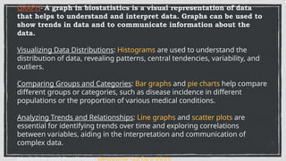
GRAPH- A graphin biostatistics is a visual representation of data
that helps to understand and interpret data. Graphs can be used to
show trends in data and to communicate information about the
data.
Visualizing Data Distributions: Histograms are used to understand the
distribution of data, revealing patterns, central tendencies, variability, and
outliers.
Comparing Groups and Categories: Bar graphs and pie charts help compare
different groups or categories, such as disease incidence in different
populations or the proportion of various medical conditions.
Analyzing Trends and Relationships: Line graphs and scatter plots are
essential for identifying trends over time and exploring correlations
between variables, aiding in the interpretation and communication of
complex data.
3.
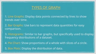
1. Line Graphs:Display data points connected by lines to show
trends over time.
2. Bar Graphs: Use bars to represent data quantities for easy
comparison.
3. Histograms: Similar to bar graphs, but specifically used to display
frequency distributions of a dataset.
4. Pie Chart: Show proportions of a whole with slices of a circle.
5. Box Plots: Display the distribution of data.
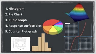
TYPES OF GRAPH
4.
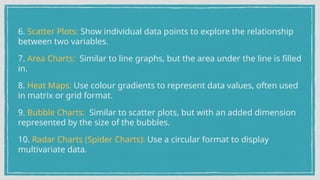
6. Scatter Plots:Show individual data points to explore the relationship
between two variables.
7. Area Charts: Similar to line graphs, but the area under the line is filled
in.
8. Heat Maps: Use colour gradients to represent data values, often used
in matrix or grid format.
9. Bubble Charts: Similar to scatter plots, but with an added dimension
represented by the size of the bubbles.
10. Radar Charts (Spider Charts): Use a circular format to display
multivariate data.
5.
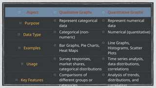
Aspect Qualitative GraphsQuantitative Graphs
Purpose
Represent categorical
data
Represent numerical
data
Data Type
Categorical (non-
numeric)
Numerical (quantitative)
Examples
Bar Graphs, Pie Charts,
Heat Maps
Line Graphs,
Histograms, Scatter
Plots
Usage
Survey responses,
market shares,
categorical distributions
Time series analysis,
data distributions,
correlations
Key Features
Comparisons of
different groups or
categories
Analysis of trends,
distributions, and
correlation
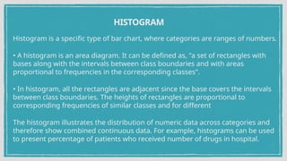
HISTOGRAM
Histogram is aspecific type of bar chart, where categories are ranges of numbers.
• A histogram is an area diagram. It can be defined as, "a set of rectangles with
bases along with the intervals between class boundaries and with areas
proportional to frequencies in the corresponding classes".
• In histogram, all the rectangles are adjacent since the base covers the intervals
between class boundaries. The heights of rectangles are proportional to
corresponding frequencies of similar classes and for different
The histogram illustrates the distribution of numeric data across categories and
therefore show combined continuous data. For example, histograms can be used
to present percentage of patients who received number of drugs in hospital.
8.
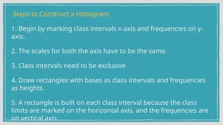
Steps to Constructa Histogram:
1. Begin by marking class intervals x-axis and frequencies on y-
axis.
2. The scales for both the axis have to be the same.
3. Class intervals need to be exclusive
4. Draw rectangles with bases as class intervals and frequencies
as heights.
5. A rectangle is built on each class interval because the class
limits are marked on the horizontal axis, and the frequencies are
on vertical axis.
9.
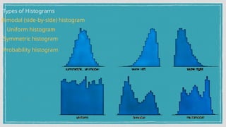
Types of Histograms
Uniformhistogram
Symmetric histogram
Probability histogram
Bimodal (side-by-side) histogram
10.
PIE CHART
A piechart is a pictorial diagram that shows how the total amount is divided between levels of a
categorical variable. It looks like a circle (or a pie) divided into radial slices or sectors.
The slices are of different sizes based on how much of the whole they represent. Each slice is
labeled to represent its value to the whole. It is used to show dependent data that how the whole
population breaks down into parts.
Usually, pie chart is not appropriate to use for samples with more than 5 or 6 different
categories.
Pie charts are used in research and business presentations to demonstrate population
segments, outcome responses and budget allocations.
The pie chart can also be used to illustrate the numerical problems and also to find out the
composition of something. Pie charts, are preferred choice as contains different segments and
sectors and each segment or sector of a pie chart forms a certain portion of the total
percentage.
11.
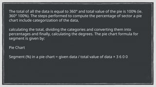
The total ofall the data is equal to 360° and total value of the pie is 100% (ie.
360° 100%). The steps performed to compute the percentage of sector a pie
chart include categorization of the data,
calculating the total, dividing the categories and converting them into
percentages and finally, calculating the degrees. The pie chart formula for
segment is given by:
Pie Chart
Segment (%) in a pie chart = given data / total value of data × 3 6 0 0
12.
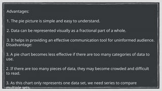
Advantages:
1. The piepicture is simple and easy to understand.
2. Data can be represented visually as a fractional part of a whole.
3. It helps in providing an effective communication tool for uninformed audience.
Disadvantage:
3. A pie chart becomes less effective if there are too many categories of data to
use.
2. If there are too many pieces of data, they may become crowded and difficult
to read.
3. As this chart only represents one data set, we need series to compare
multiple sets.
13.
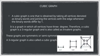
A cubic graphis one that is obtained by taking all vertices denoted
as binary words and joining the vertices with the edge whenever
the binary words differ by 1.
CUBIC GRAPH
It is a graph in which all vertices have three degree. Therefore, a cubic
graph is a 3-regular graph and is also called as trivalent graphs.
These graphs are symmetric or semi-symmetric.
A 3-regular graph is also called a cubic graph.
14.
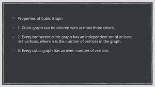
Properties of CubicGraph
1. Cubic graph can be colored with at most three colors.
2. Every connected cubic graph has an independent set of at least
n/3 vertices, where n is the number of vertices in the graph.
3. Every cubic graph has an even number of vertices.
15.
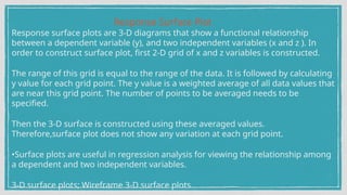
Response Surface Plot
Responsesurface plots are 3-D diagrams that show a functional relationship
between a dependent variable (y), and two independent variables (x and z ). In
order to construct surface plot, first 2-D grid of x and z variables is constructed.
The range of this grid is equal to the range of the data. It is followed by calculating
y value for each grid point. The y value is a weighted average of all data values that
are near this grid point. The number of points to be averaged needs to be
specified.
Then the 3-D surface is constructed using these averaged values.
Therefore,surface plot does not show any variation at each grid point.
•Surface plots are useful in regression analysis for viewing the relationship among
a dependent and two independent variables.
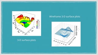
3-D surface plots; Wireframe 3-D surface plots
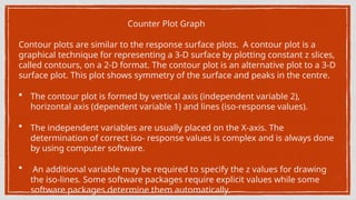
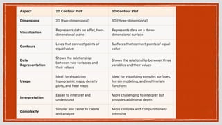
Counter Plot Graph
Contourplots are similar to the response surface plots. A contour plot is a
graphical technique for representing a 3-D surface by plotting constant z slices,
called contours, on a 2-D format. The contour plot is an alternative plot to a 3-D
surface plot. This plot shows symmetry of the surface and peaks in the centre.
• The contour plot is formed by vertical axis (independent variable 2),
horizontal axis (dependent variable 1) and lines (iso-response values).
• The independent variables are usually placed on the X-axis. The
determination of correct iso- response values is complex and is always done
by using computer software.
• An additional variable may be required to specify the z values for drawing
the iso-lines. Some software packages require explicit values while some
software packages determine them automatically.


![谷歌留痕技术 [ 𝙩𝙤𝙥 𝟮𝟯𝟯. 𝙘 𝙤𝙢 ]](https://cdn.slidesharecdn.com/ss_thumbnails/top233-260130174328-3833018c-thumbnail.jpg?width=640&height=640&fit=bounds)


