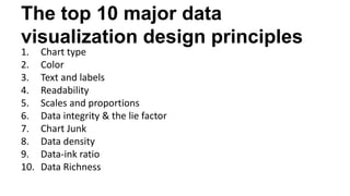
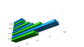
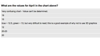
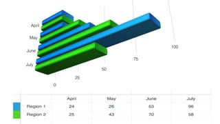
Creating
effective visuals
Kristen Sosulski
Associate Professor of Information Systems @ NYU Stern
Director of Education for the NYU Stern W.R. Berkley Innovation Lab
@sosulski | ks123@nyu.edu | kristensosulski.com
Overview
The workshop provides participants with the common presentations pitfalls and best ways to
incorporate data visualizations into live presentations. This workshop will help you create stellar
presentations that show your data through clear and well-designed displays.
Topics:
-Overview of presentation design and readability.
-Common presentation pitfalls.
-Best practices for using and delivering charts and graphs in your presentations.
-Examples of effective visual communication through the use of data visualization.
Takeaways:
-A standards checklist for designing and delivering slide presentations with charts and graphs.
-Common pitfalls for presentations and data visualizations.
Visuals are tools to help us think
Dual
channels
Limited
capacity
Active
Processing
Human information processing
system
Words
Pictures
Ears
Eyes
Sounds
Images
Verbal
Model
Pictorial
Model
Prior
knowledge
Multimedia
presentation
Sensory
memory
Working memory Long-term
memory
INTRODUCTION
Do you use PowerPoint to
 support your presentations and discussions?
 serve as your talking points?
 use as handouts for your audience?
Do you use PowerPoint to
 support your presentations and discussions?
 serve as your talking points?
 use as handouts for your audience?
What PowerPoint is NOT
Summary statement that I will read verbatim
• Additional points I want to make
– Relevant sub-point
– And another one
– And another one
• And I don’t want to to forget this part
– Or this
WHAT MAKES A POOR
PRESENATION?
We’ve all been in situations where there’s been a poor
presenter who read directly off of his/her slides…
Quarterly Report
Quarterly Report
FOR Q3 2013
RS 200 Series
RS 400 Series
RS LE
SNN 2000
PNN 2000x
Qualtrell XO
PMM 3000
0
1000
2000
3000
4000
5000
6000
Q3
2012
Q4
2012
Q1
2013
Q2
2013
RS 200 Series
RS 400 Series
RS LE
SNN 2000
PNN 2000x
Qualtrell XO
PMM 3000
Quarterly Report
FOR Q3 2013
RS 200 Series
RS 400 Series
RS LE
SNN 2000
PNN 2000x
Qualtrell XO
PMM 3000
0
1000
2000
3000
4000
5000
6000
Q3
2012
Q4
2012
Q1
2013
Q2
2013
RS 200 Series
RS 400 Series
RS LE
SNN 2000
PNN 2000x
Qualtrell XO
PMM 3000
This quarter has seen the continued declline of many of
our leading product lines. Previous market leaders such
As the PNN 2000x and the RS 200 series have continued
trends that began in Q4 of last year. The RS Limited
saw a brief surge during the holiday season, but was
quickly abandoned by consumers as the novelty-factor
began to fade.
Surprisingly, most of our gains have been seen in products
That were previously viewed as under-performers, such
As theQualtrell XO and PMM 3000. This appears to be driven
By enterprise users, and technical problems and missing
Features in Mango’s latest release have damaged its
Reputation in business environments. Whether this trend is
Temporary, or marks a major sea change in the demographics of our
Customer base will have a huge impact on our direction going forward.
COMMON
PITFALLS
What annoys people about
financial presentations?
Paradi, D. (2014)
#1: Too many numbers on a slide
#2. Readability: Small font size
32 point font is good for text and labels
20 point font is more difficult to read
14 point font is even harder
12 point font should only be used for written documents not presentations
You’re too close if you can read this
#3: Too much information for the time
#4. Mostly a table of numbers with few
visuals
FIVE WAYS WE
CAN WE IMPROVE
OUR
PRESENTATIONS?
1. DESIGN
FOR THE
PROJECTOR
Not for viewing in other formats…
Tablet Paper Screen
Use the proper
aspect ratio
You can change the aspect ratio
by going to File > Page Setup
4:3 - STANDARD 16:9 - WIDESCREEN
Show your slides in full-screen view
2. USE
SLIDES TO
SUPPORT
YOU
Instead of the slides serving as
your presentation
• Rather than reading individual values at one time, which is how we perceive tables of text, we
can, thanks to a graphs, see and potentially understand many values at once.
• This is because visual displays combine values into patterns that we can perceive as wholes,
such as patterns formed by a lines in a graph.
• As a rule of thumb, anything that is processed at a rate faster than 10 msec per item is
considered to be pre-attentive.
• Typical processing rates for non pre-attentive targets are 40 msec per item and more (Treisman
& Gormican, 1988).
• Pre-attentive processing is the
• Fast process of recognition.
• Detects several attributes, such as color and the location of objects in 2-D space
• If you want something to stand out in a graph, you should encode it using a pre-attentive
attribute that contrasts with the surrounding information
Avoid writing in full sentences.
Try to apply the 6 x 6 rule.
Graphs help us see
• Combine data into a single series;
• Present data through encodings; and
• Highlight patterns, change, trends, or cycles
Use the notes field for talking points
4. FOLLOW THE
BASIC DESIGN
GUIDELINES
Graphs help us see
• Combine Data Into a Single Series;
• Present Data Through Encodings; and
• Highlight Patterns, Change, Trends and
Cycles.
Avoid mixed case lettering.
Write in sentence case.
Graphs help us see
• Combine Data Into a Single Series;
• Present Data Through Encodings; and
• Highlight Patterns, Change, Trends, or Cycles
Use 32 point font or larger
Graphs help us see
• Combine data into a single series;
• Present data through encodings; and
• Highlight patterns, changes, trends, or
cycles
Use white or black as a background
color
Graphs help us see
• Combine data into a single series;
• Present data through encodings; and
• Highlight patterns, changes, trends, or
cycles.
Graphs help us see
• Combine data into a single series;
• Present data through encodings; and
• Highlight patterns, changes, trends, or
cycles
Graphs help us see
• Combine data into a single series;
• Present data through encodings; and
• Highlight patterns, changes, trends, or
cycles
Select the appropriate slide layout
5. MAKE CHARTS
EASY TO READ
AND INTERPRET
The top 10 major data
visualization design principles
1. Chart type
2. Color
3. Text and labels
4. Readability
5. Scales and proportions
6. Data integrity & the lie factor
7. Chart Junk
8. Data density
9. Data-ink ratio
10. Data Richness
Above all else show the data
---Edward Tufte
What are the values for April?
5. DESIGN
YOUR
CONTENT
FOR HUMANS
The rate at which information is lost is basically
a function of how it was learned (Anderson,
2000, p. 174)
What does it take to make a graphic
symbol that can be found rapidly?
Perception
Our visual system has its own rules.
Perception - Rule #1
We do not attend to everything we see.
Perception - Rule #2
Our eyes are drawn to familiar patterns. We see
what we know and expect.
Visualizations work best when they display
information as patterns that are both familiar
and easy to spot. --Stephen Few, 2009, p. 34
Perception - Rule #3
Memory plays an important role in human
cognition, but working memory is extremely
limited.
Working memory
• It is temporary
• It has limited storage capacity
Demonstration
148896678324145639874124
512121003601477986696574
487895636201403588741421
200036982596312784254189
148896678324145639874124
512121003601477986696574
487895636201403588741421
200036982596312784254189
Highlight to draw attention
148896678324145639874124
512121003601477986696574
487895636201403588741421
200036982596312784254189
But don’t highlight everything…
Preattentive processing
• Fast process of
recognition
• Detects several
attributes, such as
color and the location.
Copyright 2016 Kristen Sosulski 69
Use animation to highlight and
explain
Probability
of recall
Rapid loss initially
Slower loss later
USING VISUALS
-Nathan Yau, 2013, p. 261
Visualization is often framed as a medium for
storytelling. The numbers are the source
material, and the graphs are how you describe
the source.
-Ben Fry, 2008, p. 4.
Visualization is a kind of narrative,
providing a clear answer to a question
without extraneous details.
Watch this video by Jason
Clay:
http://www.ted.com/talks/jason_clay_how_big_brands_can_save_biodiversity?la
nguage=en
Takeaway
PowerPoint should augment your
presentation not be your presentation.
Watch this video by Hans
Rosling:
https://www.youtube.com/watch?v=hVimVzgtD6w
Takeaway
Lead your audience through your visualization
Watch this video by David
McCandless
http://www.ted.com/talks/david_mccandless_the_beauty_of_data_visualizat
ion.html.
Takeaway
Highlight and show your audience what is important.
YOU ARE THE
DESIGNER
You are control of what is
presented
….and what is omitted
Wong, 2010, p. 29
q1 q2 q3 q4 q1 q2 q3 q4
How you show it
Where you show it
Projected Paper Screen
And when you show it
0
2
4
6
8
10
12
14
THANK YOU
Kristen Sosulski
Associate Professor of Information Systems @ NYU Stern
Director of Education for the NYU Stern W.R. Berkley Innovation Lab
@sosulski | ks123@nyu.edu | kristensosulski.com
z POSSIBLE

Creating Effective Visuals for Teaching and Presentation

  • 1.
    Creating effective visuals Kristen Sosulski AssociateProfessor of Information Systems @ NYU Stern Director of Education for the NYU Stern W.R. Berkley Innovation Lab @sosulski | ks123@nyu.edu | kristensosulski.com
  • 2.
    Overview The workshop providesparticipants with the common presentations pitfalls and best ways to incorporate data visualizations into live presentations. This workshop will help you create stellar presentations that show your data through clear and well-designed displays. Topics: -Overview of presentation design and readability. -Common presentation pitfalls. -Best practices for using and delivering charts and graphs in your presentations. -Examples of effective visual communication through the use of data visualization. Takeaways: -A standards checklist for designing and delivering slide presentations with charts and graphs. -Common pitfalls for presentations and data visualizations.
  • 3.
    Visuals are toolsto help us think Dual channels Limited capacity Active Processing
  • 4.
  • 5.
  • 6.
    Do you usePowerPoint to  support your presentations and discussions?  serve as your talking points?  use as handouts for your audience?
  • 7.
    Do you usePowerPoint to  support your presentations and discussions?  serve as your talking points?  use as handouts for your audience?
  • 8.
    What PowerPoint isNOT Summary statement that I will read verbatim • Additional points I want to make – Relevant sub-point – And another one – And another one • And I don’t want to to forget this part – Or this
  • 9.
    WHAT MAKES APOOR PRESENATION?
  • 10.
    We’ve all beenin situations where there’s been a poor presenter who read directly off of his/her slides…
  • 11.
  • 12.
    Quarterly Report FOR Q32013 RS 200 Series RS 400 Series RS LE SNN 2000 PNN 2000x Qualtrell XO PMM 3000 0 1000 2000 3000 4000 5000 6000 Q3 2012 Q4 2012 Q1 2013 Q2 2013 RS 200 Series RS 400 Series RS LE SNN 2000 PNN 2000x Qualtrell XO PMM 3000
  • 13.
    Quarterly Report FOR Q32013 RS 200 Series RS 400 Series RS LE SNN 2000 PNN 2000x Qualtrell XO PMM 3000 0 1000 2000 3000 4000 5000 6000 Q3 2012 Q4 2012 Q1 2013 Q2 2013 RS 200 Series RS 400 Series RS LE SNN 2000 PNN 2000x Qualtrell XO PMM 3000 This quarter has seen the continued declline of many of our leading product lines. Previous market leaders such As the PNN 2000x and the RS 200 series have continued trends that began in Q4 of last year. The RS Limited saw a brief surge during the holiday season, but was quickly abandoned by consumers as the novelty-factor began to fade. Surprisingly, most of our gains have been seen in products That were previously viewed as under-performers, such As theQualtrell XO and PMM 3000. This appears to be driven By enterprise users, and technical problems and missing Features in Mango’s latest release have damaged its Reputation in business environments. Whether this trend is Temporary, or marks a major sea change in the demographics of our Customer base will have a huge impact on our direction going forward.
  • 14.
  • 15.
    What annoys peopleabout financial presentations? Paradi, D. (2014)
  • 16.
    #1: Too manynumbers on a slide
  • 17.
    #2. Readability: Smallfont size 32 point font is good for text and labels 20 point font is more difficult to read 14 point font is even harder 12 point font should only be used for written documents not presentations You’re too close if you can read this
  • 18.
    #3: Too muchinformation for the time
  • 19.
    #4. Mostly atable of numbers with few visuals
  • 20.
    FIVE WAYS WE CANWE IMPROVE OUR PRESENTATIONS?
  • 21.
  • 22.
    Not for viewingin other formats… Tablet Paper Screen
  • 23.
    Use the proper aspectratio You can change the aspect ratio by going to File > Page Setup
  • 24.
    4:3 - STANDARD16:9 - WIDESCREEN
  • 25.
    Show your slidesin full-screen view
  • 26.
  • 27.
    Instead of theslides serving as your presentation • Rather than reading individual values at one time, which is how we perceive tables of text, we can, thanks to a graphs, see and potentially understand many values at once. • This is because visual displays combine values into patterns that we can perceive as wholes, such as patterns formed by a lines in a graph. • As a rule of thumb, anything that is processed at a rate faster than 10 msec per item is considered to be pre-attentive. • Typical processing rates for non pre-attentive targets are 40 msec per item and more (Treisman & Gormican, 1988). • Pre-attentive processing is the • Fast process of recognition. • Detects several attributes, such as color and the location of objects in 2-D space • If you want something to stand out in a graph, you should encode it using a pre-attentive attribute that contrasts with the surrounding information
  • 28.
    Avoid writing infull sentences. Try to apply the 6 x 6 rule.
  • 29.
    Graphs help ussee • Combine data into a single series; • Present data through encodings; and • Highlight patterns, change, trends, or cycles
  • 30.
    Use the notesfield for talking points
  • 31.
    4. FOLLOW THE BASICDESIGN GUIDELINES
  • 32.
    Graphs help ussee • Combine Data Into a Single Series; • Present Data Through Encodings; and • Highlight Patterns, Change, Trends and Cycles.
  • 33.
    Avoid mixed caselettering. Write in sentence case.
  • 34.
    Graphs help ussee • Combine Data Into a Single Series; • Present Data Through Encodings; and • Highlight Patterns, Change, Trends, or Cycles
  • 35.
    Use 32 pointfont or larger
  • 36.
    Graphs help ussee • Combine data into a single series; • Present data through encodings; and • Highlight patterns, changes, trends, or cycles
  • 37.
    Use white orblack as a background color
  • 38.
    Graphs help ussee • Combine data into a single series; • Present data through encodings; and • Highlight patterns, changes, trends, or cycles.
  • 39.
    Graphs help ussee • Combine data into a single series; • Present data through encodings; and • Highlight patterns, changes, trends, or cycles
  • 40.
    Graphs help ussee • Combine data into a single series; • Present data through encodings; and • Highlight patterns, changes, trends, or cycles
  • 41.
  • 43.
    5. MAKE CHARTS EASYTO READ AND INTERPRET
  • 45.
    The top 10major data visualization design principles 1. Chart type 2. Color 3. Text and labels 4. Readability 5. Scales and proportions 6. Data integrity & the lie factor 7. Chart Junk 8. Data density 9. Data-ink ratio 10. Data Richness
  • 47.
    Above all elseshow the data ---Edward Tufte
  • 48.
    What are thevalues for April?
  • 52.
  • 54.
    The rate atwhich information is lost is basically a function of how it was learned (Anderson, 2000, p. 174)
  • 56.
    What does ittake to make a graphic symbol that can be found rapidly?
  • 57.
    Perception Our visual systemhas its own rules.
  • 58.
    Perception - Rule#1 We do not attend to everything we see.
  • 59.
    Perception - Rule#2 Our eyes are drawn to familiar patterns. We see what we know and expect.
  • 60.
    Visualizations work bestwhen they display information as patterns that are both familiar and easy to spot. --Stephen Few, 2009, p. 34
  • 61.
    Perception - Rule#3 Memory plays an important role in human cognition, but working memory is extremely limited.
  • 62.
    Working memory • Itis temporary • It has limited storage capacity
  • 63.
  • 64.
  • 65.
  • 66.
  • 67.
  • 68.
    But don’t highlighteverything…
  • 69.
    Preattentive processing • Fastprocess of recognition • Detects several attributes, such as color and the location. Copyright 2016 Kristen Sosulski 69
  • 70.
    Use animation tohighlight and explain
  • 71.
    Probability of recall Rapid lossinitially Slower loss later
  • 72.
  • 73.
    -Nathan Yau, 2013,p. 261 Visualization is often framed as a medium for storytelling. The numbers are the source material, and the graphs are how you describe the source.
  • 74.
    -Ben Fry, 2008,p. 4. Visualization is a kind of narrative, providing a clear answer to a question without extraneous details.
  • 75.
    Watch this videoby Jason Clay: http://www.ted.com/talks/jason_clay_how_big_brands_can_save_biodiversity?la nguage=en
  • 76.
    Takeaway PowerPoint should augmentyour presentation not be your presentation.
  • 77.
    Watch this videoby Hans Rosling: https://www.youtube.com/watch?v=hVimVzgtD6w
  • 78.
    Takeaway Lead your audiencethrough your visualization
  • 79.
    Watch this videoby David McCandless http://www.ted.com/talks/david_mccandless_the_beauty_of_data_visualizat ion.html.
  • 83.
    Takeaway Highlight and showyour audience what is important.
  • 84.
  • 85.
    You are controlof what is presented
  • 86.
    ….and what isomitted Wong, 2010, p. 29 q1 q2 q3 q4 q1 q2 q3 q4
  • 87.
  • 90.
    Where you showit Projected Paper Screen
  • 91.
    And when youshow it 0 2 4 6 8 10 12 14
  • 92.
    THANK YOU Kristen Sosulski AssociateProfessor of Information Systems @ NYU Stern Director of Education for the NYU Stern W.R. Berkley Innovation Lab @sosulski | ks123@nyu.edu | kristensosulski.com
  • 93.

Editor's Notes

  • #5 This figure presents a cognitive model of multimedia learning intended to represent the human information processing system. The boxes represent memory stores, including sensory memory, working memory, and long term memory. Pictures and words come in form the outside world as a multimedia presentation and enter sensory memory through the eyes and ears. Sensory memory allows for the pictures and printed text to be held as exact visual images for a very brief time period in visual sensory memory. Arrow from pictures to eyes corresponds to a picture being registered in the eyes; the arrow from Words to Ears corresponds to spoken text being registered in the ears; the arrow from words to eyes corresponds to printed text being registered in the eyes. The central work of multimedia learning takes place in working memory. Working memory is used for temporarily holding and manipulating knowledge in active consciousness. For example, this presentation, you are able to hold some of the words I'm saying at one time or some of the boxes and arrows in your mind at one time. This kind of processing , where you are consciously aware, takes place in your working memory. The left side of the box labeled Working Memory represents the raw material that comes into working memory - visual images of pictures and sound images of words - so it is based on the two sensory modalities, called visual and auditory. The right side of the working memory box represents the knowledge constructed in working memory - visual and verbal mental models and links between them, this is based on the two representation modes, Mayer refers to as pictorial and verbal.
  • #11 We’ve all be in situations where there’s been a poor presenter who read directly of his/her slides. ----- Or maybe those slides were just difficult to read for one reason or another. ----- Or the information presented was just so overwhelming ----- Or the presentation was just plain old boring. Think about the last presentation you attended? As an audience member, how engaged were you?
  • #12 We’ve all be in situations where there’s been a poor presenter who read directly of his/her slides. ----- Or maybe those slides were just difficult to read for one reason or another. ----- Or the information presented was just so overwhelming ----- Or the presentation was just plain old boring. Think about the last presentation you attended? As an audience member, how engaged were you?
  • #13 We’ve all be in situations where there’s been a poor presenter who read directly of his/her slides. ----- Or maybe those slides were just difficult to read for one reason or another. ----- Or the information presented was just so overwhelming ----- Or the presentation was just plain old boring. Think about the last presentation you attended? As an audience member, how engaged were you?
  • #14 We’ve all be in situations where there’s been a poor presenter who read directly of his/her slides. ----- Or maybe those slides were just difficult to read for one reason or another. ----- Or the information presented was just so overwhelming ----- Or the presentation was just plain old boring. Think about the last presentation you attended? As an audience member, how engaged were you?
  • #16 When 120 people (executives and middle managers were asked about the top 4 things that annoy them about financial presentations) they responded this way.
  • #18 Also, make sure that your font size is readable. I recommend no smaller than 32 point font. Not only is it harder to see, but it’s probably a good sign that you’re using too much text.
  • #19 Example: 28 slides for a 2 minute presentation.
  • #20 The presentation was full of tables of numbers with few visuals or charts.
  • #30 Rather than reading individual values at one time, which is how we perceive tables of text, we can, thanks to a graphs, see and potentially understand many values at once. This is because visual displays combine values into patterns that we can perceive as wholes, such as patterns formed by a lines in a graph to identify trends, change, or cycles.
  • #33 Rather than reading individual values at one time, which is how we perceive tables of text, we can, thanks to a graphs, see and potentially understand many values at once. This is because visual displays combine values into patterns that we can perceive as wholes, such as patterns formed by a lines in a graph to identify trends, change, or cycles.
  • #35 Rather than reading individual values at one time, which is how we perceive tables of text, we can, thanks to a graphs, see and potentially understand many values at once. This is because visual displays combine values into patterns that we can perceive as wholes, such as patterns formed by a lines in a graph to identify trends, change, or cycles.
  • #36 Also, make sure that your font size is readable. I recommend no smaller than 32 point font. Not only is it harder to see, but it’s probably a good sign that you’re using too much text.
  • #37 Rather than reading individual values at one time, which is how we perceive tables of text, we can, thanks to a graphs, see and potentially understand many values at once. This is because visual displays combine values into patterns that we can perceive as wholes, such as patterns formed by a lines in a graph to identify trends, change, or cycles.
  • #38 If you will be presenting in a dark room (such as a large hall), a dark background (dark blue, gray, etc.) with white or light text will work fine. But if you plan to keep most of the lights on (which is highly advisable), a white background with black or dark text works much better. In rooms with a good deal of ambient light, a screen image with a dark background and light text tends to washout, but dark text on a light background will maintain its visual intensity a bit better.
  • #39 Rather than reading individual values at one time, which is how we perceive tables of text, we can, thanks to a graphs, see and potentially understand many values at once. This is because visual displays combine values into patterns that we can perceive as wholes, such as patterns formed by a lines in a graph to identify trends, change, or cycles.
  • #40 Rather than reading individual values at one time, which is how we perceive tables of text, we can, thanks to a graphs, see and potentially understand many values at once. This is because visual displays combine values into patterns that we can perceive as wholes, such as patterns formed by a lines in a graph to identify trends, change, or cycles.
  • #41 Rather than reading individual values at one time, which is how we perceive tables of text, we can, thanks to a graphs, see and potentially understand many values at once. This is because visual displays combine values into patterns that we can perceive as wholes, such as patterns formed by a lines in a graph to identify trends, change, or cycles.
  • #46 Handout!
  • #54 The forgetting function of Ebbinghaus 1885. We see an exponential drop off in recall almost immediately. Then you see the rate of forgetting slows down A negative acceleration.
  • #57 http://www.youtube.com/watch?v=l8_fZPHasdo
  • #65 Take a look at the four rows of numbers and determine as quickly as you can, how many times the number 5 appears. How many? The answer is 7. Even if you got the answer right, it took you several seconds to perform this task because it involved attentive processing. The list of numbers didn’t include an preattentive attributes to distinguish the 5’s from one another, so you were forced to perform a sequential search looking for the specific shape of the number 5. Now let’s do it again.
  • #66 This was easy. 7 number fives. You can distinguish the five through a specific preattentive attribute of color intensity. Only fives are black, and all the other numbers are gray, the fives stands out in contrast to the rest. This example shows the power of preattentive attributes used knowledgeably for visual communication.
  • #68 This was easy. 7 number fives. You can distinguish the five through a specific preattentive attribute of color intensity. Only fives are black, and all the other numbers are gray, the fives stands out in contrast to the rest. This example shows the power of preattentive attributes used knowledgeably for visual communication.
  • #70 Fast process of recognition Detects several attributes, such as color and the location. of objects in 2-D space If you want something to stand out in a graph, you should encode it using a preattentive attribute that contrasts with the surrounding information
  • #72 The forgetting function of Ebbinghaus 1885. We see an exponential drop off in recall almost immediately. Then you see the rate of forgretting slows down A negative accelteration. Retention decreases as the retention interval (the time between learning and retention time) increases but the rate of forgetting slows down. PowerLaw, Exponential drop-off. Negatively accelerated in that they both show rapid loss initially an slower loss later. Rehearsal doesn’t allow information to be stored better in long term memory. The depth of processing theory held that rehearsal
  • #76 Let’s look at an example by Jason Clay, VP of the world wildlife foundation who is trying to persuade us on how big brands can save biodiversity. Note his use of powerpoint in his presentation.
  • #80 5:10 David McCandless Data Journalist (wired)
  • #86 This speaks to the data.
  • #88 Static vs interactive display?
  • #92 Visualization as a medium. Not just data. The gestalt of visualization is the encoding of data into symbols, the data we choose to show and omit, how we show it (the display), when we show it (presentation, timing) and where we show it (internet, newspaper) and how those ultimately affect our audience in non-obvious ways.