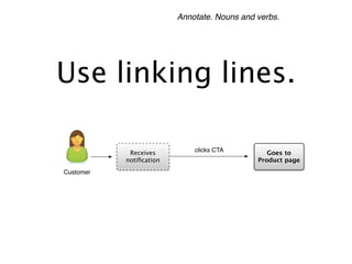
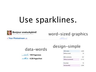
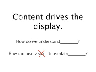
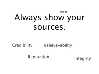
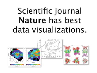
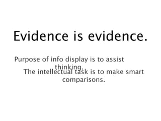
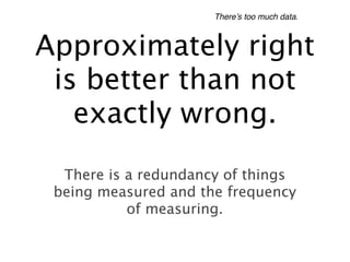
Presenting Data &
   Information
   Course by Edward Tufte

         Learnings
     by Sharon Cardinal


         December 2011
Who is Edward
            Tufte?
                                          Sculptor
Professor/Lecturer: Yale, Stanford
Princeton
                                           Publisher
     Consultant: NASA, Apple, NY Times,
     IBM, Bloomberg, Consumer Reports


                Presidential appointment: Recovery
                Independent Advisory Panel
Use whatever it
  takes to explain
    something.
                       Differences
           Casualty
Photos                          Graphs

                  Sentences
Mechanism
                                     Contrasts
         Tables   Comparisons
Use supergraphics.
                         in presentations


  High-resolution designs

                    Personal
  Interactive
                 Pre-determined
 Highly edited
Consumers are looking for sentences.


    Tell a story with
    straightforward
        graphics.
   Amateur typography

                              Clunky boxes
Cartoony arrows
                  Chartjunk
For your presentations:


   Bring a three
dimensional object
  into the room.
Zero out the
     interface.
    Scrollbars
                  Administrative debris
Menus
                 Keys or legends
Annotate. Nouns and verbs.


Use linking lines.

            Receives         clicks CTA         Goes to
           notification                       Product page
Customer
Use sparklines.
              word-sized graphics


                design-simple
 data-words
Content drives the
       display.
   How do we understand_________?


How do I use visuals to explain_________?
link to


 Always show your
     sources.

Credibility    Believe-ability

        Reputation               Integrity
Find successful
examples in the wild.

 Don’t get it original, find something
          good and copy it.
Use examples from
   newspapers.
 Sentences
                   Bullet points
         Numbers


                      TV
     Powerpoint
Scientific journal
 Nature has best
data visualizations.
Evidence is evidence.
Purpose of info display is to assist
             thinking.
   The intellectual task is to make smart
                comparisons.
There’s too much data.


Approximately right
 is better than not
   exactly wrong.
  There is a redundancy of things
 being measured and the frequency
           of measuring.
Software is not integrated.


Too many modes of
    production

 This is contrary to the means of
             the user.
The best design
can do no harm.

Edward Tufte -- Highlights from Presenting Data and Information one day couse

  • 1.
    Presenting Data & Information Course by Edward Tufte Learnings by Sharon Cardinal December 2011
  • 2.
    Who is Edward Tufte? Sculptor Professor/Lecturer: Yale, Stanford Princeton Publisher Consultant: NASA, Apple, NY Times, IBM, Bloomberg, Consumer Reports Presidential appointment: Recovery Independent Advisory Panel
  • 3.
    Use whatever it takes to explain something. Differences Casualty Photos Graphs Sentences Mechanism Contrasts Tables Comparisons
  • 4.
    Use supergraphics. in presentations High-resolution designs Personal Interactive Pre-determined Highly edited
  • 5.
    Consumers are lookingfor sentences. Tell a story with straightforward graphics. Amateur typography Clunky boxes Cartoony arrows Chartjunk
  • 6.
    For your presentations: Bring a three dimensional object into the room.
  • 7.
    Zero out the interface. Scrollbars Administrative debris Menus Keys or legends
  • 8.
    Annotate. Nouns andverbs. Use linking lines. Receives clicks CTA Goes to notification Product page Customer
  • 9.
    Use sparklines. word-sized graphics design-simple data-words
  • 10.
    Content drives the display. How do we understand_________? How do I use visuals to explain_________?
  • 11.
    link to Alwaysshow your sources. Credibility Believe-ability Reputation Integrity
  • 12.
    Find successful examples inthe wild. Don’t get it original, find something good and copy it.
  • 13.
    Use examples from newspapers. Sentences Bullet points Numbers TV Powerpoint
  • 14.
    Scientific journal Naturehas best data visualizations.
  • 15.
    Evidence is evidence. Purposeof info display is to assist thinking. The intellectual task is to make smart comparisons.
  • 16.
    There’s too muchdata. Approximately right is better than not exactly wrong. There is a redundancy of things being measured and the frequency of measuring.
  • 17.
    Software is notintegrated. Too many modes of production This is contrary to the means of the user.
  • 18.