Introduction to DataVisualization
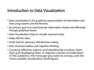
• Data visualization is the graphical representation of information and
data using reports and dashboards.
• Its primary goal is to communicate information clearly and efficiently
through graphical means.
• Data Visualization helps to visually represent data
• Helps tell the story
• Great tool for advocacy and decision making
• Aids visual perception and cognitive thinking
• Creating effective reports and dashboards involves more
than just displaying data. It requires careful consideration
of the audience, the message you want to convey, and the
most suitable visualization techniques.
3.
Principles of DataVisualization
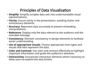
• Simplify: Simplify complex data sets into understandable visual
representations.
• Clarity: Ensure clarity in the presentation, avoiding clutter and
unnecessary elements.
• Accuracy: Represent data accurately to prevent misleading
interpretations.
• Relevance: Display only the data relevant to the audience and the
intended message.
• Consistency: Maintain consistency in design elements to facilitate
easier understanding.
• Use of appropriate visuals: Choose appropriate chart types and
visuals that best represent the data.
• Color and Contrast: Use color and contrast effectively to highlight
important information and guide the audience's attention.
• Interactivity: Incorporate interactive elements where necessary to
allow users to explore the data further.
4.
Designing Effective Reportsand Dashboards
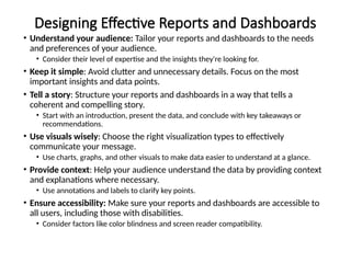
• Understand your audience: Tailor your reports and dashboards to the needs
and preferences of your audience.
• Consider their level of expertise and the insights they're looking for.
• Keep it simple: Avoid clutter and unnecessary details. Focus on the most
important insights and data points.
• Tell a story: Structure your reports and dashboards in a way that tells a
coherent and compelling story.
• Start with an introduction, present the data, and conclude with key takeaways or
recommendations.
• Use visuals wisely: Choose the right visualization types to effectively
communicate your message.
• Use charts, graphs, and other visuals to make data easier to understand at a glance.
• Provide context: Help your audience understand the data by providing context
and explanations where necessary.
• Use annotations and labels to clarify key points.
• Ensure accessibility: Make sure your reports and dashboards are accessible to
all users, including those with disabilities.
• Consider factors like color blindness and screen reader compatibility.
5.
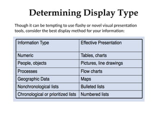
Though it canbe tempting to use flashy or novel visual presentation
tools, consider the best display method for your information:
Determining Display Type
6.
3 E’s ofDisplaying Data
•Effective
•Ethical
•Efficient
7.
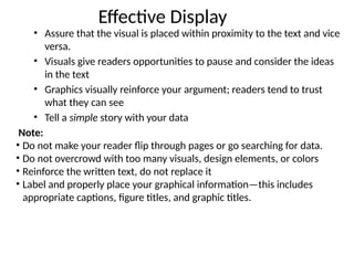
Effective Display
• Assurethat the visual is placed within proximity to the text and vice
versa.
• Visuals give readers opportunities to pause and consider the ideas
in the text
• Graphics visually reinforce your argument; readers tend to trust
what they can see
• Tell a simple story with your data
Note:
• Do not make your reader flip through pages or go searching for data.
• Do not overcrowd with too many visuals, design elements, or colors
• Reinforce the written text, do not replace it
• Label and properly place your graphical information—this includes
appropriate captions, figure titles, and graphic titles.
8.
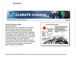
Example 1
Graphic via:NOAA National Weather Service semi-annual report on climate change. http://climate.nasa.gov/causes/
9.
Ethical Display
• Beabsolutely honest with your readers. Do not be tempted to
exaggerate trends or inflate results.
• If you did not create the graphic or generate the data, cite your source.
• If you want to publish a graphic that you did not create, obtain
permission.
• Include all relevant data. For instance, if you have a data point that you
cannot explain, do not change the scale to eliminate it.
• Represent quantities honestly.
• Do not use a table to hide a data point that would be obvious in a
graph.
• Do not use color to misrepresent an item’s importance. (Shade can trick
the idea to make elements appear larger than darker-shaded items of
the same size)
10.
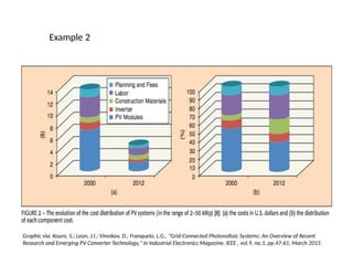
Example 2
Graphic via:Kouro, S.; Leon, J.I.; Vinnikov, D.; Franquelo, L.G., "Grid-Connected Photovoltaic Systems: An Overview of Recent
Research and Emerging PV Converter Technology," in Industrial Electronics Magazine, IEEE , vol.9, no.1, pp.47-61, March 2015
11.
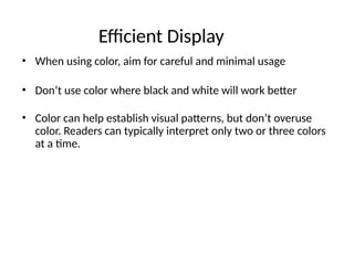
Efficient Display
• Whenusing color, aim for careful and minimal usage
• Don’t use color where black and white will work better
• Color can help establish visual patterns, but don’t overuse
color. Readers can typically interpret only two or three colors
at a time.
12.
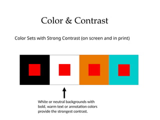
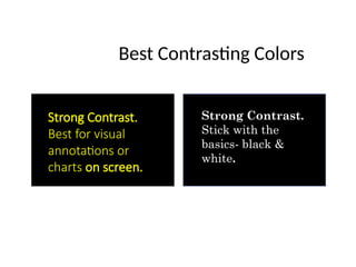
Color & Contrast
ColorSets with Strong Contrast (on screen and in print)
White or neutral backgrounds with
bold, warm text or annotation colors
provide the strongest contrast.
13.
Best Contrasting Colors
StrongContrast.
Stick with the
basics- black &
white.
Strong Contrast.
Best for visual
annotations or
charts on screen.
14.
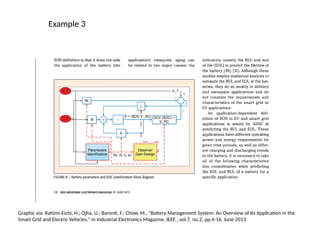
Example 3
Graphic via:Rahimi-Eichi, H.; Ojha, U.; Baronti, F.; Chow, M., "Battery Management System: An Overview of Its Application in the
Smart Grid and Electric Vehicles," in Industrial Electronics Magazine, IEEE , vol.7, no.2, pp.4-16, June 2013
15.
HATS Principles &Effective Integration of Visuals
• Headings: promote easy navigation
• Typeface, size, styles, and alignment show different levels of importance and
detail.
• Access: promote the finding and understanding of information
• Captions, labeling, and best practices for usage of color, texture, and shade fall
under access considerations as well.
• Limit text and provide ample space for access of text or information in
presentations.
• Typography: promote the ease of reading and clear levels of information
hierarchy
• Avoid using more than two types of font in one presentation, document, or
graphic.
• Assure you can read all text against your slide or graphic’s background
• Space: promote effective document design
• Do not crowd visuals with words. Trust your eyes when you step back
to view the page at a distance.
Layout
16.
Tools for DataVisualization
• Tableau:
• Tableau is a powerful and widely-used data visualization tool that allows users to
create interactive and shareable dashboards.
• It supports various data sources and offers advanced analytics features.
• Power BI:
• Power BI is a business analytics tool by Microsoft that enables users to visualize
data and share insights across an organization.
• It integrates seamlessly with other Microsoft products and offers robust data
modeling capabilities.
• Python libraries (Matplotlib, Seaborn, Pyplot):
• For those comfortable with programming, Python libraries like Matplotlib, Seaborn,
and Pyplot provide extensive capabilities for creating static and interactive
visualizations.
• R and ggplot2:
• R is a programming language and software environment for statistical computing
and graphics.
• ggplot2 is a popular R package for creating graphics and data visualizations.
• MS Excel:
• While not as powerful as specialized tools like Tableau or Power BI, Excel offers
basic data visualization capabilities suitable for simple charts and graphs.
17.
Revision Questions
• Explainthe difference between a basic data visualization tool and a
powerhouse business intelligence dashboard.
• How can you ensure that your reports and dashboards are accessible to
all users?
• Explain the concept of storytelling in data visualization.
Editor's Notes
#5 Do not be persuaded by fancy 3D or animated visuals– readers can struggle to interpret data when the presentation type of complex, moving, or novel. Simple, universal presentation tools are often best to reach a wide audience of readers.
#6 Do not be persuaded by fancy 3D or animated visuals– readers can struggle to interpret data when the presentation type of complex, moving, or novel. Simple, universal presentation tools are often best to reach a wide audience of readers.
#8 Though this principle might seem obvious,
In the example above, what is effective about the placement of this graphic? What could be made more effective in the layout and composition of this page?
How might these suggestions change from print to screen audiences?
#9 Unethical graphics can erode the credibility of an entire document– assure that you follow these ethical display options and double check your visualization before presenting information to your readers.
#10 What ethical issues do you notice about this graph? How might the manner in which the information is displayed misinform readers?
What suggestions would you offer to improve the way this data is displayed? How might you revise this graph to be more ethical?
How does color change the data and reader reception?
This particular example skews the data through the 3D presentation of the graph, which can complicate readers’ perception and interpretation of the data. The Y axis is hard to read because of the 3D skew of the lines on the chart and the shades of blue on this graph are too similar to accurately tell the data portions apart.
#11 Often, using black and white is more efficient depending on publication guidelines and requirements.
Tip: Use colors for small items, such as portions of graphics, annotations, and important words.
Graphic via: Kouro, S.; Leon, J.I.; Vinnikov, D.; Franquelo, L.G., "Grid-Connected Photovoltaic Systems: An Overview of Recent Research and Emerging PV Converter Technology," in Industrial Electronics Magazine, IEEE , vol.9, no.1, pp.47-61, March 2015
#12 The same colors will look different considering the colors they are matched with. Sometimes they will be dulled, and sometimes they will pop out even more.
This effect will become very important to keep in mind when choosing text and background colors for your design.
#13 Yellow against a black background is best for text on screen– the combination assures that readers can see it from afar, especially when used in a sans serif font.
#14 In Example 3, consider the use of color in this visual. Does it create an effective or ineffective contrast? Does the use of color make the visual easier to interpret? Why or why not?
#15 A memorable acronym to follow and use to assure your documents begin to follow proper design principles is HATS.
Headings:
Typeface, size, styles, and alignment show different levels of importance and detail.
How can headings best be used to draw attention to data visualizations on articles and presentations/handouts?
Access:
Captions, labeling, and best practices for usage of color, texture, and shade fall under access considerations as well.
Limit text and provide ample space for access of text or information in presentations.
Typography:
Avoid using more than two types of font in one presentation, document, or graphic. Multiple fonts can distract readers from your data and disrupt any visual structure you have created to signal consistent design elements in your work.
Assure you can read all text against your slide or graphic’s background
Space:
Work in harmony with margins and be familiar with text wrap settings
Allow for space around visuals rather than using frames, unless an edge of your visual bleeds into the white space of a page (i.e. the margin)
Do not crowd visuals with words. Trust your eyes when you step back to view the page at a distance.