Downloaded 163 times

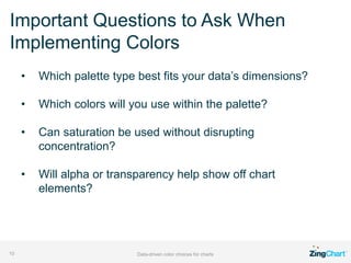

The document discusses the importance of data-driven color choices in enhancing chart usability. It outlines different color palette types such as qualitative, sequential, and diverging, each serving distinct purposes for representing data. Additionally, it presents tools for creating effective color schemes and poses key questions to consider when selecting colors for charts.


