Downloaded 433 times
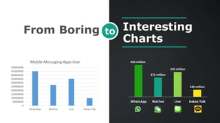

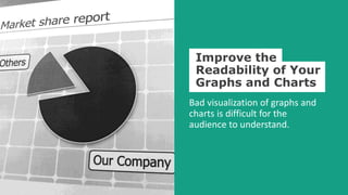

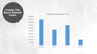

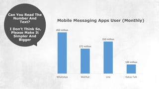
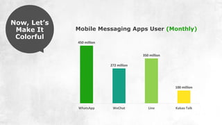
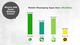
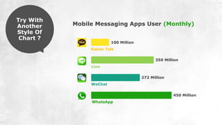
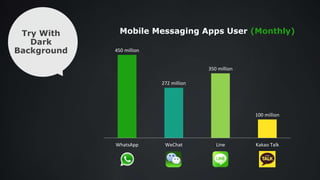
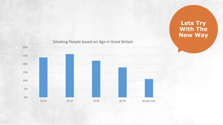
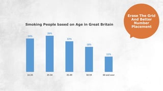
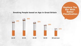
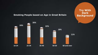
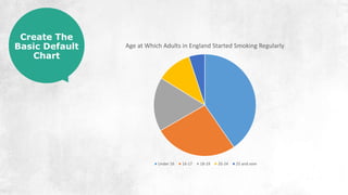
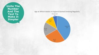
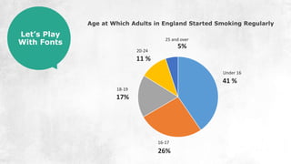
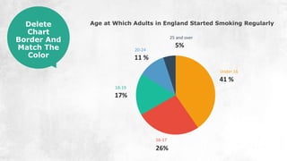
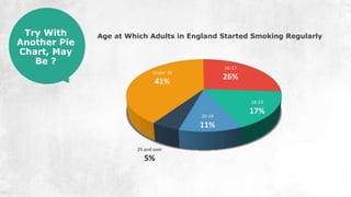
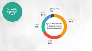
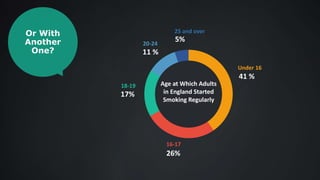


The document discusses the importance of effective visualization for mobile messaging app usage statistics, comparing platforms like WhatsApp and WeChat. It provides suggestions for improving graphs and charts, including simplifying complexity, enhancing readability, and using color effectively. Additional focus is given to visualizing smoking statistics based on age in Great Britain, emphasizing clarity and better design choices in presentations.


