Download to read offline


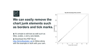
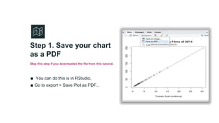


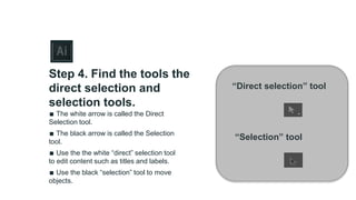


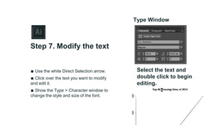


The document provides a guide on refining charts using Adobe Illustrator, highlighting common design issues, such as chart junk and readability problems. It outlines a step-by-step process for editing charts, including simplifying elements, modifying text, and removing unnecessary features. Additional resources and contact information for the author are also included.