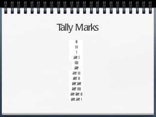
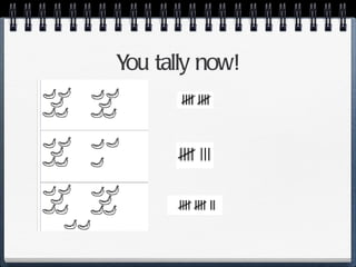
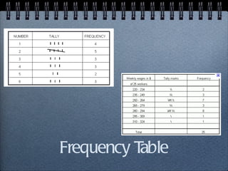
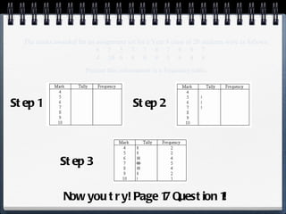
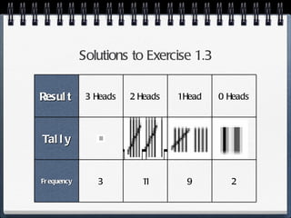
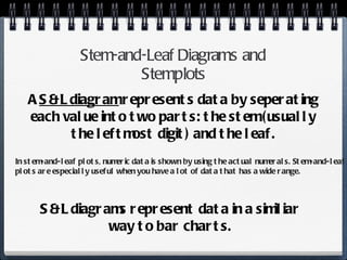
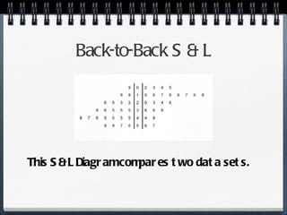
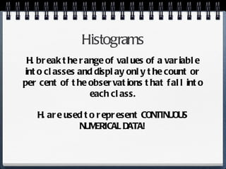
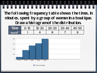
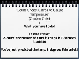
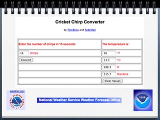
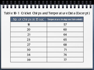
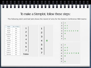
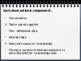
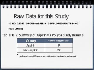
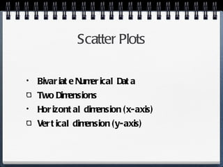
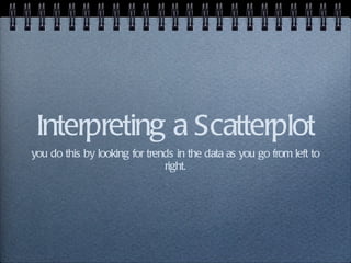
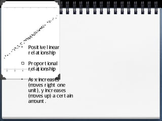
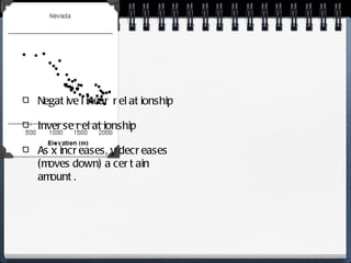
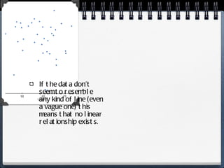
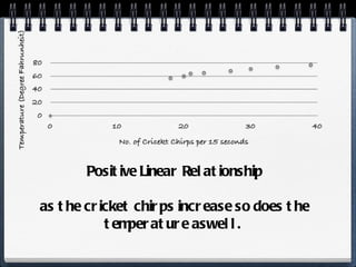
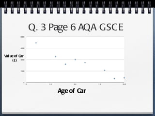
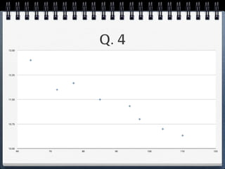
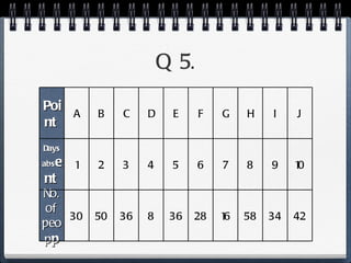
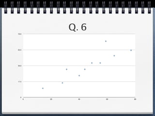
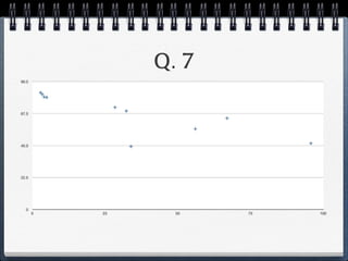
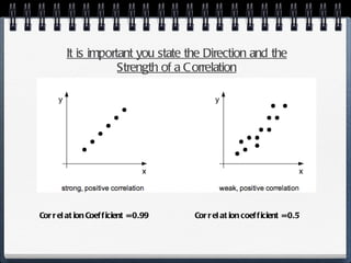
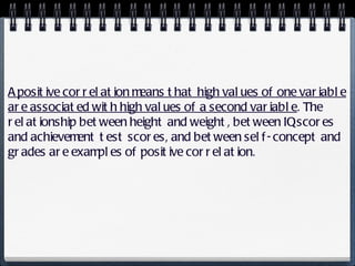
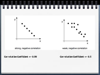
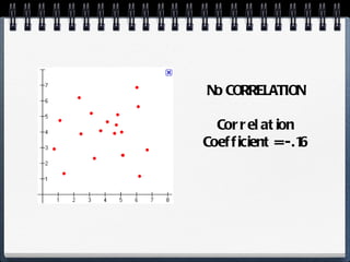
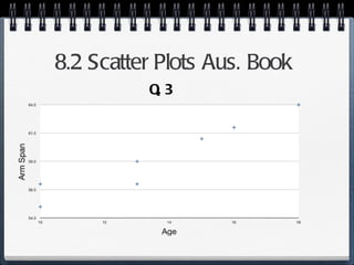
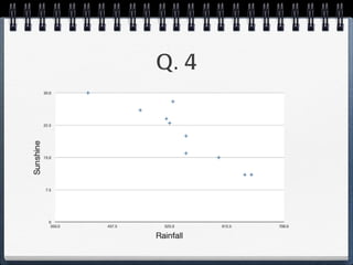
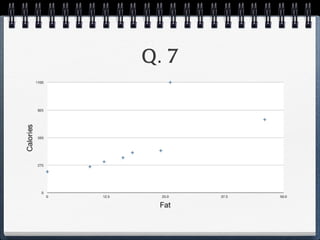
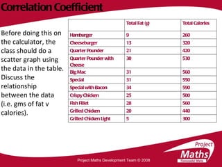
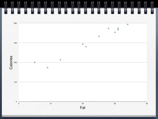
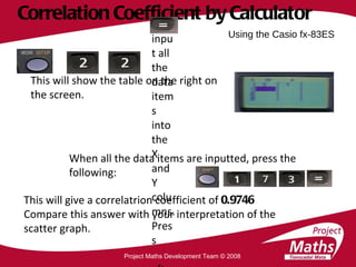
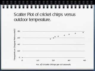
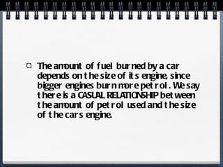
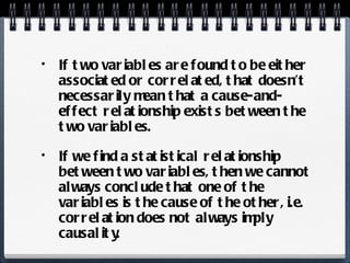
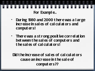
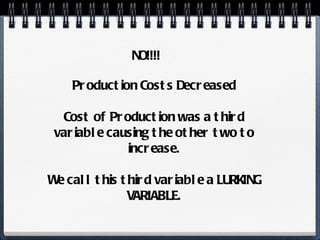
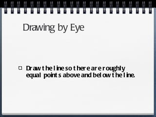
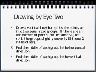
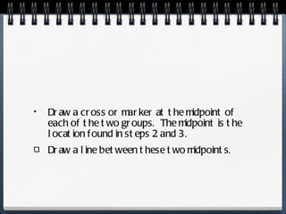
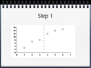
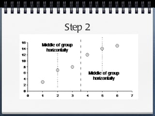
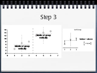
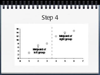
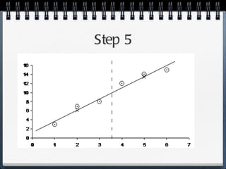
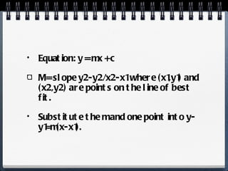
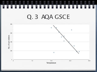
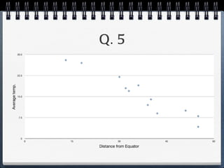
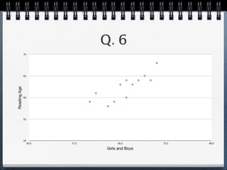
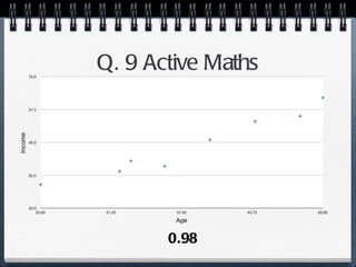
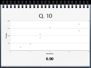
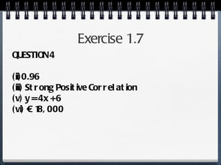
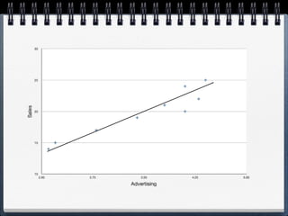
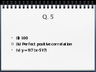
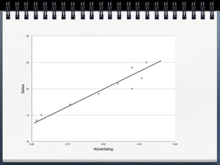
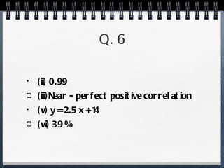
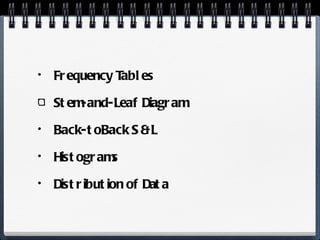
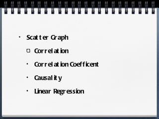
The document discusses different statistical methods for organizing and summarizing data, including frequency tables, stem-and-leaf plots, histograms, and scatter plots. It provides examples of each method and explains how to interpret the results, such as looking for relationships between variables in scatter plots. Key terms defined include correlation, variables, and linear regression lines.
In this document
Powered by AI
Introduction to frequency tables using tally marks for counting items in sets, allowing visualization of data.
Introduction to frequency tables, with examples from student marks, and steps to create a frequency table.
Solutions to exercises on data representation using tally marks and frequency.
Explanation of stem-and-leaf diagrams, their structure, and their comparison of data sets.
Overview of histograms for displaying continuous numerical data, with an example provided.
Discussion on different types of data distributions: symmetric, negatively skewed, and positively skewed.
Definition of variables, their role in research, and the importance of correlation and associations.
Examples of correlations in health research and how they are communicated in the media.
Method to estimate temperature using cricket chirps and representation of data through stemplots.Explanation of bivariate data, its characteristics, and examples illustrating relationships.
Research details showing the correlation between aspirin usage and polyp development in patients.
Understanding scatter plots, identifying positive and negative relationships, and absence of correlation.
Definition and calculation of the correlation coefficient, explaining its significance in data analysis.
Classification of correlation types: positive, negative, and no correlation with example scenarios.
Practical approach to calculating correlation coefficient using calculators and the importance of scatter graphs.
Discussion on the difference between correlation and causation, emphasizing lurking variables in data.
Steps for creating a regression model and deriving predictions from established relationships.
Finalizing the regression analysis step with calculating the line of best fit and its mathematical formulation.
Recap of key statistical concepts including frequency tables, correlation, causality, and graphical representations.
Tally Marks Tallymarks are a way to count things in groups of five. You draw four vertical lines and on the fifth you draw a diagonal line across the previous four.
The marks awardedfor an assignment set for a Year 8 class of 20 students were as follows: 6 7 5 7 7 8 7 6 9 7 4 10 6 8 8 9 5 6 4 8 Present this information in a frequency table. Step 1 Step 2 Step 3 Now you try! Page 17 Question 1!
10.
Solutions to Exercise1.3 Result 3 Heads 2 Heads 1 Head 0 Heads Tally Frequency 3 11 9 2
11.
12.
Stem-and-Leaf Diagrams andStemplots A S & L diagram represents data by seperating each value into two parts: the stem (usually the leftmost digit) and the leaf. S & L diagrams represent data in a similiar way to bar charts. In stem-and-leaf plots, numeric data is shown by using the actual numerals. Stem-and-leaf plots are especially useful when you have a lot of data that has a wide range.
13.
To make aStemplot, follow these steps: The following stem-and-leaf plot shows the record of wins for the Eastern Conference NBA teams:
Histograms H. breakthe range of values of a variable into classes and display only the count or per cent of the observations that fall into each class. H. are used to represent CONTINUOUS NUMERICAL DATA!
16.
The following frequencytable shows the times, in minutes, spent by a group of woman in a boutique. Draw a histogram of the distribution. Time 0-10 10-20 20-30 30-40 40-50 Numbe r 1 4 8 7 9
What are Variables?Variables are things that we measure, control, or manipulate in research. They differ in many respects, most notably in the role they are given in our research and in the type of measures that can be applied to them. Variables are things that we measure, control, or manipulate in research. They differ in many respects, most notably in the role they are given in our research and in the type of measures that can be applied to them.
National Institutes ofHealth (NIH) Sedentary activities (like Tv watching) are associated with an increase in obesity and an increase in the risk of diabetes in women. Anger expression may be inversely related to the risk of heart attack and stroke. (Those who express anger may have a decreased risk). Light-t-moderate drinking reduces the risk of heart disease in men.
24.
News Reporters loveto tell stories about the latest links! Such as.. Does having her first baby later in life cause a woman to live longer? (New York Times) Do we believe this or much of anything anymore?
25.
‘ Count CricketChirps to Gauge Temperature’ ( Garden Gate ) ) What you have to do! 1. find a cricket 2. count the number of times it chirps in 15 seconds 3. add 40 You’ve just predicted the temp. in degrees Fahrenfeit!
26.
27.
Table 18-1 Cricket Chirps and Temperature Data (Excerpt) No. of Chirps in 15 sec Temperature (in degrees Fahrenheit) 18 57 20 60 21 64 23 65 27 68 30 71 34 74 39 77
28.
To make aStemplot, follow these steps: The following stem-and-leaf plot shows the record of wins for the Eastern Conference NBA teams:
Two variables Tiedor paired together Two - dimensional data Bivariate Data Deals with causes or relationships The major purpose of bivariate analysis is to determine whether relationships exist. Each observation is composed of..
A Press Releaseby Ohio State University Medical Center The headline says that... “ aspirin can prevent polyps in colon cancer patients”
33.
Raw Data forthis Study ID NO. 22292 GROUP=ASPIRIN DEVELOPED POLYPS=NO (635 LINES) Table 18-2 Summary of Aspirin v’s Polyps Study Results * total sample size = 635 (approx were half randomly assigned to each person) Group % Developing Polyps* Aspirin 17 Non-aspirin 27
34.
Scatter Plots BivariateNumerical Data Two Dimensions Horizontal dimension (x-axis) Vertical dimension (y-axis)
We have alreadyseen how to measure the direction of a linear relationship BUT you will also have to decide on the STRENGTH of the relationsbip!! Introduce the...
48.
Correlation Coefficient Measuresthe strength and direction of the linear relationship between x and y (or the vertical and horizontal dimension).
49.
Calculating the C.C.It is represented by the letter r It has a value between - 1 and 1 You only have to be able to calculate it using your calculator-luckily for you!
50.
If r isclose to 1, then there is a strong positive correlation between two sets of data. If r is close to -1, we say there is a strong negative correlation between the two sets. If r is close to 0, then there is no correlation between the two sets. Most statisticians like to see correlations above = 0.6 or below - 0.6.
It is importantyou state the Direction and the Strength of a Correlation Correlation Coefficient = 0.99 Correlation coefficient = 0.5
53.
A positive correlationmeans that high values of one variable are associated with high values of a second variable . The relationship between height and weight, between IQ scores and achievement test scores, and between self-concept and grades are examples of positive correlation.
A negative correlationor relationship means that high values of one variable are associated with low values of a second variable. Examples of negative correlations include those between exercise and heart failure, between successful test performance and feelings of incompetence, and between absence from school and school achievement.
The amount offuel burned by a car depends on the size of its engine, since bigger engines burn more petrol. We say there is a CASUAL RELATIONSHIP between the amount of petrol used and the size of the cars engine.
69.
If two variablesare found to be either associated or correlated, that doesn’t necessarily mean that a cause-and-effect relationship exists between the two variables. If we find a statistical relationship between two variables, then we cannot always conclude that one of the variables is the cause of the other, i.e. correlation does not always imply causality.
70.
During 1980 and2000 there was a large increase in sales of calculators and computers! There was a strong positive correlation between the sales of computers and the sales of calculators! For Example.. Did the increase of sales of calculators cause an increase in the sale of computers??
71.
NO!!!! Production CostsDecreased Cost of Production was a third variable causing the other two to increase. We call this third variable a LURKING VARIABLE.
After you’ve founda relationship between two variables and you have some way of quantifying this relationship, you can create a model that allows you to use one variabe to predict another.
74.
1. Draw aScatter Plot. 2. If graph suggests a linear relationship.. 3. Calculate Correlation Coefficient. 4. Find the equation of the Line that best fits the data. - We draw this by eye, and then find its equation.
75.
Because you havea strong correlation be it positive or negative you know that x is correlated with y. If you know the slope and the y-intercept of that line, then you can plug in a value for x and predict the average value for y. In other words, you can predict y from x. You should never do a regression analysis unless you’ve already found a strong correlation (either pos. or neg.) between the two variables!
76.
Drawing by EyeDraw the line so there are roughly equal points above and below the line.
77.
Drawing by EyeTwo Draw a vertical line that splits the points up into two equal sized groups. If there are an odd number of points (for instance 5), just split the groups slightly unevenly (3 in one, 2 in the other). Find the middle of each group in the horizontal direction. Find the middle of each group in the vertical direction.
78.
Draw a crossor marker at the midpoint of each of the two groups. The midpoint is the location found in steps 2 and 3. Draw a line between these two midpoints.
Now Calculate Line!i.e. what is the formula for the line? i.e. what is the formula for the line?
85.
Equation: y =mx + c M = slope y2-y2/x2-x1 where (x1,y1) and (x2,y2) are points on the line of best fit. Substitute the m and one point into y-y1=m(x-x1).