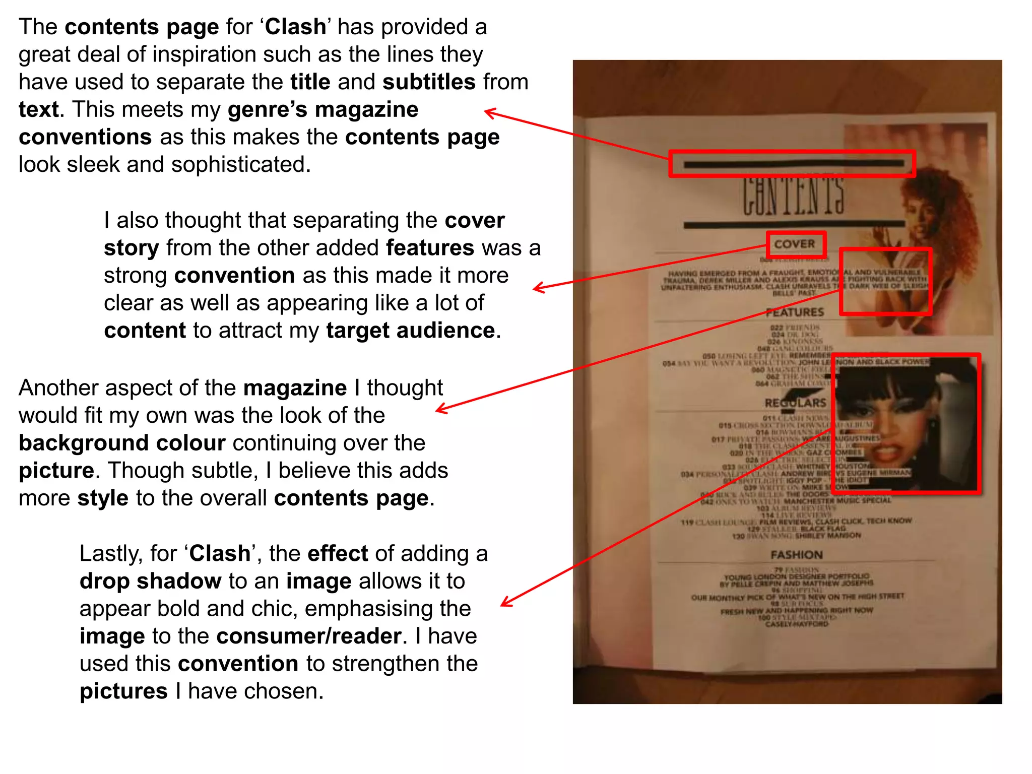
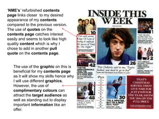
The contents page for ‘Clash’ has provided a
great deal of inspiration such as the lines they
have used to separate the title and subtitles from
text. This meets my genre’s magazine
conventions as this makes the contents page
look sleek and sophisticated.
I also thought that separating the cover
story from the other added features was a
strong convention as this made it more
clear as well as appearing like a lot of
content to attract my target audience.
Another aspect of the magazine I thought
would fit my own was the look of the
background colour continuing over the
picture. Though subtle, I believe this adds
more style to the overall contents page.
Lastly, for ‘Clash’, the effect of adding a
drop shadow to an image allows it to
appear bold and chic, emphasising the
image to the consumer/reader. I have
used this convention to strengthen the
pictures I have chosen.
‘NME’s’ refurbished contents
page links closer to my desired
appearance of my contents
compared to the previous version.
The use of quotes on the
contents page catches interest
easily and seems to look like high
quality content which is why I
chose to add in another pull
quote on the contents page.
The use of the graphic on this is
beneficial for my contents page
as it will show my skills hence why
I will use different graphics.
However, the use of
complimentary colours can
attract the target audience as
well as standing out to display
important information like an
offer.

Contents Page Deconstruction

  • 1.
    The contents pagefor ‘Clash’ has provided a great deal of inspiration such as the lines they have used to separate the title and subtitles from text. This meets my genre’s magazine conventions as this makes the contents page look sleek and sophisticated. I also thought that separating the cover story from the other added features was a strong convention as this made it more clear as well as appearing like a lot of content to attract my target audience. Another aspect of the magazine I thought would fit my own was the look of the background colour continuing over the picture. Though subtle, I believe this adds more style to the overall contents page. Lastly, for ‘Clash’, the effect of adding a drop shadow to an image allows it to appear bold and chic, emphasising the image to the consumer/reader. I have used this convention to strengthen the pictures I have chosen.
  • 2.
    ‘NME’s’ refurbished contents pagelinks closer to my desired appearance of my contents compared to the previous version. The use of quotes on the contents page catches interest easily and seems to look like high quality content which is why I chose to add in another pull quote on the contents page. The use of the graphic on this is beneficial for my contents page as it will show my skills hence why I will use different graphics. However, the use of complimentary colours can attract the target audience as well as standing out to display important information like an offer.