Download to read offline
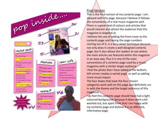

This document summarizes the development of a magazine contents page from an initial flat plan through multiple drafts. The final version includes the magazine cover, four article boxes, highlighted text, and a photo. While pleased with adding visual interest and conventions of music magazines, the creator notes the dark background could be lightened.


![5G Explained! A High Level Overview [Introduction]](https://cdn.slidesharecdn.com/ss_thumbnails/5gexplainedahighleveloverview-260119165306-cc137a3e-thumbnail.jpg?width=640&height=640&fit=bounds)


