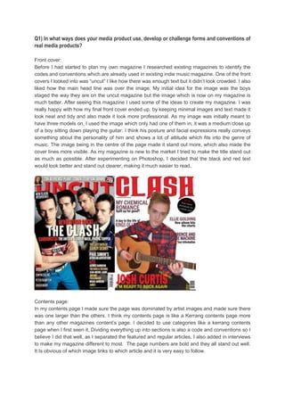
This document discusses the ways in which the media product, an indie music magazine, uses conventions of real magazines. It summarizes how the front cover, contents page, and double page spread follow conventions. For the front cover, it used minimal text and images centered around one photo like "Uncut" magazine. The contents page is organized like Kerrang magazine with categories, larger featured artist images, and bold page numbers. The double page spread similarly features a large central image, introduction, and consistent colors like Kerrang. Overall, it aims to look professional by adopting standard magazine design conventions.