Download to read offline


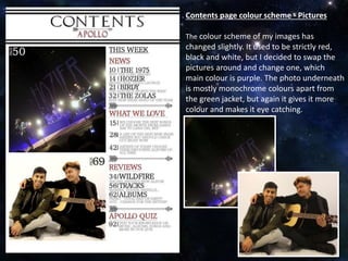
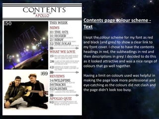
The document discusses color scheme choices for a contents page. It mentions swapping some images used and changing one photo's main color to purple. The text keeps a red and black color scheme to link to the front cover, with headings in red, subheadings in red, and descriptions in gray. Limiting the colors was meant to make the page look more professional and eye-catching without clashing colors or a busy appearance.