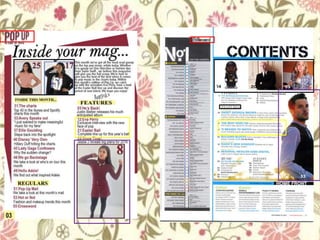
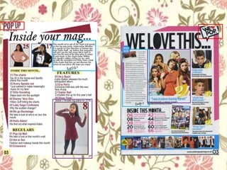
The document summarizes the process of creating a contents page for a magazine. It was inspired by the contents pages of "Billboard" and "We Heart Pop" magazines. Elements borrowed from "Billboard" include using its logo, positioning two featured artist images at the top of the page similarly, and using two colors of text (maroon and black) to indicate what each page is about. Elements from "We Heart Pop" include placing the magazine logo at the top, featuring a main image, including an editor's note, and adding color behind the text for visual appeal. The creator aimed to design a contents page that looked professional by drawing from conventions used in other popular music magazines.
