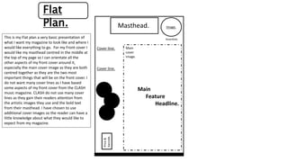
Masthead.
Main
Feature
Headline.
Cover line.
Cover line.
Price&
barcode.
Image.
tags
tags
tags
Website/social media/slogan.
Incentive.
Main
cover
image.
Flat
Plan.
This is my Flat plan a very basic presentation of
what I want my magazine to look like and where I
would like everything to go. For my Front cover I
would like my masthead centred in the middle at
the top of my page so I can orientate all the
other aspects of my front cover around it,
especially the main cover image as they are both
centred together as they are the two most
important things that will be on the front cover. I
do not want many cover lines as I have based
some aspects of my front cover from the CLASH
music magazine. CLASH do not use many cover
lines as they gain their readers attention from
the artistic images they use and the bold text
from their masthead. I have chosen to use
additional cover images so the reader can have a
little knowledge about what they would like to
expect from my magazine.
Contents Page.
For my contents page I have chosen to have a main
image on the page and then have all my text and
page numbers outlining the image as it gives it a
more professional look. I have added ‘contents
page’ at the top so my readers are aware that it is a
contents page.
Main Image
Pull Quote
I have decided to put my Main
Image of my double page
spread in the centre of the
page as it make it more
appealing to the readers eyes
rather than having loads of text
that may put them off,
considering my audience are
mainly teenagers. I have
decided to add a pull quote
which will be the most
interesting thing said
throughout the article so it
grabs my readers attention to
read it. I have also decided to
have text that can spread
across two pages as it gives the
magazine a more professional
look.

Flat plan

  • 1.
    Masthead. Main Feature Headline. Cover line. Cover line. Price& barcode. Image. tags tags tags Website/socialmedia/slogan. Incentive. Main cover image. Flat Plan. This is my Flat plan a very basic presentation of what I want my magazine to look like and where I would like everything to go. For my Front cover I would like my masthead centred in the middle at the top of my page so I can orientate all the other aspects of my front cover around it, especially the main cover image as they are both centred together as they are the two most important things that will be on the front cover. I do not want many cover lines as I have based some aspects of my front cover from the CLASH music magazine. CLASH do not use many cover lines as they gain their readers attention from the artistic images they use and the bold text from their masthead. I have chosen to use additional cover images so the reader can have a little knowledge about what they would like to expect from my magazine.
  • 2.
    Contents Page. For mycontents page I have chosen to have a main image on the page and then have all my text and page numbers outlining the image as it gives it a more professional look. I have added ‘contents page’ at the top so my readers are aware that it is a contents page.
  • 3.
    Main Image Pull Quote Ihave decided to put my Main Image of my double page spread in the centre of the page as it make it more appealing to the readers eyes rather than having loads of text that may put them off, considering my audience are mainly teenagers. I have decided to add a pull quote which will be the most interesting thing said throughout the article so it grabs my readers attention to read it. I have also decided to have text that can spread across two pages as it gives the magazine a more professional look.