These are my final decisions on the fonts I will use for my music magazine and the colour scheme I will use. There are also my final photos I will use in my magazine.
These are my final decisions on the fonts I will use for my music magazine and the colour scheme I will use. There are also my final photos I will use in my magazine.
These are my final flat plans for my POP music magazine. This powerpoint includes my flat plans for the cover page, chart page, contents page, and both pages of the double page spread.
These are my final flat plans for my POP music magazine. This powerpoint includes my flat plans for the cover page, chart page, contents page, and both pages of the double page spread.
The perfect Sundabet Slot mudah menang Promo new member Animated PDF for your conversation. Discover and Share the best GIFs on Tenor
Admin Ramah Cantik Aktif 24 Jam Nonstop siap melayani pemain member Sundabet login via apk sundabet rtp daftar slot gacor daftar
2137ad Merindol Colony Interiors where refugee try to build a seemengly norm...luforfor
This are the interiors of the Merindol Colony in 2137ad after the Climate Change Collapse and the Apocalipse Wars. Merindol is a small Colony in the Italian Alps where there are around 4000 humans. The Colony values mainly around meritocracy and selection by effort.
2137ad - Characters that live in Merindol and are at the center of main storiesluforfor
Kurgan is a russian expatriate that is secretly in love with Sonia Contado. Henry is a british soldier that took refuge in Merindol Colony in 2137ad. He is the lover of Sonia Contado.
thGAP - BAbyss in Moderno!! Transgenic Human Germline Alternatives ProjectMarc Dusseiller Dusjagr
thGAP - Transgenic Human Germline Alternatives Project, presents an evening of input lectures, discussions and a performative workshop on artistic interventions for future scenarios of human genetic and inheritable modifications.
To begin our lecturers, Marc Dusseiller aka "dusjagr" and Rodrigo Martin Iglesias, will give an overview of their transdisciplinary practices, including the history of hackteria, a global network for sharing knowledge to involve artists in hands-on and Do-It-With-Others (DIWO) working with the lifesciences, and reflections on future scenarios from the 8-bit computer games of the 80ies to current real-world endeavous of genetically modifiying the human species.
We will then follow up with discussions and hands-on experiments on working with embryos, ovums, gametes, genetic materials from code to slime, in a creative and playful workshop setup, where all paticipant can collaborate on artistic interventions into the germline of a post-human future.
Explore the multifaceted world of Muntadher Saleh, an Iraqi polymath renowned for his expertise in visual art, writing, design, and pharmacy. This SlideShare delves into his innovative contributions across various disciplines, showcasing his unique ability to blend traditional themes with modern aesthetics. Learn about his impactful artworks, thought-provoking literary pieces, and his vision as a Neo-Pop artist dedicated to raising awareness about Iraq's cultural heritage. Discover why Muntadher Saleh is celebrated as "The Last Polymath" and how his multidisciplinary talents continue to inspire and influence.
The Legacy of Breton In A New Age by Master Terrance LindallBBaez1
Brave Destiny 2003 for the Future for Technocratic Surrealmageddon Destiny for Andre Breton Legacy in Agenda 21 Technocratic Great Reset for Prison Planet Earth Galactica! The Prophecy of the Surreal Blasphemous Desires from the Paradise Lost Governments!
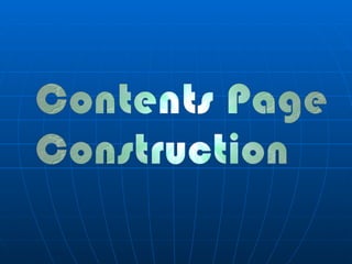
2. First I started to look at different fonts on Adobe Photoshop Cs3. I came across several fonts that I liked for the contents page, however, I thought it would be best to stay with the same masthead font as the front cover. Moreover, I stuck to the same font because I knew my magazine had to have a house style (the same style and themes of fonts, colours, layouts. Etc.) running throughout the magazine. I used the font ‘Genuine’, it was the same as the front covers and it was relevant and it linked into the music genre of the magazine; it reinforced the dance feel and genre.
3. Moreover, the mastheads for the contents was of the same font and colour gradient as the front covers, to add to this I also used the same splat logo underneath the masthead; giving the magazine a cool and funky feel which links to the genre (Dance). For both the Front cover and the Contents, I applied a ‘drop shadow’ and an ‘inner shadow’ to make it stand out to my target audience and to make it look more professional and modern.
4. Image manipulation This is one of the images I took at my photo shoot, I used this for one of the images for my contents page. I opened it on Photoshop, erased the background with the magic wand tool, then I added a gradient background and then I cut it out with the ellipse tool. To add to this, even though it took me a while to get to this point I never liked the look and I though It wasn’t very professional and didn’t look part of the magazine.
5. I then edited the images slightly differently, I used the same backgrounds but cut them out with the square tool instead; it looked better and had a greater impact on the audience. In addition, I added a square block background and I added a purple overlay to make to carry on the colour themes of the magazine. Moreover, I used a inner shadow on the purple block to make them look more 3-D and for them to stand out more.
6. I used the same type of background as the front cover to carry on the house style and colour themes; the black to grey gradient allows the text to stand out. To add to this, I also added a inner shadow as I did for the front covers background.
7. As I constructed my contents page I looked at other real contents pages for inspiration and make sure I was following the codes and conventions of magazines. Furthermore, I looked at how the other magazine had an ongoing housestyle and how it used the same colours, layouts and fonts.
8. For my contents I created a logo by using a brush of Adobe Photoshop. I liked the brush because it linked into the dance lifestyle of the magazine, the turntable gives an appealing look to the target audience. Moreover, to make the logo stand out I added another brush beneath the turntable to make it part of the dance magazine; it looked appealing and carried on the colour themes.
9. First I thought about having the logo beneath the images at the corner. However, It looked out of place and wasn’t relevant to the house style of the magazine. Therefore, I thought about having on the corner of a subheading.
10. I added some subheadings and placed the logo on top of them, it looked appealing, it targeted my audience and was relevant to the house style.
11. Moreover, I added the same colour and effects to the square block behind the text ‘FEATURE’ as I did for the bottom strip. To add to this, I used the same fonts and colours to carry on the house style and I moved my images to different places so I could fit it text; without the text going over the images.
12. Here I made the block smaller and placed it behind the number, it made the number stand out; it made a contrast that allowed the number to be seen more clearly.
13. In addition, as I went along I looked back at my flat plan making sure I was using the same type of language; the same words that grabbed the audiences attention, for instance, ‘Exclusive’ and ‘Preview’.
14. As I added my text to my contents page I kept it the same font and colours, also, I duplicated the layer that had the small blue block so I could have it under all the other numbers. What is more, is that I was very pleased with how far I had come in constructing my contents, it looked professional and I could compare it with real magazines (I will do so in my final magazine evaluation).
15. I added another subheading, with the title ‘EVENTS,’ I kept the same blue block underneath it to keep the to the same colour themes and I also kept to the same font. Furthermore, I added text below the 2 nd subheading with text like ‘Brit Awards 2010,’ this was a enticing hook that would appeal to the audience that like to go beyond the magazine and go see music and events for themselves; the aspirers and followers would want to go to the events, clubs and ‘see all the backstage interviews and after parties with the stars.’
16. This is my nearly complete contents page, it looks appealing because I have used a variety of colours, images and fonts. However, I only used a specific variety to keep to the same house style and themes that run throughout the magazine. Also, I added text to the bottom strip to make it look similar to the front cover; audiences would know that this contents page is part of the rave magazine.