1. Focus Group
I carried out a focus group with
representatives of my target audience in order
to find out more about what kind of people
they are, and what kind of magazine appeals
to them when it comes to dance music
magazines.
I will be able to gain insight on my target
audience’s mind, therefore I could make sure
my magazine would appeal specifically to
them, by including things that they said they
liked, and minimising features of the magazine
they said they didn’t like. I will incorporate this
information into my magazine.
The three representatives of my target audience
are called Sam C (17), Sam L (16) and Patrick
(17). They are all currently in full time education
and are studying for their A Level
examinations, and have a keen interest within
the electronic dance music genre.
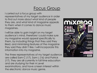
2. Focus Group
In order to carry out my focus group successfully, I showed my
representatives the November 2011 issue of legendary dance music
magazine, Mixmag, which had Carl Craig (famous Techno DJ) as it’s
cover artist. I asked them questions based on the magazine, and
noted their views/opinions down…
Patrick
Sam C
Sam L
3. 1) What aspects of this front cover
appeal to you and why?
“The colour scheme‟s quite different. It‟s
quite dark and almost mysterious so I‟d
pick it up – but only because I‟d be
curious to find out why it‟s so dark and
gloomy-ish” – Sam C
“The bits of text at the sides are really attention
grabbing for me, personally! „The Great DJ Agency
Scam‟ sounds really interesting so I‟d probably flick
through to see what the articles like. I also like the
dog Carl‟s holding – it‟s quite out there!” - Sam L
“See the colour scheme is quite weird like Sam C said earlier. I
don‟t think it makes the magazine look special or anything.
The „Mixmag‟ logo in white at the top‟s more bold and it looks
better rather than the black-ish/purple colours on the rest of
the cover. It‟s more “dance-y” than any other bit of writing on
the page. I‟d usually associate the colours on the cover with
rock music rather than dance…but I guess it does give it a bit
of a nightclub kinda theme” - Patrick
4. 2) After looking through the
magazine, would you be likely to buy it?
“Yeah I‟d say I‟d buy it. It‟s really colourful
inside and quite organized so it seems easy
to read. The articles also look quite detailed
and unique”– Sam C
“I wouldn‟t be likely to buy it. Purely for the
fact that when reading through the articles
it mentioned lots of artists/DJ‟s which I
havent even heard of. Too many different
types of dance music within one magazine.
I listen to more house/dubstep music, but
this tends to talk more about international
DJ‟s. I also don‟t listen to techno, and the
cover star is a techno artist…maybe if it
focused on certain genres a little bit more
I‟d consider buying it” - Patrick
“No, I wouldn‟t buy it. Once I looked through the
magazine it was really like…it had a lot of writing in it.
The articles do look interesting but it seems like lots of
effort and time just to read them”- Sam L
5. 3) If you could change something about
the magazine what would it be? Why?
“I‟d say the colour scheme on the front
cover. Doesn‟t really signal what kind of
music magazine this is, took me ages to figure
out it is meant to be sort of „nightclub‟
themed. I‟d say a slightly brighter colour
scheme would do the trick ”– Sam C
“I‟d say aim it at a younger audience and
design it with the young audience in mind. Its
not really on my level. Its obviously aimed at a
young audience, but I don‟t feel as if I can
connect with it or the artists within it”- Patrick
“I‟d definitely make the articles less
detailed…if there‟s extra bits of information
that had to be included I‟d put them in little
boxes around the page. The big bits of writing
seem so long and boring”- Sam L