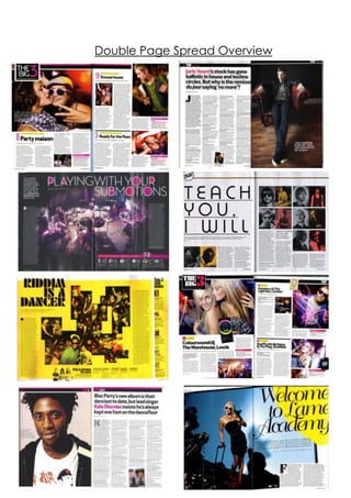
2. Mixmagare known to change it up when it comes to
their double page spreads, however, they are also all
very similar in terms of layout, design and use of
images and text.
Firstly, on every single double page spread shown
above, the text is laid out in a column type format and
is either written in black or white. This is because it goes
together with the layout of the entire magazine; from
the front page onwards the majority of text that
appears is in a column format so it appears
sophisticated, going with the magazine’s simplistic
design and also so the information is easily accessible
for the reader. The black and white also reinforce this
sophistication within the double page spreads and
make them look professional and polished. Also, all
(apart from the interview features with JorisVoorn and
KeleOkereke) of the double page spreads feature a
large display font within them as a main sell-
line/headline on the spread. This is so the reader is
drawn into reading the spread – they may not have
noticed it if they hadn’t have seen like giant, eye
catching font, and so by this clever technique, they
almost guarantee that the reader is drawn in.
Another key feature which makes the double page
spreads similar is the fact that none feature smaller
related images; although in the two ‘The Big 3’ there
are smaller images and not one main image, the
smaller images are set out as a main image for each
3. section of the double page spread (this helps to break
the article down and help it appear less intimidating
and textual to the reader). The lack of lots of smaller
related images makes the page also appear more
organized and easier to read for the audience.All of
the double page spreads (as stated before when
speaking about text) feature black and white
somewhere within the double page spread. This yet
again reinforces Mixmag’s sophisticated yet cool
brand identity and makes sure that there is a symbiotic
link between all of the double page spreads.
Depending on what the double page spread
contains, the layout can vary. For example, if it is an
interview, the layout tends to be image on one page,
with all the text in a column format on the other;
article type features usually have a main image in the
middle of the two pages, with two blocks of text (one
on the end of the right hand page, one on the end of
the left hand page) and ‘The Big 3’ double page
spreads tend to have one bigger article on one page,
along with two smaller articles on the other. However,
these conventions are broken by the ‘Welcome to
Lame Academy’ and ‘Teach You I Will’ double page
spreads – they seem to have a random layout, which
doesn’t have a known design to it. This again suggests
Mixmag isn’t afraid to refresh their magazine through
changing layout and style within their double page
spreads; they break boundaries and like to
occasionally change up their style.