SlideShare a Scribd company logo
1 of 6
This double page spread follows general and layout
conventions of a standard double page spread through
its use of things such as a main image, a sell line, a
headline, astandfirst and body copy. The double page
spread looks extremely professional; it isn‟t very text heavy
which is unlike Mixmag, however, it is obviously from
Mixmag; this is evident through its again simplistic layout.
Mixmag tend to „mix it up‟ with their double page
spreads, especially article based ones like the above, and
so it‟s design is different to other double page spreads
found in Mixmag. However, their interview based ones
tend to have the same layout and so although this
particular one doesn‟t look similar to other double pages
spreads found in Mixmag, it is conventional for Mixmag to
make each double page spread different and so in a
way it reinforces Mixmag‟s brand identity.
The title „PLAYING WITH YOUR SUBMOTIONS‟ is catchy and
appealing to the audience through the use of a pun; the
artist(s) featured are Submotion Orchestra and the title
makes light of the saying “playing with your emotions” – it
shows a picture of the band playing and so the audience
feels like they are literally playing a set with Submotion
Orchestra. The use of word play suggests that this artist is
fresh and unique, much like the magazine whilst also
indicating that both the magazine and it‟s audience are
intelligent, and on the same wavelength intellectually. It
also shows that the magazine knows that the audience is
likely to be clued up on popular dance acts, otherwise
they wouldn‟t have used the pun. The audience will
recognise this pun and will feel clever for doing so, and
the use of word play also shows the trust Mixmag has in it‟s
readers – it knows that the target audience is clever and
will understand it. It is written in a thin, white, straight lined
serif font with different shades of red, pink and purple
filling the holes (i.e. „o‟ or „p‟) in the letters, making the
headline/title and making sure it catches the readers eye.
The font helps to present the article as sophisticated yet
trendy and maintains Mixmag‟s simple yet sophisticated
brand identity.

There is only one main image on the page, which is a
wide shot of Submotion Orchestra performing and it is
shot so that we see from behind Submotion Orchestra
and we can vaguely see the audience in the distance; it
makes the reader feel as if the article is giving them VIP
access all areas with the artist and therefore they will
warm to the magazine. The main image also suggests
that Submotion Orchestra are very committed; they
haven‟t turned around and faced the camera, and are
busy playing the gig therefore we can only see their
backs – the only image we have of their faces is a few
smaller related images at the bottom right hand side of
the page. From seeing how into their gig they are, the
audience may find it appealing to go to one and so a
representation of the band being loyal, committed and
enthusiastic in their work is created through the main
image. There isn‟t much genre specific iconography in
the main image, as Submotion Orchestra is a collection of
talented musicians; it is conventional for the audience to
see an individual artist in Mixmag as dance music artists
are commonly DJ‟s who use special equipment, therefore
they don‟t need a band. We can vaguely see a
keyboard on the left hand side of the spread, which
could be argued to be genre specific iconography in this
instance, as well as funky lighting (the triangles) being
featured – lighting is unique in rave/club settings and so
can be argued as dance music iconography. The mise-
en-scene of the image is vague, however, it signal‟s that
the magazine is definitely a music magazine through the
background setting. The main image is viewable mostly
from the middle of the two pages; it appears to span
across both with the artist/stage being featured in the
middle. The image doesn‟t have a start or stop point and
so it creates an open plan layout and makes the article
seem much more relaxing and chilled – the lack of layout
structure also reflects the simplistic design within the
magazine. It may also be used to signify the fact that the
featured artist(s) are very down to earth. The small, circle
shaped, feature article photos are also important as they
show us who the band really are as, in the picture, we
can only see their backs. Their pictures appear very
normal and down to earth and are accompanied by
small pieces of text such as “both the overgrown kid and
the granddad of the band” and “…brilliant drummer and
very sporty too…”. The friendly, outgoing phrases and
language used helps the reader to relate the magazine
and form a bond with it as they understand what the
magazine is saying. The mode-of-address used also helps
to convey that Mixmag is aimed at a young audience
who are educated and street wise whilst also following
Mixmag‟s own conventions, thus maintaining brand
identity. The text used near the small images also helps to
anchor the personality of each member of the band;
there‟s the sporty one, the loud one and the moody one
etc, so the audience is able to define members of the
band as say, their friendship group, emphasising the bond
between the reader and the magazine.

The body copy, as stated earlier, is set out in two long
columns on the left and right hand side of both pages,
making the magazine look organized. The body copy
itself is an article, which heightens the sophistication of the
magazine and reflects that although the audience‟s
young, they have a mature attitude and want to read
well written pieces. The presentation of the text
emphasises this and helps to make the usually text heavy
magazine appear lighter to read. The body copy is also
written in white, linking with the title which is also written in
white and creating a uniformity across this article that
maintains the visually appealing and professional look.
The artist is represented through the information in the
body copy as a tight knit, down to earth group of friends
who came from humble beginnings and worked hard to
make it in the music industry. This also adds to the
relatable side of Mixmag, highlighting how the reader is
similar to the artists it listens to and thus attracting them to
listen to them. Intrestingly enough, no pull quotes are
used, and this is common in Mixmag‟s double page
spreads. The lack of pull quotes suggests that the
magazine is too cool and trendy for traditional techniques
of drawing the reader in – they can appear tacky as they
tend to appear more in pop/rock magazines and since
Mixmag‟s brand identity is sophisticated and mature, it
wouldn‟t want to jeopardize their brand identity. The small
snippets of text that are near the small feature article
photographs however, are separated by lines and so
appear in a small, square shape. The fact that this
information is broken down into bitesize pieces and isn‟t
included in the article makes the double page spread
more appealing –the long, textual columns on the left
and right hand side might daunt the reader if they don‟t
know much about the artist and so they‟d be much more
likely to read a smaller section separate from the main
body.

The colours which dominate the double page spread are
indigo, black,white and shades of pink and purple. This
colour scheme maintains the sophistication of Mixmag
and reflects the nightlife that the readers love and
associate with dance music. The colours used also reflect
the cool and trendy image/brand identity Mixmag has
maintained throughout the years. The colours also go all
together to create a much more professional feel to the
double page spread and also link to club atmospheres,
which are notorious for featuring purple/blue shades
inside.

The display font is also key in maintaining brand identity,
as it gives the double page spread a more serious feel,
showing how the readers take dance music seriously. The
fonts maintain brand identity as italic font is used for the
standfirst (which also breaks layout conventions in its
positioning) which is common as standfirst‟s usually have
some sort of text effect that makes it stand out, setting it
aside from the rest of the text on the page.

More Related Content

What's hot

Deconstruction of magazines
Deconstruction of magazinesDeconstruction of magazines
Deconstruction of magazinesLauren Holyoak
 
Deconstruction of magazines 2
Deconstruction of magazines 2Deconstruction of magazines 2
Deconstruction of magazines 2Lauren Holyoak
 
Mojo magazine analysis
Mojo magazine analysisMojo magazine analysis
Mojo magazine analysisLittlePainter
 
Evaluation presentation
Evaluation presentationEvaluation presentation
Evaluation presentationEmily Brown
 
Music Magazine Front Cover
Music Magazine Front Cover  Music Magazine Front Cover
Music Magazine Front Cover georgiamaesmith1
 
Double page spread analysis
Double page spread analysisDouble page spread analysis
Double page spread analysisJake Shelvey
 
Further research final
Further research finalFurther research final
Further research finalEmilyPlenty
 
Format research of music magazines
Format research of music magazinesFormat research of music magazines
Format research of music magazinesellisputnam
 
Signs And Signifiers - Music Magazines
Signs And Signifiers - Music MagazinesSigns And Signifiers - Music Magazines
Signs And Signifiers - Music MagazinesMattR298
 
Task 2 analysis of nme music magazine
Task 2  analysis of nme music magazineTask 2  analysis of nme music magazine
Task 2 analysis of nme music magazineasmediab15
 
Further research final
Further research finalFurther research final
Further research finalEmilyPlenty
 
Evaluation F – forms and conventions
Evaluation F – forms and conventionsEvaluation F – forms and conventions
Evaluation F – forms and conventionsRyan Tarran
 
Music mag analysis
Music mag analysisMusic mag analysis
Music mag analysiskellyanb
 
Magazine analysis
Magazine analysis    Magazine analysis
Magazine analysis Amir Mohseny
 

What's hot (20)

Deconstruction of magazines
Deconstruction of magazinesDeconstruction of magazines
Deconstruction of magazines
 
Deconstruction of magazines 2
Deconstruction of magazines 2Deconstruction of magazines 2
Deconstruction of magazines 2
 
Mojo magazine analysis
Mojo magazine analysisMojo magazine analysis
Mojo magazine analysis
 
Mix mag analysis
Mix mag analysisMix mag analysis
Mix mag analysis
 
Evaluation presentation
Evaluation presentationEvaluation presentation
Evaluation presentation
 
Music Magazine Front Cover
Music Magazine Front Cover  Music Magazine Front Cover
Music Magazine Front Cover
 
Double page spread analysis
Double page spread analysisDouble page spread analysis
Double page spread analysis
 
Magazine assignment
Magazine assignmentMagazine assignment
Magazine assignment
 
Further research final
Further research finalFurther research final
Further research final
 
Format research of music magazines
Format research of music magazinesFormat research of music magazines
Format research of music magazines
 
Mix mag analysis
Mix mag analysisMix mag analysis
Mix mag analysis
 
Final evaluation 2
Final evaluation 2Final evaluation 2
Final evaluation 2
 
Signs And Signifiers - Music Magazines
Signs And Signifiers - Music MagazinesSigns And Signifiers - Music Magazines
Signs And Signifiers - Music Magazines
 
Task 2 analysis of nme music magazine
Task 2  analysis of nme music magazineTask 2  analysis of nme music magazine
Task 2 analysis of nme music magazine
 
Magazine analysis
Magazine analysisMagazine analysis
Magazine analysis
 
Further research final
Further research finalFurther research final
Further research final
 
Evaluation F – forms and conventions
Evaluation F – forms and conventionsEvaluation F – forms and conventions
Evaluation F – forms and conventions
 
Music mag analysis
Music mag analysisMusic mag analysis
Music mag analysis
 
Kuku hjghjhjh
Kuku hjghjhjhKuku hjghjhjh
Kuku hjghjhjh
 
Magazine analysis
Magazine analysis    Magazine analysis
Magazine analysis
 

Viewers also liked

Double page spread overview final redraft feedback on blog
Double page spread overview final redraft feedback on blogDouble page spread overview final redraft feedback on blog
Double page spread overview final redraft feedback on blogbetsimegan
 
Front cover analysis 1
Front cover analysis 1Front cover analysis 1
Front cover analysis 1betsimegan
 
Double page spread overview
Double page spread overviewDouble page spread overview
Double page spread overviewbetsimegan
 
Final questionnaire
Final questionnaireFinal questionnaire
Final questionnairebetsimegan
 
Contents page analysis 2
Contents page analysis 2Contents page analysis 2
Contents page analysis 2betsimegan
 
Costume ideas 3
Costume ideas 3Costume ideas 3
Costume ideas 3betsimegan
 
Contents page analysis 2
Contents page analysis 2Contents page analysis 2
Contents page analysis 2betsimegan
 
Double page spread analysis 2 betsi
Double page spread analysis 2 betsiDouble page spread analysis 2 betsi
Double page spread analysis 2 betsibetsimegan
 
Front cover overview
Front cover overviewFront cover overview
Front cover overviewbetsimegan
 
Contents page overview
Contents page overviewContents page overview
Contents page overviewbetsimegan
 
Questionnaire Analysis
Questionnaire AnalysisQuestionnaire Analysis
Questionnaire Analysisbetsimegan
 
Final case study
Final case studyFinal case study
Final case studybetsimegan
 
Front cover analysis 1
Front cover analysis 1Front cover analysis 1
Front cover analysis 1betsimegan
 
Front cover analysis
Front cover analysisFront cover analysis
Front cover analysisbetsimegan
 
Contents page overview
Contents page overviewContents page overview
Contents page overviewbetsimegan
 

Viewers also liked (17)

Double page spread overview final redraft feedback on blog
Double page spread overview final redraft feedback on blogDouble page spread overview final redraft feedback on blog
Double page spread overview final redraft feedback on blog
 
Case Study
Case StudyCase Study
Case Study
 
Front cover analysis 1
Front cover analysis 1Front cover analysis 1
Front cover analysis 1
 
Double page spread overview
Double page spread overviewDouble page spread overview
Double page spread overview
 
Final questionnaire
Final questionnaireFinal questionnaire
Final questionnaire
 
Contents page analysis 2
Contents page analysis 2Contents page analysis 2
Contents page analysis 2
 
Pitch images
Pitch imagesPitch images
Pitch images
 
Costume ideas 3
Costume ideas 3Costume ideas 3
Costume ideas 3
 
Contents page analysis 2
Contents page analysis 2Contents page analysis 2
Contents page analysis 2
 
Double page spread analysis 2 betsi
Double page spread analysis 2 betsiDouble page spread analysis 2 betsi
Double page spread analysis 2 betsi
 
Front cover overview
Front cover overviewFront cover overview
Front cover overview
 
Contents page overview
Contents page overviewContents page overview
Contents page overview
 
Questionnaire Analysis
Questionnaire AnalysisQuestionnaire Analysis
Questionnaire Analysis
 
Final case study
Final case studyFinal case study
Final case study
 
Front cover analysis 1
Front cover analysis 1Front cover analysis 1
Front cover analysis 1
 
Front cover analysis
Front cover analysisFront cover analysis
Front cover analysis
 
Contents page overview
Contents page overviewContents page overview
Contents page overview
 

Similar to Double page spread analysis 1

Contents page analysis 1
Contents page analysis 1Contents page analysis 1
Contents page analysis 1betsimegan
 
Front cover Essay
Front cover EssayFront cover Essay
Front cover EssayEddie Guy
 
Front cover essay_brief
Front cover essay_briefFront cover essay_brief
Front cover essay_briefEddie Guy
 
Task 3 research bmth
Task 3 research bmthTask 3 research bmth
Task 3 research bmthasmediae15
 
Front cover analysis 2
Front cover analysis 2Front cover analysis 2
Front cover analysis 2betsimegan
 
Market research
Market researchMarket research
Market researchKaris Hays
 
Double Page Spread Analyses
Double Page Spread AnalysesDouble Page Spread Analyses
Double Page Spread AnalysesKieran Hadfield
 
Kerrang Magazine Deconstruction
Kerrang Magazine Deconstruction Kerrang Magazine Deconstruction
Kerrang Magazine Deconstruction katedawsonn97
 
Audience Research
Audience ResearchAudience Research
Audience ResearchEmilyPlenty
 
Contents Page Analysis
Contents Page AnalysisContents Page Analysis
Contents Page AnalysisJosh Naughton
 
NME and Rolling Stone front cover analysis
NME and Rolling Stone front cover analysisNME and Rolling Stone front cover analysis
NME and Rolling Stone front cover analysisritavrinda
 
Kerrang! Cover Analysis
Kerrang! Cover AnalysisKerrang! Cover Analysis
Kerrang! Cover AnalysisLukaMedia
 
Kerrang! Cover Analysis
Kerrang! Cover AnalysisKerrang! Cover Analysis
Kerrang! Cover AnalysisLukaMedia
 
Radial Analysis
Radial  AnalysisRadial  Analysis
Radial AnalysisMFJ
 

Similar to Double page spread analysis 1 (20)

Contents page analysis 1
Contents page analysis 1Contents page analysis 1
Contents page analysis 1
 
Eval 2
Eval 2Eval 2
Eval 2
 
Front cover Essay
Front cover EssayFront cover Essay
Front cover Essay
 
Front cover essay_brief
Front cover essay_briefFront cover essay_brief
Front cover essay_brief
 
Task 3 research bmth
Task 3 research bmthTask 3 research bmth
Task 3 research bmth
 
Front cover analysis 2
Front cover analysis 2Front cover analysis 2
Front cover analysis 2
 
Magazine further research
Magazine further researchMagazine further research
Magazine further research
 
FCD 2
FCD 2FCD 2
FCD 2
 
Market research
Market researchMarket research
Market research
 
Double Page Spread Analyses
Double Page Spread AnalysesDouble Page Spread Analyses
Double Page Spread Analyses
 
Kerrang Magazine Deconstruction
Kerrang Magazine Deconstruction Kerrang Magazine Deconstruction
Kerrang Magazine Deconstruction
 
Audience Research
Audience ResearchAudience Research
Audience Research
 
Contents Page Analysis
Contents Page AnalysisContents Page Analysis
Contents Page Analysis
 
Magazine analysis
Magazine analysisMagazine analysis
Magazine analysis
 
NME and Rolling Stone front cover analysis
NME and Rolling Stone front cover analysisNME and Rolling Stone front cover analysis
NME and Rolling Stone front cover analysis
 
Kerrang! Cover Analysis
Kerrang! Cover AnalysisKerrang! Cover Analysis
Kerrang! Cover Analysis
 
Magazine analysis
Magazine analysisMagazine analysis
Magazine analysis
 
Kerrang! Cover Analysis
Kerrang! Cover AnalysisKerrang! Cover Analysis
Kerrang! Cover Analysis
 
Radial Analysis
Radial  AnalysisRadial  Analysis
Radial Analysis
 
textual analysis
textual analysis textual analysis
textual analysis
 

More from betsimegan

Sub genres betsi final
Sub genres betsi finalSub genres betsi final
Sub genres betsi finalbetsimegan
 
Evaluation babyyy
Evaluation babyyyEvaluation babyyy
Evaluation babyyybetsimegan
 
Font analysis for slideshare
Font analysis for slideshareFont analysis for slideshare
Font analysis for slidesharebetsimegan
 
Practice shots
Practice shotsPractice shots
Practice shotsbetsimegan
 
Artist profile
Artist profileArtist profile
Artist profilebetsimegan
 
Location ideas
Location ideasLocation ideas
Location ideasbetsimegan
 
Exploring mise en scene final
Exploring mise en scene finalExploring mise en scene final
Exploring mise en scene finalbetsimegan
 
Final questionnaire
Final questionnaireFinal questionnaire
Final questionnairebetsimegan
 
Questionnaire analysis
Questionnaire analysisQuestionnaire analysis
Questionnaire analysisbetsimegan
 
Location ideas
Location ideasLocation ideas
Location ideasbetsimegan
 
Artist profile
Artist profileArtist profile
Artist profilebetsimegan
 
Exploring mise en scene final
Exploring mise en scene finalExploring mise en scene final
Exploring mise en scene finalbetsimegan
 

More from betsimegan (15)

Sub genres betsi final
Sub genres betsi finalSub genres betsi final
Sub genres betsi final
 
Evaluation babyyy
Evaluation babyyyEvaluation babyyy
Evaluation babyyy
 
Font analysis for slideshare
Font analysis for slideshareFont analysis for slideshare
Font analysis for slideshare
 
Font analysis
Font analysisFont analysis
Font analysis
 
Focus group
Focus groupFocus group
Focus group
 
Practice shots
Practice shotsPractice shots
Practice shots
 
Artist profile
Artist profileArtist profile
Artist profile
 
Location ideas
Location ideasLocation ideas
Location ideas
 
Costume ideas
Costume ideasCostume ideas
Costume ideas
 
Exploring mise en scene final
Exploring mise en scene finalExploring mise en scene final
Exploring mise en scene final
 
Final questionnaire
Final questionnaireFinal questionnaire
Final questionnaire
 
Questionnaire analysis
Questionnaire analysisQuestionnaire analysis
Questionnaire analysis
 
Location ideas
Location ideasLocation ideas
Location ideas
 
Artist profile
Artist profileArtist profile
Artist profile
 
Exploring mise en scene final
Exploring mise en scene finalExploring mise en scene final
Exploring mise en scene final
 

Double page spread analysis 1

  • 1. This double page spread follows general and layout conventions of a standard double page spread through its use of things such as a main image, a sell line, a headline, astandfirst and body copy. The double page spread looks extremely professional; it isn‟t very text heavy which is unlike Mixmag, however, it is obviously from Mixmag; this is evident through its again simplistic layout. Mixmag tend to „mix it up‟ with their double page spreads, especially article based ones like the above, and so it‟s design is different to other double page spreads found in Mixmag. However, their interview based ones tend to have the same layout and so although this particular one doesn‟t look similar to other double pages spreads found in Mixmag, it is conventional for Mixmag to make each double page spread different and so in a way it reinforces Mixmag‟s brand identity.
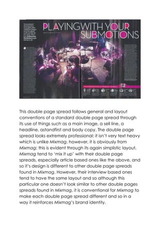
  • 2. The title „PLAYING WITH YOUR SUBMOTIONS‟ is catchy and appealing to the audience through the use of a pun; the artist(s) featured are Submotion Orchestra and the title makes light of the saying “playing with your emotions” – it shows a picture of the band playing and so the audience feels like they are literally playing a set with Submotion Orchestra. The use of word play suggests that this artist is fresh and unique, much like the magazine whilst also indicating that both the magazine and it‟s audience are intelligent, and on the same wavelength intellectually. It also shows that the magazine knows that the audience is likely to be clued up on popular dance acts, otherwise they wouldn‟t have used the pun. The audience will recognise this pun and will feel clever for doing so, and the use of word play also shows the trust Mixmag has in it‟s readers – it knows that the target audience is clever and will understand it. It is written in a thin, white, straight lined serif font with different shades of red, pink and purple filling the holes (i.e. „o‟ or „p‟) in the letters, making the headline/title and making sure it catches the readers eye. The font helps to present the article as sophisticated yet trendy and maintains Mixmag‟s simple yet sophisticated brand identity. There is only one main image on the page, which is a wide shot of Submotion Orchestra performing and it is shot so that we see from behind Submotion Orchestra and we can vaguely see the audience in the distance; it makes the reader feel as if the article is giving them VIP access all areas with the artist and therefore they will warm to the magazine. The main image also suggests
  • 3. that Submotion Orchestra are very committed; they haven‟t turned around and faced the camera, and are busy playing the gig therefore we can only see their backs – the only image we have of their faces is a few smaller related images at the bottom right hand side of the page. From seeing how into their gig they are, the audience may find it appealing to go to one and so a representation of the band being loyal, committed and enthusiastic in their work is created through the main image. There isn‟t much genre specific iconography in the main image, as Submotion Orchestra is a collection of talented musicians; it is conventional for the audience to see an individual artist in Mixmag as dance music artists are commonly DJ‟s who use special equipment, therefore they don‟t need a band. We can vaguely see a keyboard on the left hand side of the spread, which could be argued to be genre specific iconography in this instance, as well as funky lighting (the triangles) being featured – lighting is unique in rave/club settings and so can be argued as dance music iconography. The mise- en-scene of the image is vague, however, it signal‟s that the magazine is definitely a music magazine through the background setting. The main image is viewable mostly from the middle of the two pages; it appears to span across both with the artist/stage being featured in the middle. The image doesn‟t have a start or stop point and so it creates an open plan layout and makes the article seem much more relaxing and chilled – the lack of layout structure also reflects the simplistic design within the magazine. It may also be used to signify the fact that the featured artist(s) are very down to earth. The small, circle
  • 4. shaped, feature article photos are also important as they show us who the band really are as, in the picture, we can only see their backs. Their pictures appear very normal and down to earth and are accompanied by small pieces of text such as “both the overgrown kid and the granddad of the band” and “…brilliant drummer and very sporty too…”. The friendly, outgoing phrases and language used helps the reader to relate the magazine and form a bond with it as they understand what the magazine is saying. The mode-of-address used also helps to convey that Mixmag is aimed at a young audience who are educated and street wise whilst also following Mixmag‟s own conventions, thus maintaining brand identity. The text used near the small images also helps to anchor the personality of each member of the band; there‟s the sporty one, the loud one and the moody one etc, so the audience is able to define members of the band as say, their friendship group, emphasising the bond between the reader and the magazine. The body copy, as stated earlier, is set out in two long columns on the left and right hand side of both pages, making the magazine look organized. The body copy itself is an article, which heightens the sophistication of the magazine and reflects that although the audience‟s young, they have a mature attitude and want to read well written pieces. The presentation of the text emphasises this and helps to make the usually text heavy magazine appear lighter to read. The body copy is also written in white, linking with the title which is also written in white and creating a uniformity across this article that
  • 5. maintains the visually appealing and professional look. The artist is represented through the information in the body copy as a tight knit, down to earth group of friends who came from humble beginnings and worked hard to make it in the music industry. This also adds to the relatable side of Mixmag, highlighting how the reader is similar to the artists it listens to and thus attracting them to listen to them. Intrestingly enough, no pull quotes are used, and this is common in Mixmag‟s double page spreads. The lack of pull quotes suggests that the magazine is too cool and trendy for traditional techniques of drawing the reader in – they can appear tacky as they tend to appear more in pop/rock magazines and since Mixmag‟s brand identity is sophisticated and mature, it wouldn‟t want to jeopardize their brand identity. The small snippets of text that are near the small feature article photographs however, are separated by lines and so appear in a small, square shape. The fact that this information is broken down into bitesize pieces and isn‟t included in the article makes the double page spread more appealing –the long, textual columns on the left and right hand side might daunt the reader if they don‟t know much about the artist and so they‟d be much more likely to read a smaller section separate from the main body. The colours which dominate the double page spread are indigo, black,white and shades of pink and purple. This colour scheme maintains the sophistication of Mixmag and reflects the nightlife that the readers love and associate with dance music. The colours used also reflect
  • 6. the cool and trendy image/brand identity Mixmag has maintained throughout the years. The colours also go all together to create a much more professional feel to the double page spread and also link to club atmospheres, which are notorious for featuring purple/blue shades inside. The display font is also key in maintaining brand identity, as it gives the double page spread a more serious feel, showing how the readers take dance music seriously. The fonts maintain brand identity as italic font is used for the standfirst (which also breaks layout conventions in its positioning) which is common as standfirst‟s usually have some sort of text effect that makes it stand out, setting it aside from the rest of the text on the page.