(KRITI) Pimpri Chinchwad Call Girls Just Call 7001035870 [ Cash on Delivery ]...
Contents page overview
1. Contents page overview
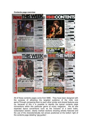
All of these contents pages come from NME. They have been designed with
the purpose of attracting the targeted audience of the indie rock
genre.Through comparing them to each other similar and shared features pop
up, because of this it is possible to identify the typical contents page
conventions within this particular genre of music magazine. We do see
expected layout conventions such as the inclusion of a band index,
subscription section, clearly marked sections showing articles featured and
the use of the characteristically red arrows positioned at the bottom right of
the contents page detailing “gig guides”.
2. In addition to these general layout conventions we also see other repeated
patterns Each features “THIS WEEK‟ positioned at the top of the page along
with a smaller version of the masthead, this shows that the publication is a
weekly one and also maintains the brand identity and allows the readers to
identify it as a contents page from NME automatically.
A symbiotic link is maintained over the contents pages it is established that
they are all from the same magazine from the use of font and color. The font
is similar to the font used in the sell lines featured on the front cover, it is
evident that the target audience is male as the font is very simple and straight
to the point, there are no fancy swirls or elaborate designs. The color of the
font used also celebrates the effectiveness of simplicity. The main text within
the contents page is colored black, the headings are a bold white color and
the subscription details are in a florescent lemon yellow color, it definitely
jumps out of the page at the reader and encourages them to subscribe. The
use of color is significant as it symbolizes an organized structure; this is the
total opposite of what the genre of indie rock essentially is, this intensifies the
fact that the content inside the magazine is chaotic and entertaining.
The layout never changes, however there are slight variations depending on
which issue is bought. Expected conventions are featured such as a page
number next to the articles listed (note that the numbers are a bright red color
to make it easier to locate which page they are on). There is no Editor
comments or letters featured, as the magazine is more about music than it is
about gossip and feeling important. There is only one main image included; it
is quite large and positioned towards the middle of the page and is often to do
with the artist/ band featured on the front cover, increasing the symbiotic link.
Because there are no other images included on the page, the target
audiences attention will solely be focused on that specific artist, Having only
one image is simple and makes a bold statement as it contradicts the
conventions of other genre magazines content pages. It is done because the
audience is more concerned about the content rather than the images. It also
creates an element of suspicion, as the reader is intrigued to find out more in
the pages that follow.
The addition of a band index shows an extra effort has been made increasing
the feeling of getting more value for money. It also shows that the music
magazine knows what it is talking about, that the content is reliable and good.
The target audience will like this idea as it gives them an interactive part to
play whilst reading the magazine they could widen their music knowledge by
listening to the bands or music artists listed. It also shows that the target
audience are extremely interested in music, they‟d prefer to have a band
index to a letter from the editor.
The use of a puff in the shape of an arrow excites the reader as it states, “gig
guides”, the target audience will be active goers to gigs and festivals and will
want to know all the information associated with the „culture‟. The use of the
arrow is also useful as it encourages the reader to turn the page and find the
gig guide.
3. Having analyzed several contents pages and comparing them to see their
similarities in terms of following layout conventions and repeated patterns. I
have concluded that NME has it‟s own brand identity and characteristics that
make it easily recognizable. This is maintained through the repetition of
different features that are unique to the NME publication. The use of these
layout conventions and repeated patterns make NME the magazine it is
today, it is a fantastic use of helping the music magazine succeed in the
highly competitive market and keep the loyalty of the readers.