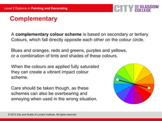
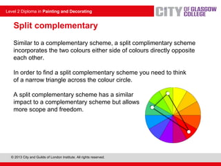
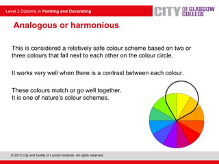
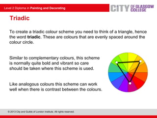
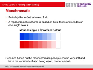
More Related Content
Similar to Colour schemes
Similar to Colour schemes (19)
More from michael mcewan (20)
Colour schemes
- 1. © 2013 City and Guilds of London Institute. All rights reserved.
Level 2 Diploma in Painting and Decorating
Colour schemes
Unit 230: Creating and applying colour
- 2. © 2013 City and Guilds of London Institute. All rights reserved.
Level 2 Diploma in Painting and Decorating
Introduction
• One of the most common questions people ask when deciding what
colours they want is, does it go?
• Some of the colour schemes in this presentation have been around
before Sir Issac Newton even began working on the colour circle.
• However, the tried and tested formulas in this presentation, which
are largely based on the colour circle, will give people some
guidance and something to build around when trying to decide
whether colours go or not.
• The information in this presentation will help advise you on colours,
understand the principles behind the various schemes and select
suitable environments for their application.
- 3. © 2013 City and Guilds of London Institute. All rights reserved.
Level 2 Diploma in Painting and Decorating
Common colour schemes
• There are many different types of colour concepts and schemes, the
majority of which are based on the colour circle. Some are safe – easy on
the eye – and some are bold and garish.
• Whether they are right or wrong is solely down to the person who has to view
them on a daily basis.
• Colour is a very individual idea. It is all around us and is something that
should never be underestimated, as it has a massive impact on our everyday
lives.
• Colours can influence our moods, how we identify items, draw our attention
to something, influence the way we think, the way we act, the decisions we
make and even our health. Take note of the colours on this page.
Tip: take note of the colours on this page!
- 4. © 2013 City and Guilds of London Institute. All rights reserved.
Level 2 Diploma in Painting and Decorating
A complementary colour scheme is based on secondary or tertiary
Colours, which fall directly opposite each other on the colour circle.
Blues and oranges, reds and greens, purples and yellows,
or a combination of tints and shades of these colours.
When the colours are applied fully saturated
they can create a vibrant impact colour
scheme.
Care should be taken though, as these
schemes can also be overbearing and
annoying when used in the wrong situation.
Complementary
- 5. © 2013 City and Guilds of London Institute. All rights reserved.
Level 2 Diploma in Painting and Decorating
Similar to a complementary scheme, a split complimentary scheme
incorporates the two colours either side of colours directly opposite
each other.
In order to find a split complementary scheme you need to think
of a narrow triangle across the colour circle.
A split complementary scheme has a similar
impact to a complementary scheme but allows
more scope and freedom.
Split complementary
- 6. © 2013 City and Guilds of London Institute. All rights reserved.
Level 2 Diploma in Painting and Decorating
Analogous or harmonious
This is considered a relatively safe colour scheme based on two or
three colours that fall next to each other on the colour circle.
It works very well when there is a contrast between each colour.
These colours match or go well together.
It is one of nature’s colour schemes.
- 7. © 2013 City and Guilds of London Institute. All rights reserved.
Level 2 Diploma in Painting and Decorating
Triadic
To create a triadic colour scheme you need to think of a triangle, hence
the word triadic. These are colours that are evenly spaced around the
colour circle.
Similar to complementary colours, this scheme
is normally quite bold and vibrant so care
should be taken where this scheme is used.
Like analogous colours this scheme can work
well when there is contrast between the colours.
- 8. © 2013 City and Guilds of London Institute. All rights reserved.
Level 2 Diploma in Painting and Decorating
Monchromatic
• Probably the safest scheme of all.
• A monochromatic scheme is based on tints, tones and shades on
one single colour.
Mono = single + Chroma = Colour
Schemes based on the monochromatic principle can be very soft and
have the versatility of also being warm, cool or neutral.
- 9. © 2013 City and Guilds of London Institute. All rights reserved.
Level 2 Diploma in Painting and Decorating
Conclusion
There is an old saying...
'Blue and green should never be seen (except when there's white
in between)’
Really? What do you think? What about these?
•Colour schemes are subjective; everyone has their own thoughts and
opinions. What one person may like, another may not.
•As a decorator, your job will be primarily to advise the customer.
•Whether the colours go or not is entirely up to them.
•Now think back to Common Colour Schemes – what type of scheme
was the text colour on that slide based on?
- 10. © 2013 City and Guilds of London Institute. All rights reserved.
Level 2 Diploma in Painting and Decorating
Any questions?
Editor's Notes
- Related to work sheets 3 & 4 assessment criteria 1-12 3.1-3.8
- Tutor note: this is not a learning outcome, but may be beneficial to the learner when learning the layout and colour association of the colour wheel