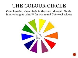
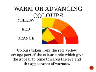
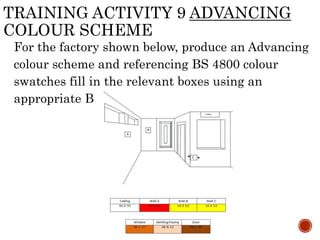
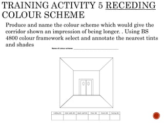
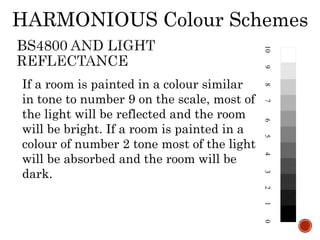
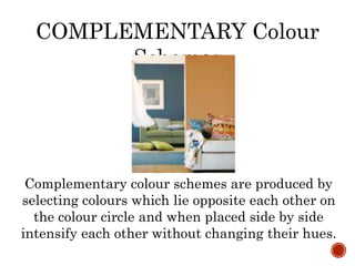
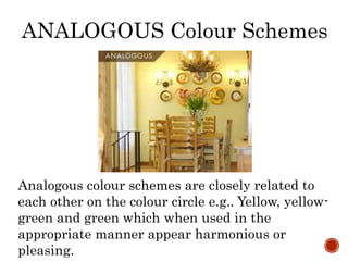
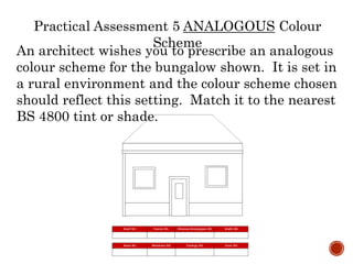
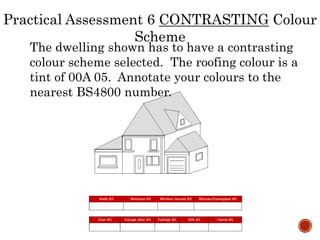
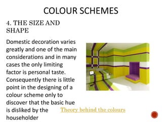
COLOUR SCHEMES
Session 2
• BS 4800
• The Colour Circle
• Types of colour
scheme
• Producing colour
schemes
BS 4800
The standard range contains 100 colours
chosen from a basic range of 237 colours
established in BS 5252:1976 Framework for
colour co-ordination for building purposes.
The range is divided into a basic selection of
32 colours, including black and white. Each
colour is identified by a code consisting of
three parts.
HUE
10
02
04
06
24
08
20
12
18
16
14
22
RED PURPLES
REDS
YELLOW REDS
YELLOW REDS
YELLOW
YELLOW GREENS
GREENS
GREEN BLUES
BLUES
PURPLE BLUES
VIOLETS
PURPLES
The first part signifies hue or
colour and consists of an even
number of two numerals, e.g. 04
Twelve main hues are used plus
greys which are all 00.
In relation to colour terminology, define the term ‘hue’:
a) measures the lightness and darkness of a colour; the
scale is based on a vertical pole divided into 11
divisions
b) measures the greyness of a colour; it is measured on
a horizontal scale from neutral grey to the pure hue
c) denotes the basic colour, distinguishing yellow from
red, blue from green, etc.
d) measures the lightness, darkness and greyness of a
colour
GREYNESS
The second part signifies, i.e. the difference in
the apparent amount of greyness in one colour
compared with another. Five grades are used,
each defined by a single letter. There are four
steps of diminishing greyness from A
maximum to D minimum. Beyond this colours
are pure or free from greyness, graded as E:
e.g. pure yellows are prefixed 10E.
WEIGHT
The weight is given in pairs of numbers from 01
to 56. Groups of colour within each of the five
greyness ranges are graduated from high value
to low value. Each of these graduations is
numbered.
A greyness - 01 to 13
B greyness - 15 to 29
C greyness - 31 to 40
D greyness - 43 to 45
E greyness – 49 to 56
EG the lighter yellow is 10 E 49 while the pure yellow is
10 E 53
COLOUR TERMS
The colour circle, the natural order of colour, tints &
shades, warm/advancing, cool/retiring, Monochromatic,
Harmonious, analogous & contrasting colour schemes.
THE COLOUR CIRCLE
THE COLOUR CIRCLE
Complete the colour circle in the natural order. On the
inner triangles print W for warm and C for cool colours
NATURAL ORDER OF
COLOUR
YELLOW AND
PURPLE/BLUE
Yellow being the lightest
colour in the colour circle is
always placed at the top,
purple blue being the darkest
is placed at the bottom. Used
in this order they are usually
visually pleasing to the eye.
• A discordant colour scheme is produced
when the natural order is reversed e.g..
a dark yellow placed next to a very light
purple.
DISCORDANT COLOURS
Coving or
Cornice
Ceiling
Frieze
Dado
Dado
Rail
Wall
Filling
Picture
Rail
Medium tone
Lightest tone
Medium tone
WARM OR ADVANCING
COLOURS
Colours taken from the red, yellow,
orange part of the colour circle which give
the appear to come towards the eye and
the appearance of warmth.
YELLOW
RED
ORANGE
When used in North facing rooms,
which have little natural daylight,
these colours add the feeling of
warmth.
WARM OR ADVANCING Colour
Schemes
Example of a Warm, Advancing colour
scheme
WARM OR ADVANCING Colour
Schemes
The fast food outlet requires redecoration in a warm
colour scheme. The chosen colour scheme should be
annotated to BS 4800 framework to the nearest
matching tint/shades.
The fast food outlet shown below requires redecoration
in warm colour scheme. The chosen colour scheme
should be annotated in BS 4800 a framework to the
nearest matching tint/shades.
Training Activity 2 – WARM Colour Scheme
Produce and name the colour scheme which would give the
corridor shown an impression of being narrower and
shorter, giving the impression that the back wall was being
brought forward. Using BS 4800 colour framework select
and annotate the nearest tints and shades.
Produce and name the colour scheme which would give
the corridor shown an impression of being narrower and
shorter, giving the impression that the back wall was
being brought forward.
Training Activity 4 ADVANCING Colour
Scheme
TRAINING ACTIVITY 9 ADVANCING
COLOUR SCHEME
For the factory shown below, produce an Advancing colour
scheme and referencing BS 4800 colour swatches fill in the
relevant boxes using an appropriate BS 4800 No.
TRAINING ACTIVITY 9 ADVANCING
COLOUR SCHEME
For the factory shown below, produce an Advancing
colour scheme and referencing BS 4800 colour
swatches fill in the relevant boxes using an
appropriate BS 4800 No.
COOL OR RECEDING
COLOURS
Colours from the green and
Blue part of the colour circle
which appear to recede or
retire away from the eye and
give the appearance of being
cold.
BLUE AND GREEN
COOL OR RECEDING Colour
Schemes
Cool colour schemes are achieved by
selecting colours from the green and blue
part of the colour circle which give the
appearance of coolness.
Produce and name the colour scheme which would give the
corridor shown an impression of being longer. . Using BS
4800 colour framework select and annotate the nearest tints
and shades
Training Activity 5 RECEDING Colour
SchemeProduce and name the colour scheme which
would give the corridor shown an impression of
being longer.
For the corridor shown below, produce a receding
colour scheme from the following range and
referencing BS 4800 colour swatches fill in the
relevant boxes using an appropriate BS 4800 No.
For the corridor shown below, produce a receding colour
scheme from the following range and referencing BS 4800
colour swatches fill in the relevant boxes using an
appropriate BS 4800 No.
MONOCHROMATIC Colour
Schemes
Monochromatic colour schemes are based solely
on tints and shades of one colour.
TINTS AND SHADES
A TINT can be described as
a colour with WHITE
added, while a SHADE can
be described as a colour
with BLACK added.
For the domestic situation shown below, produce a
Monochromatic colour scheme referencing BS 4800 colour
swatches fill in the appropriate boxes using the BS 4800 No.
For the domestic situation shown below, produce a
Monochromatic colour scheme
The client wishes you to produce a monochromatic colour
scheme for the corridor shown. Annotate the closest BS 4800
colours to your chosen scheme in the boxes below.
Practical Assessment 2 MONOCHROMATIC Colour
Scheme
The client wishes you to produce a monochromatic colour
scheme for the corridor shown.
What is a monochromatic colour scheme?
a) A colour scheme based on tints and shades of one colour.
b) A colour scheme based on any two colours which lie
opposite each other on the colour circle.
c) A colour scheme of different colours in hue, value or
chroma when seen together.
d) A colour scheme which is harmonious or has pleasing
colours closely related to each other on the colour circle.
HARMONIOUS Colour Schemes
Colours which appear pleasant together when
used in a scheme. Analogous colours can
provide harmonious combinations, so can close
tonal relationships. If there is a common
colour or tonal relationship some degree of
harmony will result.
Coloured materials either reflect light
and appear brighter, or absorb light and
appear darker. Colour can be measured
in tones (referred to as value in the
Munsell system and Weight in BS4800).
The illustration shows a range of grey
tones from white to black. Those at the
top are light tones and reflect most of
the light, and those at the bottom are
dark tones and absorb the light. These
are the REFLECTANCE VALUES of
109876543210
HARMONIOUS Colour Schemes
109876543210
If a room is painted in a colour similar
in tone to number 9 on the scale, most of
the light will be reflected and the room
will be bright. If a room is painted in a
colour of number 2 tone most of the light
will be absorbed and the room will be
dark.
HARMONIOUS Colour Schemes
Practical Assessment 3 HARMONIOUS Colour
SchemeThe shop shown was recently a retail clothing
outlet for teenage fashion. It has now changed
hands and will become an estate agency.
You are asked to prescribe a colour to show how
light reflectance of colour can create a more
appropriate ambient surrounding for the new
business.
On production of your colour scheme, annotate
the nearest BS 4800 numbers below and state
briefly why you have chosen these particular
colours and how light reflectance has had a
bearing on your selection.
Practical Assessment 3 HARMONIOUS Colour
Scheme
When compiling your answer think about:
• How the space is to be used & why this may
influence your choice of colour?
• Who is using the space & what are their
expectations requirements?
• How will greater light reflectance improve the
experience of the user?
Practical Assessment 3 HARMONIOUS Colour
Scheme
Practical Assessment 3 HARMONIOUS Colour
Scheme
Practical Assessment 3 HARMONIOUS Colour
Scheme
On production of your colour scheme, annotate the nearest
BS 4800 numbers below and state briefly why you have
chosen these particular colours and how light reflectance
has had a bearing on your selection.
EXEMPLAR
I have produced a Monochromatic colour scheme. The
principal colour was chosen to reflect the serious nature of
the business for which the space is being used. I have
chosen colours of high light reflectance so that the
properties on display in the Estate Agents are displayed to
their maximum potential & are clearly visible to clients
who may wish to view them.
COMPLEMENTARY Colour
Schemes
Complementary colour schemes are produced by
selecting colours which lie opposite each other on
the colour circle and when placed side by side
intensify each other without changing their hues.
The client wishes a redecoration scheme for the
bathroom shown below. It should be
complementary to the existing lino flooring which
is a tint of BS 10 E 49
Practical Assessment 4 COMPLEMENTARY Colour
Scheme
The client wishes a redecoration scheme for the
bathroom shown below. It should be
complementary to the existing lino flooring which
is a tint of BS 10 E 49
Practical Assessment 4 COMPLEMENTARY Colour
Scheme
What is a complementary colour scheme?
a) A colour scheme based on tints and shades of one colour.
b) A colour scheme based on any two colours which lie
opposite each other on the colour circle.
c) A colour scheme of different colours in hue, value or
chroma when seen together.
d) A colour scheme which is harmonious or has pleasing
colours closely related to each other on the colour circle.
ANALOGOUS Colour Schemes
Analogous colour schemes are closely related to
each other on the colour circle e.g.. Yellow, yellow-
green and green which when used in the
appropriate manner appear harmonious or
pleasing.
Training Activity 7 ANALOGOUS Colour Scheme
For the office shown below, produce a Analogous colour
scheme referencing BS 4800 colour swatches fill in the
appropriate boxes using the BS 4800 No.
Training Activity 7 ANALOGOUS Colour Scheme
For the office shown below, produce a Analogous colour
scheme referencing BS 4800 colour swatches fill in the
appropriate boxes using the BS 4800 No.
An architect wishes you to prescribe an analogous
colour scheme for the bungalow shown. It is set in
a rural environment and the colour scheme chosen
should reflect this setting. Match it to the nearest
BS 4800 tint or shade.
Practical Assessment 5 ANALOGOUS Colour
Scheme
Practical Assessment 5 ANALOGOUS Colour
Scheme
What is an analogous colour scheme?
a) A colour scheme based on tints and shades of one
colour.
b) A colour scheme of any two colours which lie opposite
each other on the colour circle.
c) A colour scheme of different colours in hue, value or
chroma when seen together.
d) A colour scheme which is harmonious or has pleasing
colours closely related to each other on the colour
CONTRASTING Colour Schemes
Contrasting colour schemes are produced by
choosing colours of different value, hue or chroma
e.g. the contrast of red against green, light
colours against dark colours, strong colours
against greyed colours.
For the room shown below, produce a Contrasting colour
scheme referencing BS 4800 colour swatches fill in the
appropriate boxes using the BS 4800 No.
For the room shown below, produce a Contrasting colour
scheme referencing BS 4800 colour swatches fill in the
appropriate boxes using the BS 4800 No.
The dwelling shown has to have a contrasting
colour scheme selected. The roofing colour is a
tint of 00A 05. Annotate your colours to the
nearest BS4800 number.
Practical Assessment 6 CONTRASTING Colour
Scheme
The dwelling shown has to have a contrasting
colour scheme selected. The roofing colour is a
tint of 00A 05.
Practical Assessment 6 CONTRASTING Colour
Scheme
What is a contrasting colour scheme?
a) A colour scheme based on tints and shades of one colour.
b) A colour scheme based on any two colours which lie
opposite each other on the colour circle.
c) A colour scheme with distinct differences in colours
regarding hue, value or chroma.
d) A colour scheme which is harmonious or has pleasing
colours closely related to each other on the colour circle.
COLOUR SCHEMES
Prior to drawing up any colour scheme certain
factors must be considered by the decorator.
1. SURROUNDING ENVIRONMENT
On exterior areas consideration must be given
to the effect that a colour scheme will have on
the surrounding area, whether the scheme is to
blend in with the countryside or stand out in a
shopping centre.
COLOUR SCHEMES
2. THE FUNCTION OF THE AREA
It must be determined whether the location is to be
used for work, recreation, quiet concentration, noisy
machinery, long occupation or brief casual visits.
COLOUR SCHEMES
3. THE ASPECT AND LIGHTING
The colour of any surface depends upon the type,
direction and amount of light that it receives. A
colour or colour scheme viewed under natural
light will change when viewed under artificial
light.
3. THE ASPECT AND LIGHTING
• Natural light also changes from one room to
another e.g. a room with a northern aspect
receives no direct sunlight and may seem rather
cool while a room with a southern aspect will
receive long periods of sunlight and appear
warmer.
COLOUR
SCHEMES
3. THE ASPECT AND LIGHTING
• The amount of light will also influence colour e.g.
a colour which may appear pale but colourful in a
well-lit situation will seem much darker, dull and
lifeless under poor lighting conditions
COLOUR
SCHEMES
4. THE SIZE AND SHAPE
The proportions and overall size of the area have
to be considered. By the incorrect use of colour a
corridor can be made to appear tunnel-like, while
if the correct colours are chosen then the same
corridor can have the apparent length reduced
and be made to appear wider.
4. THE SIZE AND
SHAPE
Domestic decoration varies
greatly and one of the main
considerations and in many
cases the only limiting
factor is personal taste.
Consequently there is little
point in the designing of a
colour scheme only to
discover that the basic hue
is disliked by the
householder
Theory behind the colours
GENERAL COLOUR HINTS
•Do not use too much colour, the effect is just as bad as too
little colour.
• All colours look dreadful when in the wrong proportion.
•When used in the correct position, the softer colours are
much bolder.
•In a room, pastels without relief can look anaemic
•These same pastels, when used with black and white, are
much livelier.
You should now be able to complete the
following formative and summative
assessments

Colour schemes lesson 2

  • 1.
  • 2.
    • BS 4800 •The Colour Circle • Types of colour scheme • Producing colour schemes
  • 3.
    BS 4800 The standardrange contains 100 colours chosen from a basic range of 237 colours established in BS 5252:1976 Framework for colour co-ordination for building purposes. The range is divided into a basic selection of 32 colours, including black and white. Each colour is identified by a code consisting of three parts.
  • 4.
    HUE 10 02 04 06 24 08 20 12 18 16 14 22 RED PURPLES REDS YELLOW REDS YELLOWREDS YELLOW YELLOW GREENS GREENS GREEN BLUES BLUES PURPLE BLUES VIOLETS PURPLES The first part signifies hue or colour and consists of an even number of two numerals, e.g. 04 Twelve main hues are used plus greys which are all 00.
  • 5.
    In relation tocolour terminology, define the term ‘hue’: a) measures the lightness and darkness of a colour; the scale is based on a vertical pole divided into 11 divisions b) measures the greyness of a colour; it is measured on a horizontal scale from neutral grey to the pure hue c) denotes the basic colour, distinguishing yellow from red, blue from green, etc. d) measures the lightness, darkness and greyness of a colour
  • 6.
    GREYNESS The second partsignifies, i.e. the difference in the apparent amount of greyness in one colour compared with another. Five grades are used, each defined by a single letter. There are four steps of diminishing greyness from A maximum to D minimum. Beyond this colours are pure or free from greyness, graded as E: e.g. pure yellows are prefixed 10E.
  • 7.
    WEIGHT The weight isgiven in pairs of numbers from 01 to 56. Groups of colour within each of the five greyness ranges are graduated from high value to low value. Each of these graduations is numbered. A greyness - 01 to 13 B greyness - 15 to 29 C greyness - 31 to 40 D greyness - 43 to 45 E greyness – 49 to 56 EG the lighter yellow is 10 E 49 while the pure yellow is 10 E 53
  • 8.
    COLOUR TERMS The colourcircle, the natural order of colour, tints & shades, warm/advancing, cool/retiring, Monochromatic, Harmonious, analogous & contrasting colour schemes.
  • 9.
  • 10.
    THE COLOUR CIRCLE Completethe colour circle in the natural order. On the inner triangles print W for warm and C for cool colours
  • 11.
    NATURAL ORDER OF COLOUR YELLOWAND PURPLE/BLUE Yellow being the lightest colour in the colour circle is always placed at the top, purple blue being the darkest is placed at the bottom. Used in this order they are usually visually pleasing to the eye.
  • 12.
    • A discordantcolour scheme is produced when the natural order is reversed e.g.. a dark yellow placed next to a very light purple. DISCORDANT COLOURS
  • 13.
  • 14.
  • 15.
    WARM OR ADVANCING COLOURS Colourstaken from the red, yellow, orange part of the colour circle which give the appear to come towards the eye and the appearance of warmth. YELLOW RED ORANGE
  • 16.
    When used inNorth facing rooms, which have little natural daylight, these colours add the feeling of warmth. WARM OR ADVANCING Colour Schemes
  • 17.
    Example of aWarm, Advancing colour scheme WARM OR ADVANCING Colour Schemes
  • 18.
    The fast foodoutlet requires redecoration in a warm colour scheme. The chosen colour scheme should be annotated to BS 4800 framework to the nearest matching tint/shades.
  • 19.
    The fast foodoutlet shown below requires redecoration in warm colour scheme. The chosen colour scheme should be annotated in BS 4800 a framework to the nearest matching tint/shades. Training Activity 2 – WARM Colour Scheme
  • 20.
    Produce and namethe colour scheme which would give the corridor shown an impression of being narrower and shorter, giving the impression that the back wall was being brought forward. Using BS 4800 colour framework select and annotate the nearest tints and shades.
  • 21.
    Produce and namethe colour scheme which would give the corridor shown an impression of being narrower and shorter, giving the impression that the back wall was being brought forward. Training Activity 4 ADVANCING Colour Scheme
  • 22.
    TRAINING ACTIVITY 9ADVANCING COLOUR SCHEME For the factory shown below, produce an Advancing colour scheme and referencing BS 4800 colour swatches fill in the relevant boxes using an appropriate BS 4800 No.
  • 23.
    TRAINING ACTIVITY 9ADVANCING COLOUR SCHEME For the factory shown below, produce an Advancing colour scheme and referencing BS 4800 colour swatches fill in the relevant boxes using an appropriate BS 4800 No.
  • 24.
    COOL OR RECEDING COLOURS Coloursfrom the green and Blue part of the colour circle which appear to recede or retire away from the eye and give the appearance of being cold. BLUE AND GREEN
  • 25.
    COOL OR RECEDINGColour Schemes Cool colour schemes are achieved by selecting colours from the green and blue part of the colour circle which give the appearance of coolness.
  • 26.
    Produce and namethe colour scheme which would give the corridor shown an impression of being longer. . Using BS 4800 colour framework select and annotate the nearest tints and shades
  • 27.
    Training Activity 5RECEDING Colour SchemeProduce and name the colour scheme which would give the corridor shown an impression of being longer.
  • 28.
    For the corridorshown below, produce a receding colour scheme from the following range and referencing BS 4800 colour swatches fill in the relevant boxes using an appropriate BS 4800 No.
  • 29.
    For the corridorshown below, produce a receding colour scheme from the following range and referencing BS 4800 colour swatches fill in the relevant boxes using an appropriate BS 4800 No.
  • 30.
    MONOCHROMATIC Colour Schemes Monochromatic colourschemes are based solely on tints and shades of one colour.
  • 31.
    TINTS AND SHADES ATINT can be described as a colour with WHITE added, while a SHADE can be described as a colour with BLACK added.
  • 32.
    For the domesticsituation shown below, produce a Monochromatic colour scheme referencing BS 4800 colour swatches fill in the appropriate boxes using the BS 4800 No.
  • 33.
    For the domesticsituation shown below, produce a Monochromatic colour scheme
  • 34.
    The client wishesyou to produce a monochromatic colour scheme for the corridor shown. Annotate the closest BS 4800 colours to your chosen scheme in the boxes below.
  • 35.
    Practical Assessment 2MONOCHROMATIC Colour Scheme The client wishes you to produce a monochromatic colour scheme for the corridor shown.
  • 36.
    What is amonochromatic colour scheme? a) A colour scheme based on tints and shades of one colour. b) A colour scheme based on any two colours which lie opposite each other on the colour circle. c) A colour scheme of different colours in hue, value or chroma when seen together. d) A colour scheme which is harmonious or has pleasing colours closely related to each other on the colour circle.
  • 37.
    HARMONIOUS Colour Schemes Colourswhich appear pleasant together when used in a scheme. Analogous colours can provide harmonious combinations, so can close tonal relationships. If there is a common colour or tonal relationship some degree of harmony will result.
  • 38.
    Coloured materials eitherreflect light and appear brighter, or absorb light and appear darker. Colour can be measured in tones (referred to as value in the Munsell system and Weight in BS4800). The illustration shows a range of grey tones from white to black. Those at the top are light tones and reflect most of the light, and those at the bottom are dark tones and absorb the light. These are the REFLECTANCE VALUES of 109876543210 HARMONIOUS Colour Schemes
  • 39.
    109876543210 If a roomis painted in a colour similar in tone to number 9 on the scale, most of the light will be reflected and the room will be bright. If a room is painted in a colour of number 2 tone most of the light will be absorbed and the room will be dark. HARMONIOUS Colour Schemes
  • 40.
    Practical Assessment 3HARMONIOUS Colour SchemeThe shop shown was recently a retail clothing outlet for teenage fashion. It has now changed hands and will become an estate agency.
  • 41.
    You are askedto prescribe a colour to show how light reflectance of colour can create a more appropriate ambient surrounding for the new business. On production of your colour scheme, annotate the nearest BS 4800 numbers below and state briefly why you have chosen these particular colours and how light reflectance has had a bearing on your selection. Practical Assessment 3 HARMONIOUS Colour Scheme
  • 42.
    When compiling youranswer think about: • How the space is to be used & why this may influence your choice of colour? • Who is using the space & what are their expectations requirements? • How will greater light reflectance improve the experience of the user? Practical Assessment 3 HARMONIOUS Colour Scheme
  • 43.
    Practical Assessment 3HARMONIOUS Colour Scheme
  • 44.
    Practical Assessment 3HARMONIOUS Colour Scheme On production of your colour scheme, annotate the nearest BS 4800 numbers below and state briefly why you have chosen these particular colours and how light reflectance has had a bearing on your selection. EXEMPLAR I have produced a Monochromatic colour scheme. The principal colour was chosen to reflect the serious nature of the business for which the space is being used. I have chosen colours of high light reflectance so that the properties on display in the Estate Agents are displayed to their maximum potential & are clearly visible to clients who may wish to view them.
  • 45.
    COMPLEMENTARY Colour Schemes Complementary colourschemes are produced by selecting colours which lie opposite each other on the colour circle and when placed side by side intensify each other without changing their hues.
  • 46.
    The client wishesa redecoration scheme for the bathroom shown below. It should be complementary to the existing lino flooring which is a tint of BS 10 E 49 Practical Assessment 4 COMPLEMENTARY Colour Scheme
  • 47.
    The client wishesa redecoration scheme for the bathroom shown below. It should be complementary to the existing lino flooring which is a tint of BS 10 E 49 Practical Assessment 4 COMPLEMENTARY Colour Scheme
  • 48.
    What is acomplementary colour scheme? a) A colour scheme based on tints and shades of one colour. b) A colour scheme based on any two colours which lie opposite each other on the colour circle. c) A colour scheme of different colours in hue, value or chroma when seen together. d) A colour scheme which is harmonious or has pleasing colours closely related to each other on the colour circle.
  • 49.
    ANALOGOUS Colour Schemes Analogouscolour schemes are closely related to each other on the colour circle e.g.. Yellow, yellow- green and green which when used in the appropriate manner appear harmonious or pleasing.
  • 50.
    Training Activity 7ANALOGOUS Colour Scheme For the office shown below, produce a Analogous colour scheme referencing BS 4800 colour swatches fill in the appropriate boxes using the BS 4800 No.
  • 51.
    Training Activity 7ANALOGOUS Colour Scheme For the office shown below, produce a Analogous colour scheme referencing BS 4800 colour swatches fill in the appropriate boxes using the BS 4800 No.
  • 52.
    An architect wishesyou to prescribe an analogous colour scheme for the bungalow shown. It is set in a rural environment and the colour scheme chosen should reflect this setting. Match it to the nearest BS 4800 tint or shade. Practical Assessment 5 ANALOGOUS Colour Scheme
  • 53.
    Practical Assessment 5ANALOGOUS Colour Scheme
  • 54.
    What is ananalogous colour scheme? a) A colour scheme based on tints and shades of one colour. b) A colour scheme of any two colours which lie opposite each other on the colour circle. c) A colour scheme of different colours in hue, value or chroma when seen together. d) A colour scheme which is harmonious or has pleasing colours closely related to each other on the colour
  • 55.
    CONTRASTING Colour Schemes Contrastingcolour schemes are produced by choosing colours of different value, hue or chroma e.g. the contrast of red against green, light colours against dark colours, strong colours against greyed colours.
  • 56.
    For the roomshown below, produce a Contrasting colour scheme referencing BS 4800 colour swatches fill in the appropriate boxes using the BS 4800 No.
  • 57.
    For the roomshown below, produce a Contrasting colour scheme referencing BS 4800 colour swatches fill in the appropriate boxes using the BS 4800 No.
  • 58.
    The dwelling shownhas to have a contrasting colour scheme selected. The roofing colour is a tint of 00A 05. Annotate your colours to the nearest BS4800 number. Practical Assessment 6 CONTRASTING Colour Scheme
  • 59.
    The dwelling shownhas to have a contrasting colour scheme selected. The roofing colour is a tint of 00A 05. Practical Assessment 6 CONTRASTING Colour Scheme
  • 60.
    What is acontrasting colour scheme? a) A colour scheme based on tints and shades of one colour. b) A colour scheme based on any two colours which lie opposite each other on the colour circle. c) A colour scheme with distinct differences in colours regarding hue, value or chroma. d) A colour scheme which is harmonious or has pleasing colours closely related to each other on the colour circle.
  • 61.
    COLOUR SCHEMES Prior todrawing up any colour scheme certain factors must be considered by the decorator. 1. SURROUNDING ENVIRONMENT On exterior areas consideration must be given to the effect that a colour scheme will have on the surrounding area, whether the scheme is to blend in with the countryside or stand out in a shopping centre.
  • 62.
    COLOUR SCHEMES 2. THEFUNCTION OF THE AREA It must be determined whether the location is to be used for work, recreation, quiet concentration, noisy machinery, long occupation or brief casual visits.
  • 63.
    COLOUR SCHEMES 3. THEASPECT AND LIGHTING The colour of any surface depends upon the type, direction and amount of light that it receives. A colour or colour scheme viewed under natural light will change when viewed under artificial light.
  • 64.
    3. THE ASPECTAND LIGHTING • Natural light also changes from one room to another e.g. a room with a northern aspect receives no direct sunlight and may seem rather cool while a room with a southern aspect will receive long periods of sunlight and appear warmer. COLOUR SCHEMES
  • 65.
    3. THE ASPECTAND LIGHTING • The amount of light will also influence colour e.g. a colour which may appear pale but colourful in a well-lit situation will seem much darker, dull and lifeless under poor lighting conditions COLOUR SCHEMES
  • 66.
    4. THE SIZEAND SHAPE The proportions and overall size of the area have to be considered. By the incorrect use of colour a corridor can be made to appear tunnel-like, while if the correct colours are chosen then the same corridor can have the apparent length reduced and be made to appear wider.
  • 67.
    4. THE SIZEAND SHAPE Domestic decoration varies greatly and one of the main considerations and in many cases the only limiting factor is personal taste. Consequently there is little point in the designing of a colour scheme only to discover that the basic hue is disliked by the householder Theory behind the colours
  • 68.
    GENERAL COLOUR HINTS •Donot use too much colour, the effect is just as bad as too little colour. • All colours look dreadful when in the wrong proportion. •When used in the correct position, the softer colours are much bolder. •In a room, pastels without relief can look anaemic •These same pastels, when used with black and white, are much livelier. You should now be able to complete the following formative and summative assessments