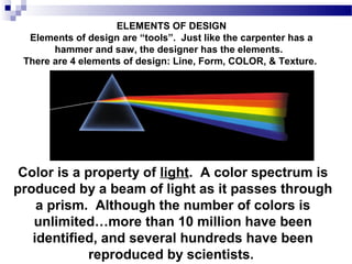
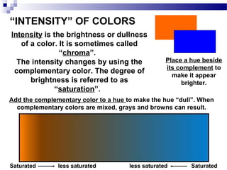
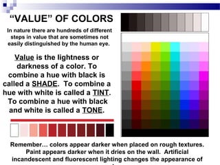
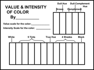
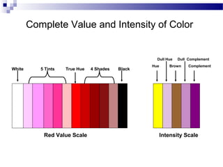
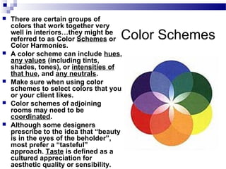
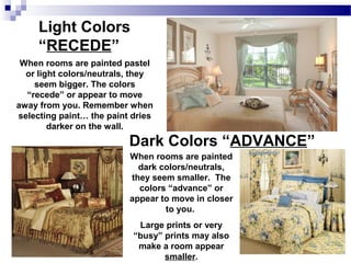
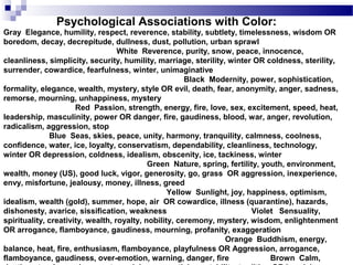
SlideShare a Scribd company logo
1 of 33
ELEMENTS OF DESIGN
Elements of design are “tools”. Just like the carpenter has a
hammer and saw, the designer has the elements.
There are 4 elements of design: Line, Form, COLOR, & Texture.

Color is a property of light. A color spectrum is
produced by a beam of light as it passes through
a prism. Although the number of colors is
unlimited…more than 10 million have been
identified, and several hundreds have been
reproduced by scientists.
B lu e

B l u e - v io l e t

B lu e - g re e n

V i o le t

Color Wheel
G re e n

R e d - v io l e t

Y e ll o w - g r e e n

R ed

Y e ll o w

R e d - o ra n g e
Y e ll o w - o r a n g e

O ra n g e

This color wheel system, based on three primary colors,
is known as the Brewster System. It was developed by
David Brewster. It is also called the Prang System. Each
color on the color wheel is a true “hue”.
Primary Colors…
Red, Blue, and Yellow
B lu e

B l u e - v io l e t

B lu e - g re e n

V i o le t

G re e n

R e d - v io l e t

Y e ll o w - g r e e n

R ed

Y e ll o w

R e d - o ra n g e
Y e ll o w - o r a n g e

O ra n g e

Primary colors
cannot be manmade by mixing
other colors
together.

A pigment is color from a biological source, which when used in housing
and design applications can be natural or synthetic (manmade).
Secondary Colors…
Orange, Green, and Violet
Remember, it’s “violet”,
not purple.

B lu e

B l u e - v io l e t

B lu e - g re e n

V i o le t

G re e n

R e d - v io l e t

Y e ll o w - g r e e n

R ed

Y e ll o w

R e d - o ra n g e
Y e ll o w - o r a n g e

O ra n g e

Secondary colors can be
“made” by mixing two
primary colors together.
Blue and red make
violet; red and yellow
make orange; yellow
and blue make green.
Tertiary Colors… Yellow-green,
Blue-green, Blue-Violet, Red-Violet,
Red-orange, Yellow-orange
B lu e

B l u e - v io l e t

B lu e - g re e n

V i o le t

G re e n

R e d - v io l e t

Y e ll o w - g r e e n

R ed

Y e ll o w

R e d - o ra n g e
Y e ll o w - o r a n g e

O ra n g e

The tertiary colors are also
referred to as the intermediate
colors. Tertiary colors are made
by mixing a primary with a
secondary color… the primary
color is always listed first. For
example, when the primary
color of yellow is mixed with
the secondary color named
green, the new tertiary color is
called yellow-green.

Tertiary colors can be expanded further, such as mixing blue and bluegreen together. The result would be the color blue-blue-green.
Perhaps we would name that color “teal” to be less confusing.
Neutral Colors…
Neutral colors include black, white, and brown. They also
include all the tints and shades of black, white, and brown…
so include colors known as tan, beige, gray, cream, etc.
Neutral colors can be made by mixing:
black and white
complementary colors
all three primaries together (plus some black or white)
Neutral colors blend well with
all other colors.
They enhance and strengthen
the other colors around them.
Stone such as slate, brick,
marble, etc.; metallics such as
brass, pewter, gold, chrome
etc.; and glass fall into the
neutral category.

Black is the
absence of
“light”;
white is the
absence of
“color”.
Complementary colors…

Complementary
colors are those
located directly
opposite each
other on the
color wheel.
“INTENSITY” OF COLORS
Intensity is the brightness or dullness
of a color. It is sometimes called
“chroma”.
The intensity changes by using the
complementary color. The degree of
brightness is referred to as
“saturation”.

Place a hue beside
its complement to
make it appear
brighter.

Add the complementary color to a hue to make the hue “dull”. When
complementary colors are mixed, grays and browns can result.

Saturated

less saturated

less saturated

Saturated
“VALUE” OF COLORS
In nature there are hundreds of different
steps in value that are sometimes not
easily distinguished by the human eye.

Value is the lightness or
darkness of a color. To
combine a hue with black is
called a SHADE. To combine a
hue with white is called a TINT.
To combine a hue with black
and white is called a TONE.

Remember… colors appear darker when placed on rough textures.
Paint appears darker when it dries on the wall. Artificial
incandescent and fluorescent lighting changes the appearance of
VALUE & INTENSITY
OF COLOR
By__________

Dull Hue
Brown

Dull Complement
Hue
Complement

Value scale for the color:______________
Intensity Scale for the color: ___________

White

5 Tints

True Hue

4 Shades

Black
Complete Value and Intensity of Color

Dull Hue

White

5 Tints

True Hue

Red Value Scale

4 Shades

Black

Hue

Dull Complement

Brown

Complement

Intensity Scale


There are certain groups of
colors that work together very
well in interiors…they might be
referred to as Color Schemes or
Color Harmonies.
A color scheme can include hues,
any values (including tints,
shades, tones), or intensities of
that hue, and any neutrals.
Make sure when using color
schemes to select colors that you
or your client likes.
Color schemes of adjoining
rooms may need to be
coordinated.
Although some designers
prescribe to the idea that “beauty
is in the eyes of the beholder”,
most prefer a “tasteful”
approach. Taste is defined as a
cultured appreciation for
aesthetic quality or sensibility.

Color Schemes








Monochromatic
A color scheme using one
color, and tints, tones and
shades of that color.



B lu e

B l u e - v io l e t

B lu e -g r e e n

V io le t

G re e n

R e d - v io l e t

Y e llo w - g r e e n

R ed

Y e llo w

R e d -o r a n g e
Y e llo w -o ra n g e

O ra n g e
Analogous


A color scheme using 3 or
more colors next to each
other on the color wheel.

B lu e

B lu e - v io le t

B lu e - g re e n

V io le t

G reen

R e d -v io le t

Y e llo w -g re e n

R e d

Y e llo w

R e d -o ra n g e
Y e llo w - o r a n g e

O range
B lu e

B l u e - v i o le t

B lu e -g re e n

Complementary

V io le t

G re e n

R e d - v i o le t

Y e llo w -g re e n

R ed

Y e llo w

R e d -o ra n g e
Y e llo w -o ra n g e



O ra n g e

A color scheme
using colors
opposite each
other on the color
wheel.
Double Complementary
A Color scheme using two
sets of complementary
colors.



B lu e

B lu e -v io le t

B lu e -g re e n

V io le t

G re e n

R e d -v io le t

Y e llo w - g r e e n

R ed

Y e llo w

R e d -o ra n g e
Y e llo w - o r a n g e

O ra n g e
Split Complementary
A color scheme using one
color, and the colors on either
side of it’s complement. This
color scheme, along with the
double complementary are
more difficult to achieve in a
tasteful fashion.



B lu e

B lu e - v io le t

B lu e - g re e n

V io le t

G re e n

R e d - v io le t

Y e ll o w - g r e e n

R ed

Y e ll o w

R e d -o ra n g e
Y e ll o w - o r a n g e

O ra n g e
Triad


A color scheme using three
colors equal distance from
each other on the color wheel.
B lu e

B lu e - v io le t

B lu e - g r e e n

V io le t

G re e n

R e d - v io le t

Y e l lo w - g r e e n

Red

Y e l lo w

R e d -o ra n g e
Y e l lo w - o r a n g e

O ra n g e
Neutral


A color scheme using whites,
blacks, browns, grays and
beiges, etc.
B lu e

B l u e - v io l e t

B lu e - g r e e n

V i o le t

G ree n

R e d - v io l e t

Y e ll o w - g r e e n

R ed

Y e ll o w

R e d - o ra n g e
Y e ll o w - o r a n g e

O ra n g e

This scheme is often “accented” with a
small amount of another hue, and called
the ACCENTED NEUTRAL.
Some designers base a room decor on a
popular “theme” instead of a prescribed color
scheme. It should only be used if it reflects the
personality and preferences of the client.


Fad

The bedroom above is decorated
around a nautical “theme”,
disregarding any specific color
harmony.

This red, white, and blue color
combination is only acceptable for
those who prefer the patriotic “theme”.
What doesn’t count…
As you put together or identify the background
and furnishing samples that make up your
color scheme, there are some items in the room
that do not have to be considered:
Books and
magazines.

Living things,
such as pets,
fresh flowers,
and plants.

The colors of a
painting, although
the predominant
color, frame, and
mat colors may be
considered.
Warm Colors


Colors on the warm side of the
spectrum…red, yellow,
orange. They usually also
include the neutral black and
brown tones.
B lu e

B lu e - v io le t

B lu e - g r e e n

V io le t

G re e n

R e d -v io le t

Y e llo w - g r e e n

R ed

Y e llo w

R e d -o ra n g e
Y e llo w - o ra n g e

O ra n g e

Warm colors are especially good in rooms with northern exposures.
Cool Colors


Colors on the cool side of
the spectrum…blue, violet,
green. They usually
include the neutral white
and gray tones.
B lu e

B l u e - v io le t

B lu e -g re e n

V io le t

G re e n

R e d - v io le t

Y e llo w - g r e e n

R ed

Y e llo w

R e d -o ra n g e
Y e llo w -o ra n g e

O ra n g e

Cool colors are especially good in rooms with southern exposures.
Light Colors
“RECEDE”
When rooms are painted pastel
or light colors/neutrals, they
seem bigger. The colors
“recede” or appear to move
away from you. Remember when
selecting paint… the paint dries
darker on the wall.

Dark Colors “ADVANCE”
When rooms are painted
dark colors/neutrals,
they seem smaller. The
colors “advance” or
appear to move in closer
to you.
Large prints or very
“busy” prints may also
make a room appear
smaller.
Choosing Color Schemes…









Color schemes look best when one color dominates.
Your dominant color should cover about two-thirds
of the room area. An equal split between dominant
and subordinate colors is less pleasing.
Evaluate parts of the room that cannot be changed,
then consider color choices that will complement
existing furnishings.
Base your color scheme on the exposure of the room
(choose warm colors for northern exposures and
cool colors for southern exposures; choose lighter
colors for small rooms and darker colors for large
rooms; choose colors you like; choose colors that
complement a particular fabric, wallpaper, work of
art, etc.
Consider the psychological and physiological effects
of color…
Physiological Effects of Individual Colors
Color creates powerful psychological and physiological effects.
Psychological effects are sensed in the mind; physiological effects actually
cause a change in the body. It is important to note that people may react
differently to the same color, based on their previous experiences or learned
behavior. Research studies have shown that:
Color affects eye's perception of weight and size. Dark and bright colors
seem heavier than light and cool colors. (However, it is interesting that the opposite
effect is true in fashion design. Dark colors tend to slim the figure, whereas light colors are usually
thought to make one look heavier.)

Color affects a person's perception of temperature. Studies have indicated
that body temperature actually fluctuates in response to various colors. For
example, red, orange, and yellow can raise one's temperature; cool colors
have the opposite reaction.
Color can cause feelings of boredom and calmness, or stimulation and
liveliness. Colors may cause the nervous system to become agitated, and the
body reacts in negative ways to this stimulus.
Colors can affect one's reaction to sounds, taste, odors, and time perception.
Colors can improve the rate of recovery of sick patients.
Psychological Associations with Color:

Gray Elegance, humility, respect, reverence, stability, subtlety, timelessness, wisdom OR
boredom, decay, decrepitude, dullness, dust, pollution, urban sprawl
White Reverence, purity, snow, peace, innocence,
cleanliness, simplicity, security, humility, marriage, sterility, winter OR coldness, sterility,
surrender, cowardice, fearfulness, winter, unimaginative
Black Modernity, power, sophistication,
formality, elegance, wealth, mystery, style OR evil, death, fear, anonymity, anger, sadness,
remorse, mourning, unhappiness, mystery
Red Passion, strength, energy, fire, love, sex, excitement, speed, heat,
leadership, masculinity, power OR danger, fire, gaudiness, blood, war, anger, revolution,
radicalism, aggression, stop
Blue Seas, skies, peace, unity, harmony, tranquility, calmness, coolness,
confidence, water, ice, loyalty, conservatism, dependability, cleanliness, technology,
winter OR depression, coldness, idealism, obscenity, ice, tackiness, winter
Green Nature, spring, fertility, youth, environment,
wealth, money (US), good luck, vigor, generosity, go, grass OR aggression, inexperience,
envy, misfortune, jealousy, money, illness, greed
Yellow Sunlight, joy, happiness, optimism,
idealism, wealth (gold), summer, hope, air OR cowardice, illness (quarantine), hazards,
dishonesty, avarice, sissification, weakness
Violet Sensuality,
spirituality, creativity, wealth, royalty, nobility, ceremony, mystery, wisdom, enlightenment
OR arrogance, flamboyance, gaudiness, mourning, profanity, exaggeration
Orange Buddhism, energy,
balance, heat, fire, enthusiasm, flamboyance, playfulness OR Aggression, arrogance,
flamboyance, gaudiness, over-emotion, warning, danger, fire
Brown Calm,
You will be completing a total of 8 pages for these two projects.
The first 6 pages will each be set up to illustrate a neutral,
monochromatic, complementary, analogous, triad, and fad color
scheme according to the sample given. Include the title, your
name, and a color wheel that is suitably colored and labeled for
each page. You must find your pictures in catalogs or
magazines… not the internet. You may use a computer or your
templates for printing.
The 7th page will include a hand-painted value and intensity
scale, using the tempera paint colors of your choice.
On the 8th page, use colored pencils to color each picture in a manner that
illustrates the psychological associations of color.

Color Projects

Dull Hue

White

5 Tints

True Hue

Red Value Scale

4 Shades

Black

Hue

Dull Complement

Brown

Complement

Intensity Scale
COLOR SCHEME: MONOCHROMATIC
BY YOUR NAME

This monochromatic
color scheme is based on
a single hue… red orange.
By mixing a small
amount of red-orange and
white, a peachy tone is
achieved.
VALUE & INTENSITY
OF COLOR
By__________

Dull Hue
Brown

Dull Complement
Hue
Complement

Value scale for the color:______________
Intensity Scale for the color: ___________

White

5 Tints

True Hue

4 Shades

Black
Name: ____________________

The psychological
associations of color…

A rose for your
true love!

The blanket of your
favorite race horse.

A rose for your
sick relative in
the hospital.

Teen boys car.

The sofa in the dentist’s waiting room.

A hat, perfect for the king’s
coronation or the college graduate.

More Related Content

What's hot

Interior styling & styles in interiors
Interior styling & styles in interiorsInterior styling & styles in interiors
Interior styling & styles in interiorsZunairaKhusro
 
Interior design styles
Interior design stylesInterior design styles
Interior design stylessindhuganeshgm
 
Interior Design Styles
Interior Design StylesInterior Design Styles
Interior Design StylesEve Stanley
 
Akash Gidwani Residential Portfolio,B.Sc.ID,Studio Apartment case study.
Akash Gidwani Residential Portfolio,B.Sc.ID,Studio Apartment case study.Akash Gidwani Residential Portfolio,B.Sc.ID,Studio Apartment case study.
Akash Gidwani Residential Portfolio,B.Sc.ID,Studio Apartment case study.dezyneecole
 
History of interior design
History of interior designHistory of interior design
History of interior designRachaelVanDyke
 
Colors in interior design
Colors in interior designColors in interior design
Colors in interior designZunairaKhusro
 
Colour Schemes-Interior Design
Colour Schemes-Interior DesignColour Schemes-Interior Design
Colour Schemes-Interior DesignDr. Baljit Kaur
 
Moodboards For Interior Design
Moodboards For Interior DesignMoodboards For Interior Design
Moodboards For Interior Designkrztyn
 
Interior design history
Interior design historyInterior design history
Interior design historySara ALmadny
 
Different interior Styles
Different interior StylesDifferent interior Styles
Different interior StylesShikha Sati
 
Independent Study: The Psychology of Color in an Interior Space
Independent Study: The Psychology of Color in an Interior SpaceIndependent Study: The Psychology of Color in an Interior Space
Independent Study: The Psychology of Color in an Interior SpaceBrittani Anderson
 
Principles of interior design
Principles of interior designPrinciples of interior design
Principles of interior designSakshi Goel
 
Psychology and Architecture
Psychology and ArchitecturePsychology and Architecture
Psychology and ArchitectureAshiq Muhammed
 
History Of Interior Design 3
History Of Interior Design 3History Of Interior Design 3
History Of Interior Design 3Kaushal joshi
 
Elements of Interior Design
Elements of Interior DesignElements of Interior Design
Elements of Interior DesignAzra Maliha
 
ROMAN INTERIORS
ROMAN INTERIORSROMAN INTERIORS
ROMAN INTERIORSAr Yadav
 

What's hot (20)

Interior styling & styles in interiors
Interior styling & styles in interiorsInterior styling & styles in interiors
Interior styling & styles in interiors
 
Interior design styles
Interior design stylesInterior design styles
Interior design styles
 
Interior Design Styles
Interior Design StylesInterior Design Styles
Interior Design Styles
 
Color Theory
Color TheoryColor Theory
Color Theory
 
Akash Gidwani Residential Portfolio,B.Sc.ID,Studio Apartment case study.
Akash Gidwani Residential Portfolio,B.Sc.ID,Studio Apartment case study.Akash Gidwani Residential Portfolio,B.Sc.ID,Studio Apartment case study.
Akash Gidwani Residential Portfolio,B.Sc.ID,Studio Apartment case study.
 
History of interior design
History of interior designHistory of interior design
History of interior design
 
Colors in interior design
Colors in interior designColors in interior design
Colors in interior design
 
Colour Schemes-Interior Design
Colour Schemes-Interior DesignColour Schemes-Interior Design
Colour Schemes-Interior Design
 
Interior theme
Interior themeInterior theme
Interior theme
 
Moodboards For Interior Design
Moodboards For Interior DesignMoodboards For Interior Design
Moodboards For Interior Design
 
Interior design history
Interior design historyInterior design history
Interior design history
 
Interior and lighting design
Interior and lighting designInterior and lighting design
Interior and lighting design
 
Different interior Styles
Different interior StylesDifferent interior Styles
Different interior Styles
 
Psychology of Colours
Psychology of ColoursPsychology of Colours
Psychology of Colours
 
Independent Study: The Psychology of Color in an Interior Space
Independent Study: The Psychology of Color in an Interior SpaceIndependent Study: The Psychology of Color in an Interior Space
Independent Study: The Psychology of Color in an Interior Space
 
Principles of interior design
Principles of interior designPrinciples of interior design
Principles of interior design
 
Psychology and Architecture
Psychology and ArchitecturePsychology and Architecture
Psychology and Architecture
 
History Of Interior Design 3
History Of Interior Design 3History Of Interior Design 3
History Of Interior Design 3
 
Elements of Interior Design
Elements of Interior DesignElements of Interior Design
Elements of Interior Design
 
ROMAN INTERIORS
ROMAN INTERIORSROMAN INTERIORS
ROMAN INTERIORS
 

Similar to Housing - Color

Similar to Housing - Color (20)

135-Color.ppt
135-Color.ppt135-Color.ppt
135-Color.ppt
 
colortheory-1217362675462023-8.pdf
colortheory-1217362675462023-8.pdfcolortheory-1217362675462023-8.pdf
colortheory-1217362675462023-8.pdf
 
Colors, id
Colors, idColors, id
Colors, id
 
Colour
ColourColour
Colour
 
Color Theory
Color TheoryColor Theory
Color Theory
 
colour theory ppt- animated ppt
colour theory ppt- animated pptcolour theory ppt- animated ppt
colour theory ppt- animated ppt
 
color
color color
color
 
Colortheory2
Colortheory2Colortheory2
Colortheory2
 
Tone & Colour in Design
Tone & Colour in DesignTone & Colour in Design
Tone & Colour in Design
 
Bacic-Elements-of-Art-and-Principles-of-Design-PPT.pptx
Bacic-Elements-of-Art-and-Principles-of-Design-PPT.pptxBacic-Elements-of-Art-and-Principles-of-Design-PPT.pptx
Bacic-Elements-of-Art-and-Principles-of-Design-PPT.pptx
 
Whoa To Wow Final
Whoa To Wow FinalWhoa To Wow Final
Whoa To Wow Final
 
Colour theory
Colour theoryColour theory
Colour theory
 
Colorwheel colorscheme
Colorwheel colorschemeColorwheel colorscheme
Colorwheel colorscheme
 
Colortheory
ColortheoryColortheory
Colortheory
 
Color.pdf
Color.pdfColor.pdf
Color.pdf
 
Color Theory
Color TheoryColor Theory
Color Theory
 
Color wheel colorscheme
Color wheel colorschemeColor wheel colorscheme
Color wheel colorscheme
 
Color Theory 1 (PowerPoint)
Color Theory 1 (PowerPoint)Color Theory 1 (PowerPoint)
Color Theory 1 (PowerPoint)
 
Colour theory II
Colour theory IIColour theory II
Colour theory II
 
Creative Industry Lecture 2 a b color form and space
Creative Industry Lecture 2 a b color form and spaceCreative Industry Lecture 2 a b color form and space
Creative Industry Lecture 2 a b color form and space
 

More from bartlettfcs

Interior Backgrounds
Interior BackgroundsInterior Backgrounds
Interior Backgroundsbartlettfcs
 
Furniture arrangement and traffic patterns
Furniture arrangement and traffic patternsFurniture arrangement and traffic patterns
Furniture arrangement and traffic patternsbartlettfcs
 
Harmony and Emphasis
Harmony and EmphasisHarmony and Emphasis
Harmony and Emphasisbartlettfcs
 
American Family - Emotions
American Family - EmotionsAmerican Family - Emotions
American Family - Emotionsbartlettfcs
 
American Family - Chapter 6, Healthy Weight Management
American Family - Chapter 6, Healthy Weight ManagementAmerican Family - Chapter 6, Healthy Weight Management
American Family - Chapter 6, Healthy Weight Managementbartlettfcs
 
Housing - Texture
Housing - TextureHousing - Texture
Housing - Texturebartlettfcs
 
American Family - Chapter 5, Nutrition
American Family - Chapter 5, NutritionAmerican Family - Chapter 5, Nutrition
American Family - Chapter 5, Nutritionbartlettfcs
 
Human Development II - Guidance Problems
Human Development II - Guidance ProblemsHuman Development II - Guidance Problems
Human Development II - Guidance Problemsbartlettfcs
 
Housing - Buying vs. Renting
Housing - Buying vs. RentingHousing - Buying vs. Renting
Housing - Buying vs. Rentingbartlettfcs
 
Human Development II, Chapter 13
Human Development II, Chapter 13Human Development II, Chapter 13
Human Development II, Chapter 13bartlettfcs
 
Human Development 2 - Observing Children
Human Development 2 - Observing ChildrenHuman Development 2 - Observing Children
Human Development 2 - Observing Childrenbartlettfcs
 

More from bartlettfcs (20)

Design Process
Design ProcessDesign Process
Design Process
 
Interior Backgrounds
Interior BackgroundsInterior Backgrounds
Interior Backgrounds
 
Furniture arrangement and traffic patterns
Furniture arrangement and traffic patternsFurniture arrangement and traffic patterns
Furniture arrangement and traffic patterns
 
Drafting
DraftingDrafting
Drafting
 
Harmony and Emphasis
Harmony and EmphasisHarmony and Emphasis
Harmony and Emphasis
 
American Family - Emotions
American Family - EmotionsAmerican Family - Emotions
American Family - Emotions
 
Balance
BalanceBalance
Balance
 
Rhythm
RhythmRhythm
Rhythm
 
Proportion
ProportionProportion
Proportion
 
Goals
GoalsGoals
Goals
 
Values
ValuesValues
Values
 
American Family - Chapter 6, Healthy Weight Management
American Family - Chapter 6, Healthy Weight ManagementAmerican Family - Chapter 6, Healthy Weight Management
American Family - Chapter 6, Healthy Weight Management
 
Housing - Texture
Housing - TextureHousing - Texture
Housing - Texture
 
Housing-Form
Housing-FormHousing-Form
Housing-Form
 
Housing - Line
Housing - LineHousing - Line
Housing - Line
 
American Family - Chapter 5, Nutrition
American Family - Chapter 5, NutritionAmerican Family - Chapter 5, Nutrition
American Family - Chapter 5, Nutrition
 
Human Development II - Guidance Problems
Human Development II - Guidance ProblemsHuman Development II - Guidance Problems
Human Development II - Guidance Problems
 
Housing - Buying vs. Renting
Housing - Buying vs. RentingHousing - Buying vs. Renting
Housing - Buying vs. Renting
 
Human Development II, Chapter 13
Human Development II, Chapter 13Human Development II, Chapter 13
Human Development II, Chapter 13
 
Human Development 2 - Observing Children
Human Development 2 - Observing ChildrenHuman Development 2 - Observing Children
Human Development 2 - Observing Children
 

Housing - Color

  • 1.
  • 2. ELEMENTS OF DESIGN Elements of design are “tools”. Just like the carpenter has a hammer and saw, the designer has the elements. There are 4 elements of design: Line, Form, COLOR, & Texture. Color is a property of light. A color spectrum is produced by a beam of light as it passes through a prism. Although the number of colors is unlimited…more than 10 million have been identified, and several hundreds have been reproduced by scientists.
  • 3. B lu e B l u e - v io l e t B lu e - g re e n V i o le t Color Wheel G re e n R e d - v io l e t Y e ll o w - g r e e n R ed Y e ll o w R e d - o ra n g e Y e ll o w - o r a n g e O ra n g e This color wheel system, based on three primary colors, is known as the Brewster System. It was developed by David Brewster. It is also called the Prang System. Each color on the color wheel is a true “hue”.
  • 4. Primary Colors… Red, Blue, and Yellow B lu e B l u e - v io l e t B lu e - g re e n V i o le t G re e n R e d - v io l e t Y e ll o w - g r e e n R ed Y e ll o w R e d - o ra n g e Y e ll o w - o r a n g e O ra n g e Primary colors cannot be manmade by mixing other colors together. A pigment is color from a biological source, which when used in housing and design applications can be natural or synthetic (manmade).
  • 5. Secondary Colors… Orange, Green, and Violet Remember, it’s “violet”, not purple. B lu e B l u e - v io l e t B lu e - g re e n V i o le t G re e n R e d - v io l e t Y e ll o w - g r e e n R ed Y e ll o w R e d - o ra n g e Y e ll o w - o r a n g e O ra n g e Secondary colors can be “made” by mixing two primary colors together. Blue and red make violet; red and yellow make orange; yellow and blue make green.
  • 6. Tertiary Colors… Yellow-green, Blue-green, Blue-Violet, Red-Violet, Red-orange, Yellow-orange B lu e B l u e - v io l e t B lu e - g re e n V i o le t G re e n R e d - v io l e t Y e ll o w - g r e e n R ed Y e ll o w R e d - o ra n g e Y e ll o w - o r a n g e O ra n g e The tertiary colors are also referred to as the intermediate colors. Tertiary colors are made by mixing a primary with a secondary color… the primary color is always listed first. For example, when the primary color of yellow is mixed with the secondary color named green, the new tertiary color is called yellow-green. Tertiary colors can be expanded further, such as mixing blue and bluegreen together. The result would be the color blue-blue-green. Perhaps we would name that color “teal” to be less confusing.
  • 7. Neutral Colors… Neutral colors include black, white, and brown. They also include all the tints and shades of black, white, and brown… so include colors known as tan, beige, gray, cream, etc. Neutral colors can be made by mixing: black and white complementary colors all three primaries together (plus some black or white) Neutral colors blend well with all other colors. They enhance and strengthen the other colors around them. Stone such as slate, brick, marble, etc.; metallics such as brass, pewter, gold, chrome etc.; and glass fall into the neutral category. Black is the absence of “light”; white is the absence of “color”.
  • 8. Complementary colors… Complementary colors are those located directly opposite each other on the color wheel.
  • 9. “INTENSITY” OF COLORS Intensity is the brightness or dullness of a color. It is sometimes called “chroma”. The intensity changes by using the complementary color. The degree of brightness is referred to as “saturation”. Place a hue beside its complement to make it appear brighter. Add the complementary color to a hue to make the hue “dull”. When complementary colors are mixed, grays and browns can result. Saturated less saturated less saturated Saturated
  • 10. “VALUE” OF COLORS In nature there are hundreds of different steps in value that are sometimes not easily distinguished by the human eye. Value is the lightness or darkness of a color. To combine a hue with black is called a SHADE. To combine a hue with white is called a TINT. To combine a hue with black and white is called a TONE. Remember… colors appear darker when placed on rough textures. Paint appears darker when it dries on the wall. Artificial incandescent and fluorescent lighting changes the appearance of
  • 11. VALUE & INTENSITY OF COLOR By__________ Dull Hue Brown Dull Complement Hue Complement Value scale for the color:______________ Intensity Scale for the color: ___________ White 5 Tints True Hue 4 Shades Black
  • 12. Complete Value and Intensity of Color Dull Hue White 5 Tints True Hue Red Value Scale 4 Shades Black Hue Dull Complement Brown Complement Intensity Scale
  • 13.  There are certain groups of colors that work together very well in interiors…they might be referred to as Color Schemes or Color Harmonies. A color scheme can include hues, any values (including tints, shades, tones), or intensities of that hue, and any neutrals. Make sure when using color schemes to select colors that you or your client likes. Color schemes of adjoining rooms may need to be coordinated. Although some designers prescribe to the idea that “beauty is in the eyes of the beholder”, most prefer a “tasteful” approach. Taste is defined as a cultured appreciation for aesthetic quality or sensibility. Color Schemes    
  • 14. Monochromatic A color scheme using one color, and tints, tones and shades of that color.  B lu e B l u e - v io l e t B lu e -g r e e n V io le t G re e n R e d - v io l e t Y e llo w - g r e e n R ed Y e llo w R e d -o r a n g e Y e llo w -o ra n g e O ra n g e
  • 15. Analogous  A color scheme using 3 or more colors next to each other on the color wheel. B lu e B lu e - v io le t B lu e - g re e n V io le t G reen R e d -v io le t Y e llo w -g re e n R e d Y e llo w R e d -o ra n g e Y e llo w - o r a n g e O range
  • 16. B lu e B l u e - v i o le t B lu e -g re e n Complementary V io le t G re e n R e d - v i o le t Y e llo w -g re e n R ed Y e llo w R e d -o ra n g e Y e llo w -o ra n g e  O ra n g e A color scheme using colors opposite each other on the color wheel.
  • 17. Double Complementary A Color scheme using two sets of complementary colors.  B lu e B lu e -v io le t B lu e -g re e n V io le t G re e n R e d -v io le t Y e llo w - g r e e n R ed Y e llo w R e d -o ra n g e Y e llo w - o r a n g e O ra n g e
  • 18. Split Complementary A color scheme using one color, and the colors on either side of it’s complement. This color scheme, along with the double complementary are more difficult to achieve in a tasteful fashion.  B lu e B lu e - v io le t B lu e - g re e n V io le t G re e n R e d - v io le t Y e ll o w - g r e e n R ed Y e ll o w R e d -o ra n g e Y e ll o w - o r a n g e O ra n g e
  • 19. Triad  A color scheme using three colors equal distance from each other on the color wheel. B lu e B lu e - v io le t B lu e - g r e e n V io le t G re e n R e d - v io le t Y e l lo w - g r e e n Red Y e l lo w R e d -o ra n g e Y e l lo w - o r a n g e O ra n g e
  • 20. Neutral  A color scheme using whites, blacks, browns, grays and beiges, etc. B lu e B l u e - v io l e t B lu e - g r e e n V i o le t G ree n R e d - v io l e t Y e ll o w - g r e e n R ed Y e ll o w R e d - o ra n g e Y e ll o w - o r a n g e O ra n g e This scheme is often “accented” with a small amount of another hue, and called the ACCENTED NEUTRAL.
  • 21. Some designers base a room decor on a popular “theme” instead of a prescribed color scheme. It should only be used if it reflects the personality and preferences of the client.  Fad The bedroom above is decorated around a nautical “theme”, disregarding any specific color harmony. This red, white, and blue color combination is only acceptable for those who prefer the patriotic “theme”.
  • 22. What doesn’t count… As you put together or identify the background and furnishing samples that make up your color scheme, there are some items in the room that do not have to be considered: Books and magazines. Living things, such as pets, fresh flowers, and plants. The colors of a painting, although the predominant color, frame, and mat colors may be considered.
  • 23. Warm Colors  Colors on the warm side of the spectrum…red, yellow, orange. They usually also include the neutral black and brown tones. B lu e B lu e - v io le t B lu e - g r e e n V io le t G re e n R e d -v io le t Y e llo w - g r e e n R ed Y e llo w R e d -o ra n g e Y e llo w - o ra n g e O ra n g e Warm colors are especially good in rooms with northern exposures.
  • 24. Cool Colors  Colors on the cool side of the spectrum…blue, violet, green. They usually include the neutral white and gray tones. B lu e B l u e - v io le t B lu e -g re e n V io le t G re e n R e d - v io le t Y e llo w - g r e e n R ed Y e llo w R e d -o ra n g e Y e llo w -o ra n g e O ra n g e Cool colors are especially good in rooms with southern exposures.
  • 25. Light Colors “RECEDE” When rooms are painted pastel or light colors/neutrals, they seem bigger. The colors “recede” or appear to move away from you. Remember when selecting paint… the paint dries darker on the wall. Dark Colors “ADVANCE” When rooms are painted dark colors/neutrals, they seem smaller. The colors “advance” or appear to move in closer to you. Large prints or very “busy” prints may also make a room appear smaller.
  • 26. Choosing Color Schemes…      Color schemes look best when one color dominates. Your dominant color should cover about two-thirds of the room area. An equal split between dominant and subordinate colors is less pleasing. Evaluate parts of the room that cannot be changed, then consider color choices that will complement existing furnishings. Base your color scheme on the exposure of the room (choose warm colors for northern exposures and cool colors for southern exposures; choose lighter colors for small rooms and darker colors for large rooms; choose colors you like; choose colors that complement a particular fabric, wallpaper, work of art, etc. Consider the psychological and physiological effects of color…
  • 27. Physiological Effects of Individual Colors Color creates powerful psychological and physiological effects. Psychological effects are sensed in the mind; physiological effects actually cause a change in the body. It is important to note that people may react differently to the same color, based on their previous experiences or learned behavior. Research studies have shown that: Color affects eye's perception of weight and size. Dark and bright colors seem heavier than light and cool colors. (However, it is interesting that the opposite effect is true in fashion design. Dark colors tend to slim the figure, whereas light colors are usually thought to make one look heavier.) Color affects a person's perception of temperature. Studies have indicated that body temperature actually fluctuates in response to various colors. For example, red, orange, and yellow can raise one's temperature; cool colors have the opposite reaction. Color can cause feelings of boredom and calmness, or stimulation and liveliness. Colors may cause the nervous system to become agitated, and the body reacts in negative ways to this stimulus. Colors can affect one's reaction to sounds, taste, odors, and time perception. Colors can improve the rate of recovery of sick patients.
  • 28. Psychological Associations with Color: Gray Elegance, humility, respect, reverence, stability, subtlety, timelessness, wisdom OR boredom, decay, decrepitude, dullness, dust, pollution, urban sprawl White Reverence, purity, snow, peace, innocence, cleanliness, simplicity, security, humility, marriage, sterility, winter OR coldness, sterility, surrender, cowardice, fearfulness, winter, unimaginative Black Modernity, power, sophistication, formality, elegance, wealth, mystery, style OR evil, death, fear, anonymity, anger, sadness, remorse, mourning, unhappiness, mystery Red Passion, strength, energy, fire, love, sex, excitement, speed, heat, leadership, masculinity, power OR danger, fire, gaudiness, blood, war, anger, revolution, radicalism, aggression, stop Blue Seas, skies, peace, unity, harmony, tranquility, calmness, coolness, confidence, water, ice, loyalty, conservatism, dependability, cleanliness, technology, winter OR depression, coldness, idealism, obscenity, ice, tackiness, winter Green Nature, spring, fertility, youth, environment, wealth, money (US), good luck, vigor, generosity, go, grass OR aggression, inexperience, envy, misfortune, jealousy, money, illness, greed Yellow Sunlight, joy, happiness, optimism, idealism, wealth (gold), summer, hope, air OR cowardice, illness (quarantine), hazards, dishonesty, avarice, sissification, weakness Violet Sensuality, spirituality, creativity, wealth, royalty, nobility, ceremony, mystery, wisdom, enlightenment OR arrogance, flamboyance, gaudiness, mourning, profanity, exaggeration Orange Buddhism, energy, balance, heat, fire, enthusiasm, flamboyance, playfulness OR Aggression, arrogance, flamboyance, gaudiness, over-emotion, warning, danger, fire Brown Calm,
  • 29.
  • 30. You will be completing a total of 8 pages for these two projects. The first 6 pages will each be set up to illustrate a neutral, monochromatic, complementary, analogous, triad, and fad color scheme according to the sample given. Include the title, your name, and a color wheel that is suitably colored and labeled for each page. You must find your pictures in catalogs or magazines… not the internet. You may use a computer or your templates for printing. The 7th page will include a hand-painted value and intensity scale, using the tempera paint colors of your choice. On the 8th page, use colored pencils to color each picture in a manner that illustrates the psychological associations of color. Color Projects Dull Hue White 5 Tints True Hue Red Value Scale 4 Shades Black Hue Dull Complement Brown Complement Intensity Scale
  • 31. COLOR SCHEME: MONOCHROMATIC BY YOUR NAME This monochromatic color scheme is based on a single hue… red orange. By mixing a small amount of red-orange and white, a peachy tone is achieved.
  • 32. VALUE & INTENSITY OF COLOR By__________ Dull Hue Brown Dull Complement Hue Complement Value scale for the color:______________ Intensity Scale for the color: ___________ White 5 Tints True Hue 4 Shades Black
  • 33. Name: ____________________ The psychological associations of color… A rose for your true love! The blanket of your favorite race horse. A rose for your sick relative in the hospital. Teen boys car. The sofa in the dentist’s waiting room. A hat, perfect for the king’s coronation or the college graduate.