1. ColourSchemesinWebDesign
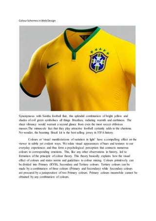
Synonymous with Samba football flair, this splendid combination of bright yellow and
shades of evil green symbolises all things Brazilian, radiating warmth and earthiness. The
sheer vibrancy would warrant a second glance from even the most soccer oblivious
masses.The minuscule fact that they play attractive football certainly adds to the charisma.
No wonder, the beaming Brazil kit is the best selling jersey in FIFA history.
Colours or ‘visual manifestations of variation in light’ have a compelling effect on the
viewer in subtle yet evident ways. We relate visual appearances of hues and textures to our
everyday experiences and thus form a psychological perception that connects numerous
colours to corresponding emotions. This, like any other observations in history, led to
formation of the principle of colour theory. This theory basically explains how the visual
effect of colours and states norms and guidelines to colour mixing. Colours primitively can
be divided into Primary (RYB), Secondary and Tertiary colours. Tertiary colours can be
made by a combination of three colours (Primary and Secondary) while Secondary colours
are procured by a juxtaposition of two Primary colours. Primary colours meanwhile cannot be
obtained by any combination of colours.
2. The Colour Wheel, first noticed by us at Class 2 ‘primary’ school, is one of the standard
methods to grasp the concept of colour combinations and relations. Originally devised by
Isaac Newton, the Colour Wheel namely consists of primary colours at three equidistant
points, coupled with secondary and tertiary colours placed in correspondence to their
wavelengths. It helps us to distinguish between warm colours (shades of Red to Yellow) and
cool colours (Green to Blue), but more essentially helps us to create colour schemes and
harmonies.
Colour Schemes are theoretically the choice of colours in blend with each other in
design to generate appeal and add flair to it. It is analogous to a template which is used in
web designing. Few of the popular colour schemes would be
Monochromatic
Use of a single colour as the crux, along with its shades, tints, variation in saturation
amongst others forms a monochromatic scheme. Essentially the same colour,
monochromes are pleasing to the eye and appear elegant, inducing a ‘clean’ effect.
3. Analogous
Use of two or three adjacent colours on the Colour Wheel, with the Primary or
Secondary tending to be the dominant shade generates the Analogous scheme. It leads
to better vibrancy and contrast relatively. If used perfectly, it should create an
attractive harmonious scheme.
Complimentary
The name says it all. Mash two colours opposite each other in the colour wheel (warm
and cool works best) and you have a colour scheme which contrasts like no other.
However, the colours in question should suit each other hand in glove or it would lead
to a contrasting amalgamated mess. Beware, complimentary colour scheme double up
as a double-edged sword.
4. Triad
Fine tuning the previous scheme, the Triadic colour scheme utilises three colours of
the Wheel located at three equidistant points equally spaced around it. Popular
amongst designers, it provides balance and smooth change in contrast throughout the
page as opposed to the Complementary scheme’s glaring display. Best of both worlds,
we say.
Colour schemes are in essence the various permutations and combinations by which
numerous colours can be represented in a single display. You can always create custom schemes
of your own choosing. Although the selection of colours from the Wheel and its appellation
theoretically may seem like child’s play, it’s difficult to recreate a scheme which is aesthetically
pleasant.