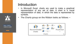
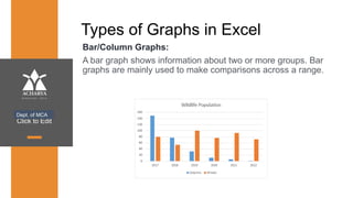
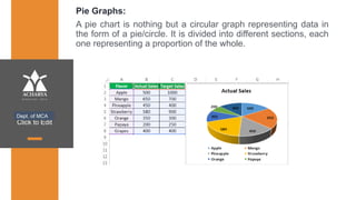
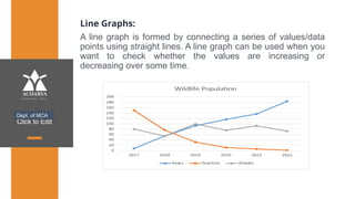
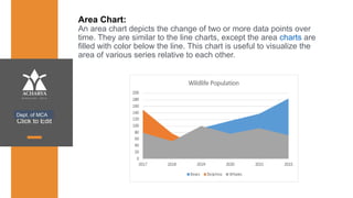
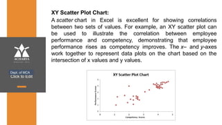
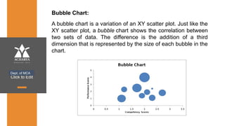
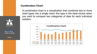
www.acharya.ac.in
Microsoft Excel Charts
Click to Edit
Introduction
• In Microsoft Excel, charts are used to make a graphical
representation of any set of data. A chart is a visual
representation of data, in which the data is represented by
symbols.
• The Charts group on the Ribbon looks as follows −
Dept. of MCA
Click to Edit
Types of Graphs in Excel
Bar/Column Graphs:
A bar graph shows information about two or more groups. Bar
graphs are mainly used to make comparisons across a range.
Dept. of MCA
Click to Edit
Pie Graphs:
A pie chart is nothing but a circular graph representing data in
the form of a pie/circle. It is divided into different sections, each
one representing a proportion of the whole.
Dept. of MCA
Click to Edit
Line Graphs:
A line graph is formed by connecting a series of values/data
points using straight lines. A line graph can be used when you
want to check whether the values are increasing or
decreasing over some time.
Dept. of MCA
Click to Edit
Area Chart:
An area chart depicts the change of two or more data points over
time. They are similar to the line charts, except the area charts are
filled with color below the line. This chart is useful to visualize the
area of various series relative to each other.
Dept. of MCA
Click to Edit
XY Scatter Plot Chart:
A scatter chart in Excel is excellent for showing correlations
between two sets of values. For example, an XY scatter plot can
be used to illustrate the correlation between employee
performance and competency, demonstrating that employee
performance rises as competency improves. The x– and y-axes
work together to represent data plots on the chart based on the
intersection of x values and y values.
Dept. of MCA
Click to Edit
Bubble Chart:
Dept. of MCA
A bubble chart is a variation of an XY scatter plot. Just like the
XY scatter plot, a bubble chart shows the correlation between
two sets of data. The difference is the addition of a third
dimension that is represented by the size of each bubble in the
chart.
Click to Edit
Combination Chart:
Dept. of MCA
A combination chart is a visualization that combines two or more
chart types into a single chart; this type is the ideal choice when
you want to compare two categories of data for each individual
subitem.
Click to Edit
Thank You
Dept. of MCA

Microsoft Excel Charts and Its Types.pptx

  • 1.
  • 2.
    Click to Edit Introduction •In Microsoft Excel, charts are used to make a graphical representation of any set of data. A chart is a visual representation of data, in which the data is represented by symbols. • The Charts group on the Ribbon looks as follows − Dept. of MCA
  • 3.
    Click to Edit Typesof Graphs in Excel Bar/Column Graphs: A bar graph shows information about two or more groups. Bar graphs are mainly used to make comparisons across a range. Dept. of MCA
  • 4.
    Click to Edit PieGraphs: A pie chart is nothing but a circular graph representing data in the form of a pie/circle. It is divided into different sections, each one representing a proportion of the whole. Dept. of MCA
  • 5.
    Click to Edit LineGraphs: A line graph is formed by connecting a series of values/data points using straight lines. A line graph can be used when you want to check whether the values are increasing or decreasing over some time. Dept. of MCA
  • 6.
    Click to Edit AreaChart: An area chart depicts the change of two or more data points over time. They are similar to the line charts, except the area charts are filled with color below the line. This chart is useful to visualize the area of various series relative to each other. Dept. of MCA
  • 7.
    Click to Edit XYScatter Plot Chart: A scatter chart in Excel is excellent for showing correlations between two sets of values. For example, an XY scatter plot can be used to illustrate the correlation between employee performance and competency, demonstrating that employee performance rises as competency improves. The x– and y-axes work together to represent data plots on the chart based on the intersection of x values and y values. Dept. of MCA
  • 8.
    Click to Edit BubbleChart: Dept. of MCA A bubble chart is a variation of an XY scatter plot. Just like the XY scatter plot, a bubble chart shows the correlation between two sets of data. The difference is the addition of a third dimension that is represented by the size of each bubble in the chart.
  • 9.
    Click to Edit CombinationChart: Dept. of MCA A combination chart is a visualization that combines two or more chart types into a single chart; this type is the ideal choice when you want to compare two categories of data for each individual subitem.
  • 10.
    Click to Edit ThankYou Dept. of MCA