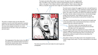
2. The direct eye contact represents determination, strength
and resilience. The artist is represented to be strong and
independent. Also its as if she is encouraging those looking
back at her to look into her eyes as they tell a deeper story
(interacting with audience). In addition it may be a sign that
she is now looking ahead and no longer wants to view her
past (the background), she is moving forward.
The shot is a medium shot, it allows the audience to see her emotions
by being able to view her facial expressions in greater depth as well as
body language. A medium shot makes the subject similar size to
background therefore their importance is shown to be similar.
This sign suggest that the content of the album
(lyrics) are not appropriate for all age groups. This
suggests the artist has emotions of aggression and
distress. The album has allowed her to express her
true feelings. This subverts the stereotypes of a
sophisticated women which is portrayed by the
key image.
The background is a natural/ nature setting the trees
represent the artist to be full of life and energy, nature
could also have associations with a higher being. This
could suggest that we are watched over even in our
darkest days. This further represents strength and
courage. This is reinforced by the artist clothing (mise
en scene), white has connotations of faith, loyalty and
clarity. This suggests that the artist aims bring about
mental clarity by purification of her thoughts and start
a fresh beginning.
The brick wall juxtaposes the representations of
nature. Bricks are cold and solid. As it is solid this
represents it to be an obstacle, it could suggest the
artist feels limited and restricted in her situation. It
could also suggest that the artist may have any
unresolved guilt that she seeks to address, this is
further reinforced with the car this could represent
the artist has left her past situation in order for her to
move forward with her thoughts. In addition the wall
could also be a symbol of a past memory, the artist
has gone to this place to explore her past to move on.
The bricks being cold represent the artist to be
detached from others and that she seeks peace
without any interference from others.
The black and white represent the past as if it is a flashback. Black has
negative connotations such as suffering and pain it is as though the artist
has gone through a negative phase by enduring a bad past/ experience.
This colour you are able to hide behind. However the colour black also
represents independence, determination, this also suggests the artist
seeks to control her situation. The colour black also adds mystery and
generates interest to find out the deeper meaning. The colour white
represents hope and a brighter future ahead.
The artist is non emotional, her facial expressions are firm and
bare. This could be because the artist chooses to guard her
emotions from others, this indicates her personality as not being
very expressive and interactive. This further hints out ideas of
her past. The artist being non emotional is a sign that she
chooses to keep her distance, this is reinforced by the car as she
has left her past behind. The colour black also reinforces the
idea of hiding away from others.
The artist face is slightly tilted this represents her to be
unhappy (melancholy) and that she seeks comfort
The artist is represented to be feminine, her hair is neatly
done, it is a sophisticated look this further indicates the artist
personality. Also the jewellery reinforce the idea of femininity,
it indicates the artist takes pride in her appearance. Also it
makes the artist attractive to appeal to both genders.
The tattoo says ‘paradise’, this represents the artist
considers the destination to be peaceful, harmonious and
bring prosperity to her. These are connotations of paradise
as well as it being a ‘higher place’ which is also reinforced
by the connotations of white. This suggests that she is
content in this place and it offers her chance of escapism.
The shadow on the car could signify not being able to run
away from your past, this suggest the artist cannot escape
her problems and that she has to deal with them. the
shadow being on the car could also suggests she has gone to
this place to revisit her past and resolve any problem. The
mirror symbolises looking back (e.g. reflection) here it
indicates she is looking back at her past.
The typography is simple, it makes use of capital letters making each letter
more significant as the size is greater, this makes the title appear bolder
and ‘louder’. Also it creates and overwhelming effect this could be
suggesting the artist emotions to. It is in the colour white which continues
with the black and white theme, however the white colours connotations
such as peace are opposite to the meaning of the title and to ‘violence’
connotations. The title means unprovoked violence, this could indicate the
artist past situation/history as well as indicate the genre of the album and
artist which is indie pop.
The ‘R,o and e’ all have Sharpe edges, this makes it look more rigid this could
represent ideas of violence. Also the artist name is not shown this is
unconventional, this is significant as it reinforces the idea that the artist want
to hideaway or hide her identity from others.
3. The typography is all in capital letters,
this makes them more significant as
they are represented to be more bold
this in turn makes them seem as
though they are emphasised more.
The white makes them them stand out
more against the darker background,
the white links in with connotations of
flowers such as both bringing comfort
and peace. The typography is all lined
in a straight line going down, this gives
it an elongated shape which allows for
each song or text to be clearly
separated which makes it more simple
fort he audience to see and distinguish
between. The typography consists of
songs titles that are similar such as
‘side a’ and ‘side b’ after each one the
amount of other songs in between
increase each time from 2 to 3 and
then 4. this gives it a repetitive effect it
is also as though its beginning of new
chapters. This could be representing
the different stages the artist went
through in her past to figure
something out. The size of the
typography is not that big this allows
for the main image to be more
enhanced which suggests it has
greater importance.
The flowers have connotations of being feminine and at peace, the colour pink connotes sensitivity as
it is a delicate and gentle colour, this suggests the artist feelings she is sensitive this could be the
reason for her troubled past. In additions flowers are associated with being thoughtful and a positive
gesture. This suggests the artist has thought about her lyrics and songs and that it is a gesture to
someone or thing that she feels. The flowers being green has connotations of being healthy and
attempting to live a life of balance and enjoyment which leads to resilience and a youthful outlook on
life, this could be what the artist aims to achieve as she lays down. Being at one with nature gives
energy and inspiration this could be the reason why the artist has chosen this setting.
The artist eyes are shut this implies the artist is shutting out the world
it could also imply that she is avoiding any external distractions just
wants to be at peace with her own thoughts. This reinforces the idea
she has escaped her past to a better more comforting place to gather
her thoughts and move on from her past. This gesture is as though the
artist is finding future for her past, she has to visit and remember her
past to move forward and figure out what is next
The artist nails are done this represents her to be feminine as she is
taking care of her appearance. The colour red connotes energy, strength,
power, determination as well as passion and love. This suggest the artist
is now in a better place she is improving her thought process, passion and
love could suggest her feelings towards music and the emotion that went
into the lyrics. In addition all these connotations imply what the songs/
album will include.
A cigarette represents the artist to be stressed and unhappy as we
associate smoking with this, also this makes the artist seem rebellious as it
does not conform to feminine stereotypes, this reinforces the idea of the
artist being melancholy. In addition it represent the artist to be relaxing
which is further indicated by her lying down and having her eyes closed.
The artist top is simple (peyote…) the colour white is significant as it has
connotations of purity, innocence, wholeness and completion. This
suggests the artist is at peace and content in that moment in time.
The shot is a medium shot this allows the audience to see the artist in
more detail it allows the audience to connect with artist as it as similar
view a person has when having a conversation with someone, as the
artist does not show much emotion this is necessary for the audience
to pick up detail The angle is as if it is high angle as the audience are
looking down at the subject, this makes the artist seem inferior as
thought she is weak and should be intimidated or threatened this
could be the reason for her having her eyes closed.
The ‘*’ is used instead of using inappropriate
language this makes it more appropriate to
be present to all age groups/audiences.
4. The typography is simple and sophisticated this shows
the artist personality as being feminine, serious but also
young and cool. The album name ‘loud’ represents the
artist to be outgoing, bold and very confident this side
of her personality is likely to be portrayed onto her
lyrics and individual songs. The distance between each
letter suggests… the colour white has contrasting
connotations to the couler red
The artist head is slightly tilted towards her side this could represent her
looking at her past, furthermore it suggests she is revisiting her past in order for
her to move forward.
The shot is a close up this provides clear and detailed image
for the audience, it is also more intimate as it is invading the
artist personal space. This links with the idea of being
seductive as well as confident. There is also no background
image therefore the main image being the artist suggest her
importance.
The artist eyes are closed this could be representing the artist to be
seductive, the extensive eye lashes reinforce this eye lashes are a
form of flattering and cause an attachment (seductive). Although
having your eye closed could also represent the artist reminiscing
on her past, as though she is in deep thought. This indicates that
the album is meaningful to her.
The artist is wearing make-up makes her more appealing, it shows her
feminine side this shows that she cares about her appearance and
wants to make a positive imprecision of her self. Makeup could also
represent a façade, it is as though the artist needs a mask on to hide
her true self, the reason for this could be because of low self esteem,
makeup may give her more confidence.
The artist mouth is slightly open, this shows the artist to be
seductive and sexual.
The colour red connotes confidence as it is a bold colour, this could
be suggesting the artist leadership and power qualities. In addition
it is a seductive colour we associate with love, this could indicate
the songs/lyrics are about her past relationships. The colour red
also has negative connotations such as danger, violence, anger and
revenge, this further indicates what her past relationships was like.
This suggest that the genre is either R&B or hip hop.
The album cover has no name of the artist, this
suggests her significance in the music industry and that
the audience recognise who she is with out being told.
This indicates her importance.
Neck tattoo says ‘rebelle fleur’ this translates to rebel flower, the word
rebel could suggest her lyrics will not be appropriate to all audiences and
that she does not stick to customs nor conventions. Rebel is reinforced by
the colour red negative connotations as well.
Her red hair connotes being fierce, the red hair and red lips
compliments each other which bring the image together.
5. The location of the shot is a bed with a sheet behind, this
represents the artist to be provocative, it also allows the audience
to be more close (intimate) with the artist. This reinforces the
colour pink romantic connotations.
The artist eyes are closed this represents her
to be in deep thought, unhappy. This is
reinforces by her hair covering most of her
face this shows her to want to hide away, this
suggest she is vulnerable and not so
confident. In addition her face is facing
down this further reinforces the idea of
shying away and being unhappy. This could
be suggesting that the lyrics are meaningful
to the artist and that they bring about
emotion to her, this indicates she has given
the audience some inside into her personal
life as the album brings emotion that is not
common to her.
The short is a medium long
shot this allows the
audience to see all the artist
body but also allows for
some detail.
The typography is simple, the font is small this could represent the artist to be feminine and petite as
well as vulnerable. The typography is all in capital letters this could represent the artist to be
confident and bold. The colour being soft pink further reinforces the artist femininity it has
connotation of being romantic, affectionate and intimate. This could be suggesting what the
individual songs will include for example reference to her past relationship. In addition the colpur
pink is a non-threatening color seeking appreciation, respect and admiration. It is not taken for
granted, the artist may seek this for the audience (her fans) and those in her personal life.
The typography order consist of a single word then
two sentences, this could be indicating the different
stages the song progress by ( eg like chapters).
The light is supposed to be natural it represents hope
and prosperity for the future. It also indicates being
young and courageous as well as independent.
The typography includes the artist and another
famous person in the music industry, this shows
that this album is exclusive as they are both
important in the music industry. the use of
another famous figure makes the album more
appealing to a wider audience it also means that
it had more funding therefore the overall outcome
is of high quality.
The typography colour is white this makes it difficult to
Red against the light pink background this suggests
That it is of less importance/significance.
The barcode shows that the album is purchased and legitimate
Which shows that it is an original which may be important for the
consumer (audience) as well as supplier.
The music label is shown ….
The artist hair is neatly done this reinforces her femininity and
that she takes pride in her appearance, also the jewelry further
suggests this although it is not a normal accessory this suggests
her uniqueness and quirky style as well as her confidence.
6. The typography of the album name, the style is
the same as the masthead however the font is
not bold this clearly shows that it is the album
name and not the artist surname.
Tha artist name is shown this suggests that she is not well known to
the main stream audience, it is the masthead to clearly indicate that
is the artist in the main image. The typography is bold and in capital
letters, this makes it stand out and catches the audiences attention.
The colour red also makes it stand out more, red connotes danger,
energy, love and passion. These different emotions may be
describing the artist personality or what will be included in the
album.
The shot is a medium close up, this allows the
audience to see the artist facial expression in greater
detail. This also allows the audience to connect with
the artist more and get to know her on a more
personal level as the shot is close-up it invades her
personal space.
The black and white effect makes it seem classical, this gives the artist a sophisticated
look. This effect is also unique this could be representing the artist to be different from
others in her genre. This is likely to attract a wider audience. There is also an olden day
effect as a boarder around the main image this completes the white and black effect.
The artist is covering half her face, this represents her playful side
to her personality. It also could represent that there is more the
audience have yet to discover about her.
The artist is shown to be wearing make up and
jewelry this represents her to be feminine and that
she takes care in her appearance.
The artist mouth is open this represents her to be in shock, this
could be suggesting the album will reveal something new to the
audience. It is also a facial expression that is unusual this may
persuade the audience to want to find out more about the
album and the artist.
The watch is shown as the album name ‘ora’ translated in to her
mother tongue means watch. This item matches/links to the album
name.
The chain around the artist neck makes her seem tough and
unstoppable.
7. The song titles have similar typography to the album masthead e.g. the letter ‘A’, it is also all in
capital letters this represents the titles to be significant text in comparison to the other texts at the
back. The colour red shares the same connotations as the it does at the front cover. The colour red
is also Rita Ora signature look as her lips always tend to be in the colour red.
The images are broken as if it was a broken mirror, this represents the
artist to inspired by many little and big things and once put together
creates her. It also could indicate that each image links to a particular
song as well as it may be the different aspects of her past expressed
with emotions through the images.
The balck and white theme/effect is continued
this makes the images seem more classical and
vintage (similar to a Marilyn Monroe look).
The images shown show the different personality's the
artist has, this will give her target audience a greater
indication of the different music genres she is into.
Famous artist that a large audience are featured in many of
the artist songs, this is likely to appeal to a wider audience.
The label is shown, this label is well known for
other big stars. This could help the artist become
more noticed and is likely to appeal to larger
audience who is a fan of this particular label/
management.
9. The ‘R’ is the sign the audience associates with the artist, it is also used in the
album cover. The typography is unique it has very Sharpe edges this represents
danger its as if it is a weapon. This typography represents the artist to be tough
and dangerous.
The black and white effect makes the artist more fearful as black connotes the
unknown, this could suggest that the audience have much to learn about the artist.
Black also connotes grieving and feeling melancholy, this could suggest this is what
the album includes or these are the emotions the artist feels. However white
connotes hope and prosperity which may be what the artist seeks.
The artist is looking up it makes her seem inferior and as if she
seeks help/comfort. The direct eye contact is engaging with the
audience . This stare may also generate fear amongst some as it is
a hard and cold look.
The makeup and jewelry make the artist seem feminine,
however the jewelry is metal this represents being cold,
assertive and dominate. This may be the different aspects of
the artist personality or what will be portrayed in the lyrics of
her songs.
The main image is the front album cover this is a effective
advertisement technique as the audience can easily notice
when purchasing the product. It also gives them an
indication of what to expect without writing.
The hair cut is like a boys, the artist is a female she is going against
conventions and norms in society. Looking like a boy gives her manly
attributes such as being more strong, dominant, powerful, determined
and assertive.
The artist hand is holding her head its as if she is in a bad place as is
deeply worried about something whilst trying to gather her thoughts.
It is also covering half her face this brings mystery to the audience as
it may be she is covering something she chooses not to show up.
The shot is a medium close up this allows for the audience to see her in
greater detail, as will as feel more emotionally connected with the artist.
The parental advisory suggests that the content of the album is not
appropriate for all age groups. This represents her power as she is able
to control bad and good aspects she includes in her albums. In addition
is shows her to be breaking conventions as this is not expected of a
female which reinforces the idea of her aiming for a more manly look.
The album name ‘rated r’ links to this sign. The typography of rated r is
very small hardly visible the reason for this is for the main image to do
most of the describing and attracting.
The artist name is shown to make it clear who the album
belongs to as it is not present on the album cover, this may
also grab a wider audiences attention as her name is well
known all over the world. It also clearly advertises that it is
an album and not something else.
Two songs that have been previewed and are popular are shown, this is an
effective advertising technique as it will appeal to the target audience. The
typography is different to indicate this and to make it stand out, the colour red
also does this.
10. The artist name is at the top (masthead) this suggests she is significant it also clearly indicates to the audience reading the magazine who the main
image is as well as who the album they are advertising belongs to, the artist name it self will advertise it self. The typography is simple similar to the
typography on the album this clearly shows that hey both link, the artist name is also in capital letters which further reinforces her significance, it is
also spaced out this makes it easier to see as it takes up most of the page which further increased its importance. The colour white stands out against
the red background.
The medium close up shot allows the audience to see the artist in
more detail, it allows for the audience to connect with the artist
emotionally as they can view her facial expressions more clearly.
The album title is positioned just bellow the middle over
the main image this increases its significance as the human
eye looks towards the middle more, this is an effective
advertising technique. The typography is similar to the
artist name however the font is bigger this further
advertises the album more.
The sunglasses allow the artist to hide her eyes which
is where most emotion is shown. This represents the
artist to be unhappy therefore does not wish for
others to notice this.
Her hand gesture is like a gun symbol, it is touching
her lips this represents her to be seeking revenge,
this may be the purpose of the album.
A rose represents love, beauty and class (being
sophisticated). These may be all the different aspects
included and portrayed through her album.
‘new’ is more appealing to Rihannas target audience
which consist of young adults as they like to be up to date.
The image is most taken up by the main image, however a slight
background is shown although this is blurry. This suggests that the most
important feature of this image is the main image, this increases the main
image significance as most of the audiences attention is focused on her.
The jewelry and the artist neat hair shows she is feminine, it
shows she takes pride in her appearance and likes to look good
and appealing. The look she goes for is less sophisticated and
more extravagant for example the red hair is unique and different
to others. The red hair is distinct which also allows the audience
to clearly identity her.
The fur has connotations of being a warrior, although
the flesh that is shown makes her seem more
vulnerable, in addition it makes her more seductive
and sexual.
The album cover is shown this makes it easier for the audience to
notice the album when purchasing. It also clearly shows that this is
a magazine advertisement for the new album.
The text gives to hit songs that have already been previewed
by the audience, they have had good chart positions and
reviews. This is the reason why they are used to advertise the
product as they know it will encourage the audience to
purchase the album and receive the rest of the songs that
will be as big in the future. This makes the audience feel
more privileged therefore the product becomes more
appealing.
11. The album cover is used in the advert as the main image,
this is effective as the audience will easily be able to
recognise the product upon purchase. It also is effective
as the audience can make assumptions on the album
based on the front cover. The direct eye contact is effective as it directly
‘Smash’ is an onomatopoeia, this creates excitement
for the audience. It also emphasises the singles
success. The typography is all in caps lock this
compliments the words meaning, it also adds to its
exaggerate effect.
The shot is a medium close up, this
allows the audience to clearly see the
artists facial expression. They are able
to generate a feeling from the image on
the artist as well as the album it self.
The audience become more engaged.
The use of another big artist featuring in the
album will appeal to a greater audience, as it
merges two artists fans together, this overall
creates more success and recognition. It also
makes the album more creative and interesting to
listen to other featuring acts.
communicates with the audience, the audience
can feel attracted to the artist and the product
more.
The open mouth could represent the artist to be seductive,
or it may be suggesting the music is going to be passionate
and strong meaning behind the lyrics.
The artist name shown on the album cover this is
effective as not all may know who the artist is
therefore the artist may appeal to new audiences.
The typography of the name is the largest text this
represents the artist significance.
The most predominant colour used on the front
cover of the album is black , the artist make up
such as lips and nails are in this colour. The colour
black is a sophisticated look although it could also
represent a deeper emotion something that is
unknown to the audience. The hint of gold on her
lipstick represents more fun and energetic look as
well as vibe to the artist image and album. The
gold colour is used on the largest text this allows
it to stand out against the black background, this
enhances the artist significance. The typography
style is unique the audience associate it with the
artist almost as if it’s a logo.
The website link is useful for her
target audience (fans) to find out
more about the album, the
release date and the artist in
general.
“Who you are” is the album title (slogan), the
typography is similar to the artist name although the
size is smaller and colour less bold, this suggests its
less important in comparison to the other text, the
artist name .